Miloš Ćirić
|
Serbian book illustrator, graphic arts teacher and phototype, woodtype and linocut letter type designer, b. Despotovo, 1931, d. Belgrade, 1999. His sons Rastko and Vukan write about both aspects of his life. His CV: he graduated in 1954 from the Academy of Applied Arts, Belgrade and took his Masters Degree in 1959, under Professor Mihailo S. Petrov. He was professor at the Faculty of Applied Arts, University of Arts, Belgrade from 1964 until 1997. He was Head of the Graphic Department from 1974 to 1975. His publications include Graphic identification 1961-1981 (SKZ, Belgrade, 1982), Graphic communications 1954-1984 (Vajat, Belgrade, 1986), Heraldry 1 (University of Arts, Belgrade, 1983) and Coat-of-Arms of Belgrade, Heraldry 2 (Cicero, Belgrade, 1991). Most of Ćirić's types were for Cyrillic, while some have Latin alphabets as well. Many would be classified today as poster types, type to accompany illustrations. The list of his typefaces: - Rastko, Latin, 1955: It is a versal typeface made in only one weight. Rastko himself thinks it was devised as light, almost linear and it was a part of his character.
- Vukan, Latin, 1960: Named after his second son, Vukan, this is a sharply cut orthogonal typeface.
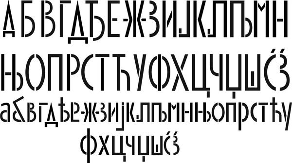
- Galerija Grafiki kolektiv, Cyrillic, 1962 (Graphic Collective Gallery): A beautiful Cyrillic display face. This was the first of his typefaces transformed in a computer font.
- Triptihon, Cyrillic, 1962 (Triptych): Another cut face, but this time really taken from the sample made in linocut. The prototypical Cyrillic poster face.
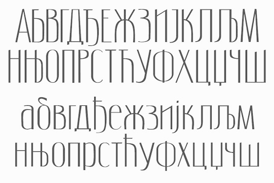
- Akademija, Cyrillic, 1966 (Academy): This typeface was made for the University and Academy where he worked. It was designed so that it can be used equally well on the paper, metal plates, seals, plaques and everything else Academy needed. He used similar typefaces on book covers and charters, in solemn situations. Rastko: Although one may think it is an ordinary serif face, it contains Cira's specific typographic handwriting. The shapes are almost geometrically reduced thus providing a decorative effect, legibility and possibility to be transferred in all materials..
- Bolsko, Latin, 1966/67/68: Bol is a small place on the island Brač. This simple condensed headline typeface was designed for pedagogical purposes made to be used for lectures at the Faculty of Applied Arts abd in its graphic identity.
- Devojačko, Cyrillic, Latin, 1969 (Maiden): A curly affectionate face.
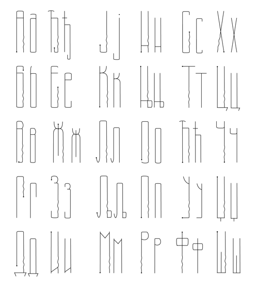
- Ćirićica, Cyrillic, 1970/72: This typeface was designed as a result of the first research on transforming Serbian handwritten Cyrillic into constructive letterforms. The raw model was the manuscript of the Fourth Gospel (John's Gospel) written at time of Despot Djurdje Barnković (1428) created then by by a Inok from Dalša. The result was a letterform of optimal proportions. The study was made on the occasion of the opening of the new building of the National Library, Republic of Serbia.
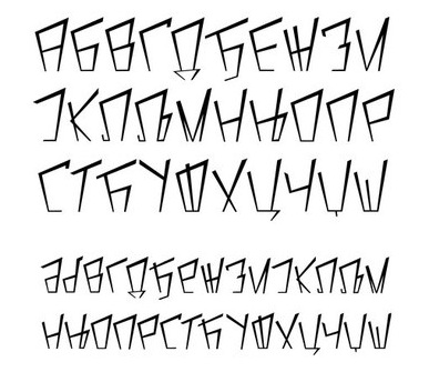
- Vojničko, Cyrillic, 1975 (Soldiers): When designing this typeface Ćirić consulted the book Blue Line of Life (Plava linija života) by Branko V. Radičević, a book about monuments and tombstones posted along roads. It is a sentimental ornamental headline face.
- Face VMA, Latin, 1976/77: A big project for the Military Medical Academy (abbreviated VMA) in which the letters had to be constructed on grids using rulers and compass only. The result is a Bank Gothic look.
- Bogradsko, Cyrillic, Latin, 1982: This typeface was used for designing the covers and title of his second book of graphic communications.
- Duklja, Cyrillic, Latin, 1984: In this case the typeface makes basis of graphic identification. As a model for designing the typeface of Montenegrin Lexicographic Institute was a text from leader seal of Petar, Prince of Duklja. Ira wrote that he enlarged and systematize the letters from the drawing which was made in time when the seal was in good condition and that he wanted to preserve the freshness of irregularities and that there were several weights in each letter while their height is only optically the same. It seems that save for that irregularity which inspired and provocative vagueness this model could not offer many clear stylistic characteristics. But what ira could read from those forms is the language of their linocuts and cut symbols. Thus his personal style naturally added to all that was missing to finish the face. In compromise between typeface with serifs and sanserifs in combination of legibility and universal applicability he saw practical solution for many tasks.
- Iva's typeface, Cyrillic and Latin, 1986: Rastko: My brother's daughter, Iva, was the first child that joined our family of applied artists. Ćirić immediately awarded himself with the title of granddad, opened the door of his studio and showed her all those games and toys from the world of the applied and other arts. Apart from the crazy games, obligatory signum and many other things Iva got many picture books which her grandpa made from time to time. The picture books contained poems, drawings, pictures and of, course letters. On one of those picture books entitled Grandpa' Stories I have found, so far, the only place where the typeface was used. It is a type of typeface imitating relief forms.
- Vukov bukvar, Cyrillic, 1987 (Vuk's Abecedary): One of the rare typefaces with lower case letters, this typeface is dignified and named after Vuk Kardžić.
- Sava's face, Cyrillic, 1987: A gorgeous old slavonic style typeface with upper and lower case.
- Epitaf, Cyrillic (Epitaph, my name, unknown year): An unpublished typeface found by his sons in the files. Ćirić used it to write names of births and deaths of friends and family members in a notebook. It could be seen as a prototype for tombstones.
[Google]
[More] ⦿
|
