
December 28, 2004
Gill Bates
What is this?
No, this is not about Bill Gates, but about
Eric Gill and Keith Bates.
In particular, it is the story of
the revival of Solus, a typeface designed
by Eric Gill in 1929.
I will let Keith Bates, who runs
K-Type from his office in Manchester, U.K.,
do the talking.
Bates's account
In 2003, whilst researching the life and work of Eric Gill, I came
across several references to a typeface called "Solus" cut in 1929.
My curiosity was kindled when I experienced difficulty in finding an
illustration of Solus in print or on the internet, and I discovered that
the typeface had been withdrawn by Monotype in 1967.
A few meagre visual snippets failed to satisfy and in July 2004 I posted
an internet request on the Typophile Forum. To my excitement Alessandro
Segalini put up a copy of the Solus typeface from a specimen book, and
although it was rather poorly printed at a small point size, I made a
"Solus Rough" font to get a feel for the typeface.
I liked result and decided to research further, to seek out clearer
source material and attempt the first digital version of Solus. I
contacted Agfa Monotype by letter and email but got no reply.
I also made contact with some of the professionals suggested by
Alessandro Segalini. Petra Cerne Oven asked Christopher Burke who felt
that Solus was superseded by Joanna. James Mosley agreed, but still felt
the resurrection of Solus to be an interesting project.
I started to compare Solus with Joanna and found it to be more similar
to Perpetua in many respects. I also still felt it to have an identity
of its own, for me it has a real English schooldays feel.
Justin Howes of the Type Museum noted, "I've always liked Solus, and it
would be good to see it revived".
Mailartist and printer Alan Brignull sent me a high resolution copy of
some Solus characters printed at 48 pt. and I set to work on making a
version that was as close to Gill's original as I could create.
A big problem was the actual shape of the slab serifs. Even at 48 pt.
the serifs appear to have slight curved bracketing. I acknowledge that
this may well be an error - James Mosley wrote "My impression is that
your bracketing, however sutble, is wrong, because Solus is conceived as
essentially a mechanistic type -- a 'light Egyptian'."
Even so, I have decided to allow myself to be guided by my observations.
Some Egyptians do possess curved brackets, moreover Solus has a warmth
compared to Joanna that is augmented by the subtle bracketing visible on
the printed copy.
In September, I contacted Robin Nicholas, Head of Typography at Agfa
Monotype, and although he didn't invite me round for a coffee and a
detailed look at Gill's original drawings, he did recommend Gill's 1926
sketchbook, 'A Book of Alphabets for Douglas Cleverdon', as showing the
origin of Solus, and I immediately ordered a copy from Amazon.
He also noted, "I understand that there may be a legal problem using
the name Solus."
So, in December 2004 I was resigned to calling the font "Non Solus" and
lovingly added it to the K-Type website. I also sent the story of its
making to Luc Devroye who replied, "I do not see why the name Solus
would have any protection--the face was designed 75 years ago, and
trademark can only be valid if it is actively defended".
I guess I'll take Luc's advice and release it under its rightful name,
at least until I hear from the lawyers, Monotype have actively neglected
the typeface for 38 years. Either way, here is a typeface which is as
near to the spirit of Eric Gill's Solus as I have been able to make.
[Comments dated December 28 and 30, 2004]
NonSolus
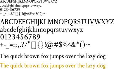
Clean outlines!
Luc Devroye
School of Computer Science
McGill University
Montreal, Canada H3A 2K6
luc@cs.mcgill.ca
http://cg.scs.carleton.ca/~luc/index.html