Oh, it's not a circle
March 2009
Luc Devroye, McGill University
 Type design is about drawing shapes, and drawing shapes is something
we have been doing since the stone age, with increasing sophistication.
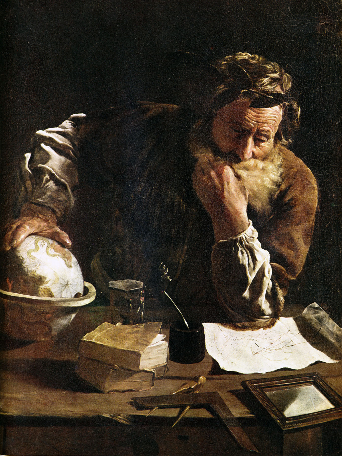
Archimedes of Syracuse (ca.~287 BC---ca.~212 BC) was a Greek mathematician,
physicist, engineer, inventor, and astronomer.
A leading scientist in classical antiquity,
he was a master of ruler and compass constructions.
The compass was the first tool for drawing a perfect circle---without it,
architecture and mechanics would be unimaginable.
The compass was the only mechanical tool for
drawing a line perpendicular to another one---without that,
humanity would have been stuck with a thousand towers of Pisa.
Type design is about drawing shapes, and drawing shapes is something
we have been doing since the stone age, with increasing sophistication.
Archimedes of Syracuse (ca.~287 BC---ca.~212 BC) was a Greek mathematician,
physicist, engineer, inventor, and astronomer.
A leading scientist in classical antiquity,
he was a master of ruler and compass constructions.
The compass was the first tool for drawing a perfect circle---without it,
architecture and mechanics would be unimaginable.
The compass was the only mechanical tool for
drawing a line perpendicular to another one---without that,
humanity would have been stuck with a thousand towers of Pisa.
 It is not clear that these mathematical and architectural tools
were formally used in type design. Until the late renaissance,
letters were sculpted or drawn by hand.
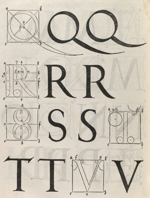
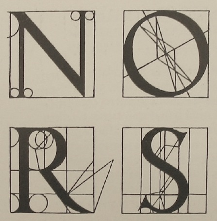
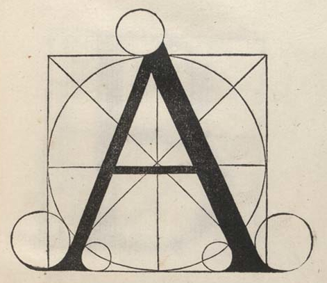
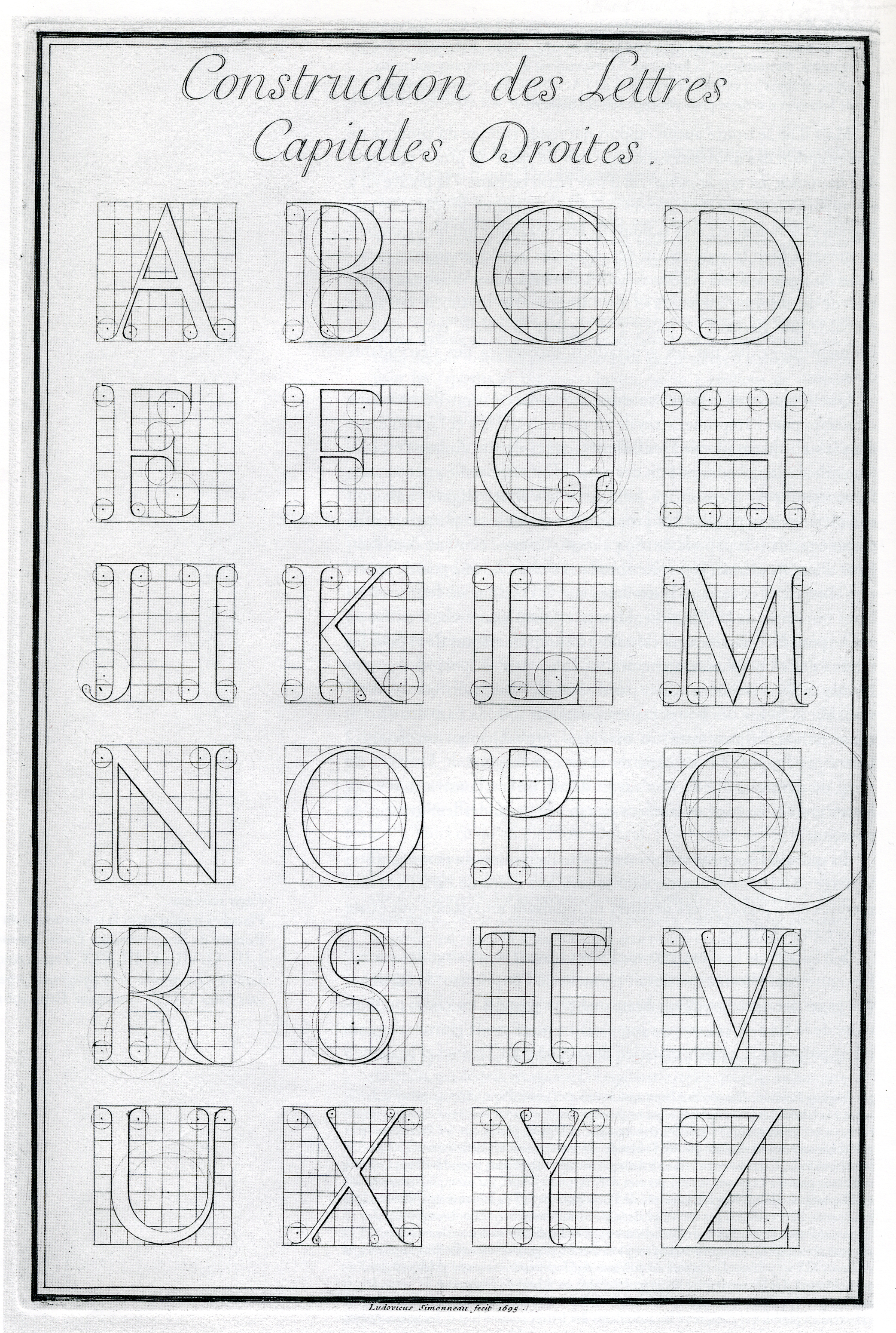
A first attempt at creating and defining letter shapes more formally
happened around 1500 in Germany, Italy and France.
It involved the use of ruler and compass and the idea of gridding paper.
Albrecht Dürer (Nürnberg, 1471-1528) used these aids in the design of
roman capital letters in 1525.
In my view, this was the first attempt at storing or coding
the letters by giving a mathematically precise recipe. The drawing itself
could be sent to all corners of the world, instead of the actual metal
type. At least, the seeds of a formal description were sown.
It is not clear that these mathematical and architectural tools
were formally used in type design. Until the late renaissance,
letters were sculpted or drawn by hand.
A first attempt at creating and defining letter shapes more formally
happened around 1500 in Germany, Italy and France.
It involved the use of ruler and compass and the idea of gridding paper.
Albrecht Dürer (Nürnberg, 1471-1528) used these aids in the design of
roman capital letters in 1525.
In my view, this was the first attempt at storing or coding
the letters by giving a mathematically precise recipe. The drawing itself
could be sent to all corners of the world, instead of the actual metal
type. At least, the seeds of a formal description were sown.
 Dürer's drawings followed similar suggestions by cisalpine
colleagues. Luca Pacioli, a Franciscan monk (1445-1514), showed geometrically
constructed letters in 1509 in his Divina Proportione.
Francesco Torniello, author of the treatise L'Alfabeto (1517), showed
many similar geometric constructions.
Dürer's drawings followed similar suggestions by cisalpine
colleagues. Luca Pacioli, a Franciscan monk (1445-1514), showed geometrically
constructed letters in 1509 in his Divina Proportione.
Francesco Torniello, author of the treatise L'Alfabeto (1517), showed
many similar geometric constructions.
 Not be outdone, the French were critical of Dürer's work.
Maistre Geoffroy Tory de Bourges, a Parisian printer, designer and engraver (1480-1533),
produced beautiful initials, borders, and illustrations.
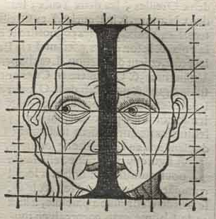
He related the proportions in letters to proportions in the human body
in Champ-fleury, auquel est contenu l'art et science de la vraie
proportion des lettres antiques selon le corps et visage humain (Paris, 1529).
Not be outdone, the French were critical of Dürer's work.
Maistre Geoffroy Tory de Bourges, a Parisian printer, designer and engraver (1480-1533),
produced beautiful initials, borders, and illustrations.
He related the proportions in letters to proportions in the human body
in Champ-fleury, auquel est contenu l'art et science de la vraie
proportion des lettres antiques selon le corps et visage humain (Paris, 1529).
 In the typographic landscape, the period between 1550 and 1650 was virtually
a total loss, void of any new ideas. The formalization regained
strength around 1700 when Philippe Grandjean de Fouchy
(b. Macon, 1666, d. Paris, 1714) developed the Romain du roi
in 1702 at the Imprimerie Royale in Paris.
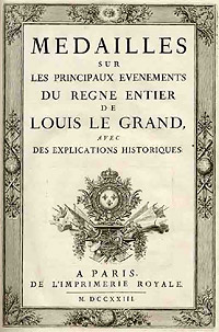
In 1695, King Louis XIV of France had commissioned a typeface,
which until today is described as the first digital font,
and at least as the first mathematically defined type,
with the code published in
Médailles sur les principaux événements du règne de Louis le Grand (1702).
The complete set of 21 sizes of roman and italic letters was
finished by Grandjean's successor Jean Alexandre and completed by Louis Luce in 1745.
The font went by the name of Romain du Roi and was for the exclusive use of the Louis XIV. It was never sold or given to any other king or government.
In the typographic landscape, the period between 1550 and 1650 was virtually
a total loss, void of any new ideas. The formalization regained
strength around 1700 when Philippe Grandjean de Fouchy
(b. Macon, 1666, d. Paris, 1714) developed the Romain du roi
in 1702 at the Imprimerie Royale in Paris.
In 1695, King Louis XIV of France had commissioned a typeface,
which until today is described as the first digital font,
and at least as the first mathematically defined type,
with the code published in
Médailles sur les principaux événements du règne de Louis le Grand (1702).
The complete set of 21 sizes of roman and italic letters was
finished by Grandjean's successor Jean Alexandre and completed by Louis Luce in 1745.
The font went by the name of Romain du Roi and was for the exclusive use of the Louis XIV. It was never sold or given to any other king or government.
 Jacques André from the University of Rennes spoke passionately about
this episode of French typographic history at ATypI 1998 in Lyon.
He recalled that father Sébastien Truchet was appointed by Louis XIV
to contribute to the work on the Bignon Commission for the purpose of compiling an encyclopaedia of trades and professions, including printing.
Jacques André from the University of Rennes spoke passionately about
this episode of French typographic history at ATypI 1998 in Lyon.
He recalled that father Sébastien Truchet was appointed by Louis XIV
to contribute to the work on the Bignon Commission for the purpose of compiling an encyclopaedia of trades and professions, including printing.
The commission turned its attention to existing characters used in printing. Three of its members (Truchet, Jaugeon and Des Billettes) undertook to design
new French letters that we have endeavoured to render as agreeable as possible to the eye.
These characters broke with the Garamond tradition.
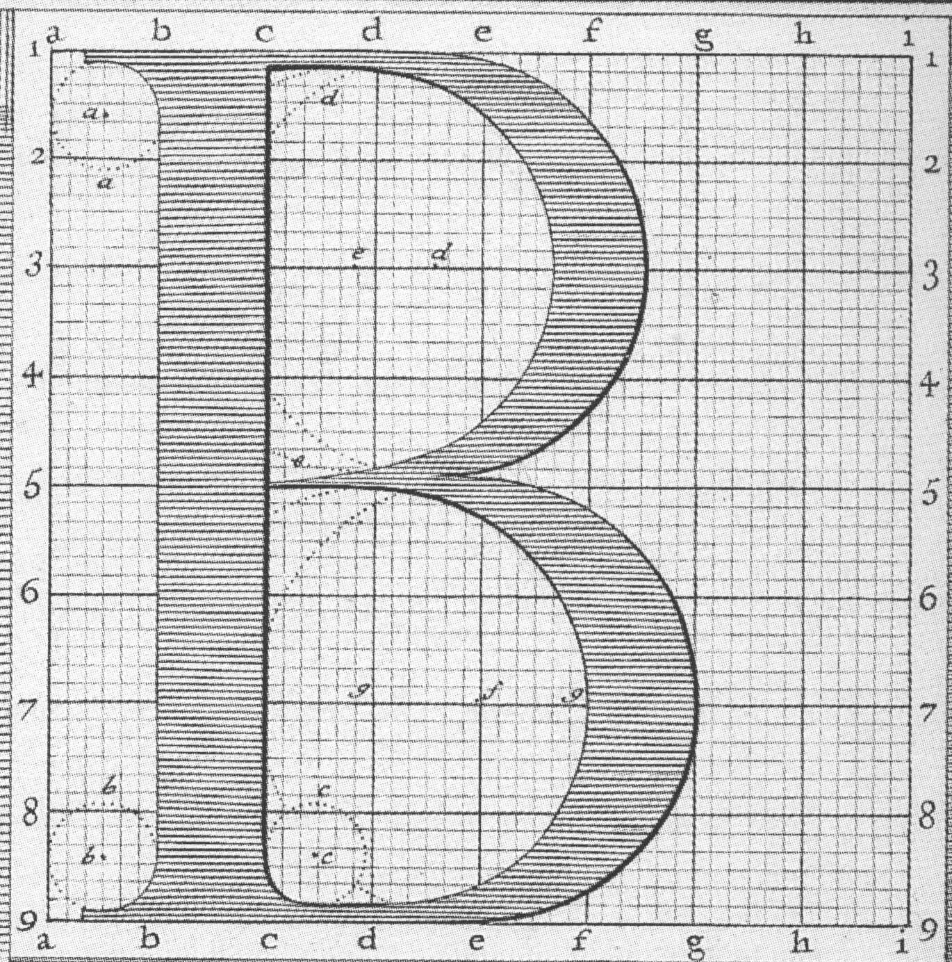 These three academics produced characters for printing plates, engraved by Louis Simonneau,
in the Romain du Roi font that Grandjean later used in
Médailles sur les principaux événements du règne de Louis le Grand.
While Simonneau's printing plates have been reproduced many times,
his hand-written notes are little known.
Yet these are the equivalent of PostScript's AFM files that contain
hinting and metric information.
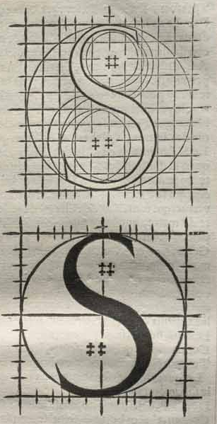
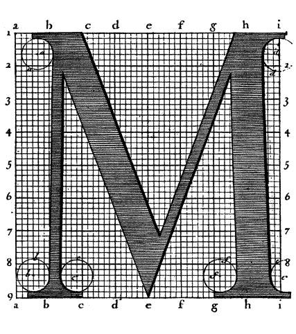
The instructions for the letter B, drawn by him in 1716, clearly show where
the centers of the circles are, and how lines are defined: it is a precise recipe.
These three academics produced characters for printing plates, engraved by Louis Simonneau,
in the Romain du Roi font that Grandjean later used in
Médailles sur les principaux événements du règne de Louis le Grand.
While Simonneau's printing plates have been reproduced many times,
his hand-written notes are little known.
Yet these are the equivalent of PostScript's AFM files that contain
hinting and metric information.
The instructions for the letter B, drawn by him in 1716, clearly show where
the centers of the circles are, and how lines are defined: it is a precise recipe.
The race for rigor and rationalization became feverish in the 18th century, with
ruler, compass and grid systems leading to ever more rational typefaces,
first with Fournier, then with Giambattista Bodoni's designs in Parma,
and ending with the work of the Didot family in Paris. These
typefaces dominated the nineteenth century,
choked the trachea of imagination, and led to typographic death in
the Victorian era.
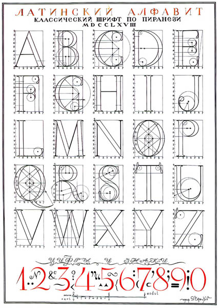 Rationalization was attempted again in the middle of the 20th century.
Russian architect and artist Iakov Chernikhov (1889-1951) developed
Romain-du-roi and compass-centric glyph definitions for some alphabets in his
book An Analysis of the Construction of Classical Typeface,
which was posthumously published in 1958.
Rationalization was attempted again in the middle of the 20th century.
Russian architect and artist Iakov Chernikhov (1889-1951) developed
Romain-du-roi and compass-centric glyph definitions for some alphabets in his
book An Analysis of the Construction of Classical Typeface,
which was posthumously published in 1958.
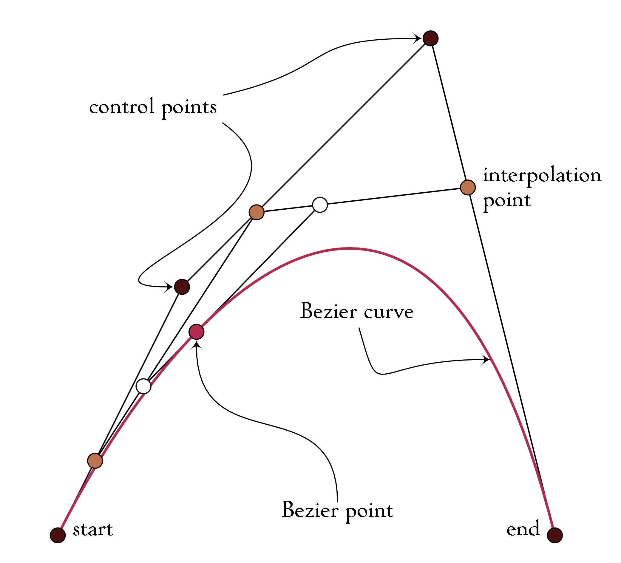 Shapes of letters are described nowadays by a sequence of Bézier curves,
which were first developed in 1959 by Paul de Casteljau (b. 1930),
a physicist and mathematician at Citroën, using de Casteljau's algorithm.
Pierre Bézier (1910-1999), an engineer at the competing car company Renault in Paris,
publicized and patented Bézier curves in 1962 for use in describing car bodies.
The third order Bézier curve
would have a start point, an end point, and two guide points inbetween,
to control the smooth curvature. The second order Bézier curve has only
one guide point, and the 17-th order Bézier curve requires sixteen guide points,
which is quite messy.
The first order Bézier curve is a straight line, which is too simplistic.
For letters, the consensus is that the second or third order provides
the best compromise between ease of design and the number of curves needed
to describe a shape.
Shapes of letters are described nowadays by a sequence of Bézier curves,
which were first developed in 1959 by Paul de Casteljau (b. 1930),
a physicist and mathematician at Citroën, using de Casteljau's algorithm.
Pierre Bézier (1910-1999), an engineer at the competing car company Renault in Paris,
publicized and patented Bézier curves in 1962 for use in describing car bodies.
The third order Bézier curve
would have a start point, an end point, and two guide points inbetween,
to control the smooth curvature. The second order Bézier curve has only
one guide point, and the 17-th order Bézier curve requires sixteen guide points,
which is quite messy.
The first order Bézier curve is a straight line, which is too simplistic.
For letters, the consensus is that the second or third order provides
the best compromise between ease of design and the number of curves needed
to describe a shape.
Chuck Geschke and John Warnock developed PostScript from 1976 until 1982,
the first truly universally
accepted computer language for graphics.
They founded Adobe in 1982 and created the type 1 font format, which was
adopted as a standard by the graphics and printing industries all over the world.
They employed third order Bézier curves to describe the outlines
of the shapes of characters.
Concatenate---back to back---a number of such curves to make a closed mould
in which we can imagine pouring black ink.
Some time later, Microsoft adopted the second order Bézier curve for its
digital truetype typefaces. From a shape description point of view,
opentype brings nothing new---it puts a shiny ribbon around those two
shapely trinkets.
The computer permitted the storage and virtually limitless
creation and reproduction of typefaces. The internet made communication
between designers and users instantaneous. The present period is unprecedented
in the history of humanity, and will make the renaissance period seem like
an insignificant blip. Yet, as a type designer and typophile, I see
nothing but imperfections and limitations all around me, and in a purely
technological sense, we may have taken a step backwards, all because of the oh.
Here we are, simultaneously
blessed with the beauty and
cursed by the limitations of Bézier's splines.
At first sight, it looks like progress, because we have finally a way of
writing down a bunch of numbers to describe a shape---we don't even need
a piece of paper or a visual aide as in Pacioli's days.
The depression of 2008-2009 should make us reflect about
the typographic regression. The world has tens of thousands
of splendid digital fonts, all genetically engineered in the same manner,
without a hint of diversity. If there is a flaw in the genetic make-up,
then all have it, and all are infected.
But the unimaginable has happened! We have lost our compass, both literally
and figuratively. A circle, or even an arc of a circle, cannot be
represented by any Bézier curve [this is an easy exercise for mathematically inclined readers].
A circle can be approximated, but that is another matter altogether.
Does it mean that the Déesse has no round cylinders or wheels? Of course
not. But it is true that not a single digital font has
a perfect arc or circle!
 An indirect consequence of the lack of circles in the Bézier family is the
incapability of representing nonlinear noncircular
outlines of uniform nonzero width, as are called
for in mono-width fonts.
In Chinese and Japanese, for example, early fonts used to be described by strokes, not outlines.
Strokes are then brushed over by pens with given nibs.
This can be used for mono-line or mono-width fonts, which often appear as if they
were produced by writing with a ballpoint pen.
Yet, anatomically correct mono-width fonts do not exist in the Bézier world.
An indirect consequence of the lack of circles in the Bézier family is the
incapability of representing nonlinear noncircular
outlines of uniform nonzero width, as are called
for in mono-width fonts.
In Chinese and Japanese, for example, early fonts used to be described by strokes, not outlines.
Strokes are then brushed over by pens with given nibs.
This can be used for mono-line or mono-width fonts, which often appear as if they
were produced by writing with a ballpoint pen.
Yet, anatomically correct mono-width fonts do not exist in the Bézier world.
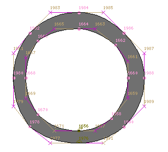
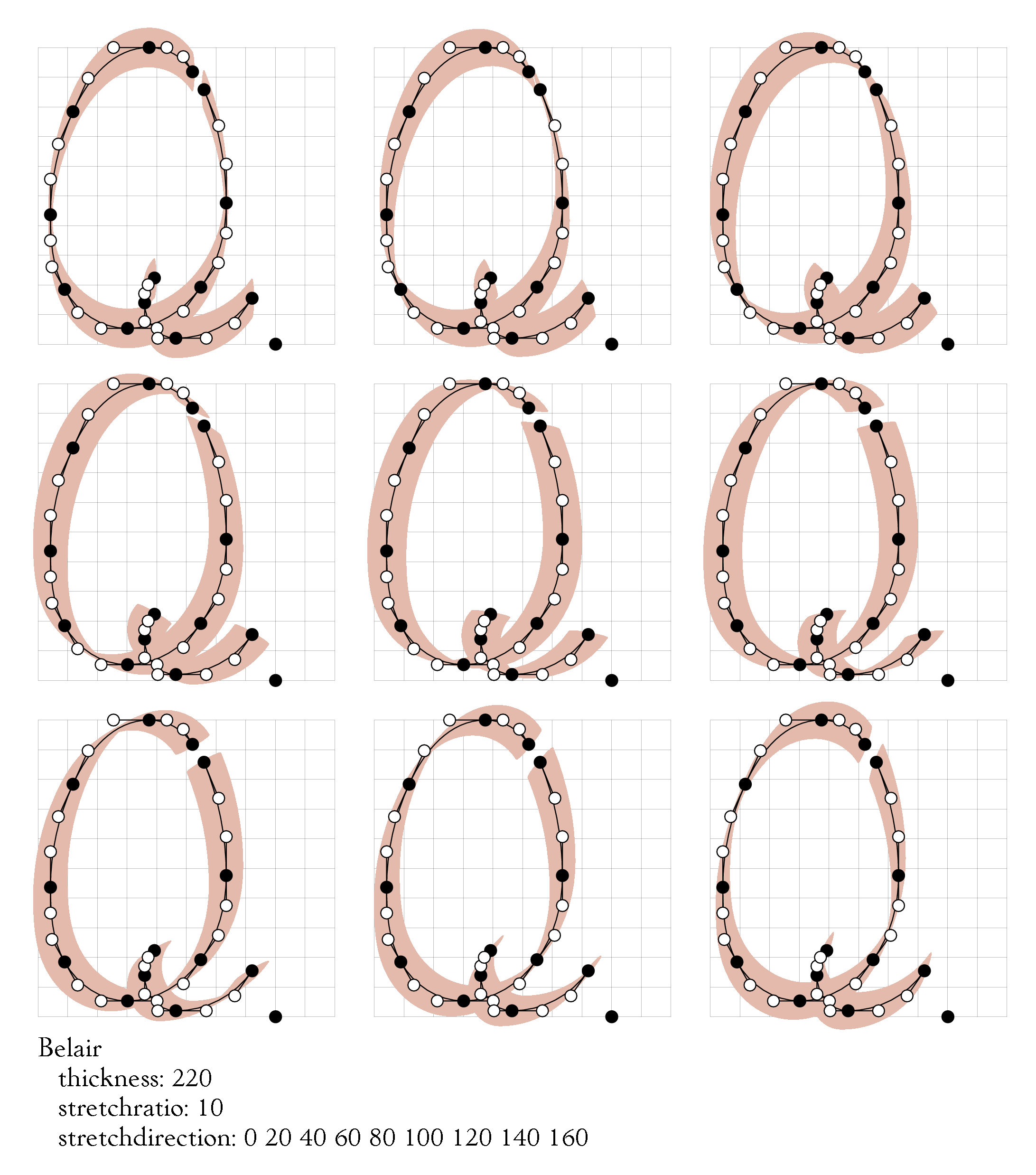
 As another example, consider the FontStruct tool created by Robert Meek for FontShop
in 2008. It permits on-line creation of modular fonts that consist of basic
building blocks. One of these is a ring, but as a blow-up of this
modular block shows, Meek has clearly struggled
with the double problem of defining exact circles and uniform widths.
The result is nothing short of a wilted disaster---imagine FontStruct's ring showing up
on a traffic sign under the Arc de Triomphe!
As another example, consider the FontStruct tool created by Robert Meek for FontShop
in 2008. It permits on-line creation of modular fonts that consist of basic
building blocks. One of these is a ring, but as a blow-up of this
modular block shows, Meek has clearly struggled
with the double problem of defining exact circles and uniform widths.
The result is nothing short of a wilted disaster---imagine FontStruct's ring showing up
on a traffic sign under the Arc de Triomphe!
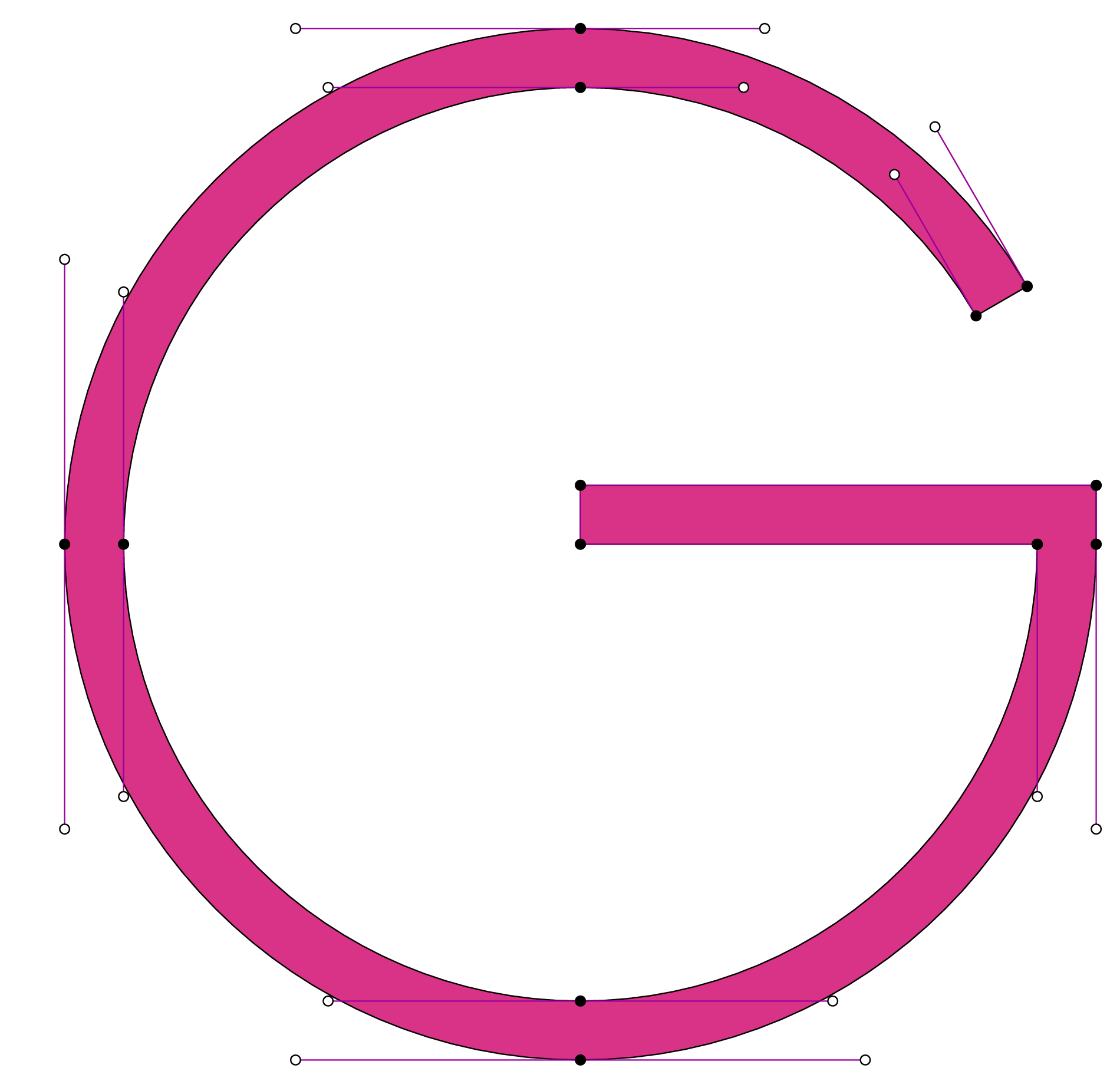
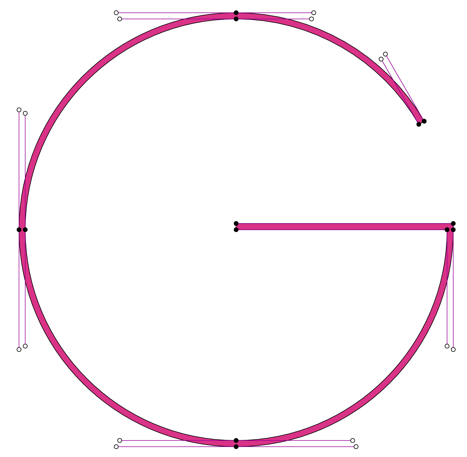 Approximations of circles do work well, and various digital font editing programs
do a good job at it, but the world deserves the real thing.
It is essential that we can work with perfect arcs of circles
and straight lines, as in the 16th century.
We need to invent other graphical descriptions and generate a new genetic species.
Approximations of circles do work well, and various digital font editing programs
do a good job at it, but the world deserves the real thing.
It is essential that we can work with perfect arcs of circles
and straight lines, as in the 16th century.
We need to invent other graphical descriptions and generate a new genetic species.
So, here is the triple task for the next jump in typeface design.
First, engineers and designers should team up to create a new
font design interface, removing it from the screen, the mouse and the keyboard.
And, who knows, create mechanical devices that include compass and ruler and
extensions of these to aid the artists.
Secondly, the computer scientists ought to create
several genetically different and coexistent
ways of describing the ink staining process.
Lastly, the mathematicians should look at their best post-Bézier tools to deal with
the circle and stroke width problem
so that we can all go Oh oh!