
Commentary
November 30, 2002
More on the Palatino story
.....
These are comments and addenda on the
Palatino story collected from various sources.
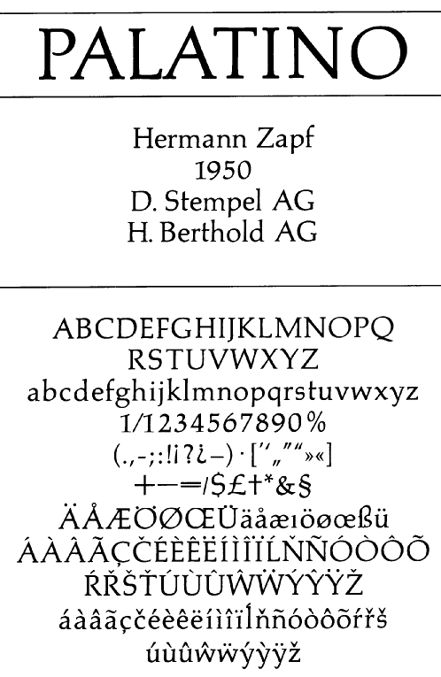
Palatino was designed from 1948-1950 by
Hermann Zapf and has become a hugely successful
typeface. It is controversial, because
it was copied by so many so often,
and its designer was cheated out of
a lot of income. First we start with
a table of equivalences to get going.
Andover Autologic Andover II Varityper Atlas Castcraft (OPTI) Book Antiqua Monotype a rip-off Calmont CG Palacio Agfa/Compugraphic Compano Criteria Southern Software Inc (SSi) Elegante Harris Kartago KatzenDisplay Southern Software Inc (SSi) Malibu Autologic Manuscript Marathon B&P Graphics Michael PA 10 Pagella GUST Aka TeXGyrePagella: extension of URW Palladio Pal Paladium Agfa/Compugraphic Palangraphic Palastar Palatine Palatino Linotype official owners Palatino Adobe Palatino Agency Type Films of Chicago Palatino SuperSpecial Type Films of Chicago Palation Werk Berthold Palatum PalazzoOriginal Softmaker faithful to the original Palermo Palino Palisade WSI Palladia Palmer PalmSprings Corel Palomar Palton Paltus Antiqua Parlament Scangraphic Patina Alphatype Pathway Paxim Scangraphic Photo Palamino Plinius Pontiac Wang PT Padua Rico QTPalatine Qualitype Spalato URWPalladio URW Valentino Vevey Zapf Calligraphic 801 Bitstream not bad
Apostrophe's opinion
Your question actually mentions small-time stuff like Arial and Geneva, but
when you delve slightly deeper into the subject, you run into the sticky
maze of Book Antiqua, the mother of all derivative work.
People who usually warn others against derivative work claim to have the
designer in mind. And that's the only exit there is. You simply can't
justify warning others against derivative work without rationalizing it
through the benefit of the original designer. But when you look at other
aspects of the industry, this logic can put you at a loss. Check out some
designers out there. Some of them sell a font on their own web site for,
say, $50, and at the same time sell the same font through a distributor for
the same price.
Insert light bulb here.
If I sell you a pound of cucumbers for $1, I make the $1 from it. If I give
the cucumbers to my cousin, then my cousin sells them to you for $1, I get
only 5 cents from the transaction.
Huh?
Something must be self-explanatory there, because I've never seen it
explained anywhere, and for the life of me I can't seem to understand it.
All I see is a one-way reasoning that says: I planted the cucumbers, so I'm
free to sell them however I like for whatever price I like, and it isn't
anybody's business how my benefit gets affected.
Well guess what? If I cop an attitude such as this one, I can't exactly
blame anyone for planting the same kind of cucumbers and selling them for
cheaper than I do. What's more, I can hardly blame anyone for buying my
cucumbers then using their seeds to plant their own in order for them to
avoid buying more cucumbers from me in the future. If planting then raising
then harvesting a cucumber costs me $20, while if I were to buy it it would
cost me $40, oh-hell-yes I'll plant it. And the manuals on how to plant
cucumbers cannot be outlawed.
Unlike Monotype's work on Book Antiqua, most derivative work shows a lot of
ingenuity. Take the beginner of this thread for an example. Andre, who
perhaps has no idea what Fontographer and Fontlab are, was willing to spend
hours condensing the characters of a font by crunching code. His only
purpose in doing that was to have a font to use in a program he wrote, and
that the font is not someone else's. Now that's what I think of as ingenious
consideration. If he were to contact Microsoft or a typographer to have the
font made for him, they would have probably done the same thing he did, but
in faster ways, and charged him a fortune for it. In some people's view,
that would be ethically acceptable and everything else would be corruption.
I think it would be plain idiocy, waste, submission to someone's
opportunistic logic, and ethics have nothing to do with it. Ethics work both
ways, you know. Whenever they don't, one side of the story must be
hypocritical. I'm all for the designers making money, but there's a
difference between doing business as usual and laying the law for the hunt.
Most derivative works have a utilitarian end. People don't add another
engine to their lawnmowers if their lawnmowers were satisfactory to them.
Besides, where is the line drawn? How many Garamonds are out there selling
for $60 each? How many Palatinos
are out there selling for $50 a shot? This
is probably the biggest double-standard around. If Bitstream or Adobe or URW
were to do derivative work, it's reproduction with improvement in mind, but
if WSI or Brendel were to do derivative work, then it's highway robbery. Is
this a double-standard or what?
If people have objections to what Andre did, let someone speak with enough
justification to their objections. A link to TypeRight and a shadow of legal
canines are not enough. TypeRight members themselves do derivative work
(check Bruton's custom-made fonts, and Ralph Smith's fonts), so either this
logic is not supposed to have two ends or people are expected to bob their
heads and pay the bill with no questions asked.
Ting-a-ling.
Apostrophe's opinion on some of the intellectual property issues.
The expression "intellectual property" constitutes in itself a sort of
oxymoron, since "property" usually means something tangible while
"intellectual" doesn't. So when someone is warned against doing derivative
work, it borders on the hilarious when you see the big picture. If
derivative work were to be condemned, then every repetitious newspaper
article or tabloid column would be a crime.
Let's say that you wrote a short story. That story had a plot that you
outlined for your own purposes and of course never published. The plot is
visible intellectually through the story, but if someone were to write down
the "intellectually visible" plot and publish it in an analysis, are they to
be condemned for releasing someone else's intellectual property? Not in my
books. Redundancy was never a sin. Maybe boring, perhaps sneaky, but not a
sin. So when someone like Rich Webb posts subtle fireworks like "And the
associated legal actions", he's just not in Kansas anymore, but in the
brainwash booth instead.
'
Rich Webb
The end result was a newly created typeface that may have been quite
similar to the copied face but one that required some measure of skill
and thought along the way to production, and one that would necessarily
have some differences in the details of the implementation.
Fast forward to the era of digital type. Some of the rules haven't
changed. Type foundries (and individuals) can still start with a printed
copy of any typeface and draw/scan/digitize it, add hinting and kerning
information, and sell it (or give it away) under a new name. Even given
the shapes of the various letter forms to start with there is quite a
lot of skill required to turn those shapes into a quality digital font,
especially a text face.
However, U.S. courts have decided that what can not be done is to start
with the digital form of the font e.g. the .ttf file, just "change a few
things," and declare it to be a new font. That is not to say that you
can't modify a font file for your own use so that, for example, the
upper case I and lower case l are distinguishable or adding a slash to
the zero character. However, just moving a few anchor points or even
converting the font through a font editor and stretching it a few
percent still leaves the font as substantially somebody else's work.
No different, really, than using a hex editor to change all instances of
"Microsoft Word" to "AcmeInc Editor" in the executable and then
reselling it. However, creating a new word processor from scratch, even
one that looks like and acts like MS Word, is a lot more defendable.
It's not a perfect analogy (cf. Lotus v Borland) but you can get the
idea.
Rich Webb Norfolk, VA
[Rich Webb's opinion on the matter, quoted in its entirety.]
Part of the answer goes back to how, in the U.S., the *name* of a type
family could be protected but the *shape* of any individual letterform
could not be. I think this was based on the (perhaps mistaken) idea that
"there are only so many ways to draw an 'a'" and was more-or-less
workable back in the days of metal type. If type foundry B wanted to
produce a version of a typeface owned by foundry A, B would have to
collect type samples, draw the faces (with slight differences for each
point size), and cut new metal punches. Not an easy job even with tools
like pantographs.
rawebb@erols.com
The bottom line
To complicate matters, there are differences between the
various versions of Palatino, all pointed out in the
text below. [Click on the images to get enlarged versions.]
Well, WSI, SSI, Brendel, Softmaker, and others
get harassed for selling rip-offs. Yet, Bitstream,
URW, Agfa and Monotype go free (even though all
of them sell Palatino rip-offs). Why can some steal
Zapf's design and sell them, and why are
others not allowed to sell them, let alone give them
away for free on a web site?
Do you have to belong to
some club? How does one become member of such
a club?
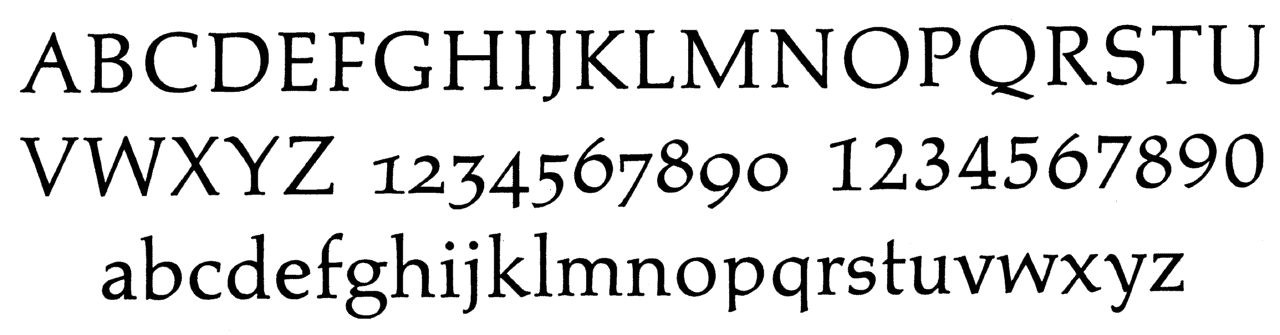
The original Palatino
The original Palatino was designed by Hermann Zapf,
while he was working at the Stempel AG in Frankfurt.
The original font can be recognized by the missing
foot serifs of p and q and by the long ascenders
(b, d, f, h, k, l). The picture was photographed
from "Das Druckwerk" by Prof. G. Barthel,
1963, page 39. [Text and photograph by Ulrich Stiehl.]
Linotype Palatino for hot-metal slug-composition
This version has been adapted for the Linotype slug
composition machines. It can be recognized by the
symmetrical foot serif of p and the asymmetrical
foot serif of q. The picture was photographed
from "Das Druckwerk", page 162.
[Text and photograph by Ulrich Stiehl.]
The original Palatino for photocomposing machines
The original Palatino for photocomposing machines
(Diatype and Diatronic, produced by the Berthold AG)
was widely used in Germany until the early nineties.
It was a high-quality font, identical in design with
the original Palatino for hot-metal hand typesetting.
The picture was photographed from
"Berthold Types" (1985), volume 2, page 1106.
[Text and photograph by Ulrich Stiehl.]
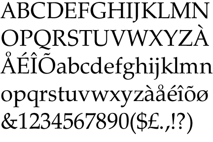
Present-day Linotype Palatino
[Linotype Palatino] departs tremendously from the original
Palatino. For instance, E and F did not
have serifs at the middle cross bars
originally, p and q did not have foot
serifs, the serif of k was much more
elegant, the y too etc. etc., and what
is more: The x-height was smaller (=
the ascenders longer) making for a much
more elegant typeface (similar to Bembo).
When Berthold went broke, the original Palatino seems to
have vanished from the type face market. At least, I do
not know any company that still offers it.
[Text by Ulrich Stiehl.]
Present-day versions of Palatino for imagesetters and
laser printers, for instance "Linotype Palatino" for
PC, Mac etc., can be recognized by the symmetrical
foot serifs of p and q and the reduced ascenders.
Today only the italic p and q are without serifs.
Hermann Zapf considers the new "Linotype Palatino"
(1998) as the definitive version of his typeface,
which was first released in 1950 by the Stempel AG.
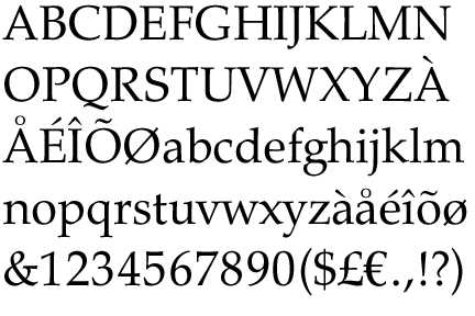
URW Palladio
URW Palladio is a free font donated by URW to
the ghostscript project. It is almost identical to
the digital version of Linotype Palatino, but there are differences:
the upper serifs are straight, not sloped, and the
characters are a bit narrower.
Also, as far as I can tell, no URW Palladio weight
carries any of the nice old style figures. Especially
the OsF number "1", with its characteristic roof,
is worth taking a closer look at (in the Palatino fonts with
old style figures, of course).
Zapf Calligraphic 801
Not to be outdone, Bitstream enters the fray with
Zapf Calligraphic 801.
Monotype
And how about that shameless copy by Monotype, Book Antiqua?
We know that Zapf was quite upset by this.
Even more upsetting is that Monotype never even thought
about withdrawing that face and offer
apologies to Zapf.
Since Monotype is now Agfa, how about a withdrawal
by Agfa-Monotype? The current Agfa "director
of words and letters", Allan Haley, is a
fantastic person, and should be in a position to make
this grand gesture of respect towards Hermann Zapf.

Copyright © 2002
Luc Devroye
School of Computer Science
McGill University
Montreal, Canada H3A 2K6
luc@cs.mcgill.ca
http://luc.devroye.org/index.html