| | |
29 Letters
[Pascal Naji Zoghbi]
|
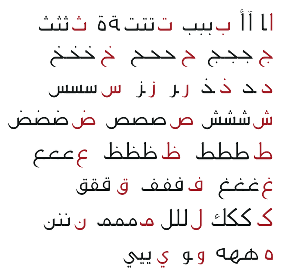
 Madrid (and before that, Lebanon)-based Arabic type designer who runs the Arab type news and blog site called Arabic Typography. KHTT link. An ex-student of the KABK in 2006, he currently is a part time instructor of design and typography at Notre Dame University, Louaize, Lebanon, as well as a part time instructor of typography at the American University of Beirut (AUB), both since 2007. His Arabic type foundry is called 29letters.
 At ATypI 2008 in St. Petersburg, he ran a workshop on the Arabic Kufi script. Speaker at ATypI 2010 in Dublin on the topic of political resistance and expression through graffiti in Lebanon and Palestine. His contributions to type design: - Massira. He has embarked on a project with Martin Majoor to design some Arabic fonts that fit Majoor's designs. He writes: Massira is my graduation typeface at Type&Media postgraduate course at The Royal Academy of Arts [KABK] in The Hague. Huda AbiFares contacted me while I was finalizing Massira and presented the opportunity to collaborate with the Dutch type designer Martin Majoor to design an Arabic typeface, which is part of the Typographic Matchmaking 01 project organized by Khatt Foundation. At first I was a bit worried due to the fact that it would be my first professional type design work and that the due date was too close. However, after taking a closer look at Martins type FFSeria and analyzing its characteristics, I noticed that the treatment of the stroke and the structure of the letters shared similarities with Massira. In both fonts the use of sharp broken curves and crispy feel is present. Consequently, I grew confident in project and decided to use Massira as a starting point for the new Arabic companion of FFSeria. Echo, which is Sada in Arabic, is the repetition of a sound caused by the reflection of sound waves from a surface. Accordingly, Sada is the echo of FFSeria. The modifications on Massira consisted of making Sada perform like FFSeria. It had to have the same point size, line space, color, contrast and feel as FFSeria. Concerning the details of Sada and the inclined angle of the vertical strokes, it was derived from the FFSeria Italic. So Sada has the same feel as the Roman but is inspired from the Italic. More on the Sada project. In 2009, Sada was renamed FF Seria and published by FontFont.
- Another project of Zoghbi involves a type family being developed for newspaper headlines.
- In 2007, he created a 3-style Phoenician type family called Fniqiya.
- Alef Pixel Caps Type for Alef Magazine (2008). Done with Huda AbiFares. This is a Latin ornamental type family.
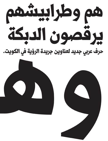
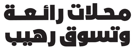
- Al Rouiya Arabic Type for the Al Rouiah Newspaper in Kuwait, 2008.
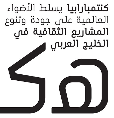
- Bukra display type for Ibn Battuta Mall in Dubai, 2008. This Futura-like typeface saw a variable part added in 2020. Adrien Midzic and Swiss Typefaces aided with the Latin.
- A corporate font under the heading, Arabic for Univers (2008). Zoghbi: An Arabic corporate typeface for a global shipping and transport company. The Arabic is intended to work with the Latin type Univers. Unfortunately, I can't mention the name of the company nor the design firm I did this Arabic type work for. I was the Arabic type consultant/specialist and associate type designer alongside Leah Hoffmitz. The font will used in all Arabic publications, ads and packaging for the company.
- Baseet (2009) is a hybrid Neo-Naskh / Modern Kufi geometric typeface. It is a mixture of straight vertical, horizontal and diagonal pen stokes incorporated in-between curved corners and edges. In 2020, Pascal Zoghbi (29LT) and Ben Wittner released the monospaced Arabic / Latin typefaces 29 LT Baseet Variable and 28 LT Zawi Variable.
- At FontStruct, he made Arapix (2009).
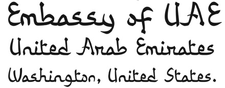
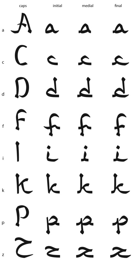
- UAE Embassy Corporate Type (2010). This is a commissioned Latin typeface based on the same concept as of an Arabic font. Each of the 26 Latin letters has Caps, Initial, Medial and Final shape enabling the letters to connect as in the Arabic script. The drawing of the letters was all done using the Arabic calligraphic bamboo stick and based on the Naskh Calligraphic Style. Opentype help from Erik van Blokland.
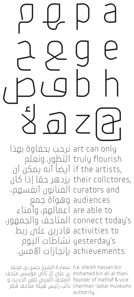
- The Mathaf Corporate Arabic-Latin Font (2011). Mathaf Arab Museum of Modern Art opened its doors to contemporary Arab art lovers in December 2010 in Doha, Qatar.
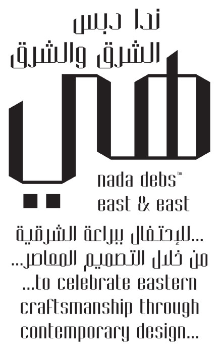
- Nada Debs (2010): a contemporary geometric Kufi type commissionewd by Nada Debs.
- For Ascender, he did Droid Arabic Naskh (see OFL), Droid Persian Naskh, and Droid Arabic Kufi (2010, OFL).
- 29LT Azer, done with Ian Party and Wael Morcos: Azer in Arabic means friendly, ready to assist and lend a hand. This multilingual typeface combines simple lines with careful detailing to create a serious but approachable look. The Arabic is a Naskh / Kufi hybrid and retains a balance between calligraphic angular cuts and unadorned construction. The Latin is a humanist sans-serif with crisp cuts based on the broad nip pen calligraphic structure and contemporary outlines. The fonts include Arabic, Farsi, Urdu and Latin variants. Azer won an award at TDC 2014.
- Pascal Zoghbi revived the 1950s font system by Nasri Khattar called Unified Arabic as UA Neo B and UA Neo B.
- LT Makina. An old typewriter font.
- LT Kaff.
- LT Zarid (+Sans, +Stencil, +Slab, +Serif). Pascal Zoghbi designed all Arabic components. 29LT Zarid Display won an award at 23TDC in 2020. The whole family has variable styles since 2020. Jan Fromm designed the Latin for Slab, Sans and Stencil. Regarding the Latin parts: Zarid Serif Display and Text Upright were designed by Ramiro Espinoza; Serif Upright was designed by Ramiro Espinoza and Khajag Apelian; Serif Slanted and Text Slanted were designed by Jan Fromm. The Cyrillic and Greek extensions were designed by Krista Radoeva and released in July 2020. Finally, 20 LT Zarid Sans features a variable style with a single (weight) axis.
- LT Zeyn. A great high-contrast fashion mag style typeface.
- Other custom types include Expo 2020 Dubai, Swatch, Noor, MIA, Noto Naskh, Shawati, Hamsa, Fdx, Emirates Headlines, AlWatan Headlines.
Speaker at ATypI 2011 in Reykjavik. Speaker at ATypI 2013 in Amsterdam. Klingspor link. [Google]
[More] ⦿
|
Ahmad Al Hindi
|
Doha, Qatar-based dype designer of the Arabic / Latin typeface Zamalka (2014), which won an award at The 2014 Horouf Type Design Competition. [Google]
[More] ⦿
|
Amira Al Dakroury
|
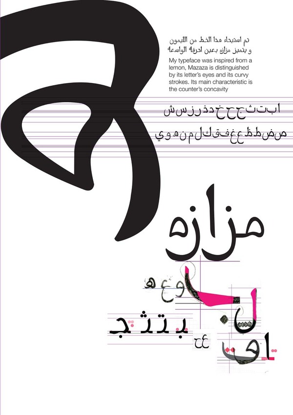
Qatari graphic designer who created the hand-printed Arabic typeface Mazaza (2011). [Google]
[More] ⦿
|
Brooq Qatar
|
Arabic font archivette: AF_Tabook-NormalTraditional, AF_Tholoth-NormalTraditional, DecoTypeNaskhVariants, DecoTypeThuluth, DiwaniLetter, FS_Diwany, FarsiSimpleBold, M-Unicode-Dawlat, M-Unicode-Sima, OldAnticBold. [Google]
[More] ⦿
|
Dareen Ismail
|
During her studies at German University in Cairo, Dareen Ismail (Doha, Qatar) created the soft-edged Arabic typeface Fankoush (2016). [Google]
[More] ⦿
|
DecoType
[Thomas Milo]

|
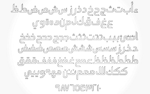
 Thomas Milo founded DecoType in Amsterdam in 1985, together with Peter Somers and Mirjam Somers. They introduced the notion of dynamic fonts, and developed Ruqaa (1987), licensed by Microsoft. They also developed the DecoTypeSetter, which was included in Adobe PageMaker MiddleEast. Deco Type is perhaps best known for its extensive DTP Naskh family, which has hundreds of variations of all letterforms, and permitted people to typeset calligraphic Arabic, as it is in a style emulating the hand of the Ottoman calligrapher Mustafa Izzet Efendi. Part of that package is the DecoType Authentic Naskh typeface. DecoType donated a custom version of Naskh to the Unicode Consortium for printing the Arabic parts of their manuals. Other fonts include DTP Nastaaliq. Thomas Milo is also a specialist of Turkic and Slavic linguistics. His company's beautiful fonts sell for 125 USD: P.O. Box 55518, 1007 NA Amsterdam, The Netherlands. Thomas Milo's talks about Arabic fonts at the 1998 RIDT in Saint-Malo and at ATypI in Copenhagen in 2001 were masterful performances---entertaining and insightful from start to finish. From Milo's site: DecoType contributes fonts and Arabic Calligraphy applications to Microsoft Office Arabic Edition; to Adobe PageMaker Middle East DecoType provides a special interface for Calligraphic typesetting; to the MacOS 9 it contributes Arabic fonts.
 In 2009, Thomas Milo received the second Dr. Peter Karow Award for Font Technology&Digital Typography for the development of the ACE layout engine (the heart of the Tasmeem plugin for InDesign ME) for Arabic text setting. The citation reads: Thomas Milo and his company DecoType developed with ACE, which is an acronym for 'Arabic Calligraphic Engine', new advanced technology for Arabic text setting, which needs a far more sophisticated approach than for instance the Latin script, based on a thorough analysis of the Arabic script. Not only served Milo's typographic research as the fundament for the ACE technology, clearly it also formed a basis for the development of the OpenType format, although this is a less known and acknowledged fact. In 2017, he developed the new electronic Mus'haf Muscat at the behest of the Ministry of Endowments and Religious Affairs of the Sultanate of Oman. Speaker at ATypI 2010 in Dublin. Speaker at ATypI 2011 in Reykjavik. Speaker at ATypI 2013 in Amsterdam. MyFonts page. Speaker at ATypI 2008 in St. Petersburg. Personal link. [Google]
[MyFonts]
[More] ⦿
|
Eman Makki
|
Doha, Qatar-based designer of the Arabic children's book typeface Dardasha (2018), which is characterized by exaggerated blobbiness and is derived from the Maghribi script. [Google]
[More] ⦿
|
Erik Brandt
|
Erik Brandt teaches typography and visual communication at Virginia Commonwealth University in Doha, Qatar, and has been active in university teaching since 1998. Educated internationally, his research interests focus on issues of globalization that affect and drive the complexities of inter-cultural visual communication systems. His career began as a cartoonist in Japan, and has since found focus largely in print media. He maintains a small graphic design studio, Typografika, and has also received recognition for his short films. He is currently Chair of the Design Department and Professor of Graphic Design at MCAD (Minneapolis College of Art and Design) in Minneapolis, Minnesota. Author of Ficciones Typografika (2019). Speaker at ATypI 2006 in Lisbon. Designer of these experimental typefaces at FontStruct in 2008: Pixel System 26 (an update of Zirkel System (1999), a circle font also by Brandt). [Google]
[More] ⦿
|
Fatima Abbas
|
 Fatima Abbas is a Sudanese graphic design student at Virginia Commonwealth University School of Arts in Qatar. In 2021, she designed the display typeface Brier which is characterized by tiny broken strokes in the crossbars and elephant feet. [Google]
[More] ⦿
Fatima Abbas is a Sudanese graphic design student at Virginia Commonwealth University School of Arts in Qatar. In 2021, she designed the display typeface Brier which is characterized by tiny broken strokes in the crossbars and elephant feet. [Google]
[More] ⦿
|
Fatma Alemadi
|
Doha, Qatar-based designer of the handcrafted Latin typeface Tall (2017). Behance link. Creative Market link. [Google]
[More] ⦿
|
Fernando Volken Togni
|
Talented Brazilian illustrator. Creator at Unique Types of the free experimental typeface Yezza (2011). [Google]
[More] ⦿
|
Haneen Al Sharif
|
Doha, Qatar-based designer of the Arabic typeface Qatra (2012). [Google]
[More] ⦿
|
Hanin N. Bader
|
Doha, Qatar-based design student who created the Arabic typeface Rafeedia (2012). [Google]
[More] ⦿
|
Joe Talisic
|
Joe Talisic a Cebuano Filipino graphic designer, who is currently working with brand advertising in Doha Qatar. Photo page. He created the kitchen tile modular typeface Organik (2010). [Google]
[More] ⦿
|
Jordan Gushwa
|
At he Type @ Cooper program in 2012, Jordan Gushwa designed Bettie Cooker. Design Research Committee is the studio of Jordan Gushwa and company currently located in Doha Qatar. Jordan is a graduate of Cranbrook 2d where he studied under Elliott Earls. [Google]
[More] ⦿
|
Kholoud Al-Sada
|
Qatar-based designer of the Arabic typeface Indimaaj (2012), which combines the modernity of the contemporary Arabic typeface, and the originality of the geometric Kufic style. [Google]
[More] ⦿
|
Kitabat Arabic Calligraphy and Typography Conference
|
Kitabat Arabic Calligraphy and Typography Conference was the first major conference dealing solely with Arabic calligraphy and type design. Held from April 5-8, 2006, in Dubai. Speakers included Nabil Safwat (keynote speaker), Ugur Derman (Istanbul, Turkey), Mohamed Zakariya (Virginia, USA), Dr Goeffrey Roper (London, UK), Mamoun Sakkal (Seattle, USA), Johannes Bergerhausen (Germany), Adil Allawi (Diwan, UK), Kamal Mansour (Monotype, USA), Bruno Steinert (Linotype, Germany), Mounir Al-Shaarani (Cairo, Egypt), Huda Smitshuijzen AbiFares (AUD, UAE / Khatt, Holland), Nadine Chahine (Linotype, Germany), Gerard Unger (Bussum, Holland), Tajelssir Hassan (Sharjah, UAE), Reza Abedini (Teheran, Iran), Tarek Atrissi (Utrecht, Holland), Ihsan Hammouri (Jordan/USA), Obeida Sidani (Dubai, UAE), Yasmine Taan (LAU, Lebanon), Aida Sakkal (Seattle, USA), Antonia Carver (Dubai, UAE), Zeina Maasri (AUB, Lebanon), Fawzi Rahal (Dubai, UAE), Nadine Touma (Beirut, Lebanon), Leland Hill (VCU, Qatar), and Petr Van Blokland (Holland). [Google]
[More] ⦿
|
Kristyan Sarkis
[TPTQ Arabic Type Foundry]
|
 [More] ⦿
|
Mohammed Ezzat Kamel
|
Graphic and type designer in Doha, Qatar, where he runs e-studio. In 2010, he designed a type family for both Latin and Arabic called Delta Doha, named after the oil equipment company that commissioned the typefaces. In 2013, we find him in Alexandria, Egypt, where he speclaizes in brand and logo designs. Eid Arabic (2013) is a geometric display typeface for Eid Greeting Cards. [Google]
[More] ⦿
|
Nasser Khalaf
|
Nasser Khalaf (b. 1991) is a digital artist in Amman, Jordan and Doha, Qatar. He created the hairline straight-edged typeface Muse (2013), which was inspired by British rock band Muse. Soul (2013) is a straight-edged graffiti typeface. In 2014, he made the single stroke typeface Lolo. Behance link. [Google]
[More] ⦿
|
Nathan Davis
|
Nathan Davis is trained in sculpture and installation, and received his MFA in Design from the California College of the Arts in San Francisco. Nathan runs a creative studio called Arcadian Studio with his partner Jennifer Davis, and is an Assistant Professor Virginia Commonwealth University in Qatar. His talk at ATypI 2014 in Barcelona was entitled TYPO TAPAS Type of Place: Global Vernacular Type Archive. His aim is to develop a global user-generated archive of vernacular typography in the 21st century. [Google]
[More] ⦿
|
Owly
|
Arabic font archive. It includes this: - From Boutros International: GE-Box-Bold, GE-Cap-Medium, GE-Contrast-Bold, GE-Curves-Medium, GE-East-ExtraBold, GE-Elegant-Bold, GE-Elegant-Medium, GE-Jarida-Heavy, GE-MB-Farah-Bold, GE-MB-Farasha-Light, GE-MB-Fares-Medium, GE-MB-MB-Bold-Condensed, GE-MB-Najm-Bold, GE-Modern-Bold, GE-Modern-Light, GE-Modern-Medium, GE-Narrow-Light, GE-SS-TV-Bold, GE-SS-Text-Bold, GE-SS-Text-Light-Italic, GE-SS-Text-Light, GE-SS-Text-Medium, GE-SS-Text-UltraLight, GE-SS-Two-Bold, GE-SS-Two-Light, GE-SS-Two-Medium, GE-SS-Unique-Bold, GE-SS-Unique-Light, GE-Tasmeem-Medium, GE-Unique-Expanded-Bold, GE-Wide-ExtraBold, all made in 2004. Also, Boutros-Ads-Pro-Bold, Boutros-Ads-Pro-Bold-Condensed, Boutros-Ads-Pro-Light, Boutros-Ads-Pro-Medium, Boutros-Ads-Pro-Medium-Italic.
- From Agfa: A-Badie-Shahba (1990).
- From A. Badie Hammami in Aleppo, Syria: Joude, ABH-Ogaret-Light, Badie-Dimah-Normal, Badie-Falcon, Badiefont-Dima, Badiefont-Sabeel, SAHBA-NEW. All made between 1993 and 2003.
- From MAK Alagha, Applied Graphic Arts: AGA-Abasan-Regular, AGA-Aladdin-Regular, AGA-Battouta-Regular, AGA-Dimnah-Regular, AGA-Furat-Regular, AGA-Granada-Regular, AGA-Juhyna-Regular, AGA-Kayrawan-Regular, AGA-Mashq-Bold, AGA-Mashq-Regular, AGA-Nada-Regular, AGA-Petra-Regular, AGA-Rasheeq-Bold, AGA-Sindibad-Regular. All made in 1994-1995.
- From Al-Hakami: AL-Dorrh, AL-Masaa, khalaad-AL-Dorrh.
- From Applied Arabic Limited, 1994-1995: AXtADvertBoldCond, AXtAdvertMedItalic, AXtAdvertisingBold, AXtAdvertisingExtraBold, AXtAdvertisingLight, AXtAdvertisingMedium.
- From Elias Designer: Ah-moharram-bold, Ah-moharram-light.
- From Al-Hassoun: Al-Ekbariah-Font.
- By Al-Amri (cracked, he says): Al-Hadith1, Al-Hadith2, Al-Homam, Al-Mothnna, Al-Samsam.
- By Abdullah Naser Al-Mawash: Al-Mawash-Shatt-Al-Arab, Al-Rashed-Riyadh.
- From Mohamed Amer: Al-Mwaheb4, Mohamedamer_Al-Salaf, Mohamedamer_EBN-ELNILE.
- From Mohammed Al-Rashed ADV: Al-Rashed-Sayidty.
- From Bassam Al-Mohammadi, Riyadh: Bassam-Ostorah (2000).
- From Ali Ahmed Al Buainain: Boahmed-AlHarf-Bold (2005).
- From Paradise Corp, 2000-2001: H_Esfahan, H_Sima.
- From M. Hacen, 2006-2007: Hacen-Beirut-Heading, Hacen-Beirut-Light, Hacen-Beirut, Hacen-Casablanca-Heavy, Hacen-Casablanca-Light, Hacen-Casablanca, Hacen-Dalal-St, Hacen-Dalal-Text, Hacen-Dalal, Hacen-Digital-Arabia-LT, Hacen-Digital-Arabia-XL, Hacen-Digital-Arabia, Hacen-Egypt, Hacen-Extender-X-Slant, Hacen-Extender-X4-Deeper, Hacen-Extender-X4-Super-Fit, Hacen-Extender-X4, Hacen-Extender, Hacen-Freehand, Hacen-Jordan, Hacen-Lebanon, Hacen-Liner-Print-out-Light, Hacen-Liner-Print-out, Hacen-Liner-Screen-Bd, Hacen-Liner-Screen, Hacen-Liner-XL, Hacen-Liner-XXL, Hacen-Newspaper, Hacen-Promoter-Lt, Hacen-Promoter-Md, Hacen-Promoter, Hacen-Qatar, Hacen-Sahafa, Hacen-Samra-Lt, Hacen-Samra, Hacen-Saudi-Arabia-XL, Hacen-Saudi-Arabia, Hacen-Sudan-Bd, Hacen-Sudan, Hacen-Tehran, Hacen-Tunisia-Bold, Hacen-Tunisia-Lt, Hacen-Tunisia, Hacen-Typographer-Bold, Hacen-Typographer-Book, Hacen-Typographer-Heavy, Hacen-Typographer, Hacen-Vanilla-Ultra-Light, Hacen-Vanilla.
- From Hesham Darweesh, 1993: Hesham-AlSharq-Normal-Traditional, Hesham-Bold, Hesham-Cortoba-Normal-Traditional, Hesham-Fostat-Normal-Traditional, Hesham-Free-Normal-Traditional, Hesham-Ghorn-Italic, Hesham-Gornata-Normal, Hesham-Kashkool-Normal-Traditional, Hesham-Kufi, Hesham-Nagham-Normal-Traditional, Hesham-Normal.
- From Linotype: Isra-Regular, Isra-Thin-Regular (2006), Mariam-Linotype.
- From Maleksoft Developer Co: K-Elham, K-Farnaz, K-Homa, K-Kamran, K-Nasim, K-Sina, K-Tabassom, K-Traffic.
- By Silicon Soft for King Abdulaziz City for Science and Technology (KACST): KacstTitle (2002).
- From Agfa Alawi Hashim Bafageeh: MCS-Haramain.-2000, MCS-Haramain.-Band-2000, MCS-Hor-1-S_I-Abrade-2000, MCS-Hor-1-S_I-Flag-2000, MCS-Hor-1-S_I-Normal-2000, MCS-Hor-1-S_I-Snail-2000, MCS-Hor-1-S_I-Wave-2000, MCS-Hor-1-S_U-Normal-2000, MCS-Hor-1-S_U-Snail-2000, MCS-Hor-2-S_I-Normal-2000, MCS-Hor-4-S_U-Bite-2000, MCS-Hor-8-S_I-Normal-2000, MCS-Hor-8-S_U-Normal-2000, MCS-Tholoth-1-S_U-Normal-2000.
- From Nawel: MO_Nawel.
- From MARIA: Mahdi (2006).
- From MJ farsi Fonts: Mj_Afaaq-Bold.
- From Mohammad Al Shalfan in Riyadh: Mohammad-Bold-Normal (1996), Mohammad-Dawlat, Mohammad-Head, Mohammad-Naskh, khalaad-Dawlat.
- From Motken in Riyadh: Motken-AL-Ravidain-Art, Motken-daeira, Motken-noqta-ii, Motken-noqta. All made in 2001.
- From Hamoonsoft: Poolad-Bold, Poolad-Light, Poolad-Outline, all made in 2004.
- From Fazlur Rahman Quraishi (at Shmookh Computer in Riyadh): SC_ALYERMOOK, SC_AMEEN, SC_DUBAI, SC_GULF, SC_HANI, SC_KHALID, SC_LUJAYN, SC_OUHOD, SC_REHAN, SC_SHARJAH, SC_SHMOOKH-01, SC_TARABLUS. All dated 2001.
- From Sakkal: Sakkal-Maya-Pro, Sakkal-Seta-Pro.
- From Sultan Almaktari in Aden, Yemen: Sultan---3-LINE, Sultan---Aden1.
- From Sinasoft: Zeytoon-Bold, Zeytoon.
- From Bader Moftah El Jarow Misurata in Libya: bader_al-gordabia (2004).
- From Majid Al-Otaibi: khalaad-Abeer, khalaad-Diala, khalaad-Hadeel, khalaad-Noora, khalaad-Sara, khalaad-Sima, khalaad-Susan, khalaad-Wafa, khalaad-al-arabeh-2.
- From Khaled: ma3ali-aqsa.
[Google]
[More] ⦿
|
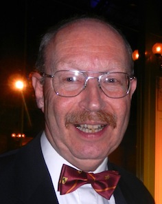
Pascal Naji Zoghbi
[29 Letters]
|
 [More] ⦿
|
Sanaa Rahman
|
Doha, Qatar-based designer of the simple Arabic font Nayya (2013). Behance link. [Google]
[More] ⦿
|
Simon Hanna
|
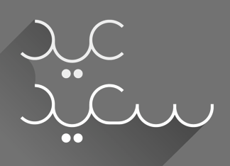
 Simon Hanna (Beirut, and/or Doha, Qatar) created Warrior, an Arabic typeface, and Wonder Circles (2013). In 2015, he designed the multiline origami typeface Folded. [Google]
[More] ⦿
Simon Hanna (Beirut, and/or Doha, Qatar) created Warrior, an Arabic typeface, and Wonder Circles (2013). In 2015, he designed the multiline origami typeface Folded. [Google]
[More] ⦿
|
Tarek Atrissi
|
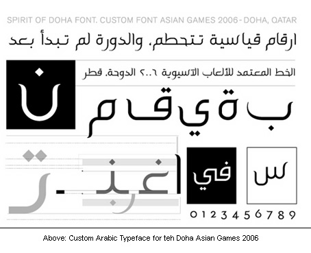
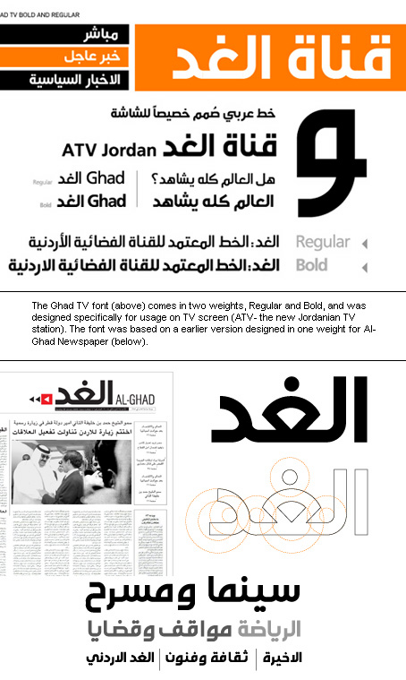
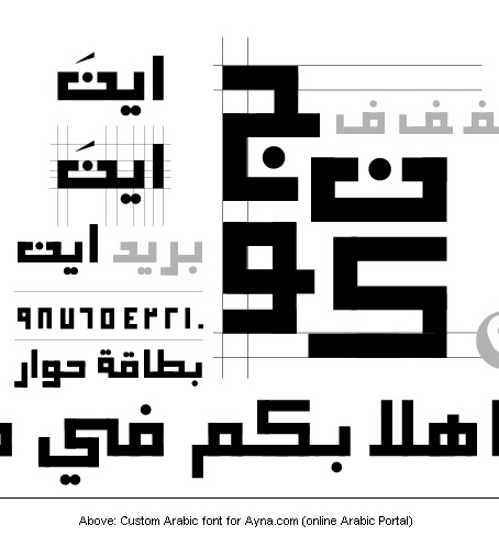
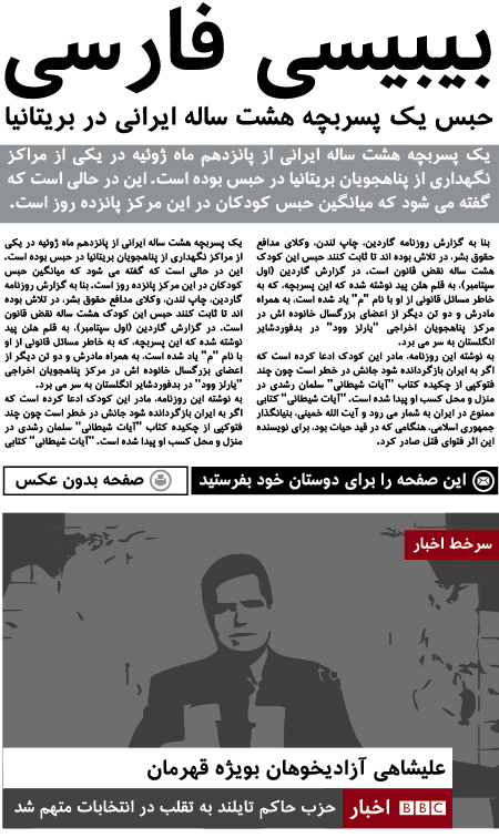
Arabic type site by Tarek Atrissi, a Beirut-born Lebanese professional designer, who is located in Hilversum, The Netherlands. He holds a BA in Graphic Design from the American University of Beirut, Masters of Arts in Interactive Multimedia from Utrecht School of Arts in Holland and an MFA in Design from the School of Visual Arts in NY. A Designer of the 6-weight Arabic family called AT, The Spirit of Doha (2004, for the Asian Games 2006), Al-Ghad (for the Jordanian newspaper Al-Ghad), the Ghad TV font (for the Jordanian station ATV), Etisalat (custom type for Etisalat Communications), Ayna (a squarish typeface done for Ayna.com), and Ambesque (2006, for the Amwaj Islands of Bahrain). He manages Arabtypography.com, a site dedicated solely to Arab typography. In 2008, he created Atrissi Sans. In 2007, he embarked on a project with Peter Bilak to develop Fedra Arabic to accompany Bilak's Fedra family. In 2010, he designed a custom Arabic font for the new BBC Arabic TV channel and custom Farsi face for the new BBC Farsi TV channel. [Google]
[More] ⦿
|
Thomas Milo
[DecoType]
|
[MyFonts]
[More] ⦿
|
Titus Nemeth
|
 Titus Nemeth runs TNTypography in Paris, and specializes in Arabic typeface design, typography and custom type. A 2006 graduate in the Master of Arts Typeface Design programme at the Department of Typography and Visual Communication, University of Reading, he also studied Arabic script at the École Supérier d'Art et de Design d'Amiens, France. Titus holds a PhD in Typography & Graphic Communication from the University of Reading, UK.
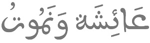
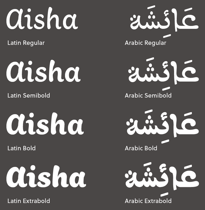
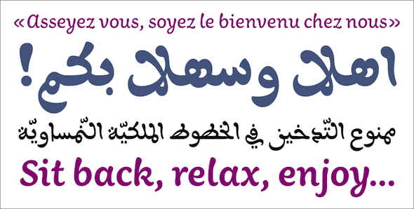
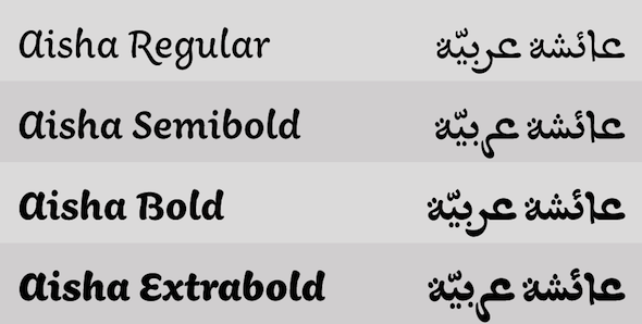
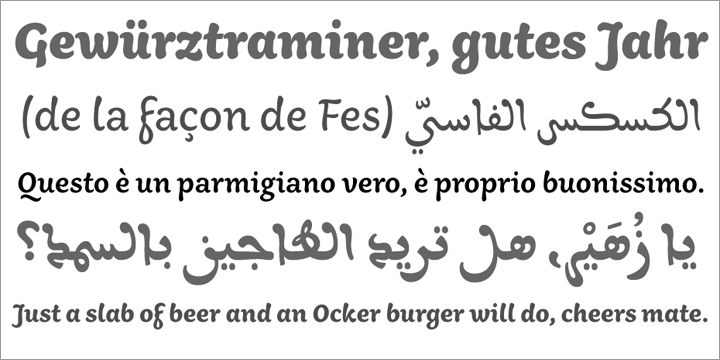
 Originally from Vienna, he specialises in multi-script typeface design with an emphasis on the Arabic script. He lives in Paris. His Masters thesis researched the current state of Arabic newspaper type and typography and found acclaim by experts in the field (The current state of Arabic newspaper type and typography (2006, Reading: University of Reading)). Currently, he teaches type design at ESAD Amiens, France, and is a guest lecturer in the MATD program at the University of Reading. The typeface Nassim (Latin/Arabic, his project at the University of Reading in 2006) was awarded the 'Certificate of Excellence in Type Design' at the TDC 2007, won the first prize in the original typeface design category of the European Design Awards 07 and was shortlisted by the Design Museum London for the exhibition "Designs of the Year 2007" in the category typography. It will be published by Rosetta Type in 2011. Titus Nemeth's research covers technological, linguistic and interdisciplinary aspects of multi-script typography and typeface design. Ph.D. student at the University of Reading in 2012. Thesis topic: Arabic typography 1911-2011. In 2008, he worked as an assistant professor of Graphic Design at Virginia Commonwealth University in Doha, Qatar and continued his work as a freelance designer and consultant. Designer of the futuristic typeface Wallflower (2004; he calls it a humanist stencil) and of Fra Bartolomeo (2004, based on the lettering on a sketch by Italian renaissance artist Fra Bartolomeo). Working on this serif face (2005). His talk at ATypI 2008 in St. Petersburg: Tasmeem, a new software jointly developed by WinSoft and DecoType, offers new perspectives for Arabic typeface design. Titus Nemeth was invited by the developers to be the first third party designer to get insights of the system, its methodologies and to actually design for Tasmeem. He was asked to convert his existing Nassim typeface from an OpenType based rendering, to rendering within Tasmeem. Hiba Studio interview. At ATypI 2009 in Mexico City, he spoke about l'arabe maghrébin. Since 2009 Titus has been teaching typography in Amiens. His typeface Aisha (2009) won an award in the non-Latin category at TDC2 2010, and was published at Rosetta Type in 2010. He states: Aisha is a multi-script typeface for Arabic and Latin. While the Arabic design is a revival of a metal fount inspired by Maghribi calligraphy, the Latin design was newly conceived and drawn to echoe the feel and look of the Arabic. Samples of Aisha: i, ii, iii, iv, v, vi, vii, viii, ix. In 2011, Rosetta published Nassim and in 2016 Skolar Sans Arabic (as part of their large Sklolar Sans project). Codesigner with Joshua Darden of Omnes Arabic. Author of Arabic Type-Making in the Machine Age (Brill, 2017) and Arabic Typography: History and Practice (Niggli, 2022). Speaker at ATypI 2013 in Amsterdam. Speaker at ATypI 2016 in Warsaw on There is nothing Arabic about the Arabic script. Klingspor link. [Google]
[MyFonts]
[More] ⦿
|
TPTQ Arabic Type Foundry
[Kristyan Sarkis]
|
 Sarkis has a BA in Graphic Design from Notre Dame University, Lebanon, and a Master's from the Design in Type and Media program at the The Royal Academy of Art in The Hague, The Netherlands. He has worked in the fields of graphic design and branding/advertising, and has taught at Virginia Commonwealth University (in Qatar). He was an independent graphic and type designer based in The Hague, The Netherlands, and is currently in Amsterdam. In 2015, he cofounded TPTQ Arabic Type Foundry. Flickr page.
 In a KHTT interview, he writes: My first real experience with type was when I was working with Mohtaraf Beirut Graphics (2007), one of the leading design houses in Lebanon. Mohtaraf has a strong affinity to Arabic type and has produced several beautiful Arabic typefaces. Back then, I was given a task to start drawing a typeface. I was hesitant at first, but got very quickly into it. The design director Yara Khoury noticed that I 'have a knack for this', and encouraged me to go on with it. I was delighted to have the opportunity to understand a lot more about type under Yara's direction, and with some eye-opening sketches from Ali Assi, to research the calligraphic styles and explore the beauty of the Arabic script. I had very limited technical knowledge in font development at the time, therefore after I did the original digital drawings on Adobe Illustrator, Greta Khoury, my colleague at the time, who was and remains one of my biggest sources of inspiration, took over the project, did her magic tricks with it, and produced it into a working font in Fontlab Studio. I owe my start in type design to Yara Khoury and Greta Khoury and to an endless fascination with the Arabic script and the ethereal art of Arabic calligraphy. This drove me to work on self-initiated typefaces which eventually culminated in pursuing a higher education in Type Design at The Royal Academy of Art in The Hague. There, it all went to a whole new level, with countless additional inspirations: from the great teachers that we had, to all the lecturers and the amazing amount of information that was given to us. His typefaces: - Thuraya (2010) is his thesis project at KABK: Thuraya is a display Arabic typeface that explores a contemporary context for the Diwani script. It won an award at TDC2 2011.
- Still at KABK, he did a revival called Almost Didot (2010).
- Coco (2010) is a rounded serif text typeface under development.
- About Vespertine Arabic, he writes: Vespertine is a linear font designed specifically for the icelandic artist Björk by M/M Paris. Though seemingly a childish handwriting, the typeface is unusual, tricky and cursive with intricate curves. These characteristics, along with the thickness, x-height, counters and hand movement were meticulously studied and implemented in the Arabic version without undermining its legibility.
- He also created Always Arabic, an Arabic companion of the Latin house font Always used by the feminine hygiene product company by the same name.
- Amale is a modern Arabic display typeface suitable for newspaper headlines, book titles and logotypes.
- Designer of Colvert Arabic (2012, Typographies.fr).
- Louvre Abu Dhabi Logotype (2013).
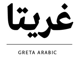
- Greta Arabic (2011), which was designed for newspapers, won an award at TDC 2012 and again at TDC 2016.
- Kanun (2016-2017) by Krystian Sarkis is an Arabic signage type family carefully crafted to also handle long texts. It is the Arabic counterpart of Typotheque's November. Co-designer with Maha Aki of the Latin / Arabic typeface Kanun Stencil (2021), a playful typeface inspired by industrial signage and mechanical stencilling. Kanun Stencil is equipped with a collection of transportation and travel-related signs, symbols, icons, and various sets of arrows for signage and wayfinding systems. Kanun is meant as an Arabic counterpart of Peter Bilak's November.
- Teshrin (2017). A warmer version of Kanun, still well equipped for information signage and wayfinding projects.
- Qandus (2017-2019). A Latin / Arabic cooperative typeface by Kristyan Sarkis and Laura Meseguer.
Speaker at ATypI 2016 in Warsaw on A Typographic Maghribi Trialogue. In this talk, he explains, together with Laura Meseguer and Juan Luis Blanco, the Typographic Matchmaking in the Maghrib project of the Khatt Foundation, which tries to facilitate a cultural trialogue as well as shed a typographic spotlight on the largely ignored region of the Maghreb in terms of writing and design traditions. The specific goal of the collaboration is the research and development of tri-script font families (for Latin, Arabic and Tifinagh) that can communicate harmoniously. Behance link. Personal home page. [Google]
[More] ⦿
|
