
July 15, 2003
Stempel's history, 1895-1955
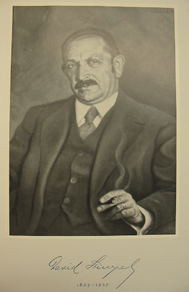
David Stempel
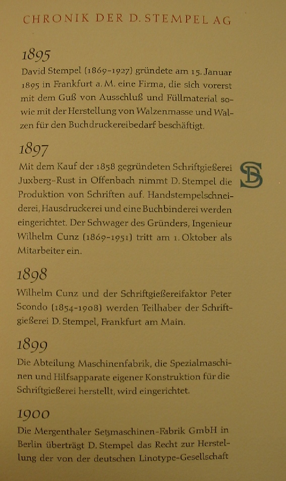
¶ On 15 January 1895, David Stempel (1869-1927) founds the Stempel Foundry in Frankfurt. In 1897, it starts type production with the purchase of the Juxberg-Rust foundry from Offenbach. In 1897, the brother in law of David Stempel, Wilhelm Cunz (1869-1951) joins the firm. Wilhelm Cunz and Peter Scondo (1854-1908) become partners in the firm.
The first typefaces
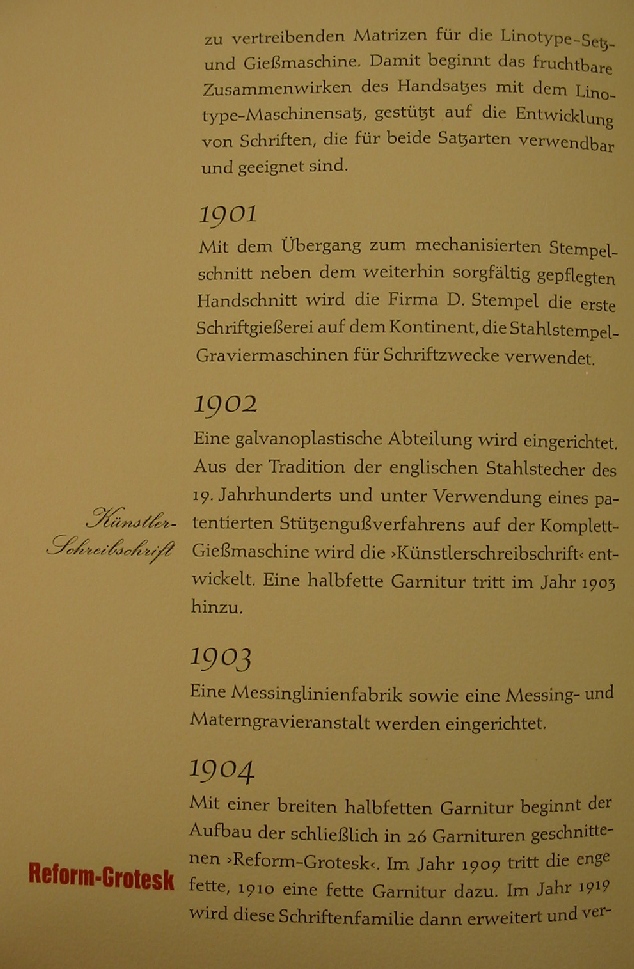
¶ Künstlerschreibschrift is developed in 1902, followed in 1903 by a Halbfett weight. Reform Grotesk is a 26-weight family started in 1904 and mostly finished by 1910. The last weight is addded in 1919.
Paul Bürck
¶ Professor Paul Bürck makes the Bürck Schrift in 1904.
F. Schweimanns
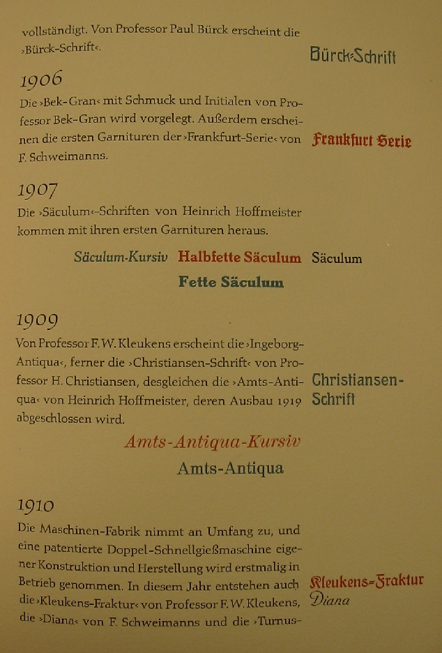
¶ F. Schweimanns makes the first weights of his Frankfurt series (a Fraktur family) in 1906. This is followed in 1910 by the script face Diana and in 1912 by Korso.
Bek-Gran
¶ In 1906, Professor Bek-Gran publishes the Bek-Gran typeface, which includes initial caps.
Heinrich Hoffmeister
¶ Heinrich Hoffmeister publishes the first weights of his Säculum family in 1907. From 1909-1919, he works on the various weights of Amts-Antiqua.
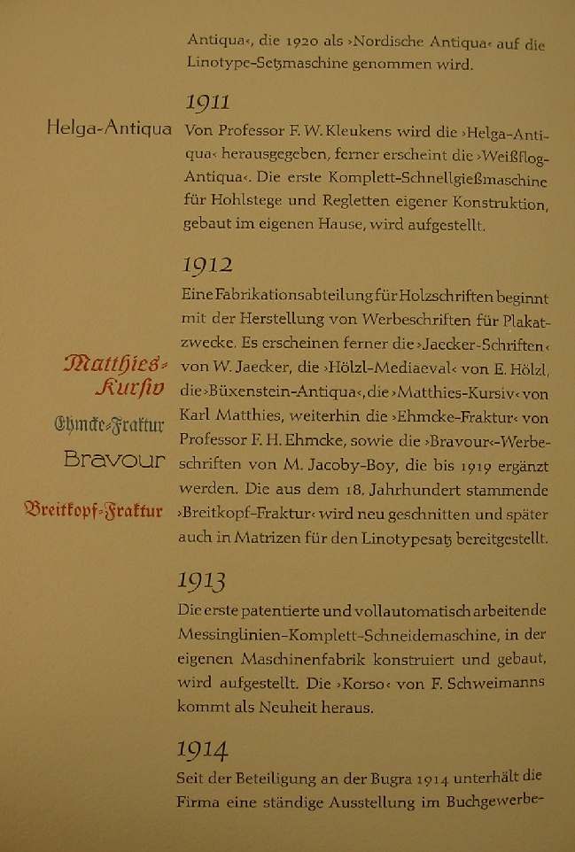
F. W. Kleukens
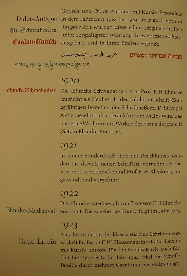
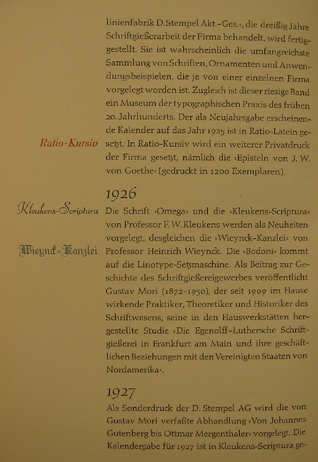
¶ F. W. Kleukens makes Ingeborg Antiqua in 1909, Kleukens Fraktur in 1910, the elegant Helga-Antiqua in 1911, Gotische Antiqua in 1914, the classical Ratio-Latein and Ratio-Latein-Kursiv in 1923-1924, and Omega and Kleukens-Scriptura in 1926. Kleukens founds the Ratio-Presse in 1919.
H. Christiansen
¶ Professor H. Christiansen publishes Christiansen-Schrift in 1909.
Turnus
¶ Turnus is published in 1910. It becomes known as Nordische Antiqua in 1920.
Weißflog-Antiqua
¶ Weißflog-Antiqua is published in 1911.
1912
¶ 1912 sees the development of Büxenstein-Antiqua and the cutting of the old Breitkopf-Fraktur.
W. Jaecker
¶ W. Jaecker publishes Jaecker-Schriften in 1912.
E. Hölzl
¶ E. Hölzl publishes Hölzl-Mediaeval in 1912.
Karl Matthies
¶ Karl Matthies publishes Matthies-Kursiv in 1912.
F.H. Ehmcke
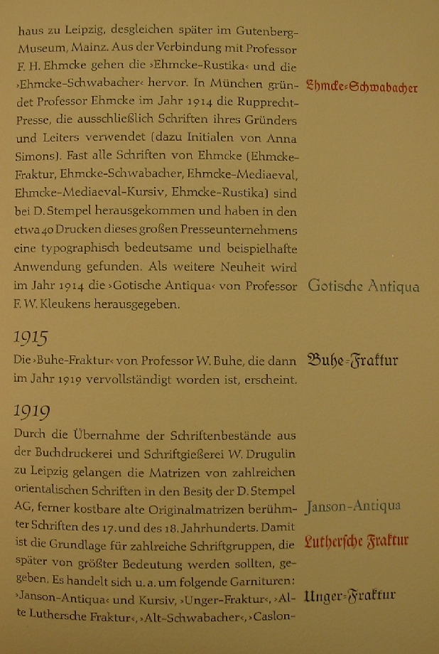
¶ Professor F.H. Ehmcke publishes Ehmcke-Fraktur in 1912, and Ehmcke-Rustika and Ehmcke-Schwabacher in 1914 (the latter only appeared in 1920). In 1914, Ehmcke founds the Rupprecht-Presse in München, which employs exclusively Ehmcke's typefaces, which are all Stempel originals. Ehmcke Mediaeval and Ehmcke Mediaeval Kursiv appear in 1922 and 1923, respectively.
M. Jacoby-Boy
¶ M. Jacoby-Boy publishes Bravour-Werbeschriften in 1912.
W. Buhe
¶ W. Buhe publishes Buhe-Fraktur in 1915, and finishes this family in 1919.
W. Drugulin
¶ In 1919, the W. Drugulin foundry is bought by Stempel. This way, Stempel gets access to many oriental typefaces as well as the matrices of many faces from the 18th and 19th centuries, such as Janson-Antiqua and Kursiv, Unger-Fraktur, Alte Luthersche Fraktur, Alt-Schwabacher, Caslon-Gotisch (fraktur), and Didot-Antiqua. These will be developed by Stempel in the decades ahead.
Rudolf Koch
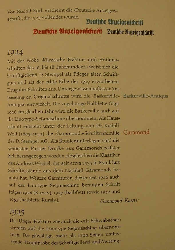
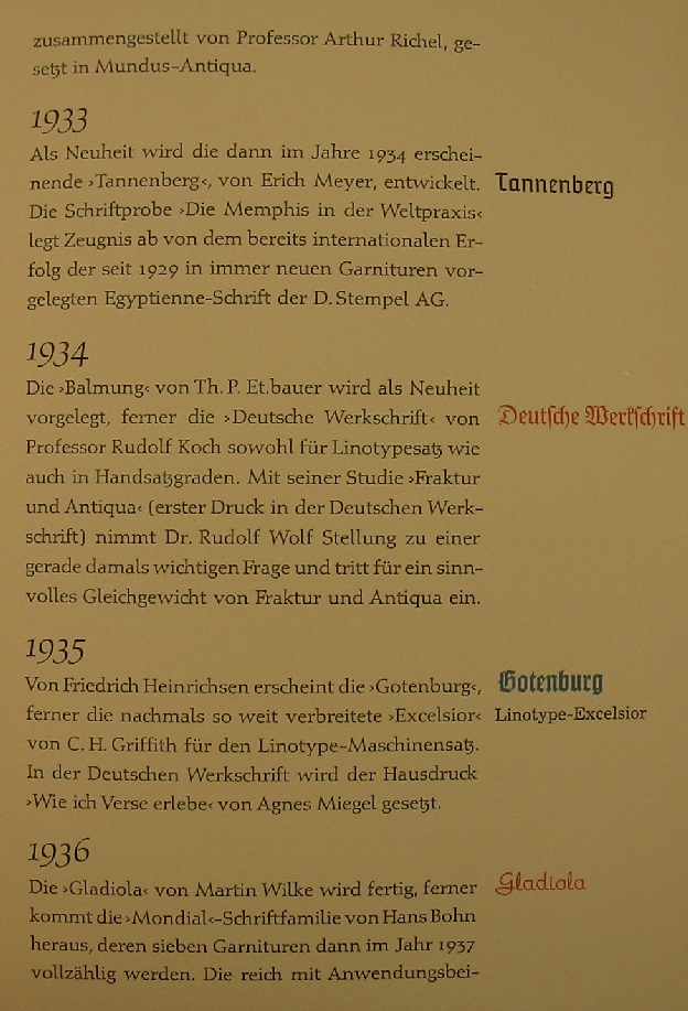
¶ Rudolf Koch's first typeface at D. Stempel AG is Deutsche Anzeigenschrift, a Fraktur family developed from 1923-1925. This is followed by by another Fraktur family, Deutsche Werkschrift (1934).
1924-1925
¶ 1924 is the year of the development of grand house styles, such as the Garamond family, produced under the direction of Dr. Rudolf Wolf (1895-1942). Kursiv (1926), Halbfett (1927) and Halbfett Kursiv (1933) are to follow later. Similarly, Baskerville-Antqua is published in 1924, to be completed in 1928 by a Halbfett. In 1925, stempel publishes a 1200-page specimen book, Hauptptobe der Schriftgießerei Messinglinienfabrik D. Stempel Akt.-Ges. This is probably the largest such book ever published at that time.
Heinrich Wieynck
¶ Professor Heinrich Wieynck publishes the fraktur font Wieynck-Kanzlei in 1926.
Gustav Mori
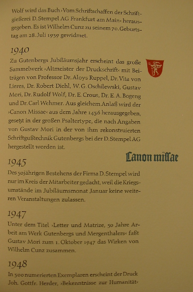
¶ Gustav Mori (1872-1950) was a Stempel employee, type theorician and type practician as well as type historian all in one. In 1926, he published "Die Egenolff-Luthersche Schriftgießerei in Frankfurt am Main und ihren geschäftlichen Beziehungen mit den Vereingten Staaten von Nordamerika". This is followed in 1927 by "Von Johannes Gutenberg bis Ottmar Mergenthaler" and in 1928 by "Der Türkenkalender für das Jahr 1455". In 1947, he writes Letter und Matrize, 50 Jahre Arbeit am Werk Gutenbergs und Mergenthalers.
Wilhelm Pischner
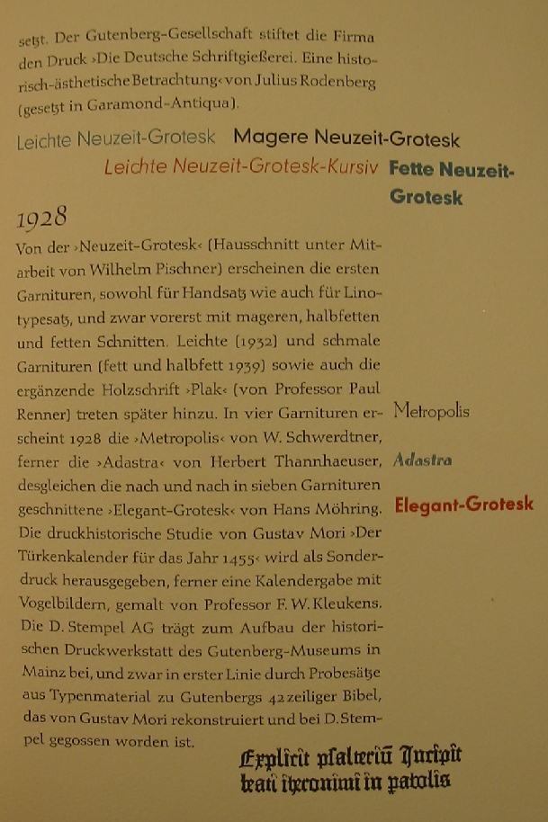
¶ The first big sans family developed in-house is Neuzeit Grotesk, whose deveklopment started in 1928 under the guidance of Wilhelm Pischner. This will be followed by light (1932), fett (1939) and halbfett (1939) weights later.
Willy Schwerdtner
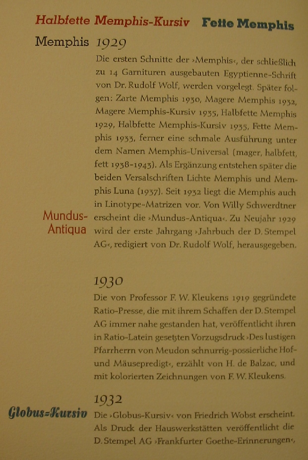
¶ Willy Schwerdtner publishes the 4-weight typeface, Metropolis, in 1928, and Mundus-Antiqua in 1929.
Herbert Thannhaeuser
¶ Herbert Thannhaeuser publishes the display face Adastra in 1928.
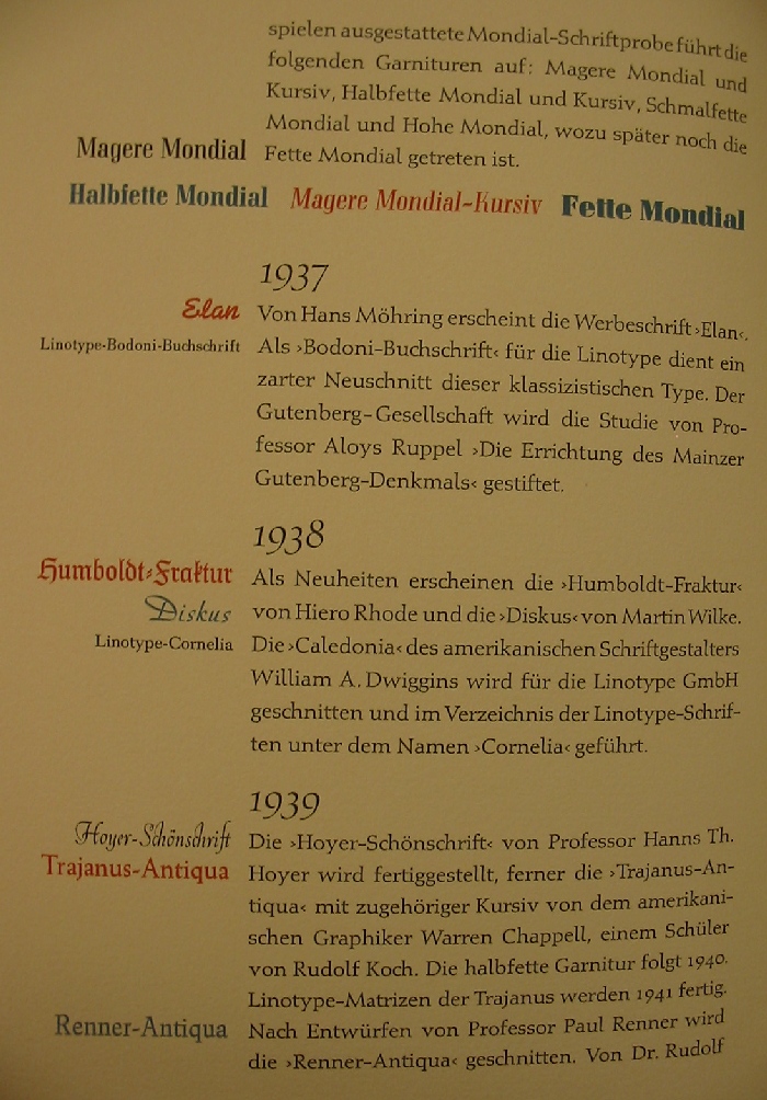
Hans Möhring
¶ Hans Möhring publishes the seven-weight family Elegant-Grotesk in 1928. In 1937, he creates the script face Elan.
Herbert Thannhaeuser
¶ Herbert Thannhaeuser publishes the display face Adastra in 1928.
Dr. Rudolf Wolf
¶ Dr. Rudolf Wolf finishes the first weights of the egyptian family Memphis in 1929. Later weights include Zarte (1930), Magere (1932), Magere Kursiv (1935), Halbfette (1929), Halbfette Kursiv (1935), Fette (1933), Memphis-Universal (1938-1943), Lichte (1937), and Memphis Luna (1937).
Friedrich Wobst
¶ Friedrich Wobst publishes Globus-Kursiv in 1932.
Erich Meyer
¶ Erich Mayer publishes Tannenberg in 1933.
Friedrich Heinrichsen
¶ Friedrich Heinrichsen publishes the Fraktur face Gotenburg in 1935.
1935-1938
¶ House fonts developed for the Linotype machine include Linotype-Excelsior (1935, adapted from C.H. Griffith's Excelsior), Linotype-Bodoni-Buchschrift (1937), and Linotype-Cornelia (1938, after W.A. Dwiggins' Caledonia),
Martin Wilke
¶ Martin Wilke publishes the script fonts Gladiola (1936) and Diskus (1938).
Hans Bohn
¶ Hans Bohn publishes the family Mondial in 1936-1937 in seven weights.
Hiero Rhode
¶ Hiero Rhode publishes Humboldt-Fraktur in 1938.
Hanns Th. Hoyer
¶ Professor Hanns Th. Hoyer publishes the calligraphic face Hoyer-Schönschrift in 1939.
Warren Chappell
¶ Warren Chappell, a student of Rudolf Koch, publishes Trajanus-Antiqua in 1939 (the Halbfett follows in 1940).
Paul Renner
¶ Professor Paul Renner publishes Renner-Antiqua in 1939.
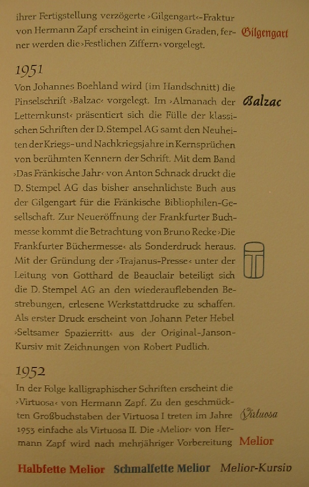
Hermann Zapf
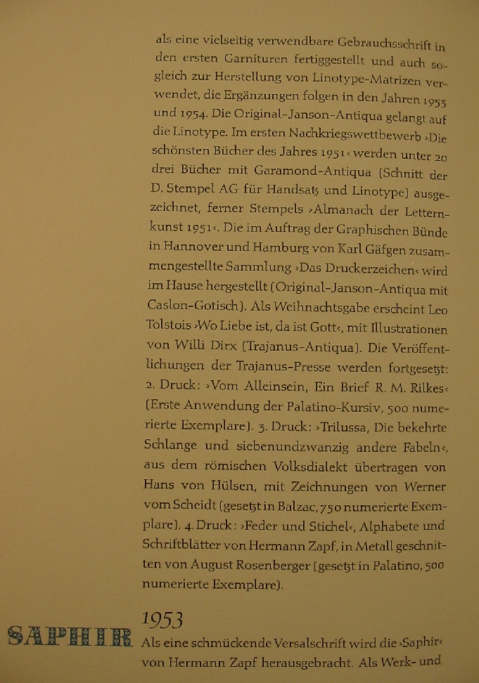
¶ Hermann Zapf enters Stempel with a bang in 1950, the year in which Stempel releases Palatino, accompanied by Michalangelo (1950) and Sistina (1951), Gilgangart-Fraktur (1950) and Festlichen Ziffern (1950). In 1952, the calligraphic script font Virtuosa is published, followed by the caps faces Virtuosa I (1952) and Virtuosa II (1953). The multi-weight family Melior is released in 1952. The striking ornamental caps face Saphir appears in 1953. This is followed by Kompakt in 1954.
Johannes Boehland
¶ Johannes Boehland publishes the brush face Balzac in 1951.
Gudrun Zapf-von Hesse
¶ Gudrun Zapf-von Hesse publishes the Diotima family in 1953, accompanied by Smaragd and Ariadne-Initialen.
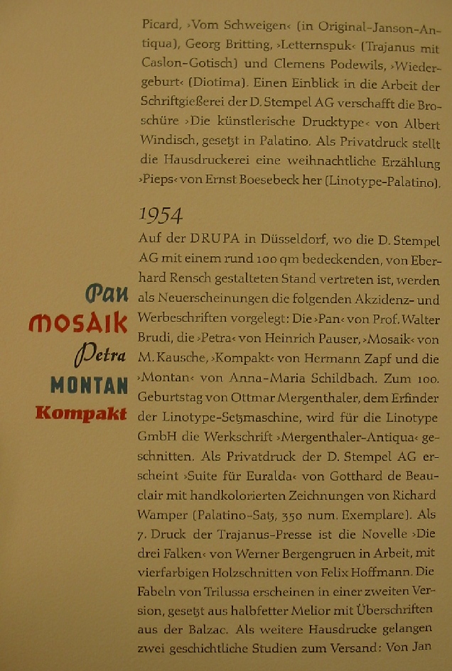
Walter Brudi
¶ Walter Brudi publishes the brush font Pan in 1954.
Heinrich Pauser
¶ Heinrich Pauser publishes the script font Petra in 1954.
M. Kausche
¶ M. Kausche publishes Mosaik in 1954.
Anna-Maria Schildbach
¶ Anna-Maria Schildbach publishes the sans face Montan in 1954.
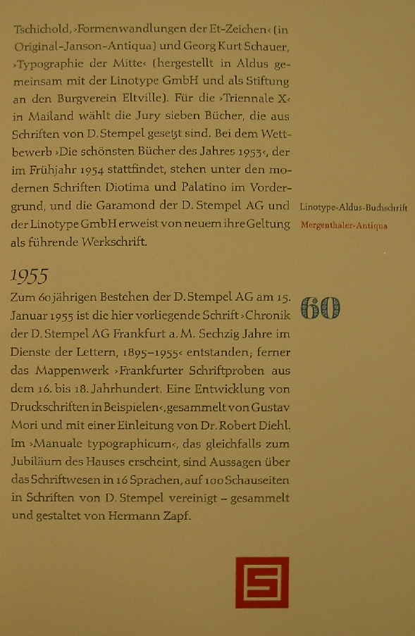
1955
¶ In 1955, the house face Chronik is published, preceded in 1954 by Linotype-Aldus-Buchschrift and Mergenthaler-Antiqua. The company's story is broken off at this point.
Copyright © 2003
Luc Devroye
School of Computer Science
McGill University
Montreal, Canada H3A 2K6
luc@cs.mcgill.ca
http://cg.scs.carleton.ca/~luc/index.html