Musings
March 1, 2001

Truetype versus type 1


.....  


A lot has been written about truetype versus type 1, so let me add a few lines to the pile. Microsoft does not seem to understand why serious designers and professionals remain stubbornly attached to type 1 fonts. I will try to explain why this is so, by explaining the conceptual differences between the truetype and type 1 font formats and font development strategies.


The formats  


Let us begin with the font formats. Type 1 files are conceptually simpler. The manual is a readable 100-page booklet, the "black book". Compare this with truetype's 500+ undecypherable error-filled spec pages that must be downloaded and printed. If you are not a computer scientist with at least a B average from MIT, you can forget about understanding the truetype specs. The type 1 people put the absolute minimum in a font: name information, character width information, an encoding vector (the encoding vector says in what numerical position we must place the letter "a", for example), and the character outlines in the form of cubic Bezier curves. Some hinting is provided, but the format is light, with hints taking up one or two lines of code per character. (Hinting provides information that some output devices such as screen renderers could use to make certain places of the character outlines align with pixels.) Because of this simplicity, it was easy, early on, to develop editors and tools for the type 1 format. There are human-readable forms of type 1 fonts, and somehow, the fonts feel like the cars from the fifties and sixties---in case of a problem, they can easily be fixed by the driver or any random mechanic, unlike the modern day machines with their electronic ignitions and remote control starters. Professional designers often alter an existing font (I hate to say "always", although that is not far from the truth) for a particular contract. Type 1 permits easy adaptation, from a simple change of font name to a replacement of an outline. 
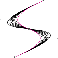
The cubic Bezier curves, with two intermediate control points, allow for easy font editing, as local changes do not cause extensive ripple effects that need additional fixing. Making renderers for laser printers and screen is easy because type 1 is integrated with the postscript language, for which renderers and printing engines are easily available. This coupling of type 1 and postscript was essential in the early development. In fact, it was a stroke of genius.


Tables and mags  


Truetype was developed at Apple, but it would not even be in the competition today were it not for a pro-active decision by Microsoft to use it as the in-house format for all Windows products. The font format is all but human friendly. Postscript and type 1 were created by a group of innovators who genuinely wanted to create a simple graphics package---and succeeded! Truetype arose from the twisted minds of hackers, academics and other heliophobics. A truetype file consists of a number of tables, tightly packed together, with every bit of every table having a precise description. Now, bits are not readable except to aliens. If you pack 8 random bits together to get a byte, you will get gibberish. Bits and bytes cannot be edited or altered with standard text editors. Thus, special programs are needed to penetrate truetype files. The tables have variable sizes, so yet another table is added in front that directs people, very much like the page finder at the beginning of a magazine. This principle of listing the start locations of the tables is necessary because one would otherwise not be able to tell which bit belongs to which table. Can you imagine what happens if you decide to remove a page from your magazine, or 7 bytes from your truetype file? Yes, you need to recalculate the whole page index. Now compare: type 1 is a magazine without a page index but with nice big titles for all the stories. Truetype has a page index, but the stories have no titles, no subsections, no paragraphs, and no space between words.


Murderers  


Well, on to the tables themselves. The truetype designers put a lot of stuff in the font, more than is needed. There are the outlines of the characters themselves of course. Then there are metric tables, and kerning tables. The only table missing is a massage table. Assume that you are reading about the character outline somewhere in your magazine. Now place the end of the story (say, the kerning) in a different chapter, the picture of the murderer in yet another chapter together with all other pictures including the photograph of the president of France, and the accompanying pie chart in yet another chapter that collects all pie charts for the entire magazine. How about them apples? Would you like to read such a magazine? The type 1 magazine, in contrast, is like your average issue of Time---it is simple, and things that belong together are on the same page.


Nosiness  


Truetype gets involved in other peoples' affairs. Truetype has places for descriptions of various encoding vectors (remember, the numeric positions for the characters) for various platforms, and provides font names for each platform. A truetype font has a "postscript platform" name, for example. A truetype font designer must thus learn about all these platforms and all possible encodings for all platforms. This is way beyond what can be expected from our casual design professional or software engineer.


Evening course?  


For good screen rendering, hinting is essential. Now, the good people at truetype decided to throw in a computer language to provide hinting. Yes, truetype has a language within its guts! Something like a mini-postscript, or Visual Basic. People in my part of the world pay 800 dollars for an evening course to learn java or any decent computer language. To learn a new computer language just to be able to hint is just too much. As a result, hinting has been largely ignored. Hinting is mostly done by converting a font from type 1 to truetype, and hoping that the converter knows how to do that translation (most don't or didn't), or by hinting directly in a font editor (most have limited capabilities in this respect). The decision to place hinting in the hands of a few people at Microsoft and one or two other labs is one of the downfalls of truetype. Converted fonts usually appear poorly on screens. Fix the hinting? Well, sorry, you can't do better than what the Fontographer and Fontlab people decided you can do, which is way below the capacity of the hinting engine inside truetype.


Stinky pixels  


In fact, truetype is very much concerned with the accuracy of the medium on which it is used. That too makes designing a truetype font nearly impossible. Type 1 was sold as the first simple scalable font. It does not worry about "dpi" and pixel sizes--it leaves those worries to the applications that use the fonts. It separates church and state in a clear manner. But truetype needs to know. The hinting is done for certain pixel accuracy ranges, with different rules for different ranges. Type 1 lets the application worry about getting fonts to appear nicely on low resolution devices. This could be done by introducing anti-aliasing or even on-the-fly "artificial intelligence" type hinting, as the output device is none of type one's business. Truetype on the other hand is meddlesome---it sticks its nose where it does not belong, and frankly, where the smell is sometimes nauseating.


No tools. Help!  


Let us recap what a computer programmer needs in order to write an application that changes a truetype font: he/she has to learn a computer language (sorry, no truetype courses offered in my town, buddy); he/she has to become a screen hacker, a trade only acquired by trial and error while destroying a perfectly good marriage; and he/she has to know everything about encoding vectors and unicode--Quiz: what is the definition of unicode? Final answer? ... Sorry, but we'll have some parting gifts. And all that is necessary before the programmer even deals with the first outline in the font. Even today, well past the tenth birthday of truetype, we have virtually no good truetype tools, as even the simplest tool for truetype requires a formidable effort on the part of the tool's developer. As a result, truetype has ended up at the bottom of the food chain, invariably and inevitably, as the end product of a type 1 conversion. Quality control was in the hands of the converters. Incredibly, Apple or Microsoft never published a high quality converter.


All the gorgeous esses consist of just one (count them: one!!!) cubic (type 1) Bezier segment. Two of truetype's quadratic Bezier segments (in pink, with additional break-up in the middle) are needed to obtain the same character. The (black) cubic segments are also much richer in curvature detail.


Mutants and fonts  


Thinking about making a truetype font from scratch? Well, if you start from another truetype font, chances are that that font was a conversion of a type 1 font. Unless you start from one of the basic Microsoft fonts, Verdana, Arial, Georgia, ComicSans, Tahoma, Webdings, or Trebuchet. These are roughly speaking the only fonts on earth that were professionally designed in truetype format. All others are suspect conversions. Any derivative of the latter will have quality problems. No wonder the designers demand type 1 fonts, as they should. In fact, would it not be great if someone made a genealogical chart of all fonts, so that we can trace the roots, indicate the conversions on the ancestral paths, and see where the origins are. It is clear that nearly all fonts descend from the type 1 tribe. Most people I am sure would prefer a font with a very short and clear genealogical path, conversion-free, uncorrupted. Truetype was not designed to be at the head of a new tribe. Truetype fonts are just mutants at the bottom of the family tree.


Cubic versus quadratic  


Now, imagine that against all rules and laws, and against any sense of aesthetics, you would like to edit the outlines of Arial in your favorite truetype font editor to make your own new font, Burial. Good luck to you, because truetype uses quadratic Bezier curves, that is, each curvy segment has two endpoints, and one control point to control the curvature. Each truetype Bezier segment is severely limited in its molding capacity. Type 1 fonts have two intermediate control points. For example, one cubic (type 1) Bezier segment can make an "S", but one quadratic (truetype) Bezier segment can at best make a "C" . Truetype needs at least two segments to make an "S". If a truetype segment is changed, many other neighboring segments needs changing too, and the editing becomes long and tedious. In contrast, prolific typographers are incredibly fast with the creation and modification of cubic segments. At ATypI meetings, I have seen famous typographers draw good-looking characters with a mouse in well under a minute. So, here too, the truetype crew made a short-sighted decision.


The character 8 from the truetype version (left) of Adobe's PoeticaChanceryI. This font was originally designed in type 1 format, and later converted via Type Designer 3.0 by an unknown stranger. The pink points are the control points: each quadratic Bezier segment has at most one of these points. Compare with the same character in type 1 format (right): every cubic Bezier segment has two control points, and very interestingly, almost every cubic Bezier segment was "converted" into two quadratic Bezier segments, cluttering up the outline with points.


Burp  


Any modifications of truetype this late in the game, such as truetype open, and opentype, are just additional complications that cannot cure the cancer in truetype's veins. The basic truetype defects are there, for everyone to see. To try to manipulate the market to force truetype down everyone's throats, even under a disguised name, is just plain wrong. A suspicious mind or a Microsoft employee might say that truetype can do things that type 1 fonts can't. There are fancy character placements for non-Latin languages and ligature tables, to name two such features. If additional properties are needed that type 1 does not presently offer, the type 1 backers should tackle these by developing smarter applications, or adding optional files. For example, people have asked me regularly for random fonts, that is, fonts in which the characters change in some way. This could be done by providing three things: a type 1 font from any type 1 library, an additional file that describes the randomization process, and an application that is smart enough to understand both. People who do not want the randomness just need the type 1 font file. The truetype philosophy in this situation would have been to add the randomness in yet another table in the font file. (Bloating. Burp.) To understand this is to understand the differences in the development strategies. If you believe that we should all strive to make things simpler, more accessible, and purer, then you believe in type 1 fonts. The patient burped one last time as he was carried out of the room. The next morning, the stench was gone.


Copyright © 2001 Luc Devroye
School of Computer Science
McGill University
Montreal, Canada H3A 2K6
luc@cs.mcgill.ca
http://luc.devroye.org