

WHAT
IS A
“FREE
FONT”?
FREE FONTS sites on the web are so plentiful you may wonder, "Why should anyone ever pay for a font?"
Generally speaking, most Free Fonts are...
1. drawn by amateurs, students and hobbyists.
2. drawn by professionals, purchased at some point and then distributed free--illegally--over the web.
3.professional, proprietary fonts that have been copied or autotraced and renamed to disguise their identities.
4. professionally designed fonts given away by the professionals who designed them, or the companies that license them in order to promote sales.
Thus, most Free Fonts are usually either poor-quality amateur fonts or stolen property being pirated. The reason for this is that the creation of a high-quality, full-character-set font is such a laborious process that those designers who make a living creating fonts simply can't afford to give their work away for free.
If you ask, "What is the difference between a quality, professional font and a poor quality Free Font?" the answer is "One to two months." That is, it takes about 4-8 weeks to bring a font from rough concept to a flawless final product, properly rendered and fully kerned.
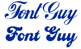
At left, screen shots of bad web fonts, illustrate the difference between amateur and Free Fonts and fonts of professional quality.
1.
FONT GUY
The first example on top comes from an amateur font site. The letters
are spaced unevenly, and are totally inconsistent:The vertical strokes
are not the same thickness; the bottom strokes connecting the letters
to one another are all shaped differently; the bottom loop of the y is
in a different style than the upper part. The lower line of lettering
was set in CASEY from flashfonts.com. This
font shows balance and consistency. The complete font took me about 6
weeks of meticulous work including constant reevaluation and revision.
2.
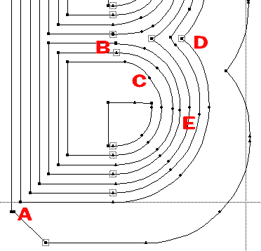
DIMENSIONAL B (Portion)
Concentric circles anyone? At A, the angle line does not begin at the
corner point where it should; B. Instead of using all transitional (straight
to curve) points, the points chosen are arbitrary; C. lumpy curve and
extraneous point; D. Bad curves; E. Instead of being concentric circles,
these circles are sloppy and uneven.
3.
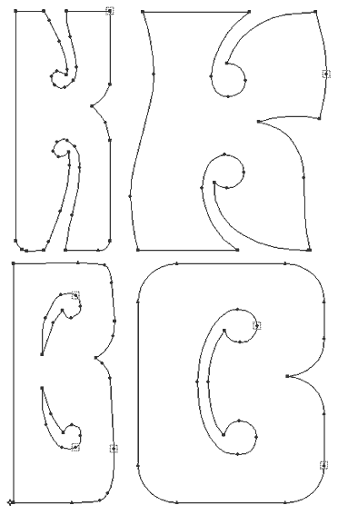
60's FONTS
In the left column are K and B from an amateur font site and at right
are the same letters from flashfonts' PEACE
and LOVE fonts, respectively. The cheap font
shows shoddy letterforms, an excess of points, awkward curves, crooked
lines that should be straight and curved strokes drawn with many segments
instead of using bezier curves. Also, the diameter of the rounds inside
the K don't even match that of the B. The Flashfonts K & B show consistency
in curves and weights, and the minimum number of points, properly placed.
(Plus, I got permission to use the style! Click)
Remember, Free Fonts may look okay at small point sizes on the web, but will bring down the quality of your work in print or at larger sizes. Experienced designers know better. They know you get what you pay for!
(And now, amateur font designers, you've just been told everything you need to know to make high-quality fonts...all it takes is a hell of a lot of work!)