|
Italian Design Forum
|
The room that the Italians had appropriated for themselves
was by far the best room. It had simultaneous translation
(the talks were in Italian), and nice tables to write on and put
your stuff. It was cozy--as cozy as conference rooms can get, I guess-,
and the audience felt close
to the speakers. This is where I spent most of my time--I wanted
to hear about the state of type in Italy, about their thinking,
their dreams, the issues, their identity.
I must say that the current state of Italian typography
is beautifully summarized
in Italic 1.0 Contemporary Type Design in Italy,
a book edited by
Paolo Lanarduzzi, Mario Piazza and Silvia Sfligiotti at
AIAP Edizioni (Milano, 2002).
I immediately bought a book at the extensive impromptu bookstore
set up by Nijhof&Lee, wondering at the time how Nijhof&Lee managed
to get 6 tons worth of printed material from The Netherlands to
Rome. To get a more complete historical picture, I also bought
Abecedario: la grafica del novecento
by Sergio Polano and Pierpaolo Vetta (Mondadori Electa, Milano, 2002),
La Lettera Uccide by Giovanni Lussu (Stampa Alternativa / Graffiti, Rome, 1999),
and
Questioni di Carattere: La Tipografia in Italia dal 1861 agli anni Settanta by Manuela Rattin and Matteo Ricci (Stampa Alternativa / Graffiti, Rome, 1997).
There were a few cancelations, most notably
Claudio Piccinini and Olivia Nepi, one of whom gave birth to a child just
before the meeting.
The Italian tracks were expertly chaired by Carlo Branzaglia
(replacing Giovanni Anceschi) and Sergio Polano.
Branzaglia lamented the demise of Italian foundries until the mid to late nineties.
Speaker after speaker would at least mention Aldo Novarese and Nebiolo
in some context, and the disappearance of Novarese has clearly left a great void.
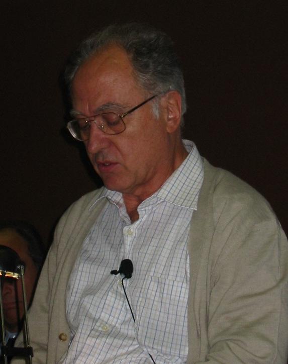
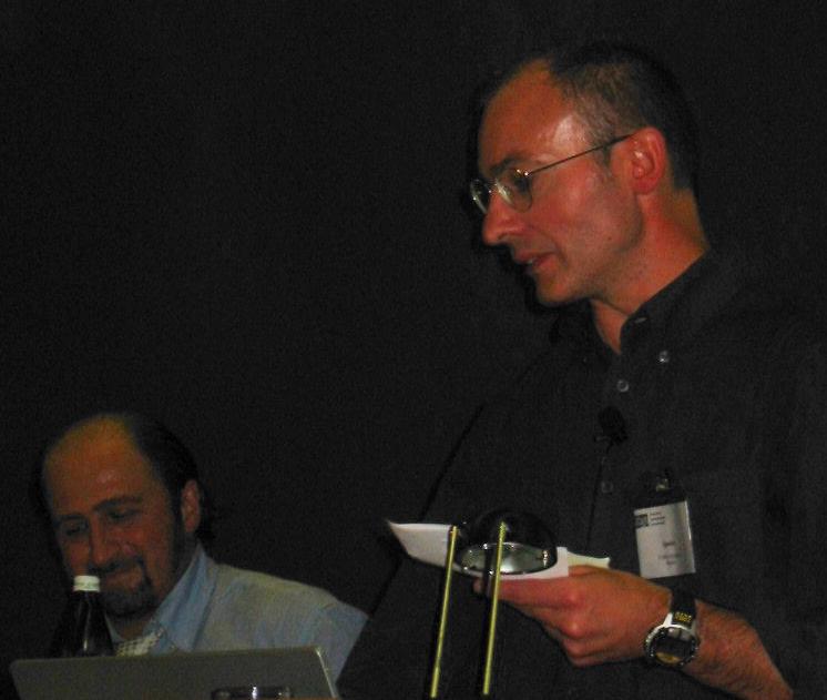
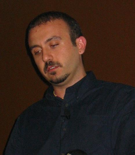
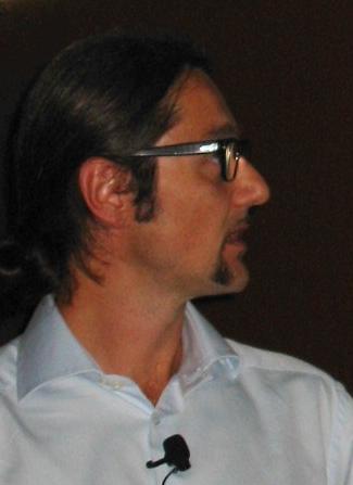
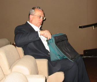
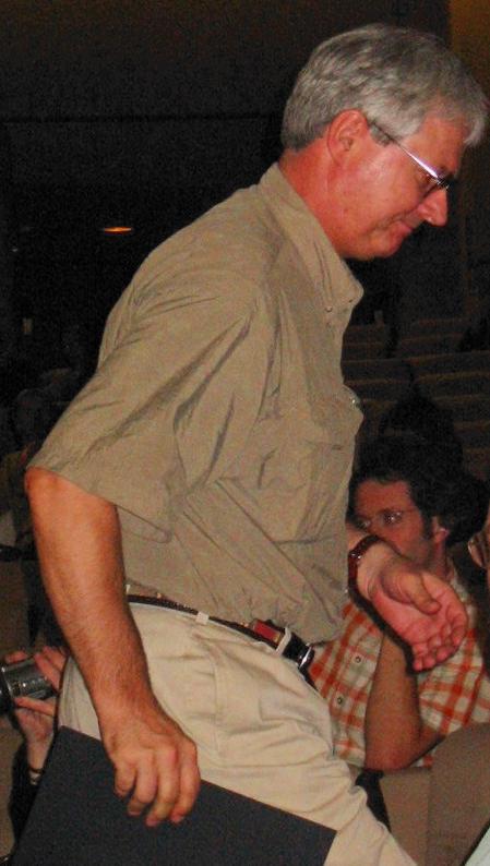
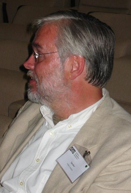
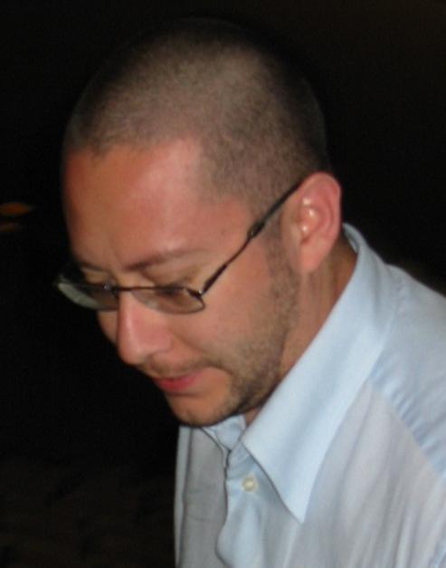
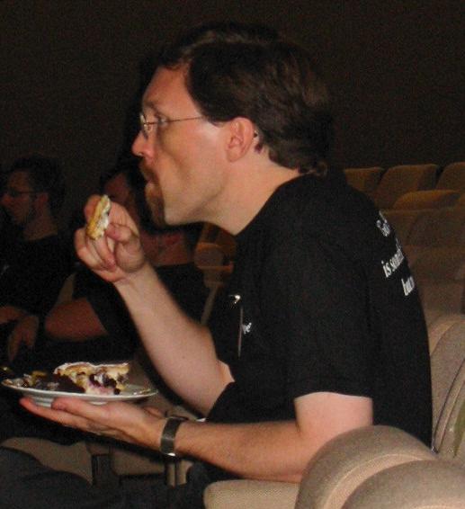
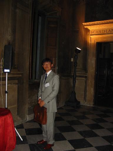
Piero De Macchi (shown in the picture) was hired by Novarese in 1956, where
he worked for a few years under the tough but inspired master. Novarese's
mottos were "Go against the flow/ Do not waste/ Complete the work". Piero admitted
to having left Nebiolo with Novarese's two viruses, a dedication to perfection,
and a love of type. At that point I realized that Piero was not
just giving a talk, he was giving THE talk of his life--he was
telling his life's story, and this was the time and the place.
Although I loved every minute of the Italian track just as much as
I love scooping up the last bit of amatriciana sauce from my plate of pasta,
I thought that Piero's autobiographical presentation was the most
compelling. Piero published L'avventura Didot,
and made some beautiful fonts that were never published, such as Simon, Alexandra and Paloma.
He told us how Seat wanted to change the 1977 font Galfra in the
Italian telephone directories. This led to Nomina, a squarish version of Futura
with tons of ink traps, and small serifs added for legibility.
Piero is working on a 32-weight version of Nomina for
use on screens.
The Italian tracks were expertly chaired by Carlo Branzaglia
(replacing Giovanni Anceschi) and Sergio Polano.
Branzaglia lamented the demise of Italian foundries until the mid to late nineties.
Speaker after speaker would at least mention Aldo Novarese and Nebiolo
in some context, and the disappearance of Novarese has clearly left a great void.
Piero De Macchi (shown in the picture) was hired by Novarese in 1956, where
he worked for a few years under the tough but inspired master. Novarese's
mottos were "Go against the flow/ Do not waste/ Complete the work". Piero admitted
to having left Nebiolo with Novarese's two viruses, a dedication to perfection,
and a love of type. At that point I realized that Piero was not
just giving a talk, he was giving THE talk of his life--he was
telling his life's story, and this was the time and the place.
Although I loved every minute of the Italian track just as much as
I love scooping up the last bit of amatriciana sauce from my plate of pasta,
I thought that Piero's autobiographical presentation was the most
compelling. Piero published L'avventura Didot,
and made some beautiful fonts that were never published, such as Simon, Alexandra and Paloma.
He told us how Seat wanted to change the 1977 font Galfra in the
Italian telephone directories. This led to Nomina, a squarish version of Futura
with tons of ink traps, and small serifs added for legibility.
Piero is working on a 32-weight version of Nomina for
use on screens.
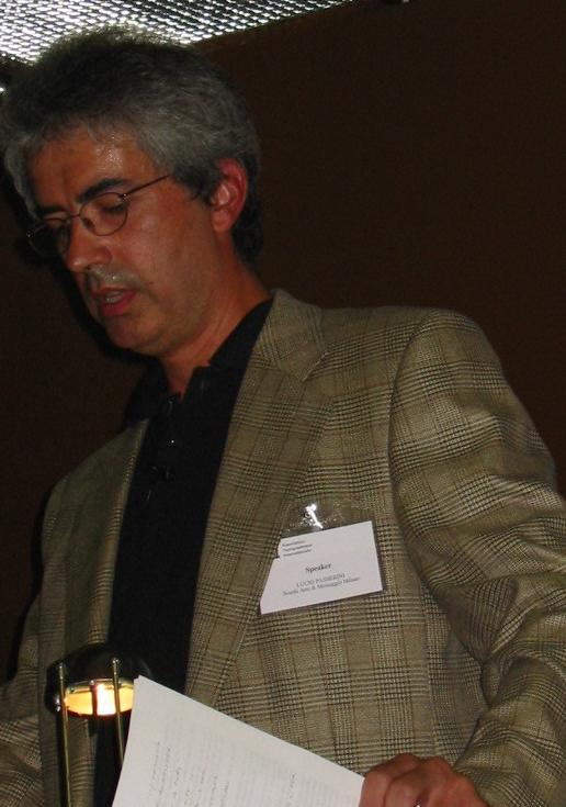
Lucio Passerini spoke about the new calligraphy in Italy.
He translated Robert Bringhurst's "Elements of Typographic Style" in Italian,
and got involved in the Associazone Calligrafica Italiana, which
offers calligraphy courses in Italy and publishes a
beautiful magazine, La Operina. Giovanni de Faccio is also involved
in this association, which tries to reverse a historical trend, as
calligraphy was in fact a subject in elementary school before 1950.
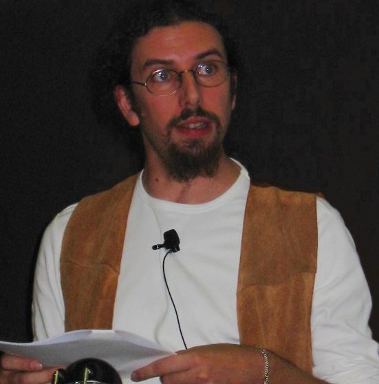
The calligraphic trend was also apparent in the elegant
and well-organized presentation of
Giovanni de Faccio. He used black/white images showcasing his
fonts, with a rare touch of dramatic red.
For me, it was the most beautiful talk in a conference, loaded
with gorgeous images.
The subject of Giovanni's talk was his Rialto.df family, developed
at dfType in Austria, where he now lives. dfType is run with
Lui Karner, owner of Fischbachpresse, named after Fischbach, the small village where Lui and
Giovanni first met.
Giovanni stressed his complete freedom in the 5-year Rialto
project--he had no boss and no deadline!
He is, of course, a calligrapher, but admitted to
influences by C. Van Dijck and Jan Van Krimpen's Romanée
in the design of Rialto.
Rialto's lower case was derived from Capitalis Monumentalis.
Capitals are smaller than usual for readability and are tilted 1 degree
to the right for easy combination with italics, which
in turn are only tilted 3 degrees.
He described his italics as soft and feminine and his miniscules
as hard and male. Other Italian speakers also mentioned
"soft feminine" typefaces. My theory is
that this is just
a subliminal signal to half of the audience that the speaker
is available for a macchiato and "whatever" after his talk.
(Hey, we are in Italy!)
The Rialto family is quite complete, and there even exist versions with optical
corrections for special methods of printing (Rialto Pressa).
Interestingly, Rolling Stone magazine uses Rialto now.
Giovanni concluded with brilliant new designs,
StiloDF, LineaDF, NovellaDF and PietraDF.
He joins de Macchi in the club of the type perfectionists.
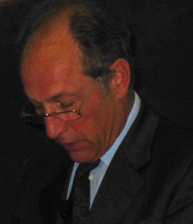
The third member of that perfectionist club is
Martino Mardersteig, owner of the Valdomega Type House,
ex-student of the Polytechnic in Munich, and son of the famous
typographer Giovanni Mardersteig.
VAL (Valdomega Aesthetic Line) has 12 fonts now, all with optical
sizing. Martino is very much worried about the declining quality
of print. Not enough attention is paid to the 3d impression
of letters on soft paper, to the print medium in general.
Showing a passionate side, he complained about
books with long lines of text, lots of errata, dense body,
overuse of lining figures ("too aggressive"), not
enough ligatures, electronically produced small caps,
small margins, and zero grid location functionality.
He showed Monotype Bembo besides a metal Bembo and the VAL
Bembo to prove how in most cases the original character of the font is
lost when glyphs are scanned and turned into a font "out of context".
"The digital versions are forgeries", he proclaimed.
His father, Giovanni, would take years to finalize a font,
and the respect for the original creators of lead type is lost
in the digital era. In 1956, Giovanni turned his lead creations
over to Monotype, by the way.
Within hours of Mardersteig's angry and powerful presentation,
bang, another bombshell was dropped on the meeting by Ivano Colombo from
the Politecnico in Milan, one of the main universities in Italy
for the study of type. Mamma mia, I was experiencing
Italy at its best, with emotional
outbursts and moody comments making 30 minutes seem like two.
Deeply influenced by his teacher, Giovanni Lussu, he ended
his talk with Lussu's adage: Bring on typographic culture!
We will never give up!.
The speaker offered a litany of complaints about the pollution, and
now asphyxiation, brought on in typography by cultural poverty.
He spoke briefly about typography at the Politecnico in Milan,
where, according to him, there is very little in the way
of type production, relative to the numerous and interesting meetings
and projects.
With Colombo and Mardersteig, the Italian testosterone trip
was over. The contrast with the next few gentlemen could not have been
more dramatic.
Poster designer Polyphemo "Emo" Risaliti surely is the humblest and most
polite of the line-up. He apologized for being there and taking up
people's time! I am sure many readers know him from his
1993 creation, Kniff, at Font Bureau (all bowls and inner circles
in this font are rectangular, and the serifs are as in a Bodoni).
Giangiorgio Fuga is the other gentle soul, perpetually smiling.
Fuga is a professor of typography at ISIA in Urbino, and runs the
Studio Grafico Giò Fuga in Milan.
He spoke, softly and quietly, about two corporate fonts he
helped make, Wally Type (for a company of luxury goods) and
Cordenons (for a papermill by that name). They were originally designed
by Mario Piazza on the basis of Hans Eduard Meier's lineale font, Syntax.
The Wally company wanted truetype for Windows, which, Fuga said,
created problems because of the many sections needed to describe
the glyphs. In passing,
Fuga heaped praise on OpenType, especially for ligatures.
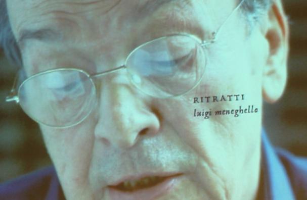
Carlo Buffa calls himself an accidental type designer.
He was asked to make typefaces for moviemakers.
Ritratti was created for a movie by Carlo Mazzacurati and Marco Paolini
on modern day Venetian writers such as Luigi
Meneghello.
The Ritratti face was digitized from Aldus Manutius' work.
His worried mainly about the preservation of the lack of precision
of the original letters. To save space, the worn-look outlines
had to be stored as linear Bezier segments. The font is used for titling only.
For one thing, because of the pressure of the production schedule,
the font had to be finished in a week.
Annomille is another font designed for a film of
Carlo Mazzacurati, La Lingua del Santo. This one though
is done from scratch and, it too, looks fantastic.
Just like Carlo Buffa, graphic artist
Andrea Braccaloni does not consider himself a type designer.
But just as all the other Italians who claimed this, he went
on to prove the opposite.
His PDF files were focused and impressive. It is interesting
how most speakers showed PDF files--no "Power Point" at this
meeting, what a relief.
Andrea's fonts include Egeo, Museimpresa (a corporate pixel font),
Ubu, Screeeen (a font family for flash files), Mila ("a sweet soft font,
named after a woman"---we are still in Italy, remember), and
Etica ("the moralist typeface").
Mila was the first font at Die Kleine Fonderie (the small foundry).
Etica, a descendant of Helv-etica, and published as LL Etica,
has characteristic letter parts in the y, k, q and m, that set
it apart from any other font. Andrea calls Etica a "female type".
It was at this point that I realized that "Italian Design Forum"
was a misprint. The original title of the track was "Female Type Forum".
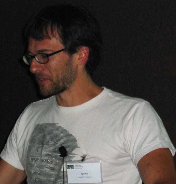
One of the most prolific of the modern day Italian typographers
is Fabrizio Schiavi of FSD (Fabrizio Schiavi Design).
It was a bit disturbing to see this brilliant young man
struggle with stage fright, while in fact he was surrounded
by admirers and enthusiasts. The situation was expertly and
diplomatically defused by the chair, Sergio Polano,
who turned the talk into an interview.
Fabrizio showed how his Sys family is a viable alternative
to Verdana for print. It has ink traps, is a bit more condensed,
and thus, seems to read easier.
In the same vein, Pragmata (2001) is an excellently hinted
monospaced font, that compares well with
Courier, Letter Gothic (its spiritual parent) and Monaco.
He wrapped up by showing Eco (2001), a font based on a logo for Ageco dating
from the seventies.
Keep it up, Fabrizio, we love you.
CSUNI, carattere senza una nome importante,
is a font family developed very
methodically and logically by Luciano Perondi.
He read an interview with Giovanni Lussu from 1998,
as he too, as so many other speakers before him in this Forum,
showed his respect for Lussu.
We never learned whether CSUNI was a male or female type.
Alessio Leonardi lives and works in Berlin, and has many
of his fonts published at FontShop.
It is thus no surprise Alessio prefers Meta over Helvetica.
He decided to entertain the audience with a PDF-puppet show
with memorable lines such as
"Helvetica goes to bed with virtually everyone".
In the end, the king puppet goes to the Helvetica puppet:
"You will have to be replaced by Meta".
After the puppet show, Alessio explained the design
of the OEM font family Schering, developed
with Albert Pinggera. In this font, the axis of symmetry
moves about to give the font an airy light feel.
The last part of his lively presentation was
entitled BuyMyFonts, as Alessio has just opened
a web site, www.BuyMyFonts.com.
Leonardo Sonnoli's presentation had some commercial undertones,
just as in Alessio's talk. It is of course true that many
typographers need bread on the table, and thus must execute
projects for companies. Leonardo Sonnoli, Giangiorgio Fuga,
and a few others struggled with the schizophreny caused
by developing a font on demand and the artistic freedom
they so cherish. Leonardo did a wonderful job of organizing
his ideas and his contributions. He is largely influenced by
architectural designs. For example, he made a great-looking font
to emulate the lettering found along Italian railways, and called it
Trieste, the city where he is based.
Other work of Sonnoli's consists largely of custom fonts
such as Carpe Diem (custom calendar font), Cuconi (theater font),
and Contatto (theater font). The audience was
impressed by the many beautiful posters he designed.
Carlo Vinti spoke about
The new typography and Campo Grafico; the debate on typography in Italian magazines in the 1930s.
This was a talk about the history of type in Italy,
and the commotion in the 1930s surrounding
Jan Tschichold's Neue Typographie and the need for
typographical design as a distinct métier.
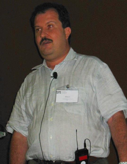
Mauro Carichini is in the thick of things. He designed type for [T-26] and
Linotype, and teaches at the Politecnico in Milan. He is a co-founder of Limbo Studio in that same city.
At first sight, Mauro appears to be a reserved nicely groomed man,
but wouldn't you know it, he started off with two dingbats, one for
a man and one for a woman, the kind of thing you would use on
doors of toilets, were it not that they were quite explicit.
I guess we'll have to call this "bisexual type".
Later on, he confessed to not liking serifs: they are passe, period.
Characters are abstract geometric objects.
His type showings included a unicase with all inner bowls filled,
a minimalist font or two, several experiments based on Eurostile (Glass Flag, Water Flag, Baby Mine),
and a few liquid writing fonts (Bioplasm, Ectroplasm),
all to drive home the point that he hates serifs.
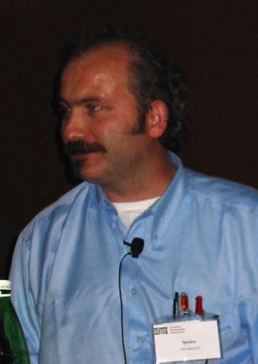
There were several other speakers, such as Massimo Pitis, the Milanese founder
of Vitamina Studio, who is not a mainstream type designer,
but rather a graphic artist who works for various companies.
His Diario font, for example, a modified Agenda, is used by "blu",
an Italian mobile phone company. Univers65 was updated for a job for
Canale 5, and at one point, he recommended that La Sapienza, Italy's
principal university, only use Avenir for a strong identity.
Mauro Zennaro too is a graphic designer, but with a paleontological twist.
As a student of paleography, his interest is in the history and meaning
of Roman inscriptions. He made a great point when he said that Roman inscriptions
for streets and buildings came in one readable style, Capitalis, and that
modern day bus stop notices come in about 20 types, all chaotically mixed
together, unintelligible, and of course, clashing with the
architectural surroundings.
Sorry, Mauro and Massimo, but my pictures of you were underexposed.
And finally, the princess of Italian type, Silvia Sfligiotti,
who gave a grand survey of the state of type in Italy.
She is the co-editor
of the magnificent book on Contemporary Type Design
in Italy (AIAP, 2002). She is also
one of the authors of "La grafica in Italia", an
overview of Italian graphic design in the twentieth century.
She teaches editorial design at the Accademia di Comunicazione in Milano,
where she is co-owner of Studio Bianca (since 1997).
The original title of her talk was Dopo Novarese?,
since Novarese left such a tremendous void that Italian designers had to look
to European (non-Italian) examples in the nineties, as there was
no Italian tradition. In her survey, she stressed
that there is a healthy revival underway.
She mentioned some of the speakers I introduced above, as
well as some notable absentees: Claudio Piccinini, the people from
Design Lab in Milan (Jane Patterson et al), Antonio Pace
(the Frankfurt-based designer of Linotype Gianotten, a Bodoni for small
sizes), Albert Pinggera (ex-MetaDesign, who worked with FontShop and studied in
The Hague),
Anna Roncchi (who with James Clough has a large role in Italian calligraphy),
Giovanni Lussu (of course!),
Francesco Messina (who modified Fairfield into Bomfield),
Paolo Palma (who makes interesting use of type based on modular elements),
Matteo Federico Bologna (who moved from his native Milan to New York where
he founded Mucca Design; the designer of Pravda, a Cyrillic simulation font,
Rizzoli, a nice take on Bodoni, Lettera Trentadue, New Tuscany Bold and Cut Up),
Roberto Bagatti (who works for MTV, and designed Grimoire),
Mario Piazza, and several others.
A few noteworthy remarks: she basically dismissed Pinggera as
"non-Italian" because he was too much influenced by the Dutch.
She liked Pace's Cita type for the city of Milan
(round extremities, dotless i, erased baseline),
but she did not see the spiritual link with the city of Milan.
Now, get off your chair, and order her book!
|

I have no idea how many people attended
the
I have no idea how many people attended
the  
Three keynote addresses were delivered.
Of those, I missed Rosemary Sassoon's closing keynote speech
about typography and real life.
Giovanni Lussu spoke about the shape of language.
He is a professor at the Politecnico in Milan, and a hugely
respected type and graphic design personality.
He was really the best choice in Italy for the opening keynote
slot.
Paul F. Gehl, a curator at the The Newberry Library in Chicago,
one of the new world's most important type and calligraphy
collections, delivered the second keynote address. He
is a connoisseur of historical Rome and early Italian history,
and speaks Italian fluently. He spoke eloquently
about time, the fourth dimension in type. Calling himself
a "grumpy type historian", he complained about so-called
type revivals, recuttings and interpretations.
As an example, Monotype Bembo (by Stanley Morison, 1929),
should, according to him, be called a historically-based type
(a phrase coined by Boge and Shaw), or a digital homage (a phrase
by John Downer) to Aldus Manutius' Bembo of 1495.
The digital Bembo is not used as meant when it was invented--for one thing,
the kerning and spacing has been altered.
That led Gehl to talk about type monasteries,
and other monasteries, collections of people who do not communicate
with people in other fields of specialization.
One of the exciting things in any meeting of this sort
is the exposure to the newest bunch of typefaces.
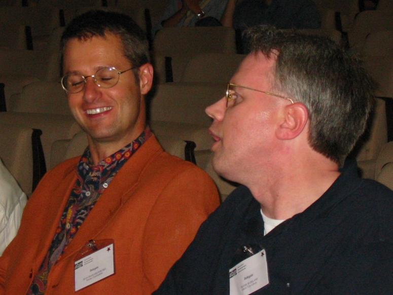
Linotype took the first shot, with Linotype Sabon Next,
a big family of faces by Jean-Francois Porchez
(shown in the picture sitting next to Frank Blokland), which
Linotype itself calls a revival of a revival. It is based
of course on Jan Tschichold's Sabon--the only face Tschichold
wanted to be remembered for--and on original Garamond/Granjon models.
Akira Kobayashi presented another Linotype novelty, Optima Nova.
One of the exciting things in any meeting of this sort
is the exposure to the newest bunch of typefaces.
Linotype took the first shot, with Linotype Sabon Next,
a big family of faces by Jean-Francois Porchez
(shown in the picture sitting next to Frank Blokland), which
Linotype itself calls a revival of a revival. It is based
of course on Jan Tschichold's Sabon--the only face Tschichold
wanted to be remembered for--and on original Garamond/Granjon models.
Akira Kobayashi presented another Linotype novelty, Optima Nova.
Dennis Pasternak, the principal of Galapagos Design, presented
his Bartholomé family, which started out as an OEM for
an inkjet printer, in an Open version with genealogical similarities
to Castellar MT and Colonna MT. Later, Small Caps and Regular filled
versions were added. Even though he designs fonts directly on screen,
he has been working on this family since 1996.
He is shown in the picture accepting a Bukvaraz award.
Adobe was very active promoting their new OpenType library,
which is steadily growing. Robert Slimbach's newest family,
Brosio, was unwrapped at the meeting. He too is the recipient of
a Bukvaraz award, which was picked up on his behalf
by the ubiquitous David Lemon.
Adobe was very active promoting their new OpenType library,
which is steadily growing. Robert Slimbach's newest family,
Brosio, was unwrapped at the meeting. He too is the recipient of
a Bukvaraz award, which was picked up on his behalf
by the ubiquitous David Lemon.
The old guys, how I love to listen to them. With
experience dripping down their chins, they can delight
any audience time after time, until time runs out.
I fondly remember
Colin Banks, whose talk I attended last year:
he passed away earlier this year. But there are many others left,
who hopefully have a few more decades of energy and creativity in
them. Matthew Carter entertained the crowds with
the lettering on gravestones in New England burial
grounds, and with some remarks on screen fonts. While
the whole world seems to focus on fonts for printing, he
stressed that the majority of font use is on screen.
Still according to Carter,
while screen fonts will be increasingly important,
any adaptation to technology
is doomed to have a short lifespan,
because "the engineers will solve all
problems sooner or later".
Other "old guys" I missed because of scheduling conflicts
include Erik Spiekermann, Lars Bergquist, James Mosley,
Paul Shaw, and Gerard Unger.
[Note: my definition of "old" includes me and anyone older than me.]
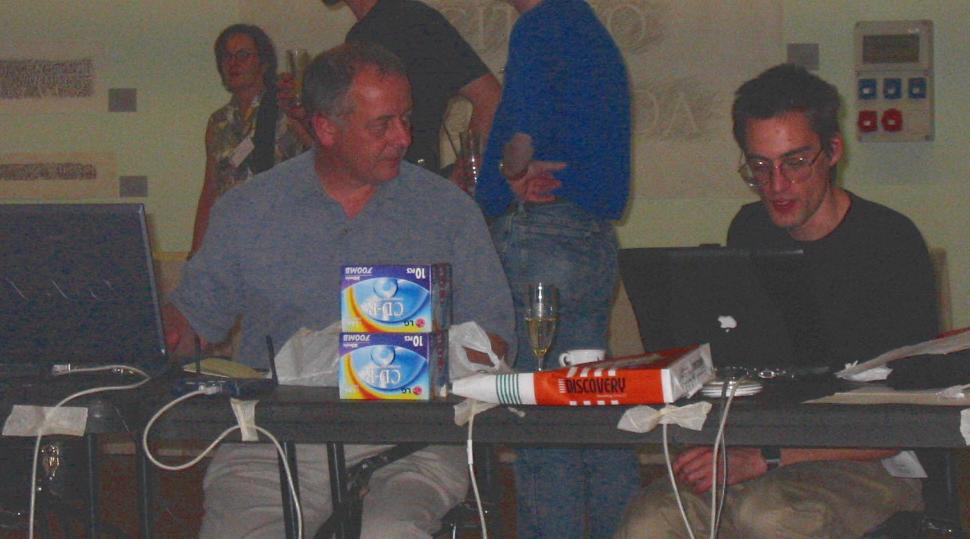
The software gurus at the meeting, in charge of computer
connections, were people like Peter Fraterdeus, and the
guys from Textmatters, Mark Barratt and Ben Weiner, shown in the picture
behind their computers.
Others frequently seen in the internet pit were Ted Harrison, Yuri
Yarmola, the programmer extraordinaire, Hrant Papazian, and
Zvika Rosenberg.
This year saw an avalanche of awards.
The Prix Charles Peignot is given by ATypI about every fourth year
to a deserving type designer under the age of 35.
Jonathan Hoefler (shown on the right)
is this year's winner
[picture courtesy of Peter Fraterdeus]. Previous winners are
Jean-François Porchez (1998), Carol Twombly (1994),
Robert Slimbach (1991), Petr van Blokland (1988), Jovica
Veljovic (1985), and Claude Mediavilla (1982).
And the next day, Maxim Zhukov (shown on the right)
and Mark Batty handed out award
certificates to the winners of the Bukvaraz type
competition. The about 100 winning entries are showcased
in a gorgeous 374-page book, Language Culture Type,
edited by John Berry (shown on the left), and published in 2002 by ATypeI/Graphis.
The book has several interesting essays on non-Latin languages
as well. Incredibly, it was included in the goodie bag of all
participants. It's a book I promise I will never sell.
On the left, Gabriel Martinez Meave accepts his Bukvaraz award.
On the right, Lucas De Groot, another winner.
On the left, Gabriel Martinez Meave accepts his Bukvaraz award.
On the right, Lucas De Groot, another winner.
The audience during the award ceremony, including, from
left to right,
Lucas De Groot, Eric Van Blokland,
Gabriel Martinez Meave and Lars Bergquist.
The audience during the award ceremony, including, from
left to right,
Lucas De Groot, Eric Van Blokland,
Gabriel Martinez Meave and Lars Bergquist.
Susan Skarsgard delighted the
audience with some jazzy video clips on four calligraphers and
calligraphic font designers: Margo Chase, Jerry Campbell, Michael Clark and
Rick Cusick. Especially the sequence on Jerry Campbell
was great. It was emotionally charged and funny at the
same time. Jerry has worked for over 50 years in Detroit, where
he designed the lettering for Cadillac, and co-designed the ITC Isbell font.
At one point, Jerry saw an ad from Signature Software for
having a font made out of one's handwriting
for about 99 dollars. Jerry sent in his "sample", and
he received his font in the mail. Some time later,
he noticed his own beautiful handwriting in a national ad
campaign for Buick, and realized that Signature Software must
have done something underhanded. Soooo, lucky Jerry cashed in from
Buick. That font is now called Camalot.
The videos on Campbell and Cusick were sweet, respectful,
classy, and touching. Well done, Susan!
When I registered for the meeting, I was pleased
to see Hrant Papazian's name on the program. He
always has a message---his talks are never passive or
descriptive, but they vibrate and make you think. He thrives
on the shock effect. Unfortunately, it was scheduled on
the last day of the meeting, and
I had to leave Rome on that day.
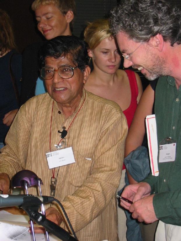
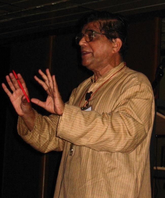
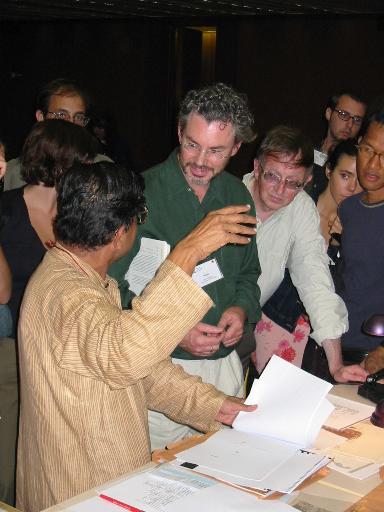
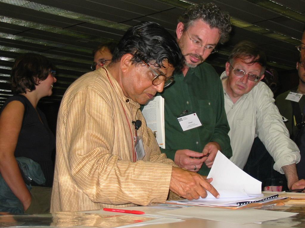
A day earlier, I managed to listen to R.K. Joshi though,
an award-winning Indian typographer and type teacher.
His presentation was spiritual and magical, interweaving
movement, silence, sound, type composition,
and Indian poetry. The audience was in awe and surrounded
the speaker
When I registered for the meeting, I was pleased
to see Hrant Papazian's name on the program. He
always has a message---his talks are never passive or
descriptive, but they vibrate and make you think. He thrives
on the shock effect. Unfortunately, it was scheduled on
the last day of the meeting, and
I had to leave Rome on that day.
A day earlier, I managed to listen to R.K. Joshi though,
an award-winning Indian typographer and type teacher.
His presentation was spiritual and magical, interweaving
movement, silence, sound, type composition,
and Indian poetry. The audience was in awe and surrounded
the speaker 
Below are a few pictures of the non-Latin track people,
including Zvika Rosenberg, a Hebrew font designer (on the left),
Hrant Papazian, our Armeno-Latin expert (on the right),
and Victor Gaultney, a type designer with SIL International,
shown here having lunch in the main auditorium.
Below are a few pictures of the non-Latin track people,
including Zvika Rosenberg, a Hebrew font designer (on the left),
Hrant Papazian, our Armeno-Latin expert (on the right),
and Victor Gaultney, a type designer with SIL International,
shown here having lunch in the main auditorium.
A type meeting in Rome would be unthinkable without
some stone cutters. Two sessions were organized
around Michael Harvey,
Richard Kindersley, Kristoffel Boudens and John Benson,
with some demonstrations to boot. The picture on the right shows Jos Geusens
(left) and Kristoffel Boudens (right), two
happy-go-lucky Belgian stone cutters, during a lunch break.
Kristoffel pushes the typographic boundaries in his craft and is
already making an impact on the international scene.
Various talks focused on the Roman incriptions
and Roman lettering.
These include talks by Cynthia Batty (shown on the left), Paul Shaw,
Sumner Stone and Michael Twyman.
Other participants told me that a tour of old Rome led by Paul Stiff was
very interesting.
Various talks focused on the Roman incriptions
and Roman lettering.
These include talks by Cynthia Batty (shown on the left), Paul Shaw,
Sumner Stone and Michael Twyman.
Other participants told me that a tour of old Rome led by Paul Stiff was
very interesting.
The
The 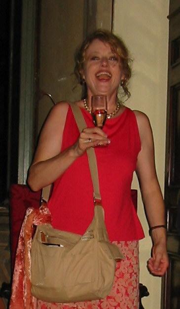
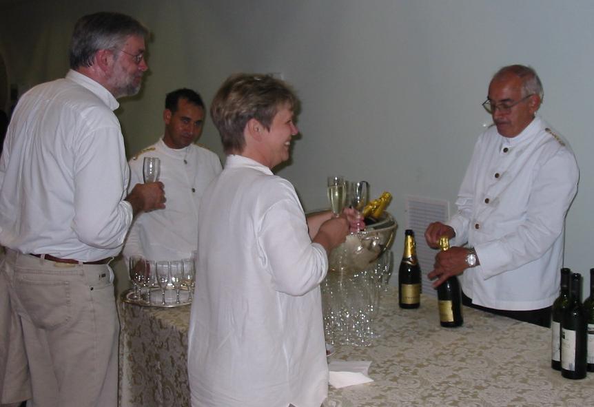
To finish, here are a few more shots of people having fun
before, during and after the various receptions,
starting with John Berry at the Prosecco bar.
To finish, here are a few more shots of people having fun
before, during and after the various receptions,
starting with John Berry at the Prosecco bar.
Continuing with Henk Gianotten, after whom Linotype Gianotten
was named, a face made by Antonio Pace, who was, as far as I could
tell, not at the meeting. Henk is the one on the right.
Continuing with Henk Gianotten, after whom Linotype Gianotten
was named, a face made by Antonio Pace, who was, as far as I could
tell, not at the meeting. Henk is the one on the right.
Here are Gillian Riley and James Mosley, who were both very active at
the meeting.
Here are Gillian Riley and James Mosley, who were both very active at
the meeting.
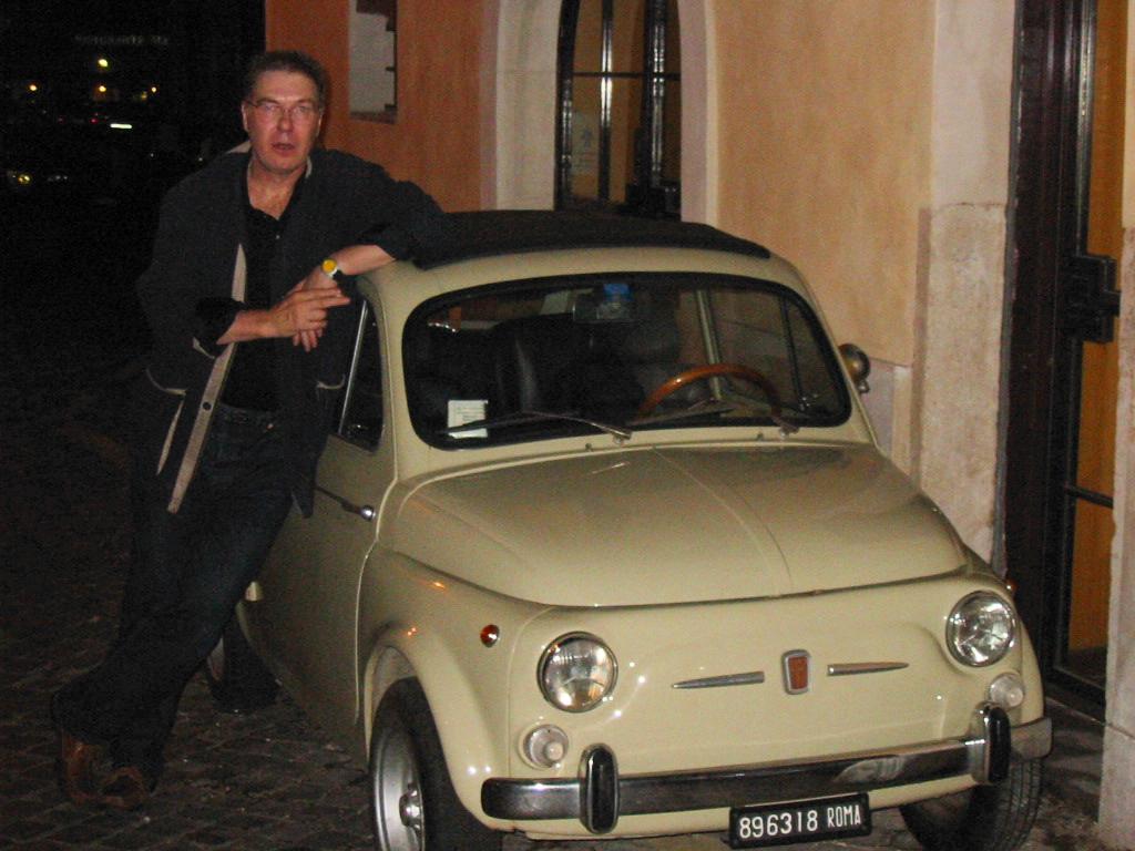
Every time I visit Italy, I take a picture like this.
The land that brings us Ferraris and Maseratis also brings
us gnome-sized automobiles. Jef Tombeur, who is not a particularly
tall fellow, still managed to strike his usual bar-style
pose on the roof of the gnome. Note the miniscule parking ticket:
I am sure the dwarf who wrote it used a 5x5 pixel font.
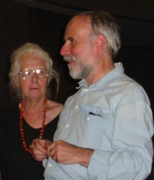
So finally, I say goodbye to my two dear companions during this
memorable event. Thank you both, Sophie and Jef, for hanging
out with an old Belgian. Arrividerci.
Every time I visit Italy, I take a picture like this.
The land that brings us Ferraris and Maseratis also brings
us gnome-sized automobiles. Jef Tombeur, who is not a particularly
tall fellow, still managed to strike his usual bar-style
pose on the roof of the gnome. Note the miniscule parking ticket:
I am sure the dwarf who wrote it used a 5x5 pixel font.
So finally, I say goodbye to my two dear companions during this
memorable event. Thank you both, Sophie and Jef, for hanging
out with an old Belgian. Arrividerci.