TYPE DESIGN INFORMATION PAGE last updated on Thu Jul 16 06:32:00 EDT 2026
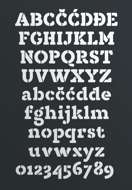
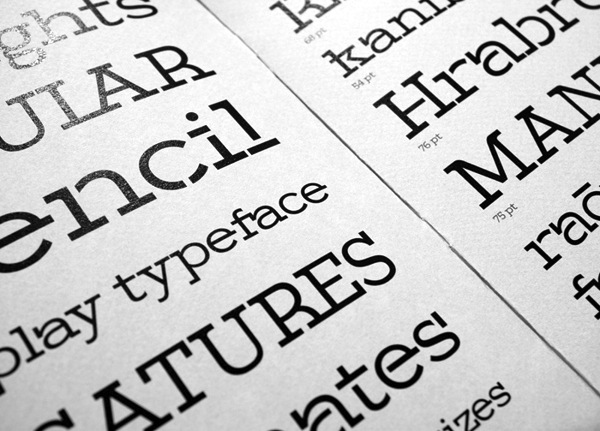
FONT RECOGNITION VIA FONT MOOSE

|
|
|
|
|
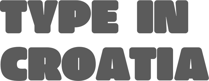
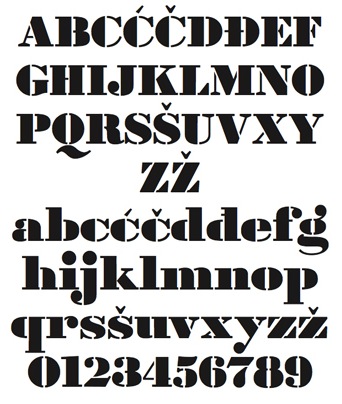
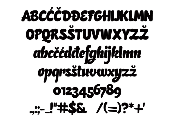
The Croatian type scene | ||
|
|
|
|
SWITCH TO INDEX FILE
Zagreb-based Croatian designer (b. 1982) of Oktober (2005, organic style) and Manu (2005, futuristic). Dafont link. [Google] [More] ⦿ | |
Alphabet Design
|
Other creations: Pixelina, Borek, Duckling, Fat Trace, Kloi (now Kloi BT (2004)), Tabita BT (2005, an informal font), and the great patterns of the Symbols font, JechoTecho. From the web site: He started working with digital fonts back in the days of bitmap fonts, sometime in 1988. At that time the studio operated in Zagreb, (former) Yugoslavia, which later became the capital of independent Croatia, under the name PixelPrint. The name changed to Abeceda Dizajn in 1992 while establishing itself as a successful typographic studio that specialized in font localization and type consulting. Abeceda Dizajn studio was the official distributor and manufacturer for Bitstream Inc. for Croatia and Slovenia from 1995 until 1997, when it relocated to Canada. Today, Alphabet Design is again a Bitstream re-seller. In 2005, Bitstream published Kloi, Borhand Tabitha, Duckling, as well as JechoTecho1 (the latter typeface was made by Evzen Jecho). Alphabet Design is donating all its proceeds of January 2005 to tsunami aid. In 2005, cartoonist Branimir Zlamalik created Smiles (dingbats) and Ulixa (comic book family). [Google] [MyFonts] [More] ⦿ |
Ana Sakac is a digital designer based in Zagreb, Croatia. She has been working for digital agency Bornfight since 2017. [Google] [More] ⦿ | |
Croatian designer of Ugly R (2011) and Ana Sparavec (2011, hand-printed). [Google] [More] ⦿ | |
Osijek, Croatia-based designer, b. 1995. During her studies at the University of Zagreb, Croatia, she created the handwriting typeface Aspades (2017). Dafont link. [Google] [More] ⦿ | |
| |
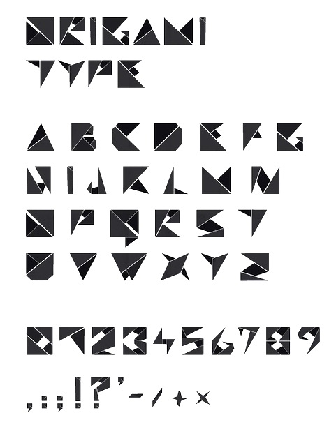
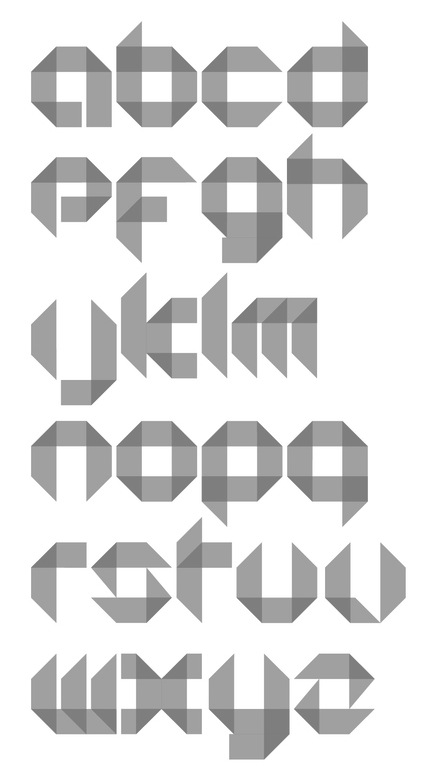
Croatian creator of Origami (2009), a paperfold typeface. Zeman lives in Zagreb, where he studies industrial design. [Google] [More] ⦿ | |
Babushke Studio
|
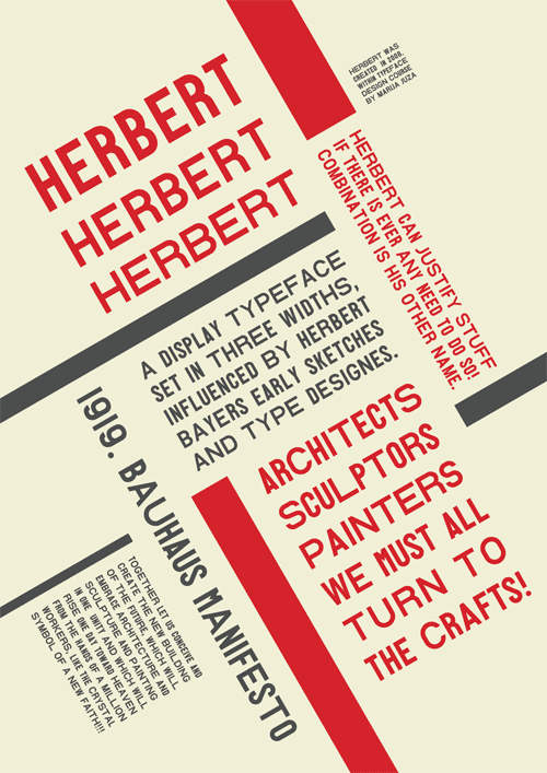
Babushke created Herbert (2012), which is based on Herbert Bayer's early Bauhaus sketches. It is a low contrast 3-style typeface whose function is to properly align text in blocks. TDC mentions that Marija lives in Zabok, Croatia. Behance link. Klingspor link. [Google] [More] ⦿ |
BAM Creative Studio (or: Shoutbam)
|
|
Boris Mahovac
| |
Split-based Croatian designer (b. 1978) of Fast Magic Marker (2007). [Google] [More] ⦿ | |
His slab serif graduation typeface Grotto (2017) plays on the contrast between industrial massiveness and catwalk aesthetics. [Google] [More] ⦿ | |
Graphic and interior designer in Zagreb, Croatia. He made FingerDraw Font (2009). [Google] [More] ⦿ | |
CheapProfonts
|
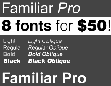
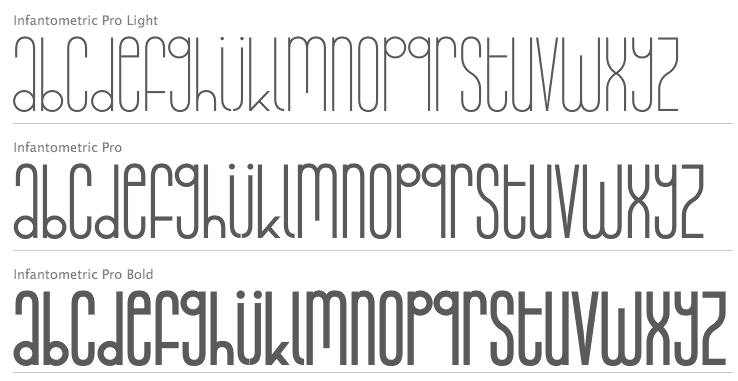
Designer at FontStruct in 2008 of cowboy_hippie and Syndrome X (DNA-look typeface inspired by Syndrome BRK by Brian Kent). Nelsson's fonts are Classic Trash BRK Pro, Dynamic BRK Pro, Galapogos BRK Pro, Genotype BRK Pro, King Cool KC Pro (kid's hand; done with Kimberly Geswein), Lamebrain BRK Pro, Matrise Pro and Matrise Text Pro (dot matrix), Phorfeit BRK Pro, Syndrome BRK Pro, Technique BRK Pro, Vigilance BRK Pro, Grapple BRK Pro. The "BRK" refers to Brian Kent, the original free font designer. In 2009, he added a number of fonts that were done by Nick Curtis some years before that (hence the "NF"): Boogie Nights NF Pro (art deco face), Copasetic NF Pro, Coventry Garden NF Pro, Pro, Fontleroy NF Pro, Hamburger Heaven NF Pro, Monterey Popsicle NF Pro, and Wooden Nickel NF Pro. Trypewriter Pro (2009) is based on Kevin King's Trypewriter. Helldorado Pro (2009) is a Tuscan wood type style typeface based on a font by Levente Halmos. Designer of Isbit Pro (2012, a magnificent melting ice cube-shaped superlliptical typeface family), Familiar Pro (2011, designed with the same metric as Helvetica but "better than Arial"), Bloco Pro (2010, fat counterless face), Trump Town Pro (2009, athletic lettering slab serif), Geometric Soft Pro (2009), Geometry Script Pro (2010, upright connected script), DIN Fun Pro (2011), Infantometric Pro (2012), Foobar Pro (2012) and Cheap Pro Fonts Serif (2009). Typefaces from 2013: Adultometric Pro (narrow monoline sans). Dafont. Fontspace link. Fontsquirrel link. Catalog of Nelsson's bestselling typefaces. [Google] [MyFonts] [More] ⦿ |
This Corel font is on Nenad Zanko's Croatian site. [Google] [More] ⦿ | |
Creative Toucan (was: Leo Supply Co)
|
Typefaces from 2014: Dabre, Handeer, Bad Land, Thron, 806 Typography (wood style didone), Rypote. Typefaces from 2015: Debeli Bridge (faded, grungy and gorgeous), Rustal, Madalen, Stiquez, Vallyns (grungy, stamped typeface), Falsthan (brush face), Areson, Summeron (brush script), Surpal Lovely (Victorian kitsch), Summer 2, Megeon (+Grunge), Dabre Grunge (textured caps). Typefaces from 2016: Taramda, Endless Script, Riot Ton, Dabre (grungy stamped style), La Tequila (Western font), Originals (painted letters), Originals is out, Avenue Drift, Amoky (sketched), Bastielle Script, Ipsum Script, Baroquey Script, Pomah Type (brush script), Vrown Fox (dry brush), Time Machino (dry brush), The Gohe Go, My Boquet Script, The Sellen, Baley Sun, Brushed Traveler, Salone Strand, Aple Time (brush), Bert Loch (brush), Brushed Car, Last and Chaos (brush), Thin Zeus (brush), Top Light (fat brush typeface), Summer Soul Script, Summter (connected script), Summdraw, Planine Script, Samtak Script, Astel Script, Rostek Old, Megiline, Sally Script, Rolley, Naila Script, Amoky (textured letterpress emulation typeface family), Reeld (dry brush typeface), Stamped Navy (textured). Typefaces from 2017: Musterion (brush script), Wolvos (rough brush), Xenos, Descolorido, Mushroom (an angulara children's book font), California Jackpot, Zondas, Codiac (rough brush), Gullias (signage script), California or California Jackpot (brush font), Rhinos Rocks (brushy), Quick Toy (inky brush script), Italiano (dry brush), Gode (thick brush), Ananas Lips, Kiwano Apple, Cup of Sea, Fly N Walk, Sign 45 (vintage grungy poster style), Jaoy, Gas Rock, Acids. Typefaces from 2018: Storehouse (a vintage all caps copperplate family with small wedge serifs; by Nicolas Massi and Leonard Posavec; it includes a stencil style), San Francisco, Quick Pick (brush), Mick's, Jumper, Alask (brush), Royal Twins, Clas (brush script), Yolloy, Scolarship (sketched). Typefaces from 2019: Planina, Athletica (letterpress style), Costa La Vista (font duo), Springs, Originals 2 (dry brush), Astana. Typefaces from 2020: Myla (a display typeface). Typefaces from 2021: Surfbars (a dry brush font for outdoors usage; also supports Cyrillic). Fontspace link. Creative Market link. Old URL. Another Creative Market link. Dafont link. Fontplanet link. [Google] [MyFonts] [More] ⦿ |
The zip file has about ten Croatian truetype fonts. [Google] [More] ⦿ | |
Hrzica Davor from Croatia showcases many dingbat fonts, including Monotype dingbats such as Df Calligraphic Ornaments, Df Diversions, and df Diversities. [Google] [More] ⦿ | |
Daggertypo
|
|
Croatian designer of Sunhawk Allcaps (2017). Graphicriver link. [Google] [More] ⦿ | |
Danijel Poldrugac
| |
Danko Thomas
| |
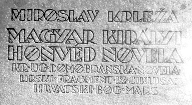
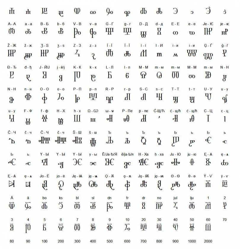
Darko Zubrinic from the Faculty of Electrical Engineering and Computing Av. Vukovar 39, Zagreb, Croatia, has created a set of TeX and METAFONT files called Croatian Glagolitic (1995-1996). It contains 367 symbols covering Croatian Glagolitic (round, angular, Baska Tablet, quickscript, about 60 ligatures, Baromic broken ligatures, calligraphic letters), Croatian Cyrillic, Stechak ornaments, and Croatian wattle patterns. See also here. The fonts are described in his paper "Croatian fonts", TUGboat, Vol. 17, 1996. This page also has links to other Glagolitic fonts. Old URL. [Google] [More] ⦿ | |
Rovinjsko Selo, Croatia-based designer of the free sci-fi techno typeface Kontakt (2016). [Google] [More] ⦿ | |
Zagreb, Croatia-based designer of the vector fonts Animal Typography (2016), Drop Cap (2016, colorful flower-themed initials) and Blurred (2016). In 2017, she designed Spring Alphabet and Modern Tribe. Behance link. Creative Market link. Her company is called Polar Vectors. [Google] [More] ⦿ | |
Croatian designer from Zagreb (b. 1957) who created the Glagolitic typefaces GlagolicaUnicode (1998) and Staroslavenski unicode (1998). These fonts can be found here and here. [Google] [More] ⦿ | |
Croatian graphic designer. She created a revival of a XVIth century ornamental caps typeface in 2010. [Google] [More] ⦿ | |
Croatian creator of the bouncy hand-printed font Zimamedia (2000, with Kresimir Zimonic). [Google] [More] ⦿ | |
Dual Type
|
Her graduation typeface in the TypeMedia program at KABK was Dalma (2018). Dalma is a carefully manicured roundish display typeface for Latin, Greek and Cyrillic. In 2019, Martin Grasser and Zrinka Buljubasic co-designed 188 Sans for And Repeat / Future Fonts. They write: The Regular weight, based loosely on Frank Hinman Pierpont's Monotype Grotesque, calls to mind early 20th century workhorse sans-serifs. Co-designer of Sunnyside (2021, Martin Grasser and Zrinka Buljubasic), a slab serif rooted in the aesthetic language of 70's California. Dribble link. [Google] [More] ⦿ |
During her graphic design studies in Zagreb, Croatia, Elizabeta Loncar created the display typeface Porque (2014). [Google] [More] ⦿ | |
Croatian designer of PX Glagolitic 01, a freeware pixel font for glagolitic script. Regalar and bold versions are available. Recommended usage size is 8pt. He also made the great free pixel family PX Sans Nouveaux (2008), about which he writes: Sans nouveaux is designed for the malcontents. [...] Sans nouveaux is serious business. Dafont link. [Google] [More] ⦿ | |
Erik Marinovich
| |
Ermin Mededovic
| |
Web and graphic designer in Bregana, Croatia, who created the square-shaped typeface Duma in 2015. [Google] [More] ⦿ | |
Croatian designer from Zagreb of the Glagolitic font Krcka glagoljska kurziva (2002, also called Kr*ka notarska *kola), a glagolitic quickscript from the island of Krk. This typeface can be found here and here. [Google] [More] ⦿ | |
Free Mac fonts in the EversonMono series for CSX, Celtic, Croatian, Cyrillic, Esperanto, Gaelic, Georgian, Greek, Icelandic, Inuktitut, Ogham, Romanian, Sami, and Turkish. [Google] [More] ⦿ | |
Fat Factory
|
Behance link. [Google] [More] ⦿ |
Zagreb, Croatia-based designer (b. 1998) of the grungy Broken Life (2009), which can be downloaded from Dafont. [Google] [More] ⦿ | |
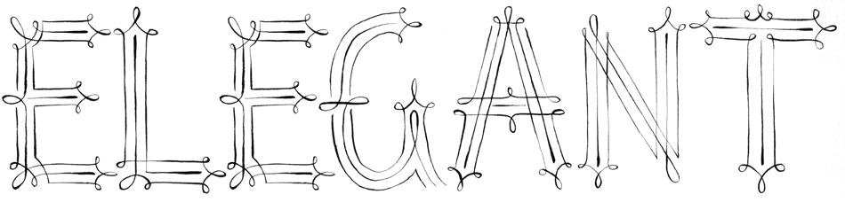
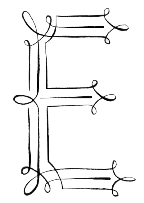
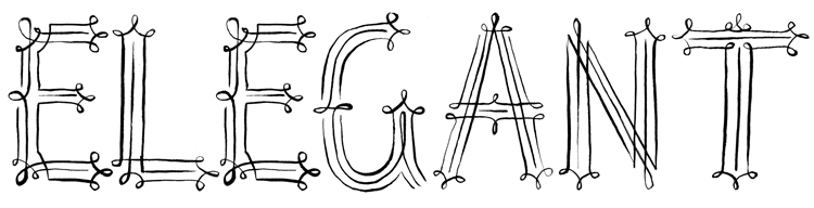
Illustrator and graphic designer in Rijeka, Croatia, who created the free handcrafted typeface Not So Elegant (2015). [Google] [More] ⦿ | |
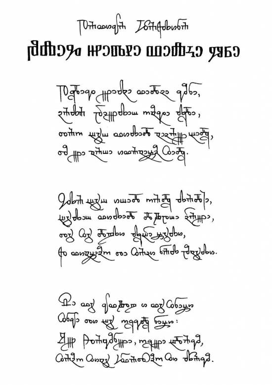
Creator of the beautiful font Epistula Croatica (2011), a Glagolitic face. [Google] [More] ⦿ | |
Filip Gjurin (Zagreb, Croatia) created the stencil typeface Gjurencil (2012). [Google] [More] ⦿ | |
Filip Karaga
| |
From Croatia, Garibaldi's 2000+ font archive with previews. A bit slow, but this direct access page will help a lot! [Google] [More] ⦿ | |
Dino Manzella's draft on a book entitled Forgotten Scripts: a Book of Runes. Fantastic pages in all respects! Many fonts can be downloaded. Includes Academiury-ITV (Georgian, by Alexander&Temuri Imnaishvili), Rashi, Alex and ChayaBold (by Aaron Schmiedel), Angelic and Enochian (by Digital Type Foundry), several rune fonts by Dan Smith, Beth-Luis-Fearn and Beth-Luis-Nion (by Curtis Clark), Cherokee (by Joseph LoCicero), Moonrune (Morton Bek, 1995), Eshmoon (by Salim G. Khalaf, Family Health International), Glagoljica UGL and Glagoljica OBL (old Croatian; by Zox), RK Meroitic, RK Sanskrit, RK Ugaritic, Mendel Siddur, Nug-Soth (by Daniel U. Thibault), Tzipporah and RuthFancy (by AFS Ltd), and RNIB Braille. [Google] [More] ⦿ | |
Gen Ramirez
| |
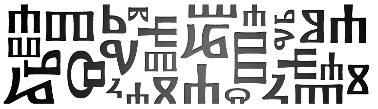
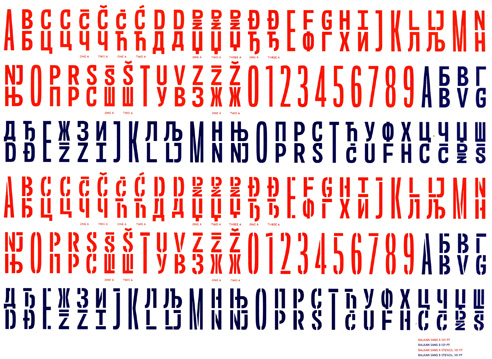
Quoting: The Glagolitic script (Glagolitsa) is the oldest known Slavic script and supposedly was created by the missionaries St Cyril (827-869 AD) and St Methodius (826-885 AD). They needed it to translate the bible and other religious texts into Old Slavic language when the Slavic world converted to Christianity. The letters were probably modeled after a cursive Greek script. With their translations which were based on a slavic dialect of the Thessaloniki area, they created the literary standard known as Old Church Slavonic. The name Glagolitic comes from the fourth letter of the script, glagol. Glagol in turn stems from the Serbo-Croatian glagoljica, from Old Church Slavonic glagolu (word). The script was also referred to as azbuka which is a generic term derived from the names of the first two letters of the alphabet. The Glagolitic script consists of 33 basic letters whose order is mainly based on the Greek script, apart from some letters that represent Slavic sounds not found in Greek language. The origin of the shape of the non-Greek Glyphs is unknown, some say they are derived from hebrew or Coptic script, but there is little evidence. The earliest documents written in Glagolitic are from the 9th century. Glagolitic was used until the 12th century and then gradually replaced by Cyrillic, sometimes Latin in liturgical uses. Only in Croatia was it used in church until the 19th century, because in 1248, the Croats had been given special permission by Pope Innocent IV to use their own language and script in liturgy. In Croatia, the rounded shapes of the Glagolitic Glyphs (seen above) also evolved into a very distinctive, more square variant which features a lot of ligatures. Today, Glagolitic is a dead script only used for research and scholarly purposes. [Google] [More] ⦿ | |
Croatian designer and illustrator. In 2010, he created Fourteen Stencil. In 2011, he made Paperfold. [Google] [More] ⦿ | |
From Croatia, V. Gaco's font editor for bitmaps (FON) on Windows. [Google] [More] ⦿ | |
Hot Type
|
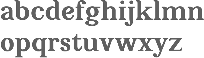
In 2016, he designed Zico and Zico Display at Rosetta Type. Earlier, in the TypeMedia program at KABK in Den Haag, he designed Bolid Slab for his graduation in 2015. That typeface was at the basis of Zico. Zico won an award at TDC 2016TDC 2016. His Punta Display (a sharply sculpted serif family with typographic features that look like they could be carved in stone) won an award at the Type Directors Club's Type Design Competition 2019. In 2021, he set up Hot Type and designed the playful serif typeface Nyck, a fun display family inspired by the equally playful work of Josef Tyfa (Tyfove Antikva) and William Addison Dwiggins. Nyck features two variable fonts as well. Other fonts from 2021 include Stroy Grotesk (a narrow grotesk newspaper sans in 12 styles billed as a contemporary interpretation of nostalgia) and Stroy Mono. Tumblr link. Twitter link. Future Fonts link. Personal home page. [Google] [More] ⦿ |
| |
His typefaces:
| |
Free font manager (about 1MB zipped) from ZIK in Zagreb, Croatia. Alternate site. Windows software. MacOS version under development. Alternate URL. [Google] [More] ⦿ | |
iDEA2Design
| iDEA2Design is Danko Thomas' outfit in Croatia. He has some fonts, but I could not locate them. Alternate URL. One font is called identity (2002). [Google] [More] ⦿ |
Mini-archive with the Belwe family (Bitstream, tuned for East European by MAJUR Ltd., Zagreb, Croatia, 1995), as well as Bernhard Modern. [Google] [More] ⦿ | |
Inkclear
| Luis Carlos Redondo (Inkclear) is an art director, illustrator and designer in Zagreb, Croatia. He made the heavy slab serif headline typeface Heavyweight (2011). We find him a couple of years later back in Barcelona. In 2013, he helped organize a multi-designer ornamental caps typeface called Simpl3. Behance link. [Google] [More] ⦿ |
Croatian designer (b. 1987) of the childish handwriting typeface Madness (2008), also called Kai's Hangover Truetype Font. [Google] [More] ⦿ | |
Graphic designer in Zagreb, Croatia, who made the typeface Shkowaca in 2012. [Google] [More] ⦿ | |
Zagreb, Croatia-based creator of the school project sci-fi typeface Aero (2013). [Google] [More] ⦿ | |
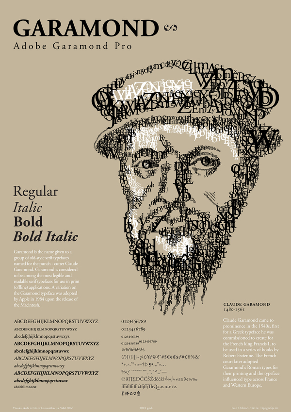
Croatian graphic designer in Zagreb who made a great Adobe Garamond Pro poster in 2010. [Google] [More] ⦿ | |
Ivana Bacanek
| |
Graduate of the University of Zagreb, class of 2013. She created an unnamed hand-drawn typeface in 2013. [Google] [More] ⦿ | |
During her studies in Umag, Croatia, Ivana Katarina Milinkovic created the text typeface FuseType (2016). [Google] [More] ⦿ | |
Ivana Ziljak is a graphic designer who teaches at the Faculty of Graphic Arts, Department of Typography, in Zagreb, Croatia. she has designed type and is working towards a doctoral degree. [Google] [More] ⦿ | |
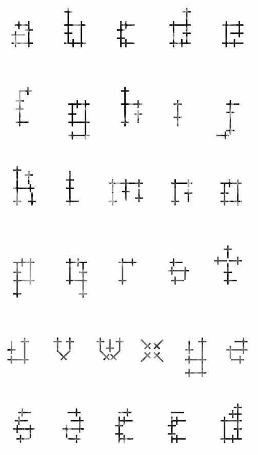
Split, Croatia-based designer and illustrator at the Academy of Art in Split, who created a typeface out of crosses called Crosses (2012). Behance link. [Google] [More] ⦿ | |
Archive with the Monotype families Courier New CE, Times New Roman CE, Arial CE. Also, Lucida Sans, and a Swiss family (type 1), adapted by Tefik Becirovic, Zagreb, for use in East-European languages. Link went dead. [Google] [More] ⦿ | |
Jimbo Bernaus
| |
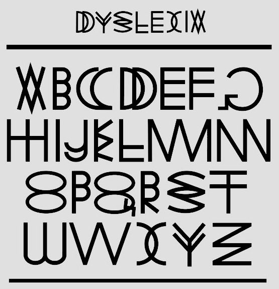
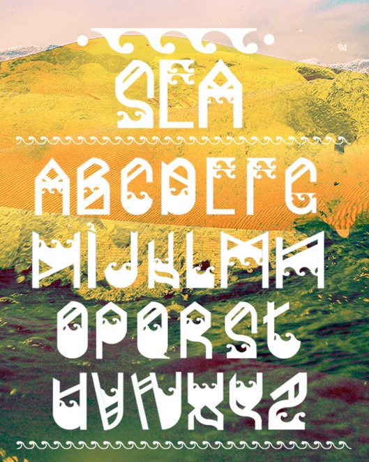
During his studies in Zagrebacka Dubrava, Croatia, Josep Drdic created an experimental typeface called Dyslexia (2013). He also created the decorative typeface Sea (2013). [Google] [More] ⦿ | |
Zagreb, Croatia-based designer of the ultra-contrasted ABC Art Typeface (2012). [Google] [More] ⦿ | |
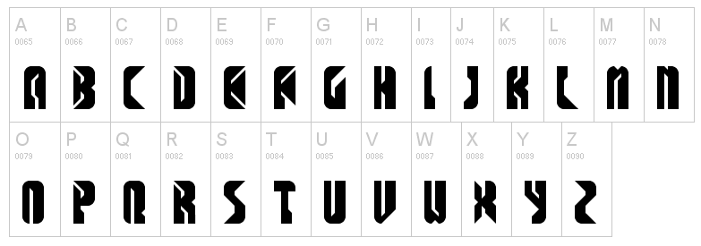
Zagreb, Croatia-based designer of these modular display typefaces in 2015: Mountain, Daggers, Stronghold, Harakiri, Lionheart, Beatdown, Elk, King. In 2017, he designed Kjub (squarish) and Kanelira (ultra-condensed). [Google] [More] ⦿ | |
| |
Klaudio Pap (PhD) is assistant professor in the Faculty of Graphic Arts teaching Computer Typography, Computer graphics and Computer programming. He also teaches Design and Computer reprophotography, Computer Typography and at the Polytechnic of Zagreb he teaches Web Search and Navigation, Web Interactive Programming, Graphic software Languages and Digital Printing. Klaudio has been engaged in research and development in the areas of computer graphics, image and text processing, modeling and simulation with computers, web technologies, digital printing and graphic software languages. He is co-author of two books and has published more then 30 scientific papers. He has co-authored development and software packages and has taken active part in research projects being head in three of them. Since February 2005 he is associate member of the Croatian Technical Science Academy. At ICTVC 2007, he spoke about Development of PostScript Procedures for Transformations of Digital Typography. [Google] [More] ⦿ | |
Croatian creator of the bouncy hand-printed font Zimamedia (2000, with Drasko Ivezic). [Google] [More] ⦿ | |
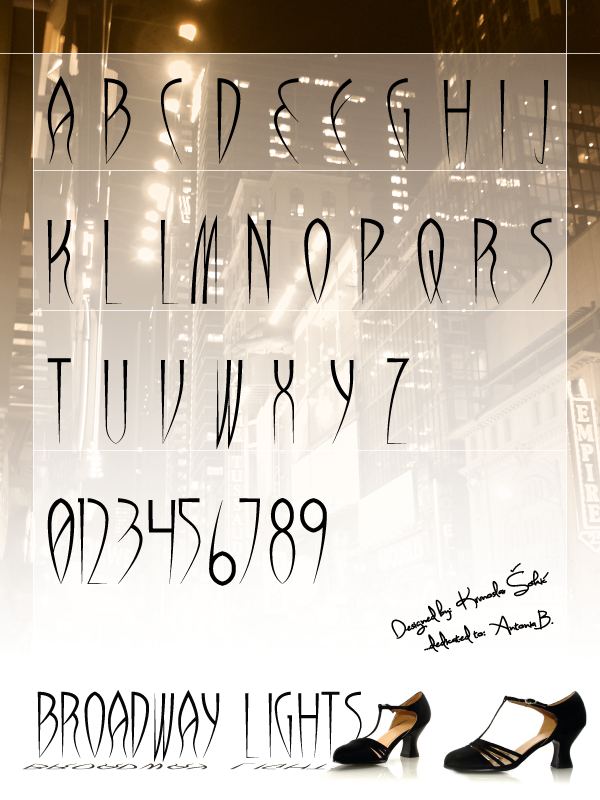
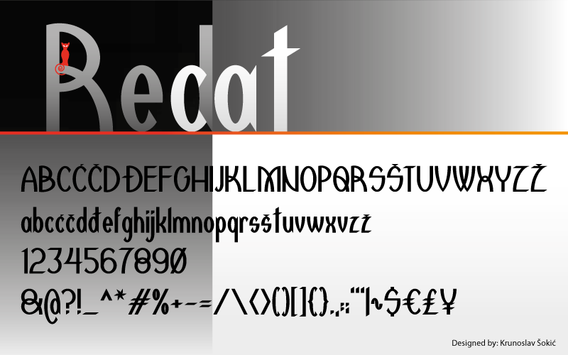
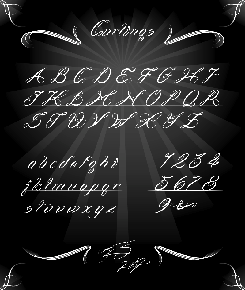
Typefaces created in 2012: Redcat, Wrong Ink (ink run face), Curlings (curly script). Typefaces from 2015: Differentiator (free rounded hexagonal typeface). Devian tart link. Klingspor link. Home page. [Google] [More] ⦿ | |
| |
Croatian designer of the sci-fi typeface Aerospace (2019). [Google] [More] ⦿ | |
| |
Leonard Posavec
| |
| |
Lettermin Type Foundry (was: Ermin Design)
|
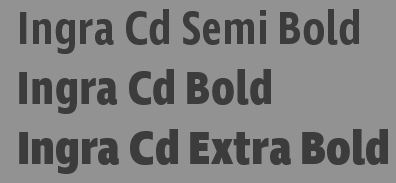
At Plazm he published Centrifuga (1996), Board (1995). In 2005, he finished the design of a 40-style a typeface family for Delo, one of the leading Slovenian daily newspapers. In 2014, he created Lipa Agate (Type Together), a workhorse sans serif for use in very small type sizes. Similarly, Ingra (2015) is a 30-style sans family designed for use in magazines, with weights ranging from hairline to extra bold. In 2016, Ermin published Fino, Fino Sans and Fino Stencil at Type Together, which advertizes is as a dramatic, contemporary family that scales beyond the world of looks by tapping into archetypes. It amplifies the most theatrical aspects of the Didone, while bringing an uncommon flexibility of style and variation to any type palette. Tall and stately, this is a caps-only typeface system. In 2019, Omar sans was retired by Typotheque and Mededovic rejuvenated this octagonal design as Edge Sans. In 2021, he added Edge Slab. [Google] [MyFonts] [More] ⦿ |
Graphemica is the work of Luca Bresolin, an Italian graphic designer currently based in London and Zagreb. He created typefaces such as Mio Display (2016) and OCR-A Extended (2016, which covers English, Greek, Cyrillic, Arabic and Hindi). Behance link. [Google] [More] ⦿ | |
Luis Carlos Redondo
| |
Croatian designer of this border type font (2005). [Google] [More] ⦿ | |
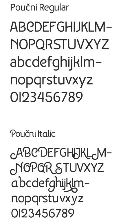
Luka Peric studies design at the University of Zagreb. In 2012, he created the stencil serif type family Thea, as well as Poucni Sans (developed under the guidance of Nikola Djurek), which has hints of art deco. [Google] [More] ⦿ | |
Croatian designer of the handcrafted typeface Lucky First (2018). [Google] [More] ⦿ | |
A Croatian company that sells East European fonts based on Bitstream originals. The 1600 TrueType font CD sells for 78 dollars. Bitstream fonts with East-European details. Check also here. [Google] [More] ⦿ | |
Marija Juza
| |
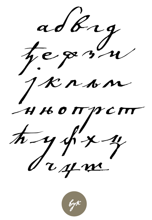
Creator of the Cyrillic typeface Vuk (2012), which is named after and based on the handwriting of Vuk Stefanovic Karadzic, a Serbian philologist and linguist who was the major reformer of the Serbian language. In 2015, Vedran Erakovic and Marija Rnjak finally published Vuk at LatterPalette. Thanks to some OpenType features, this typeface does a good job at emulating real handwriting. In 2016, Marija designed the didone typeface Nocturno BG (Latin and Cyrillic) at Tipometar. [Google] [More] ⦿ | |
Mare Rajcic is an art director and graphic designer located in Zagreb, Croatia. In 2011, she created some logotypes, as well as a paper-fold typeface. Behance link. [Google] [More] ⦿ | |
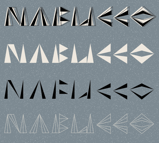
During her studies under Nikola Djurek at the School of Design in Zagreb in 2010, Marina Jukic designed an experimental layered font, Nabucco. She writes: Nabucco is a revival typeface taken from a poster for Giuseppe Verdi's opera Nabucco Boris Bucan made for the Croatian National Theatre in Split. Boris Bucan is a renowned artist, painter and graphic designer from Croatia, famous for his peculiar approach in designing posters for cultural events. This silk-screen poster was made in 1983, and it was most likely inspired by Babylonian art and cuneiform script. The use of silk-screen caused a slight shift in printing of these bichrome letterforms, which was an inspiration for designing a layering font that contains two layers taken from the poster and an outline construction layer that provides many ways of combining them. [Google] [More] ⦿ | |
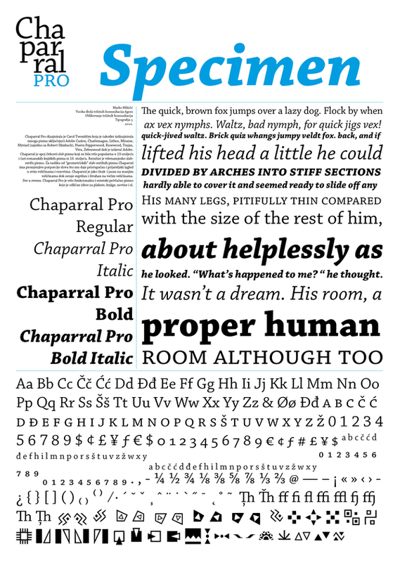
Rijeka, Croatia-based illustrator and graphic designer. Creator of a poster for Carol Twombly's 1997 font, Chaparral (2010). [Google] [More] ⦿ | |
Marko Dugonjic
| |
Marko Hrastovec
| |
Illustrator, photographer and web artist from Osijek and Zagreb, Croatia, b. 1985. In 2010, he obtained an MA degree in Visual communications from the University in Zagreb, Faculty of Architecture, School of Design, and attended a Type@Cooper program in the summer of 2014. He founded the creative studio Marivo. Marko created the fat rounded counterless font Slukoni-Medium (2009), and the anorexic monoline typeface Obli (2010). In 2013, he designed Gross (grotesk caps, modeled after house lettering seen in Opatija, Croatia). In 2015, he made the calligraphic sans typeface Acadia, which was started at Type@Cooper. In 2016, he published Knifer (squarish and varying in width from 100 to 600). Dafont link. Kernest link . Klingspor link. Font Squirrel link. Abstract Fonts link. Behance link. Klingspor link. Creative Market link. [Google] [More] ⦿ | |
Croatian graphic designer and photographer, b. 1985, who lives in Osijek. He created the modular typeface Tea Leaf in 2009. Behance link. Dafont link. [Google] [More] ⦿ | |
Croatian designer of Pixel Madness (2018). [Google] [More] ⦿ | |
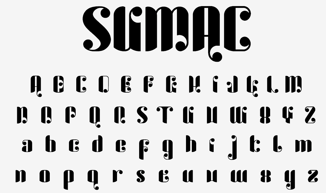
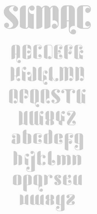
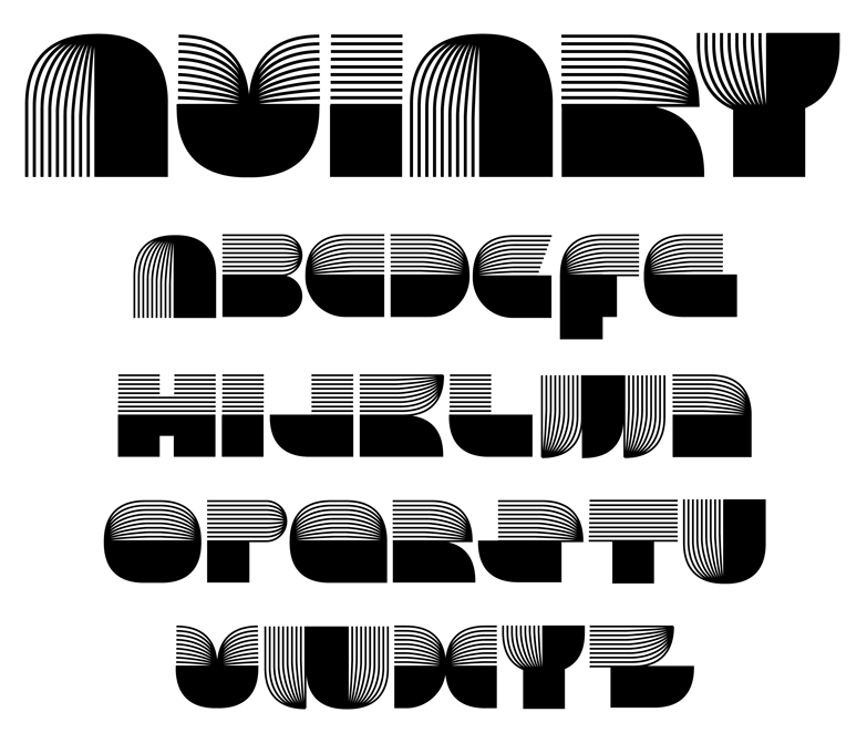
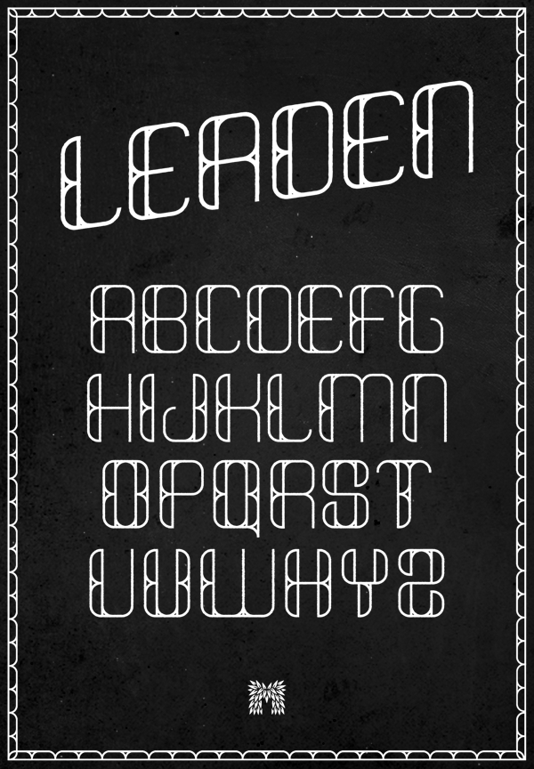
American graphic designer in Rijeka, Croatia. Designer of the ball terminal face Sumac (2010), the prismatic typeface Aviary (2011), Minor Slab and the self-described badass sans typeface On Ramp (2011, Lost Type), Leaden (2012), Anchor (2012). Behance link. Creattica link. Devian Tart link. [Google] [More] ⦿ | |
During her studies in Zagreb under Nikola Djurek, Michelle Kovacevic designed the rebellious typeface Aleksandar (2017) and the squarish typeface Wanted (2017). [Google] [More] ⦿ | |
Mico Samardzija
| |
Designer in Zagreb, Croatia, who made the vector format hexagonal or octagonal typeface Deergraphy (2013). Behance link. [Google] [More] ⦿ | |
Croatian designer of the hand-printed typeface Mihaela Borak (2011). [Google] [More] ⦿ | |
Two free Croatian TrueType fonts: GlagoljicaUGLStaroHrvatskoPismo, Glagoljica_IIIstaroMakedonskopismo. [Google] [More] ⦿ | |
Milatype
|
|
Milo Dominik Ivir
| |
Milo Typografik
| Milo Dominik Ivir is a Croation graphic designer and type designer, born in Zagreb in 1968. He worked at the Institute of Print Technology and Planning in Berlin, and started Milo Typografik. Check his essay "Schrifttechnologien und Bildschirmtypografie". His typefaces: Agram (2000), Aramaica (1997), AvantHighBook (1997), Bonbon (1998), CorinnaHand (1999), Delirious (1998), GirlsAndBoys (1997), Gotharda (1997, a blackletterish headline face), Kaptol (1997), LexikaBold, Pianissimo (1998), Poster-Inline (1997), Poster-Outline (1997), Samantha (1997), StariGrad (1998), StephenHand (1997), Zagreb. His families: Factory (1997), FactoryBroken (1997), Klavir (1997), KlavirCaps (1997), Milo-Inline, Milo-Outline, Screen14 (1998), Screen14Bold (1998). He joined Linotype in 1999 where he had already published his blackletter font Linotype Gotharda (1997). FontShop link. Klingspor link. [Google] [MyFonts] [More] ⦿ |
Klingspor link. Linotype link. [Google] [More] ⦿ | |
Designer in Zagreb, Croatiam who created Quentin (2016), a typeface revival, at the School of Design, Zagreb. It uses a combination of the old Badel comapany logo and custom lettering from old Yugoslavian books. [Google] [More] ⦿ | |
| |
Type designer in Zagreb, who created the flowing serif typeface Adria SPL (2012). These fonts were extended / expanded into Arexil (2017). [Google] [MyFonts] [More] ⦿ | |
Croatian designer, b. 1993, of the beach dingbat font Pikto Tea (2015). [Google] [More] ⦿ | |
Born in 1971 in Zagreb, Croatia. Graduated on Academy of Fine Arts in Zagreb, where she now works as an assistant. Simultaneously, she is doing a masters degree at ALU, Ljubljana, Slovenija, specializing in Visual Communications Design. Winner of an award at the 2005 FUSE type competition with her experimental security-oriented typeface "Monitoring". Digital reviver of the nice angular glagolitic font family Vrbnik Missal style (angular glagolitic, 1456) consisting of GLAG_1 (1995) and NIKI_l (1995). These fonts can be found here. [Google] [More] ⦿ | |
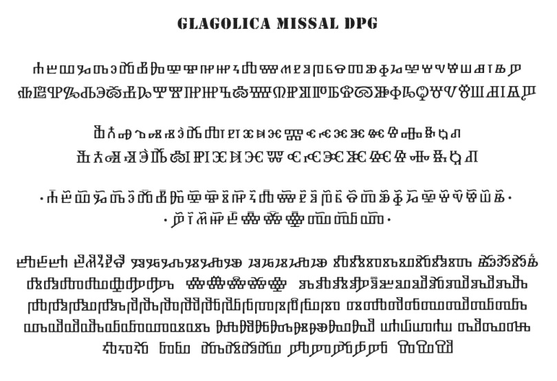
Nenad Hancic (Glagolitica Fonts&Co) specializes in Glagolitic. He created two fonts, Croatica (2009), and Glagolica Missal DPG. The lower case letters of Glagolica Missal DPG are based on Missal from 1483, while the capital letters are based on those of Transit of St. Jerome from 1508. Nenad lives in Duesseldorf, Germany. [Google] [More] ⦿ | |
Under the mentorship of Marko Hrastovec and Andrija Mudnic, Zagreb, Croatia-based Neva Zidic designed the angular typeface Abricot (2018). [Google] [More] ⦿ | |
Nikola Djurek
| |
Croatian designer of the handcrafted typeface Croatica Bold (2017) and Quick Latin (2017). Creative Market link. [Google] [More] ⦿ | |
During her graphic design studies in Zagreb, Croatia, Nina Ivanovic designed the typewriter-style typeface Baraka (2013, +Stencil). [Google] [More] ⦿ | |
Nino Bodac
| |
Nuform Type Foundry
|
In 2015, he designed the retro Viktor Script with James Edmondson at Oh No Type. At Future Fonts, he published Brzo (2020: a display typeface inspired by the boldness of 90s basketball graphics), the reverse stress typeface Jaws (2018) and the vintage typeface Hermanos (2018-2021). He writes: Hermanos is a dedication to the hand painted signs found in the mission district of San Francisco. Its flared serifs, narrow stature and cheerful spirit make Hermanos a perfect compliment for packaging, restaurants and editorial headlines. Designer of Ozik (2022), a bizarre four-weight display typeface that pays homage to the iconic lettering featured on Black Sabbath's Vol.4 album. Future Fonts link. [Google] [More] ⦿ |
Born in Zadar, Croatia, Olja Mandic moved to Belgrade, Serbia, in 1991. In 2014, he designed the techno typeface Neutrino. Behance link. [Google] [More] ⦿ | |
| |
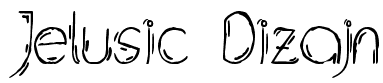
Croatian designer (b. 1990) of Jelusic Dizajn (2011) and Jelusic Rukopisni (2011). [Google] [More] ⦿ | |
| |
Rijeka, Croatia-based creators of the stone cut style font CarFont (2015), which is used in the magazine Artip. Behance link. [Google] [More] ⦿ | |
This is the now defunct foundry of Boris Mahovac in Zagreb that produced a number of knock-off fonts between 1992 and 1995, such as Addressans_PP, Baskwille_PP, Candidate_PP, Cavalier_PP, Centrepiece_PP, FuturSans_PP.ttf GarantiquaBlack_PP, Garantiqua_PP, Handy_Script_PP, HelveticaHeavy_PP, Lubaline_PP, OptiMistik_PP, Pixies_PP, RomanExtraPP, Universans450_PP, Universans570_PP, and Universans670_PP. Since that episode, Boris Mahovac became a member of TypeRight, an organization that has as its goal the protection of typefaces (including, I guess, protection against knock-offs). [Google] [More] ⦿ | |
Croatian designer of the psychedelic typeface Blow (2010). [Google] [More] ⦿ | |
Zagreb, Croatia-based designer (b. 1991) of the hand-printed outline typeface Fontdizajnesrki (2011) and of Rober (2011). [Google] [More] ⦿ | |
Zagreb, Croatia-based designer of the monolinear handcrafted typeface Lumie (2020). [Google] [More] ⦿ | |
Roger S. Nelsson
| |
In 2014, he designed Réal, a fashion mag typeface family (Homme, Serif, and Femme) that is imagined as a custom type for Yves Saint Laurent. Réal Serif is a lapidary typeface, while Réal Homme is a contrasted almost Peignotian sans typeface. [Google] [More] ⦿ | |
Croatian, b. 1986, who made the handwriting font Tena (2005). [Google] [More] ⦿ | |
Marina aka Selina Huber grew up near Pula in Croatia, and applied graffiti on cows and sheep as a youngster. She is now based in Zagreb and Amsterdam. Behance link. She designed the Kanzlei typeface Son of Bach (2012), which permits layering. [Google] [More] ⦿ | |
Zagreb, Croatia-based designer of Baboo Sans (2016), a font finished during her studies at the University of Zagreb's Faculty of Architecture. In 2017, she designed Paona Slab under Nikola Djurek. [Google] [More] ⦿ | |
Based in San Francisco. Creator of the Tuscan typeface Stari Grad (2014), which was inspired by Dubrovnik, Croatia. Behance link. [Google] [More] ⦿ | |
| |
Tapatipo
|
Rabar Ultra Black (2015) also won an award at Tipos Latinos 2016. Winner at Tipos Latinos 2018 of a type design award for Victus (2016), which is a Venetian typeface with all the warmth and calligraphic DNA from the renaissance era. In 2018, he graduated from the TypeMedia program at KABK in Den Haag with a sans typeface called Entorno Sans. It includes a variable font intended for signage systems in urban and virtual spaces, and comes with a stencil style and many wayfinding icons. That same year, he published Elba. Gen runs the type and graphic design studio Dual Type with Zrinka Buljubasic. [Google] [More] ⦿ |
| |
Typetester
| On-line screen font tester, written by Marko Dugonjic (Croatia). [Google] [More] ⦿ |
Typofactura
|
|
Typonine
|
Typotheque link. MyFonts page. Alternate URL. FontShop link. Behance link. Speaker at ATypI 2013 in Amsterdam and at ATypI 2014 in Barcelona. In Amsterdam, he presented a system that weds Latin and Cyrillic scripts. The chronology of his typefaces:
MyFonts page. Alternate URL. FontShop link. Behance link. Klingspor link. [Google] [MyFonts] [More] ⦿ |
Val Kalinic
| |
| |
His typefaces include Skockana (2003), Slovit (2003, an interpretation of the Cyrillic version of the Renaissance cursive), Narator (2003). Koledar (2004), Cyrillic versions of Champion and Magna (2008), Orden (2010), and Adamant BG (2009, a sturdy Cyrillic family). Besides Adamant Sans BG, he designed PF Adamant Pro (2010, Parachute: +Cyrillic). Still in 2010, PF Adamant Pro was awarded Third Prize in the Granshan 2010 competition for Cyrillic text typefaces. PF Adamant Sans Pro followed in 2015, after winning an award at Granshan 2014. In 2015, Vedran Erakovic and Marija Rnjak co-designed the handwriting font Vuk, which is named after and based on the handwriting of Vuk Stefanovic Karadzic, a Serbian philologist and linguist who was the major reformer of the Serbian language. Thanks to some OpenType features, this typeface does a good job at emulating real handwriting. In 2017, he designed the sans serif typeface Stena, which is characterized by deep sharp ink traps and a large x-height. In 2018, he published Ana, a layered set of decorative capitals. MyFonts link. Free downloads here. Behance link. Klingspor link. Abstract Fonts link. [Google] [MyFonts] [More] ⦿ | |
Croatian Masters student in graphics technologies and engineering in Zagreb, 2010-2011. He created the modular display typeface Fade (2010) which makes creative use of ball terminals. Quarity (2011) is an experimental labyrinthine face. In 2013, during his doctoral studies at the Faculty of Arts in Zagreb, he created Touch, a piano key typeface on a didone base. [Google] [More] ⦿ | |
VIDI Visual Design Studio
|
|
During her studies, Vita Vrebac (Zagreb, Croatia) designed the packaging typeface Niba (2016). [Google] [More] ⦿ | |
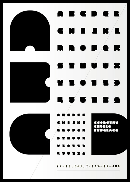
Graduate from Polytechnics University in Zagreb, and student at the New York Online School for Design. He created the fat counterless typeface Geometry Circle (2010). MyFonts link. Vjeko Sumic Design Studio, located in Serbia. Klingspor link. Behance link. Vand Studio link. [Google] [MyFonts] [More] ⦿ | |
Koncar is a visual artist and designer born in 1979 in Bjelovar, Croatia. He lives in Zagreb where he works as art director, information architect and designer at the multidisciplinary design studio Revolucija, which he co-founded in 2004. He is into experimental typography, by which he means that he creates alphabets (not fonts) out of objects. [Google] [More] ⦿ | |
Half Serb, half Croatian Vladimir Radibratovic studied architecture before falling in love with the visual arts as a student of painting and illustration at the Academy of Applied arts in Belgrade of two prominent calligraphers, Stjepan Fileki and Alexandar Dodig. He moved to Athens, Greece, to work as a calligrapher. At Parachute, in 2021, he released three calligraphic typefaces for Latin, Greek and Cyrillic, PF Rafskript (original design between 2000 and 2003), PF Signskript (for packaging and sign painting; originally done between 2000 and 2003) and PF Mediterra (unconnected; first designed between 2000 and 2003). [Google] [MyFonts] [More] ⦿ | |
| |
VP Type (or: VP Pixel Fonts)
|
In 2020, Val released Medieval Pixel VP, Technical Rounded VP, the 10-style squarish techno font family Technical Standard VP and Technical Stencil VP. Twitter link. Fontshop link. [Google] [MyFonts] [More] ⦿ |
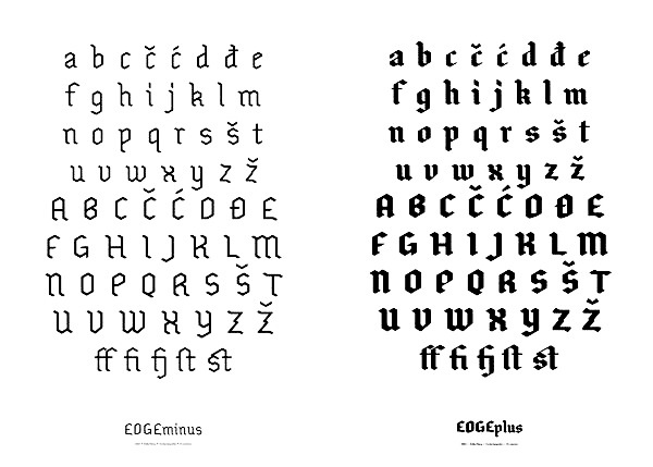
During his studies in Zagreb, Croatia, Zeljko Simeg created the blackletter typeface Edge (2013). [Google] [More] ⦿ | |
Croatian designer (b. 1973) of the round and angular Glagolitic fonts Glagoljica-IIIstarohrvatskopismo, GlagoljicaUGLStaroHrvatskoPismo in 1995. These typefaces may be found here and here. Alternate URL. [Google] [More] ⦿ | |
Zrinka Buljubasic
|


 In Nikola Djurek's type design class in Zagreb, Andrea Franic created the large x-height titling typeface
 Zagreb, Croatia-based designer of Flor (2019: a layerable floral font), Valent (2019, vintage logo style) and Fog Type (2017).
  Croatia-born graduate of School of Design in Zagreb and the
  Started in 2008, this web place by Norwegian entrepreneur Roger S. Nelsson (based in Honningsvåg, Norway) sells fonts by Ray Larabie, Brian Kent, Nick Curtis, Derek Vogelpohl and Kevin King that were originally freeware fonts. Nelsson reworked them (more glyphs, more multilingual) and asks about 10 dollars per font now. He says his fonts now cover these Latin languages: Afrikaans, Albanian, Basque, Belarusian (Lacinka), Bosnian, Breton, Catalan, Chamorro, Chichewa, Cornish, Croatian, Czech, Danish, Dutch, English, Esperanto, Estonian, Faroese, Filipino (Tagalog), Finnish, French, Frisian, Galican, German, Greenlandic, Guarani, Hungarian, Icelandic, Indonesian, Irish (Gaelic), Italian, Kashubian, Kurdish (Kurmanji), Latvian, Lithuanian, Luxembourgian, Malagasy, Maltese, Maori, Northern Sotho, Norwegian, Occitan, Polish, Portuguese, Rhaeto-Romance, Romanian, Saami (Inari), Saami (Lule), Saami (North), Saami (South), Scots (Gaelic), Serbian (latin), Slovak(ian), Slovene, Sorbian (Lower), Sorbian (Upper), Spanish, Swedish, Tswana, Turkish, Turkmen, Ulithian, Walloon, Welsh, Yapese.
 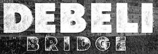 Cakovec, Croatia and Washington Park, WA-based designer (b. 1995) of preponderantly grunge typefaces. In 2013, he created Funny Classic, Lion Pro, Lover, War is in the Air (military stencil), Aussen (squarish), Ensione (outlined), Rangle, Gaon, Momgers, Escapea (athletic lettering),
  Daggertypo is a small type foundry based in Split, Croatia, founded by Nino Bodac in 2019. Typefaces:
 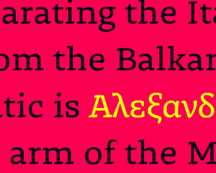 Originally from Croatia, she studied Visual Communication Design Bachelor and New Media Design Masters at Art Academy of Split, after which she pursued typographic education by attending Type@Cooper Condensed Program in New York and later at TypeMedia Masters of the Royal Academy of Art, The Hague, The Netherlands. She worked for a decade as a graphic and digital designer. Zrinka runs the type and graphic design studio Dual Type with Gen Ramirez.
  [
[ [
[ Designer in Zagreb, Croatia. Creator of the avant garde hipster typeface Non Bell (2014) and the monoline sans typeface Alex (2014). Over at
  [
[ Ex-student of Nikola Djurek at the School of design in Zagreb, class of 2014. At
  Graphic design student in Zagreb, whose mentor is Nikola Djurek. Under Djurek's guidance, he created a few script typefaces, included the plump
  Graphic designer from Zagreb, Croatia where he graduated with an MA from the School of Design. He is a graduate of the
  [
[ Graphic designer in Zagreb, Croatia. He created these stencil typefaces:
  Croatian designer (b. 1988) of the geometric art deco typeface
  Freelance graphic designer in Zagreb, Croatia. She made the devilish blackletter typeface
  Varazdin, Croatia-based student-designer of the angular and very legible text typeface Garud Serif (2015), and of the monospace display typeface Tekt (2015). In 2017, she designed Modra (a serifed typeface) and Alfru. [
 Zagreb, Croatia-based designer of the display typeface Mediteraneo (2017). [
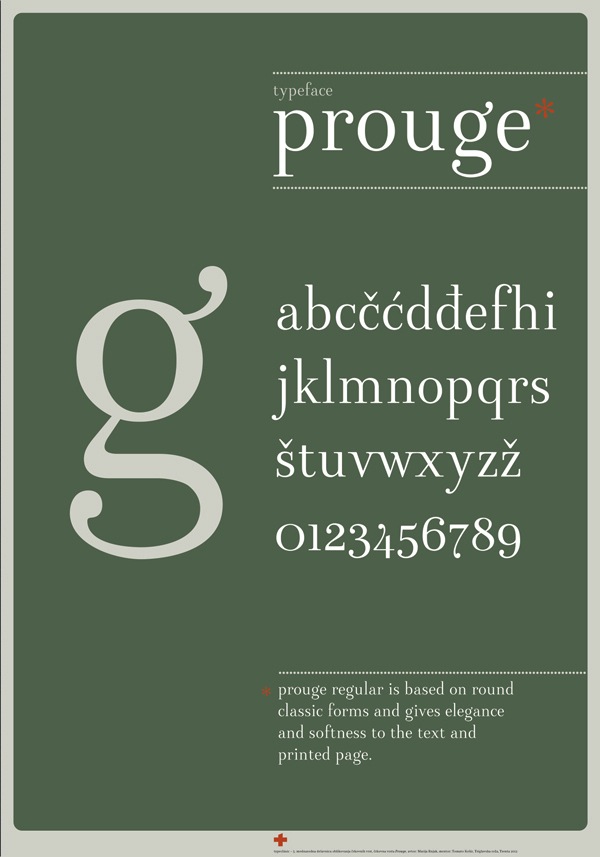
 Croatian designer who lives in Ljubljana. He is owner and type designer at Lettermin (since 2012) and design director at Delo Publishing House. Creator of fonts such as Board, Counter (dot matrix), DeeDot, Dirty Karlson, Dope, EnfontTerrible (grunge), Exer, Fractual (Fraktur), Frizider (connected 50s style lettering), Gliberto, Jogurt Pi, Kelih, Latirilica, Malomorgen (Fraktur), Manifestina, Ministry of Defense, NoBodyType, Omar Sans and Omar Sans Plus (1999, Typohteque), Pope-Regular, PopeInline, Siscia, Sugestica, Tune, Telekom Pi, Video-Flat.
  Croatian calligrapher and type designer, based in Belgrade, Serbia. Graduate of the Faculty of Applied Arts in Belgrade. During
  [
[ Zagreb, Croatia-based designer, b. 1982, Zagreb. Graduate of The School of Applied Arts and Design in Zagreb, class of 2000. In 2021, he designed
  Croatian lettering srtist. Designer of
  New York City-based
  [
[ Erik Marinovich (Croatia) ran/runs
  Croatian graphic designer in Zagreb who made a stunning
  Graduate of the Faculty of Architecture, University of Zagreb, Croatia. Zagreb-based architect and designer. Creator of the fat didone typeface Eva (2017), which was renamed
 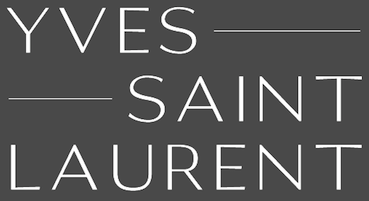 Zadar and/or Zagreb, Croatia-based designer. Creator of
  Zagreb, Croatia-based designer of the great artsy ultra-fat Niki Mill (2019). [
 Designer and lettering artist in Guadalajara, Mexico (and/or Split, Croatia?), who created the Mexican diner signage script typeface Tejuino (2015) and the informal sans typefaces Taqueta, Rabar and Festa, all made in 2015. Astro Regular (or Astro MX) (2015) by Gen Ramirez, Manuel Lopez (with assistance of Rodrigo Heredia and Rodrigo Nuñez) won an award at
  Split, Croatia-based designer of the warm revival typeface
  Type designer in Croatia. His typefaces include
 Zagreb, Croatia-based designer of the ultra-fat typeface Rockflick (2015), Pirate Glyphicons (2015), and the Roman capitals typeface Dafnis (2015). [
 Serbian designer who lives in Belgrade. He was born in 1980 in Split, Croatia. In 2009, he obtained a Masters in Applied Graphics from the University of Arts, Belgrade. He works as an Art editor in the Serbian daily newspaper Politika, and also collaborates with FontShop. In 2017, he set up
  Croatian designer of
  [
[
|
|
|
|