TYPE DESIGN INFORMATION PAGE last updated on Mon Apr 13 05:45:22 EDT 2026
FONT RECOGNITION VIA FONT MOOSE
|
|
|
|||||||||||||||||||||||||||
|
The best commercial typefaces of 2021: Luc's selection
This is my own selection of the best commercial typefaces published in 2021, grouped by category. The list will grow until December 31, 2021.
|
EXTERNAL LINKS | |||||||||||||||||||||||||||
| | | |||||||||||||||||||||||||||

file name: Diab Jaser Awesome Pro 2021

file name: Diab Jaser Awesome Pro 2021

file name: Diab Jaser Awesome Pro 2021

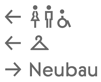
file name: Lucas De Groot The Stencil 2021

file name: Lucas De Groot The Stencil 2021

file name: Lucas De Groot The Stencil 2021

file name: Lucas De Groot The Stencil 2021

file name: Lucas De Groot The Stencil 2021

file name: Lucas De Groot The Stencil 2021

file name: Steve Matteson Companion Old Style 2021 after Frederic Goudy 1927

file name: Steve Matteson Companion Old Style 2021 after Frederic Goudy 1927

file name: Steve Matteson Companion Old Style 2021 after Frederic Goudy 1927
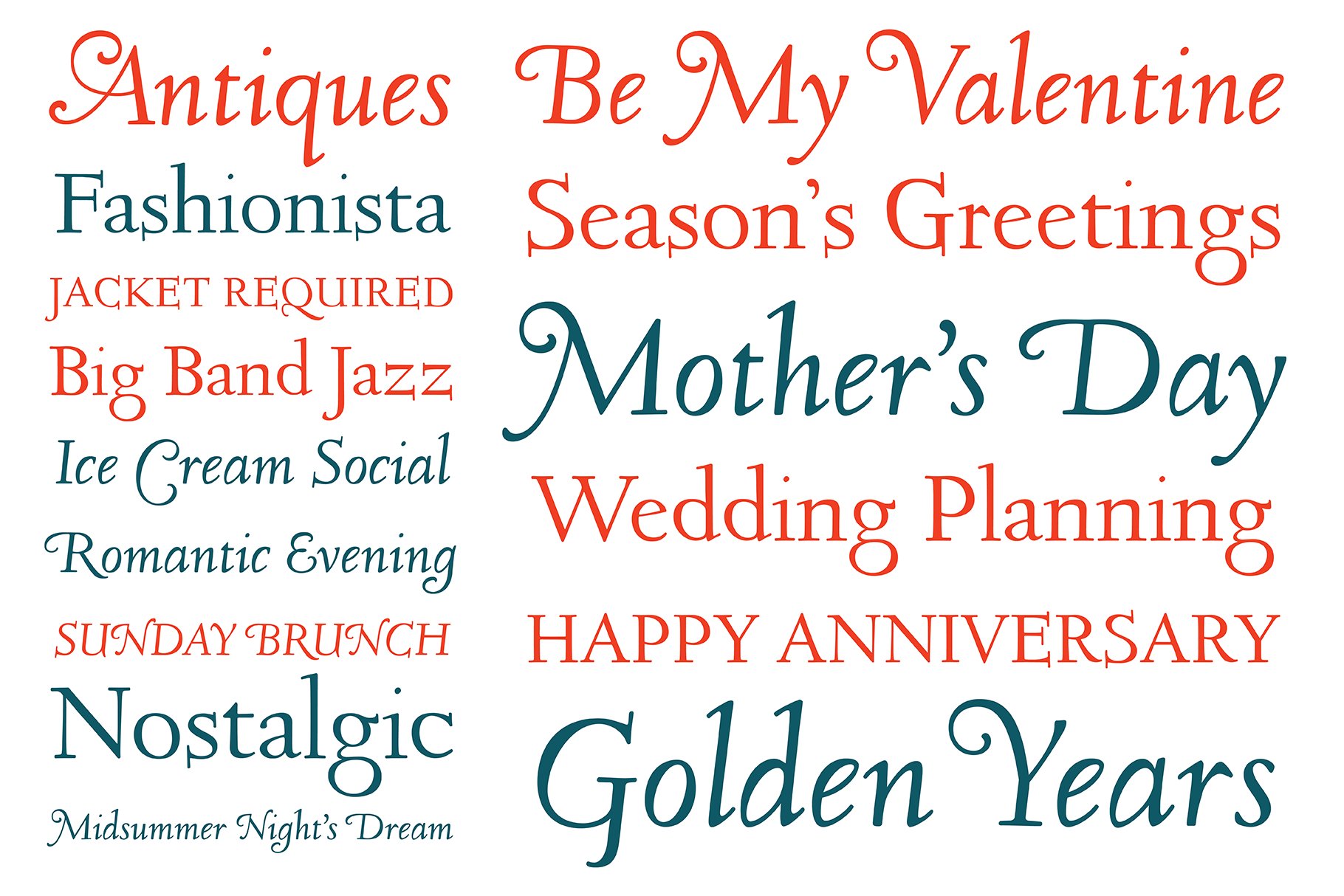
file name: Steve Matteson Companion Old Style 2021 after Frederic Goudy 1927

file name: Supertype Adapt 2021

file name: Supertype Adapt 2021

file name: Supertype Adapt 2021

file name: Supertype Adapt 2021

file name: Supertype Adapt 2021

file name: Supertype Adapt 2021

file name: James Hultquist Todd Cambium 2021

file name: James Hultquist Todd Cambium 2021

file name: James Hultquist Todd Cambium 2021

file name: James Todd Cambium 2021

file name: James Todd Cambium 2021

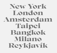
file name: Underware Plakato 2021

file name: Underware Plakato 2021

file name: Underware Plakato 2021

file name: Underware Plakato 2021

file name: Underware Plakato 2021

file name: Underware Plakato 2021

file name: Underware Plakato 2021

file name: Cinketype Margaret Neue 2021

file name: Cinketype Margaret Neue 2021

file name: Cinketype Margaret Neue 2021

file name: Arve Batevik Graut 2021

file name: Arve Batevik Graut 2021

file name: Arve Batevik Graut 2021

file name: Arve Batevik Graut 2021

file name: Elias Hanzer Arizona 2021

file name: Elias Hanzer Arizona 2021

file name: Elias Hanzer Arizona 2021

file name: Elias Hanzer Arizona Flare 2021

file name: Elias Hanzer Arizona Flare 2021

file name: Elias Hanzer Arizona Mix 2021

file name: Elias Hanzer Arizona Sans 2021

file name: Elias Hanzer Arizona Sans 2021

file name: Elias Hanzer Arizona Sans 2021

file name: Elias Hanzer Arizona Serif 2021

file name: Elias Hanzer Arizona Text 2021

file name: Jeremie Gauthier Miju 2021

file name: Jeremie Gauthier Miju 2021

file name: Jeremie Gauthier Miju 2021

file name: Jeremie Gauthier Miju 2021

file name: Tan Type Liebe 2021

file name: Tan Type Liebe 2021

file name: Tan Type Liebe 2021

file name: Tan Type Liebe 2021

file name: Tan Type Liebe 2021

file name: Tan Type Liebe 2021

file name: Juanjo Lopez Graveur 2021

file name: Juanjo Lopez Graveur 2021

file name: Juanjo Lopez Graveur 2021

file name: Juanjo Lopez Graveur 2021

file name: Juanjo Lopez Graveur 2021

file name: Juanjo Lopez Graveur 2021

file name: Vectro Type Vctr Mono 2021

file name: Vectro Type Vctr Mono 2021

file name: Vectro Type Vctr Mono 2021

file name: Jesse Ragan Escalator Elevator 2021

file name: Jesse Ragan Escalator Elevator 2021

file name: Jesse Ragan Escalator Elevator 2021

file name: Jesse Ragan Escalator Elevator 2021

file name: Jesse Ragan Escalator Elevator 2021

file name: Jesse Ragan Escalator Elevator 2021

file name: Jesse Ragan Escalator Elevator 2021

file name: Jesse Ragan Escalator Elevator 2021

file name: Jesse Ragan Escalator Elevator 2021

file name: Jesse Ragan Escalator Elevator 2021

file name: Jesse Ragan Escalator Elevator 2021

file name: Jesse Ragan Escalator Elevator 2021

file name: Jesse Ragan Escalator Elevator 2021

file name: Jesse Ragan Escalator Elevator 2021

file name: Jesse Ragan Escalator Elevator 2021

file name: Dmitrii Mikitenko Ecatherina 2021

file name: Dmitrii Mikitenko Ecatherina 2021

file name: Dmitrii Mikitenko Ecatherina 2021

file name: Tarek Alsawwa Kairouan 2021

file name: Tarek Alsawwa Kairouan 2021

file name: Tarek Alsawwa Kairouan 2021

file name: Beatrice Caciotti Bumpy 2021

file name: Beatrice Caciotti Bumpy 2021

file name: Beatrice Caciotti Bumpy 2021

file name: Francesco Canovaro Bakemono 2021

file name: Francesco Canovaro Bakemono 2021

file name: Francesco Canovaro Bakemono 2021

file name: Francesco Canovaro Bakemono 2021

file name: Francesco Canovaro Bakemono 2021

file name: Mila Garret Lucille 2021

file name: Mila Garret Lucille 2021

file name: Mila Garret Lucille 2021

file name: Mila Garret Lucille 2021

file name: Rod Mc Donald Goluska 2021

file name: Rod Mc Donald Goluska 2021

file name: Rod Mc Donald Goluska 2021

file name: Rod Mc Donald Goluska 2021

file name: Rod Mc Donald Goluska 2021

file name: Rod Mc Donald Goluska 2021

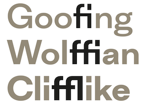
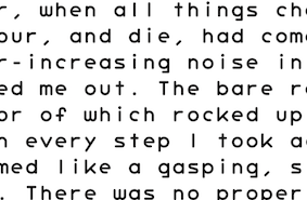
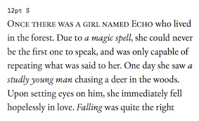
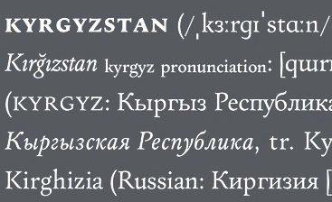
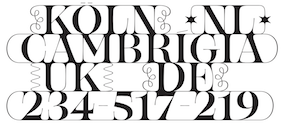
file name: Arnaud Chemin N N Didot Moderne 2021

file name: Arnaud Chemin N N Didot Moderne 2021

file name: Arnaud Chemin N N Didot Moderne 2021

file name: Arnaud Chemin N N Didot Moderne 2021

file name: Arnaud Chemin N N Didot Moderne 2021

file name: Mostafa El Abasiry Tashweeq 2021

file name: Mostafa El Abasiry Tashweeq 2021

file name: Mostafa El Abasiry Tashweeq 2021

file name: Para Type D I N2014 Rounded 2021 4
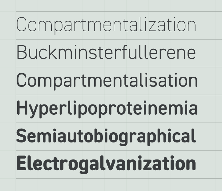
file name: Para Type D I N2014 Rounded 2021 5

file name: Para Type D I N2014 Rounded 2021
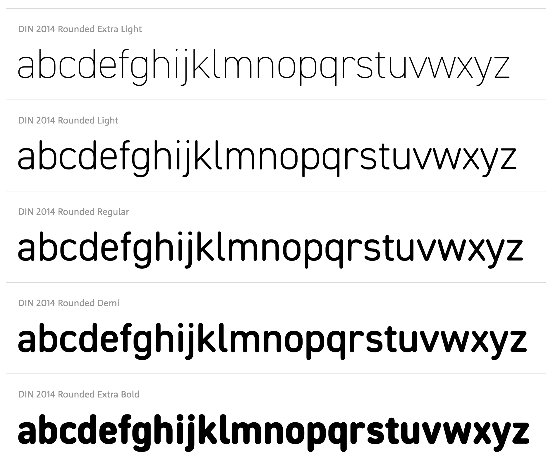
file name: Isabella Chaeva Vasily Biryukov Alexander Lubovenko D I N2014 Rounded 2021
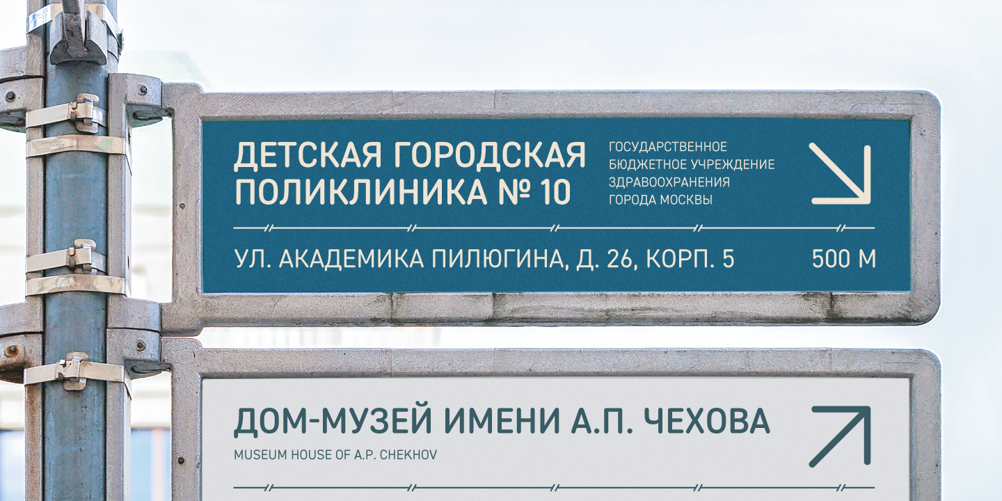
file name: Isabella Chaeva Vasily Biryukov Alexander Lubovenko D I N2014 Rounded 2021

file name: Muhammad Ridha Agusni Toxide 2021

file name: Break Maiden Nellie Display 2021

file name: Break Maiden Nellie Display 2021

file name: Break Maiden Nellie Display 2021

file name: Break Maiden Nellie Display 2021

file name: Hoodzpah Chapman Ave 2021

file name: Hoodzpah Chapman Ave 2021

file name: Hoodzpah Chapman Ave 2021

file name: Hoodzpah Chapman Ave 2021

file name: Hoodzpah Chapman Ave 2021

file name: 38 lineart Toxide 2021 1

file name: 38 lineart Toxide 2021 2

file name: Jean Francois Porchez Astronef Super 2021

file name: Jean Francois Porchez Astronef Super 2021

file name: Jean Francois Porchez Astronef Super 2021

file name: Jean Francois Porchez Astronef Super 2021

file name: Gianluca Sandrone Xanti Typewriter 2021

file name: Gianluca Sandrone Xanti Typewriter 2021

file name: Gianluca Sandrone Xanti Typewriter 2021

file name: Gianluca Sandrone Xanti Typewriter 2021

file name: Gianluca Sandrone Xanti Typewriter 2021

file name: Nicky Laatz Nightingale Script 2021

file name: Nicky Laatz Nightingale Script 2021

file name: Nicky Laatz Nightingale Script 2021

file name: Nicky Laatz Nightingale Script 2021

file name: Nicky Laatz Nightingale Script 2021

file name: Nicky Laatz Nightingale Script 2021

file name: Nicky Laatz Nightingale Script 2021

file name: Marina Khodak T T Rationalist 2021

file name: Type Type T T Rationalist 2021 1

file name: Type Type T T Rationalist 2021 2

file name: Type Type T T Rationalist 2021 3

file name: Newglyph Baikal 2021

file name: Newglyph Baikal 2021

file name: Newglyph Baikal 2021

file name: Newglyph Baikal 2021

file name: Naipe Foundry Pacaembu 2021 1

file name: Naipe Foundry Pacaembu 2021 2

file name: Naipe Foundry Pacaembu 2021 3

file name: Naipe Foundry Pacaembu 2021 4

file name: Naipe Foundry Pacaembu 2021 5

file name: Naipe Foundry Pacaembu 2021

file name: Patrick Griffin Ronaldson Pro 2021

file name: Patrick Griffin Ronaldson Pro 2021

file name: Patrick Griffin Ronaldson Pro 2021

file name: Patrick Griffin Ronaldson Pro 2021

file name: Patrick Griffin Ronaldson Pro 2021

file name: Ralph M Unger Gravira 2021 after Herbert Thannhaeuser 1935

file name: Ralph M Unger Gravira 2021 after Herbert Thannhaeuser 1935

file name: Ralph M Unger Gravira 2021 after Herbert Thannhaeuser 1935

file name: Ralph M Unger Gravira 2021 after Herbert Thannhaeuser 1935

file name: Ralph M Unger Gravira 2021 after Herbert Thannhaeuser 1935

file name: Thierry Blancpain G T Maru 2021

file name: Thierry Blancpain G T Maru 2021

file name: Thierry Blancpain G T Maru 2021

file name: Noel Leu G T Ultra 2021

file name: Noel Leu G T Ultra 2021

file name: Noel Leu G T Ultra 2021

file name: Noel Leu G T Ultra 2021

file name: Noel Leu G T Ultra Fine Ultra 2021

file name: Noel Leu G T Ultra Standard Bold 2021

file name: Gregory Shutters La Farge 2020 2021

file name: Gregory Shutters La Farge 2020 2021

file name: Gregory Shutters La Farge 2020 2021

file name: Gregory Shutters La Farge 2020 2021

file name: Gregory Shutters La Farge 2020 2021

file name: Gregory Shutters La Farge 2020 2021

file name: Alessandro Colizzi Neon Nbl 2019 2020 after Giulio Da Milano Neon 1933 1934

file name: Alessandro Colizzi Neon Nbl 2019 2020 after Giulio Da Milano Neon 1933 1934

file name: Alessandro Colizzi Neon Nbl 2019 2020 after Giulio Da Milano Neon 1933 1934

file name: Alessandro Colizzi Neon Nbl 2019 2020 after Giulio Da Milano Neon 1933 1934

file name: Alessandro Colizzi Neon Nbl 2019 2020 after Giulio Da Milano Neon 1933 1934

file name: John Hudson Alice Savoie Paul Hanslow Karsten Luecke Brill 2011

file name: John Hudson Alice Savoie Paul Hanslow Karsten Luecke Brill 2011

file name: John Hudson Alice Savoie Paul Hanslow Karsten Luecke Brill 2011

file name: John Hudson Alice Savoie Paul Hanslow Karsten Luecke Brill Cyrillic 2021

file name: John Hudson Alice Savoie Paul Hanslow Karsten Luecke Brill Cyrillic 2021

file name: John Hudson Alice Savoie Paul Hanslow Karsten Luecke Brill Cyrillic 2021

file name: Kris Sowersby Epicene 2021

file name: Kris Sowersby Epicene 2021

file name: Kris Sowersby Epicene 2021

file name: Kris Sowersby Epicene Display 2021

file name: Kris Sowersby Epicene Display 2021

file name: Kris Sowersby Epicene Display 2021

file name: Kris Sowersby Epicene Display Black 2021

file name: Kris Sowersby Epicene Text 2021

file name: Mika Melvas Steamtown 2021

file name: Mika Melvas Steamtown 2021

file name: Mika Melvas Steamtown 2021

file name: Melvastype Steamtown 2021 1

file name: Melvastype Steamtown 2021 2

file name: Kristof Van Proeyen Interbellum 2021

file name: Kristof Van Proeyen Interbellum 2021

file name: Punch Interbellum 2021 3

file name: Punch Interbellum 2021 4

file name: Punch Interbellum 2021 5

file name: Punch Interbellum 2021

file name: Art Grootfontein Flexible 2021

file name: Art Grootfontein Flexible 2021

file name: Art Grootfontein Flexible 2021 1

file name: Joelmaker Rogelio Script 2021 4

file name: Joelmaker Rogelio Script 2021 5

file name: Joelmaker Rogelio Script 2021

file name: Pedro Gonzalez P G F Americas 2021

file name: Pedro Gonzalez P G F Americas 2021

file name: Pedro Gonzalez P G F Americas 2021

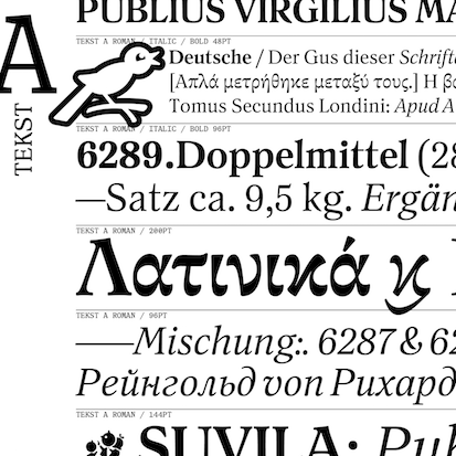
file name: Lewis Mc Guffie Tekst 2021

file name: Lewis Mc Guffie Tekst 2021

file name: Lewis Mc Guffie Tekst 2021

file name: Lewis Mc Guffie Tekst 2021

file name: Lewis Mc Guffie Tekst 2021

file name: Roberto De Vicq De Cumptich Tuppence 2021 after Stephenson Blake Blackfriars 1910

file name: Roberto De Vicq De Cumptich Tuppence 2021 after Stephenson Blake Blackfriars 1910

file name: Roberto De Vicq De Cumptich Tuppence 2021 after Stephenson Blake Blackfriars 1910

file name: Roberto De Vicq De Cumptich Tuppence 2021 after Stephenson Blake Blackfriars 1910

file name: Paulo Goode Sienna 2021

file name: Paulo Goode Sienna 2021

file name: Paulo Goode Sienna 2021 2

file name: Paulo Goode Sienna 2021 4

file name: Paulo Goode Sienna 2021 5

file name: Paulo Goode Sienna 2021

file name: P22 P22 Underground Pro 2021

file name: P22 P22 Underground Pro 2021

file name: P22 P22 Underground Pro 2021

file name: P22 P22 Underground Pro 2021

file name: P22 P22 Underground Pro 2021

file name: Nathatype Ballon Midair 2021 3

file name: Nathatype Ballon Midair 2021 4

file name: Nathatype Ballon Midair 2021 5

file name: Nathatype Ballon Midair 2021

file name: Fabio Haag Type Seiva 2021

file name: Fabio Haag Type Seiva 2021

file name: Fabio Haag Type Seiva 2021
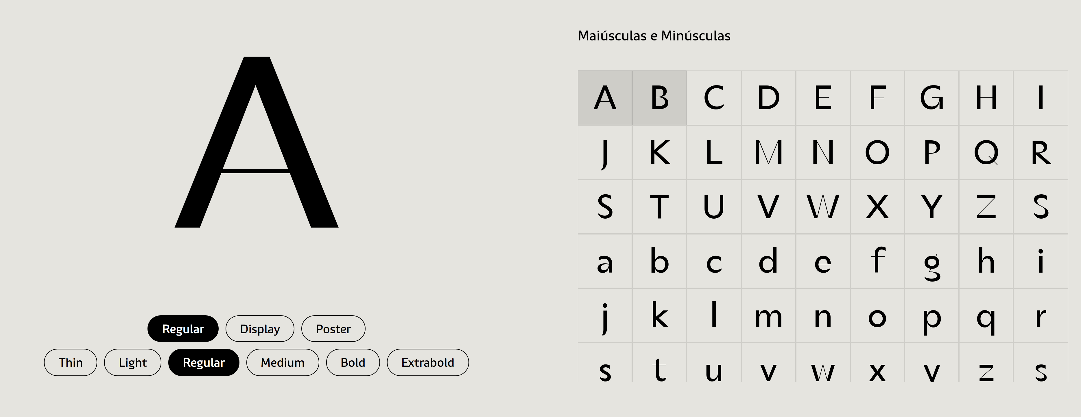
file name: Fabio Haag Type Seiva 2021

file name: Fabio Haag Type Seiva 2021

file name: Fabio Haag Type Seiva 2021
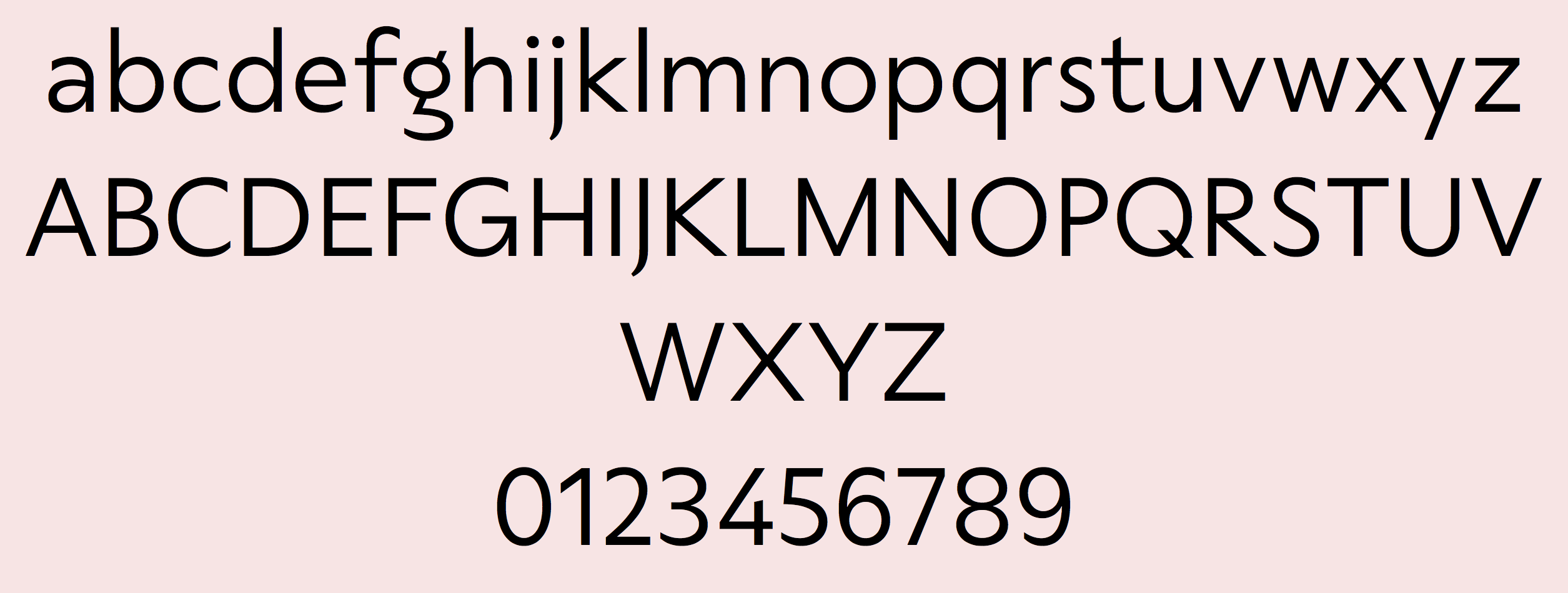
file name: Fabio Haag Type Seiva 2021
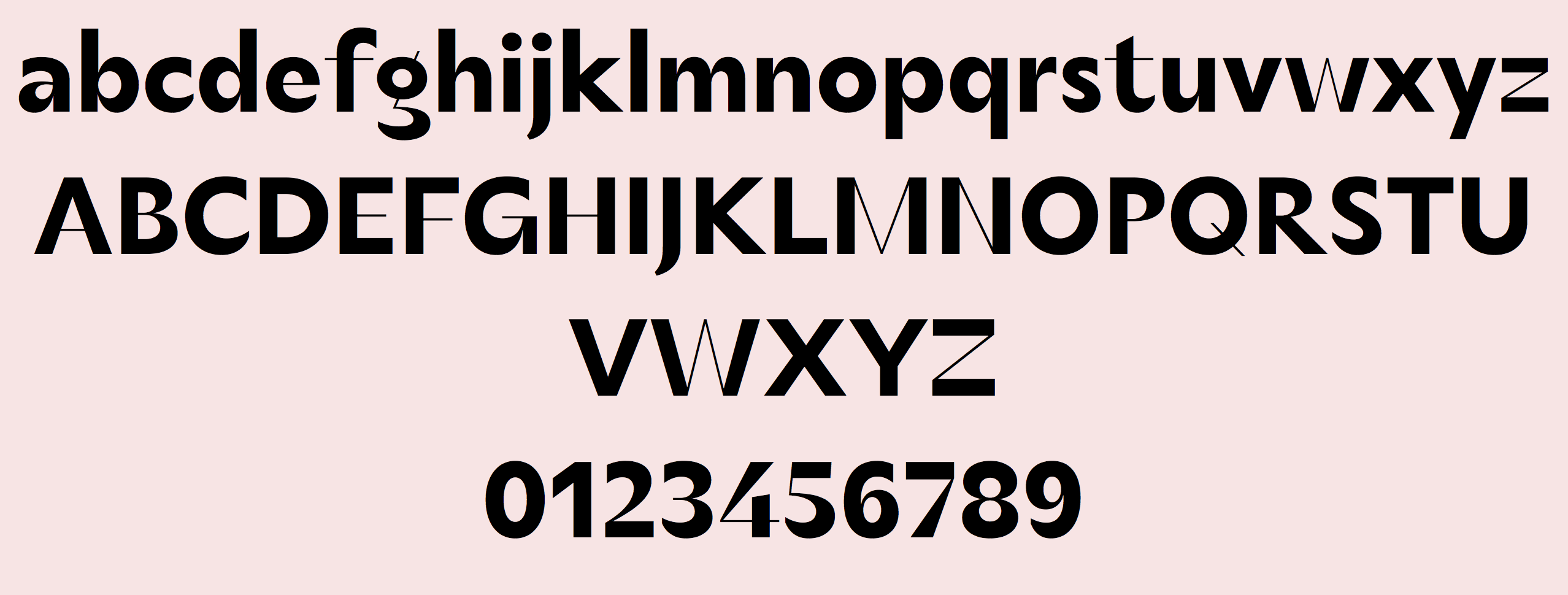
file name: Fabio Haag Type Seiva 2021

file name: Corey Hu Urbanist 2021

file name: Corey Hu Urbanist 2021

file name: Corey Hu Urbanist 2021

file name: Corey Hu Urbanist 2021 1

file name: Corey Hu Urbanist 2021 2

file name: Corey Hu Urbanist Black 2021

file name: Corey Hu Urbanist Light 2021

file name: Tomas Brousil Crabath 2021

file name: Tomas Brousil Crabath 2021

file name: Tomas Brousil Crabath 2021

file name: Tomas Brousil Crabath 2021

file name: Tomas Brousil Crabath 2021

file name: Tomas Brousil Crabath 2021

file name: Mostafa El Abasiry Dardashah 2021

file name: Mostafa El Abasiry Dardashah 2021

file name: Mostafa El Abasiry Dardashah 2021

file name: Mario Feliciano Parafina 2021

file name: Mario Feliciano Parafina 2021

file name: Mario Feliciano Parafina 2021

file name: Mario Feliciano Parafina 2021

file name: Fontanova Indigo Antiqua2 2021 1

file name: Fontanova Indigo Antiqua2 2021 5

file name: Fontanova Indigo Antiqua2 2021

file name: Andres Felipe Ramirez Milanesa Serif 2021

file name: Andres Felipe Ramirez Milanesa Serif 2021

file name: Andres Felipe Ramirez Milanesa Serif 2021

file name: Andres Felipe Ramirez Milanesa Serif 2021

file name: Andres Felipe Ramirez Milanesa Serif 2021

file name: Andres Felipe Ramirez Milanesa Serif 2021

file name: Andres Felipe Ramirez Milanesa Serif 2021

file name: Andres Felipe Ramirez Milanesa Serif 2021

file name: Andres Felipe Ramirez Milanesa Serif 2021

file name: Johan Stroem Indigo Antiqua2 2021

file name: Johan Stroem Indigo Antiqua2 2021

file name: Lucas Descroix Paraiso 2021

file name: Lucas Descroix Paraiso 2021

file name: Lucas Descroix Paraiso 2021

file name: Lucas Descroix Paraiso 2021

file name: Lucas Descroix Paraiso 2021

file name: Mona Franz Jakob Runge Gratimo 2021

file name: Mona Franz Jakob Runge Gratimo Classic 2021

file name: Mona Franz Jakob Runge Gratimo Classic 2021

file name: Mona Franz Jakob Runge Gratimo Classic 2021

file name: Mona Franz Jakob Runge Gratimo Grotesk 2021

file name: Mona Franz Jakob Runge Gratimo Grotesk 2021

file name: Mona Franz Jakob Runge Gratimo Grotesk 2021

file name: Mona Franz Jakob Runge Grato Gratimo 2021

file name: Mona Franz Jakob Runge Grato Gratimo 2021

file name: Mona Franz Jakob Runge Grato Gratimo 2021

file name: Mona Franz Jakob Runge Grato 2021

file name: Mona Franz Jakob Runge Grato Classic 2021

file name: Mona Franz Jakob Runge Grato Classic 2021

file name: Mona Franz Jakob Runge Grato Classic 2021

file name: Mona Franz Jakob Runge Grato Grotesk 2021

file name: Mona Franz Jakob Runge Grato Grotesk 2021

file name: Damelev Studio Northway 2021

file name: Damelev Studio Northway 2021

file name: Damelev Studio Northway 2021

file name: Damelev Studio Northway 2021

file name: Milan Pleva Monograf 2021

file name: Milan Pleva Monograf 2021

file name: Milan Pleva Monograf 2021

file name: Milan Pleva Monograf 2021 1

file name: Milan Pleva Monograf 2021 4

file name: Milan Pleva Monograf 2021

file name: Suandana Ipandemade The Strattos 2021

file name: Suandana Ipandemade The Strattos 2021

file name: Suandana Ipandemade The Strattos 2021

file name: Suandana Ipandemade The Strattos 2021

file name: Zetafonts Stadio Now 2020 after Aldo Novarese Stadio 1974

file name: Zetafonts Stadio Now 2020 after Aldo Novarese Stadio 1974

file name: Zetafonts Stadio Now 2020 after Aldo Novarese Stadio 1974

file name: Zetafonts Stadio Now 2020 after Aldo Novarese Stadio 1974

file name: Zetafonts Stadio Now 2020 after Aldo Novarese Stadio 1974

file name: Hans Heitmann Legit Sans 2021

file name: Hans Heitmann Legit Sans 2021

file name: Hans Heitmann Legit Sans 2021

file name: Hans Heitmann Legit Sans Soft 2021

file name: Hans Heitmann Legit Sans Soft 2021

file name: Hans Heitmann Legit Serif 2021

file name: Hans Heitmann Legit Serif 2021

file name: Hans Heitmann Legit Serif 2021

file name: Khaiuns Kolligio 2021 2

file name: Khaiuns Kolligio 2021 3

file name: Salih Kizilkaya S K Ilke Mono 2021 4

file name: Salih Kizilkaya S K Ilke Mono 2021 5

file name: Salih Kizilkaya S K Ilke Mono 2021

file name: Salih Kizilkaya S K Ilke Mono 2021 .

file name: Tien Min Liao Eliptico 2021

file name: Tien Min Liao Eliptico 2021

file name: Tien Min Liao Eliptico 2021

file name: Tien Min Liao Eliptico 2021

file name: Tien Min Liao Eliptico 2021

file name: Storytype Studio Gisrida 2021

file name: Storytype Studio Gisrida 2021

file name: Storytype Studio Gisrida 2021

file name: Storytype Studio Gisrida 2021

file name: Almarena 1769 2021 1

file name: Almarena 1769 2021 2

file name: Almarena 1769 2021 3

file name: Almarena 1769 2021 4

file name: Almarena 1769 2021 5

file name: Almarena 1769 2021

file name: Daniel Perraudin West 2014 2021

file name: Daniel Perraudin West 2014 2021

file name: Daniel Perraudin West 2014 2021

file name: Daniel Perraudin West 2014 2021

file name: Daniel Perraudin West 2014 2021

file name: Matthias Beck P22 Graciosa 2015 2021

file name: Matthias Beck P22 Graciosa 2015 2021

file name: Matthias Beck P22 Graciosa 2015 2021

file name: Latinotype Singolare 2021 1

file name: Latinotype Singolare 2021 3

file name: Sofia Mohr Singolare 2021

file name: Sofia Mohr Singolare 2021

file name: Sofia Mohr Singolare 2021

file name: Sofia Mohr Singolare Layers 2021

file name: Sofia Mohr Singolare Stencil 2021
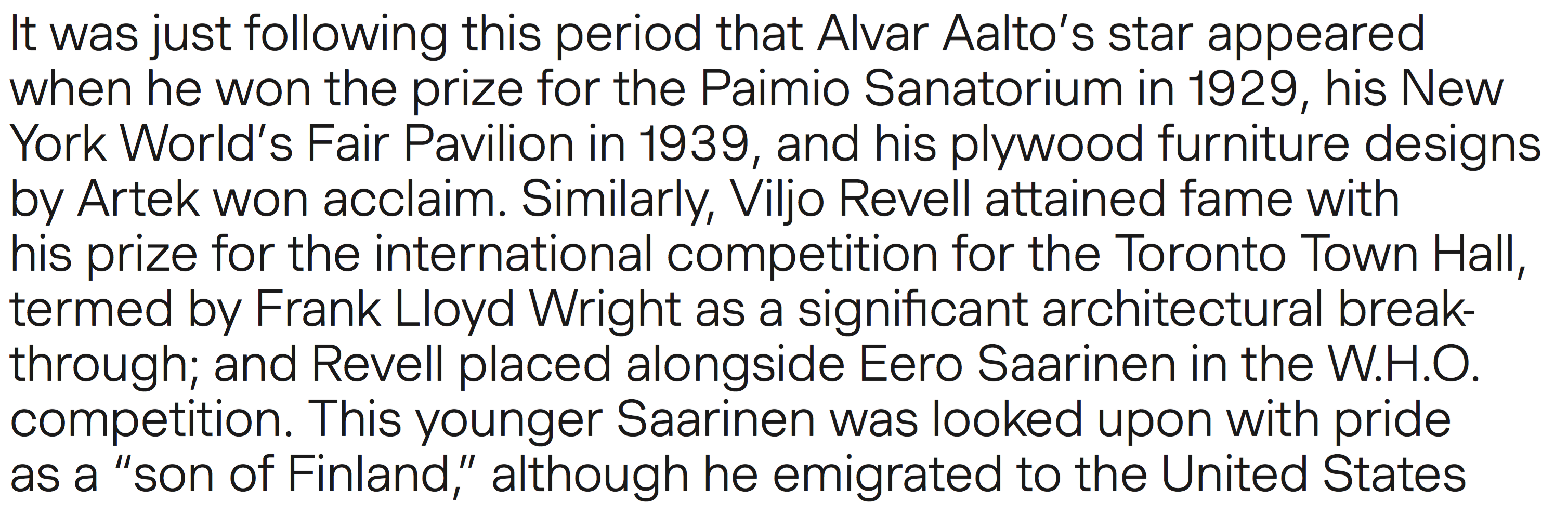
file name: Matthieu Cortat Anthony Franklin Sander Vermeulen Muoto 2021

file name: Matthieu Cortat Anthony Franklin Sander Vermeulen Muoto 2021

file name: Matthieu Cortat Anthony Franklin Sander Vermeulen Muoto 2021

file name: Matthieu Cortat Anthony Franklin Sander Vermeulen Muoto 2021

file name: Shape Studio Bahagia Script 2021 1

file name: Shape Studio Bahagia Script 2021 2

file name: Shape Studio Bahagia Script 2021 3

file name: Shape Studio Bahagia Script 2021

file name: Panos Vassiliou P F D I N Max 2021

file name: Panos Vassiliou P F D I N Max 2021

file name: Panos Vassiliou P F D I N Max 2021

file name: Panos Vassiliou P F D I N Max 2021

file name: Panos Vassiliou P F D I N Max 2021

file name: Panos Vassiliou P F D I N Max 2021

file name: Russell Mc Gorman Eramax123 2021

file name: Russell Mc Gorman Eramax123 2021

file name: Russell Mc Gorman Eramax123 2021

file name: Caio Kondo P P Eiko 2021

file name: Caio Kondo P P Eiko 2021

file name: Caio Kondo P P Eiko 2021

file name: Caio Kondo P P Eiko Medium 2021

file name: Robert Janes A B C Gravity 2021

file name: Robert Janes A B C Gravity 2021

file name: Robert Janes A B C Gravity 2021

file name: Robert Janes A B C Gravity 2021

file name: Rui Abreu Chassi 2021

file name: Rui Abreu Chassi 2021

file name: Rui Abreu Chassi 2021

file name: Rui Abreu Chassi 2021

file name: Rui Abreu Chassi 2021

file name: Jeremie Gauthier 1769 Display 2021

file name: Jeremie Gauthier 1769 Display 2021

file name: Jeremie Gauthier 1769 Display 2021

file name: Jeremie Gauthier 1769 Display 2021

file name: Jeremie Gauthier 1769 Display 2021

file name: Jeremie Gauthier 1769 Display 2021
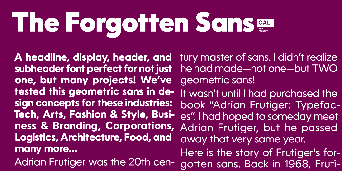
file name: Dave Lawrence Oceanwide Pro 2021

file name: Dave Lawrence Oceanwide Pro 2021

file name: Dave Lawrence Oceanwide Pro 2021

file name: Andrejs Kirma Kolka 2021 1

file name: Andrejs Kirma Kolka 2021 2

file name: Andrejs Kirma Kolka 2021 3

file name: Charles Maze Mercure 2021

file name: Charles Maze Mercure 2021

file name: Charles Maze Mercure 2021

file name: Charles Maze Mercure 2021

file name: Charles Maze Mercure 2021

file name: Fontfabric Code Next 2021 1

file name: Fontfabric Code Next 2021

file name: Svetoslav Simov Mirela Belova Stan Partalev Code Next 2021

file name: Svetoslav Simov Mirela Belova Stan Partalev Code Next 2021

file name: Svetoslav Simov Mirela Belova Stan Partalev Code Next 2021

file name: Svetoslav Simov Mirela Belova Stan Partalev Code Next 2021

file name: Marie Boulanger Faubourg 2021

file name: Marie Boulanger Faubourg 2021

file name: Marie Boulanger Faubourg 2021

file name: Marie Boulanger Faubourg 2021

file name: Marie Boulanger Faubourg 2021

file name: Alejandro Paul Plethora 2021

file name: Alejandro Paul Plethora 2021

file name: Alejandro Paul Plethora 2021

file name: Sudtipos Plethora 2021 1

file name: Sudtipos Plethora 2021 4

file name: Sudtipos Plethora 2021 5

file name: Monday Type Fiona Pro 2021 1

file name: Monday Type Fiona Pro 2021 2

file name: Monday Type Fiona Pro 2021 3

file name: Monday Type Fiona Pro 2021 4

file name: Monday Type Fiona Pro 2021 5

file name: Monday Type Fiona Pro 2021

file name: Avraham Cornfeld Ploni 2021

file name: Alef Alef Alef Ploni 2021 1

file name: Alef Alef Alef Ploni 2021 2

file name: Alef Alef Alef Ploni 2021 3

file name: Alef Alef Alef Ploni 2021 4

file name: Alef Alef Alef Ploni 2021 5

file name: Alef Alef Alef Ploni 2021

file name: Blancoletters Ingeo 2021 1

file name: Blancoletters Ingeo 2021 5

file name: Blancoletters Ingeo 2021

file name: Antonina Zhulkova Pavel Emelyanov Yulia Gonina T T Fors 2021

file name: Antonina Zhulkova Pavel Emelyanov Yulia Gonina T T Fors 2021

file name: Antonina Zhulkova Pavel Emelyanov Yulia Gonina T T Fors 2021

file name: Juan Luis Blanco Ingeo 2021

file name: Juan Luis Blanco Ingeo 2021

file name: Eugene Bunin Monumentum 2021 1

file name: Eugene Bunin Monumentum 2021 2

file name: Eugene Bunina Monumentum 2021

file name: Claudio Rocha Werner 2021 after A D Werner Dubbeldik 1972

file name: Claudio Rocha Werner 2021 after A D Werner Dubbeldik 1972

file name: Claudio Rocha Werner 2021 after A D Werner Dubbeldik 1972

file name: Claudio Rocha Werner 2021 after A D Werner Dubbeldik 1972

file name: Blast Foundry Granblue 2021

file name: Blast Foundry Granblue 2021

file name: Blast Foundry Granblue 2021

file name: Blast Foundry Granblue 2021

file name: Blast Foundry Granblue 2021

file name: Blast Foundry Granblue 2021

file name: Diana Ovezea Granblue 2021

file name: Adam Ladd Otterco 2021

file name: Adam Ladd Otterco 2021 3

file name: Adam Ladd Otterco 2021 4

file name: Adam Ladd Otterco 2021 5

file name: Adam Ladd Otterco 2021

file name: Alice Savoie Lucette Black 2021

file name: Alice Savoie Lucette Black 2021

file name: Alice Savoie Lucette Black 2021

file name: Alice Savoie Lucette Black 2021

file name: Dieter Hofrichter Capricho 2021

file name: Dieter Hofrichter Capricho 2021 7

file name: Dieter Hofrichter Capricho 2021 8

file name: Dieter Hofrichter Capricho 2021

file name: Jean Francois Porchez Altesse 2021

file name: Jean Francois Porchez Altesse 2021

file name: Jean Francois Porchez Altesse 2021

file name: Jean Francois Porchez Altesse 2021

file name: Jean Francois Porchez Altesse 2021

file name: Jean Francois Porchez Altesse 2021

file name: Jean Francois Porchez Altesse 2021

file name: Jean Francois Porchez Altesse 2021

file name: Jean Francois Porchez Altesse 2021

file name: Hoftype Capricho 2021 4

file name: Hoftype Capricho 2021 5

file name: Hoftype Capricho 2021

file name: Alit Design Burgie 2021 1

file name: Alit Design Burgie 2021 2

file name: Alit Suarnegara Burgie 2021

file name: Alit Suarnegara Burgie 2021

file name: Alit Suarnegara Burgie 2021

file name: Kris Sowersby Manuka 2021

file name: Kris Sowersby Manuka 2021

file name: Kris Sowersby Manuka 2021

file name: Kris Sowersby Manuka 2021

file name: Kris Sowersby Manuka 2021

file name: Kris Sowersby Manuka Regular 2021

file name: Kris Sowersby Manuka Slab Black 2021

file name: Spacetype Garet 2021

file name: Spacetype Garet 2021

file name: Spacetype Garet 2021

file name: Spacetype Garet 2021

file name: Spacetype Garet 2021 2

file name: Alanna Munro Avona Serif 2021

file name: Alanna Munro Avona Serif 2021

file name: Alanna Munro Avona Serif 2021

file name: Alanna Munro Avona Serif 2021

file name: Alanna Munro Avona Serif 2021

file name: Alberto Romanos Bw Pose 2021

file name: Alberto Romanos Bw Pose 2021

file name: Alberto Romanos Bw Pose 2021

file name: Alberto Romanos Bw Pose 2021

file name: Alberto Romanos Bw Pose 2021

file name: Alberto Romanos Bw Pose 2021

file name: Fateh Lab Hugh 2021

file name: Fateh Lab Hugh 2021

file name: Fateh Lab Hugh 2021

file name: Fateh Lab Hugh 2021

file name: Fateh Lab Hugh 2021

file name: Fateh Lab Hugh 2021

file name: Fateh Lab Hugh 2021

file name: Borutta Group Change Serif 2021 1

file name: Borutta Group Change Serif 2021 2

file name: Borutta Group Change Serif 2021 3

file name: Borutta Group Change Serif 2021 5

file name: Borutta Group Change Serif 2021

file name: Letterhend La Graziela 2021 1

file name: Letterhend La Graziela 2021 2

file name: Letterhend La Graziela 2021 5

file name: Letterhend La Graziela 2021

file name: Letterhend Metro Capitals 2021 1

file name: Kazuo Kanai Waon Pro 2021

file name: Kazuo Kanai Waon Pro 2021

file name: Kazuo Kanai Waon Pro 2021

file name: Kazuo Kanai Waon Pro 2021

file name: Kazuo Kanai Waon Pro 2021

file name: Pedro Leal Orla 2021

file name: Pedro Leal Orla 2021

file name: Pedro Leal Orla 2021

file name: Pedro Leal Orla 2021

file name: Pedro Leal Orla 2021

file name: Fanny Hamelin Selva 2021

file name: Fanny Hamelin Selva 2021

file name: Fanny Hamelin Selva 2021

file name: Fanny Hamelin Selva 2021

file name: Fanny Hamelin Selva 2021

file name: Fanny Hamelin Selva 2021

file name: Floodfonts Arpona Sans 2021 1

file name: Floodfonts Arpona Sans 2021 2

file name: Floodfonts Arpona Sans 2021 3

file name: Floodfonts Arpona Sans 2021 4

file name: Floodfonts Arpona Sans 2021 5

file name: Barbara Bigosinska Sharf 2021

file name: Barbara Bigosinska Sharf 2021

file name: Blast Foundry Sharf 2021

file name: Blast Foundry Sharf 2021

file name: Blast Foundry Sharf 2021

file name: Blast Foundry Sharf 2021

file name: Blast Foundry Sharf 2021

file name: Marko Hrastovec Nyck 2021

file name: Marko Hrastovec Nyck 2021

file name: Marko Hrastovec Nyck 2021

file name: Marko Hrastovec Nyck 2021

file name: Marko Hrastovec Nyck 2021

file name: Artegra Procerus 2021 1

file name: Artegra Procerus 2021 2

file name: Ceyhun Birinci Procerus 2021

file name: Ceyhun Birinci Procerus 2021

file name: Ceyhun Birinci Procerus 2021

file name: Ceyhun Birinci Procerus 2021

file name: Studio Aurora Tankobon 2021

file name: Studio Aurora Tankobon 2021

file name: Studio Aurora Tankobon 2021

file name: Studio Aurora Tankobon 2021

file name: Studio Aurora Tankobon 2021

file name: Studio Aurora Tankobon 2021

file name: Mysterylab Klangfarbe Script 2021 1

file name: Mysterylab Klangfarbe Script 2021 2

file name: Mysterylab Klangfarbe Script 2021 3

file name: Mysterylab Klangfarbe Script 2021 4

file name: Mysterylab Klangfarbe Script 2021

file name: Josh Finklea Centra Mono 2021

file name: Josh Finklea Centra Mono 2021

file name: Josh Finklea Centra Mono 2021

file name: Josh Finklea Centra Mono 2021

file name: Josh Finklea Centra Mono 2021

file name: Josh Finklea Centra Mono 2021

file name: Josh Finklea Centra Mono 2021

file name: Josh Finklea Centra Mono 2021

file name: Josh Finklea Centra Mono 2021

file name: Josh Finklea Centra Mono 2021

file name: Josh Finklea Centra Mono 2021

file name: Josh Finklea Centra Mono 2021

file name: Canada Type Normandia 2021 1

file name: Canada Type Normandia 2021 2

file name: Canada Type Normandia 2021 3

file name: Canada Type Normandia 2021 10

file name: Canada Type Normandia 2021 6

file name: Canada Type Normandia 2021 7

file name: Canada Type Normandia 2021 8

file name: Canada Type Normandia 2021 9

file name: Canada Type Normandia 2021 4

file name: Canada Type Normandia 2021 5

file name: Canada Type Normandia 2021

file name: Alejandro Paul Magari 2021

file name: Alejandro Paul Magari 2021

file name: Alejandro Paul Magari 2021

file name: Alejandro Paul Magari 2021

file name: Alejandro Paul Magari 2021

file name: Alejandro Paul Magari 2021

file name: Alejandro Paul Magari 2021

file name: Alejandro Paul Magari 2021

file name: Alejandro Paul Magari 2021

file name: Alejandro Paul Magari 2021

file name: Alejandro Paul Magari 2021

file name: Alejandro Paul Magari 2021

file name: Alejandro Paul Magari 2021

file name: Alejandro Paul Magari 2021

file name: Alejandro Paul Magari 2021

file name: Protimient Lightbox21 2021 10

file name: Protimient Lightbox21 2021 3

file name: Protimient Lightbox21 2021 4

file name: Protimient Lightbox21 2021 5

file name: Protimient Lightbox21 2021 6

file name: Protimient Lightbox21 2021 7

file name: Protimient Lightbox21 2021 8

file name: Protimient Lightbox21 2021 9

file name: Baron W N M Kutaraja 2021

file name: Baron W N M Kutaraja 2021 1

file name: Baron W N M Kutaraja 2021 4

file name: Baron W N M Kutaraja 2021 5

file name: Ryan Thomas Kofffi 2021

file name: Ryan Thomas Kofffi 2021

file name: Ryan Thomas Kofffi 2021

file name: Ryan Thomas Kofffi 2021

file name: Ryan Thomas Kofffi 2021

file name: Ryan Thomas Kofffi 2021

file name: Ryan Thomas Kofffi 2021

file name: Ryan Thomas Kofffi 2021

file name: Wundertype Chom 2021 1

file name: Wundertype Chom 2021 2

file name: Wundertype Chom 2021 3

file name: Wundertype Chom 2021 4

file name: Wundertype Chom 2021 5

file name: Wundertype Chom 2021

file name: I R F Lab Studio Amanda Manopo 2021 1

file name: I R F Lab Studio Amanda Manopo 2021 2

file name: I R F Lab Studio Amanda Manopo 2021 3

file name: I R F Lab Studio Amanda Manopo 2021 4

file name: I R F Lab Studio Amanda Manopo 2021

file name: M Irvan Syouqi S Amanda Manopo 2021

file name: M Irvan Syouqi S Amanda Manopo 2021

file name: Drawwwn Geeeki Soft 2021 1

file name: Drawwwn Geeeki Soft 2021 2

file name: Drawwwn Geeeki Soft 2021 3

file name: Drawwwn Geeeki Soft 2021 5

file name: Drawwwn Geeeki Soft 2021

file name: Eduardo Manso Inklination 2021

file name: Eduardo Manso Inklination 2021

file name: Eduardo Manso Inklination 2021

file name: Eduardo Manso Inklination 2021

file name: Eduardo Manso Inklination 2021

file name: Eduardo Manso Inklination 2021

file name: Alexei Chekulayev Postulat 2021

file name: Alexei Chekulayev Postulat 2021

file name: Botio Nikoltchev Apparat 2021

file name: Botio Nikoltchev Apparat 2021

file name: Botio Nikoltchev Apparat 2021

file name: Botio Nikoltchev Apparat 2021

file name: Botio Nikoltchev Apparat 2021

file name: Botio Nikoltchev Apparat 2021

file name: Botio Nikoltchev Apparat 2021

file name: Botio Nikoltchev Apparat 2021

file name: Botio Nikoltchev Apparat 2021

file name: Botio Nikoltchev Apparat 2021

file name: Botio Nikoltchev Apparat 2021

file name: Botio Nikoltchev Apparat 2021

file name: Botio Nikoltchev Apparat 2021

file name: Botio Nikoltchev Apparat 2021

file name: Botio Nikoltchev Apparat 2021

file name: Botio Nikoltchev Apparat 2021

file name: Stawix Ruecha Chom 2021

file name: Stawix Ruecha Chom 2021

file name: Stawix Ruecha Chom 2021

file name: Stawix Ruecha Chom 2021

file name: Stawix Ruecha Chom 2021

file name: Stawix Ruecha Chom 2021

file name: Pedro Leal Elaine 2021

file name: Pedro Leal Elaine 2021

file name: Pedro Leal Elaine 2021

file name: Pedro Leal Elaine 2021

file name: Pedro Leal Elaine 2021

file name: Pedro Leal Elaine 2021

file name: Pedro Leal Elaine 2021

file name: Pedro Leal Elaine 2021
| | |
|
Luc Devroye ⦿ School of Computer Science ⦿ McGill University Montreal, Canada H3A 2K6 ⦿ lucdevroye@gmail.com ⦿ https://luc.devroye.org ⦿ https://luc.devroye.org/fonts.html |




































 NN Didot Moderne (Arnaud Chemin at


