TYPE DESIGN INFORMATION PAGE last updated on Thu Apr 16 22:24:15 EDT 2026
FONT RECOGNITION VIA FONT MOOSE
|
|
|
|
Fat Faces
Didone is a genre of serif typeface that emerged in the late 18th century and was the standard style of general-purpose printing during the nineteenth century. Called didone in the 1954 the Vox-ATypI classification system---after Firmin Didot and Giambattista Bodoni---, it is characterized by narrow and unbracketed (hairline) serifs, the vertical orientation of weight axes, the strong contrast between thick and thin lines (with horizontal parts thinner), and ball terminals. The beginning of the nineteenth century saw the development of bold lettering for advertizing. Fat faces describe fat didones, which showed magnified contrast, keeping the thin parts of the letter slender while magnifying the vertical strokes massively. Commercial Type describes them as follows in their promotion of Isambard: In the early years of the nineteenth century, Latin typeface design gained self-awareness and set about trying to exert suasive force. How to harvest attention? How to make a message shout above the clamor of competing messages? How to sell a product? Typefaces grew bigger and bolder, and then almost impossibly inflated. So-called "fat faces" were the first real innovation of the century. They piled weight onto modern serif skeletons until they couldn't shoulder any more. Like balloon animals (or Jeff Koons sculptures), fat faces seem bulky beyond all reason, but their pronounced contrast gives them grace, and they require extraordinary finesse and virtuosity to execute (and to use). They have endured in popular culture, managing to find a niche in every period of graphic design, never not projecting an air of outrageous coolness. |
EXTERNAL LINKS |
| | |

file name: Commercial Type Isambard 2019 2020
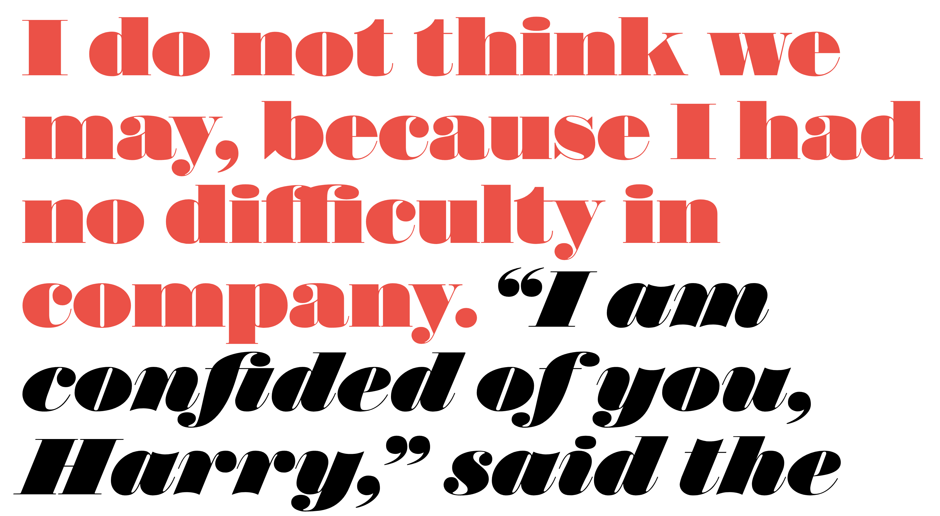
file name: Commercial Type Isambard 2019 2020

file name: Commercial Type Isambard Condensed 2019 2020
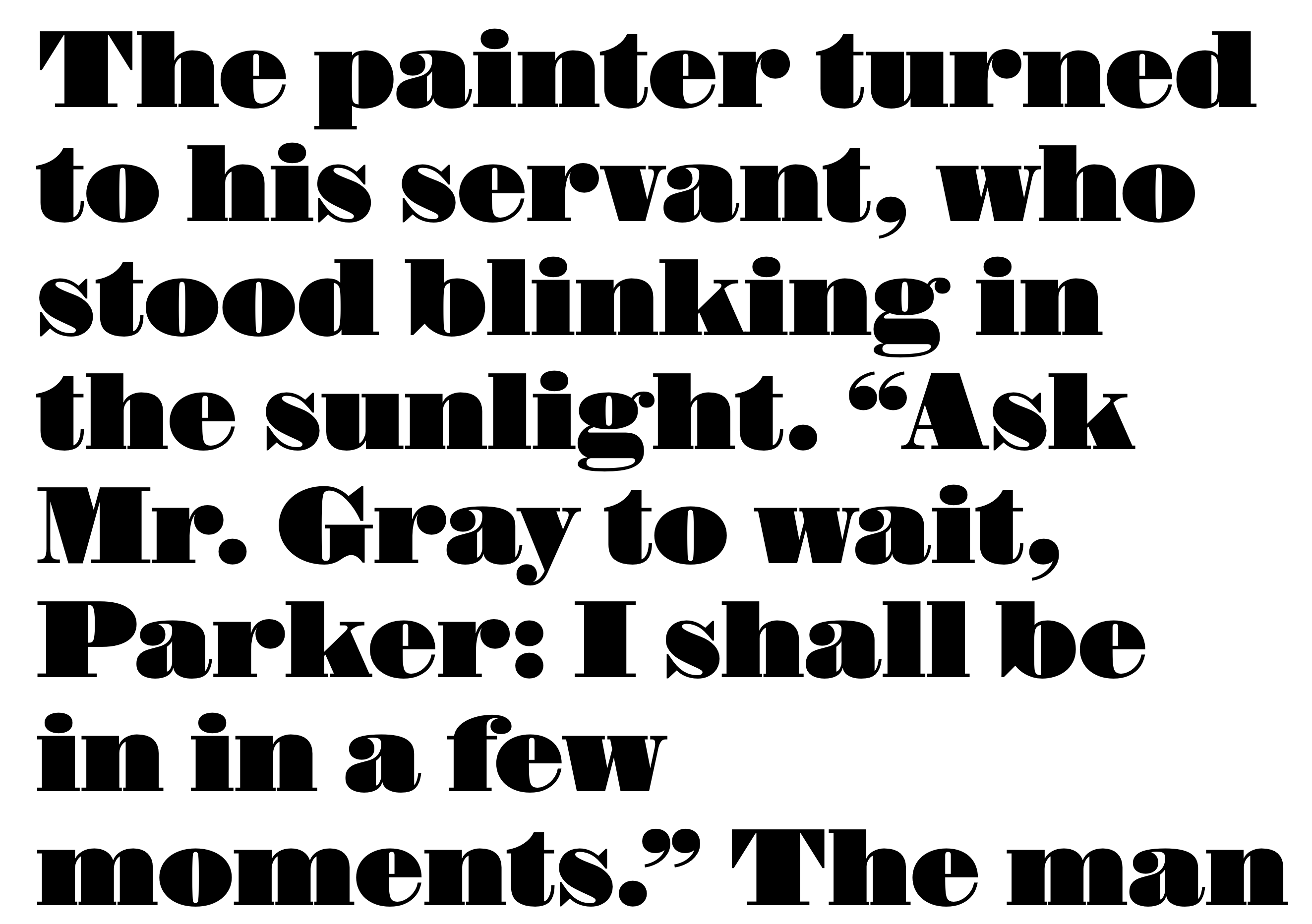
file name: Commercial Type Isambard No2 2019 2020

file name: Commercial Type Isambard X Condensed 2019 2020

file name: Fat Face Redford Robins Poser London 1840s
| | |
|
Luc Devroye ⦿ School of Computer Science ⦿ McGill University Montreal, Canada H3A 2K6 ⦿ lucdevroye@gmail.com ⦿ https://luc.devroye.org ⦿ https://luc.devroye.org/fonts.html |

