TYPE DESIGN INFORMATION PAGE last updated on Wed May 6 16:35:09 EDT 2026
FONT RECOGNITION VIA FONT MOOSE
|
|
|
|
Janson
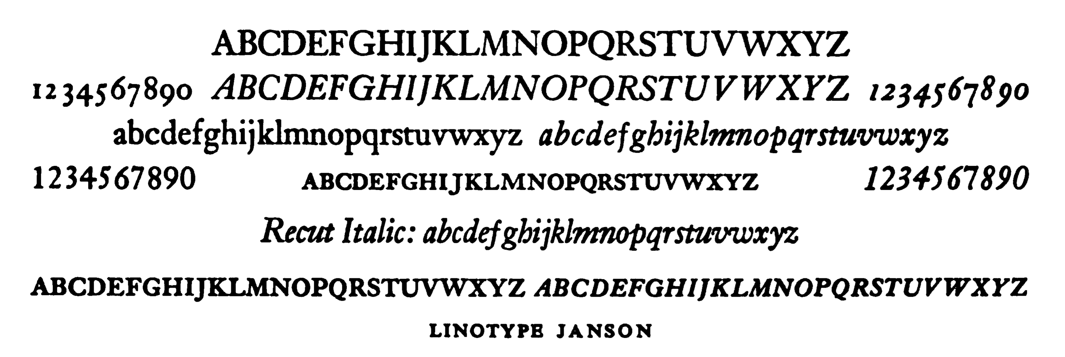
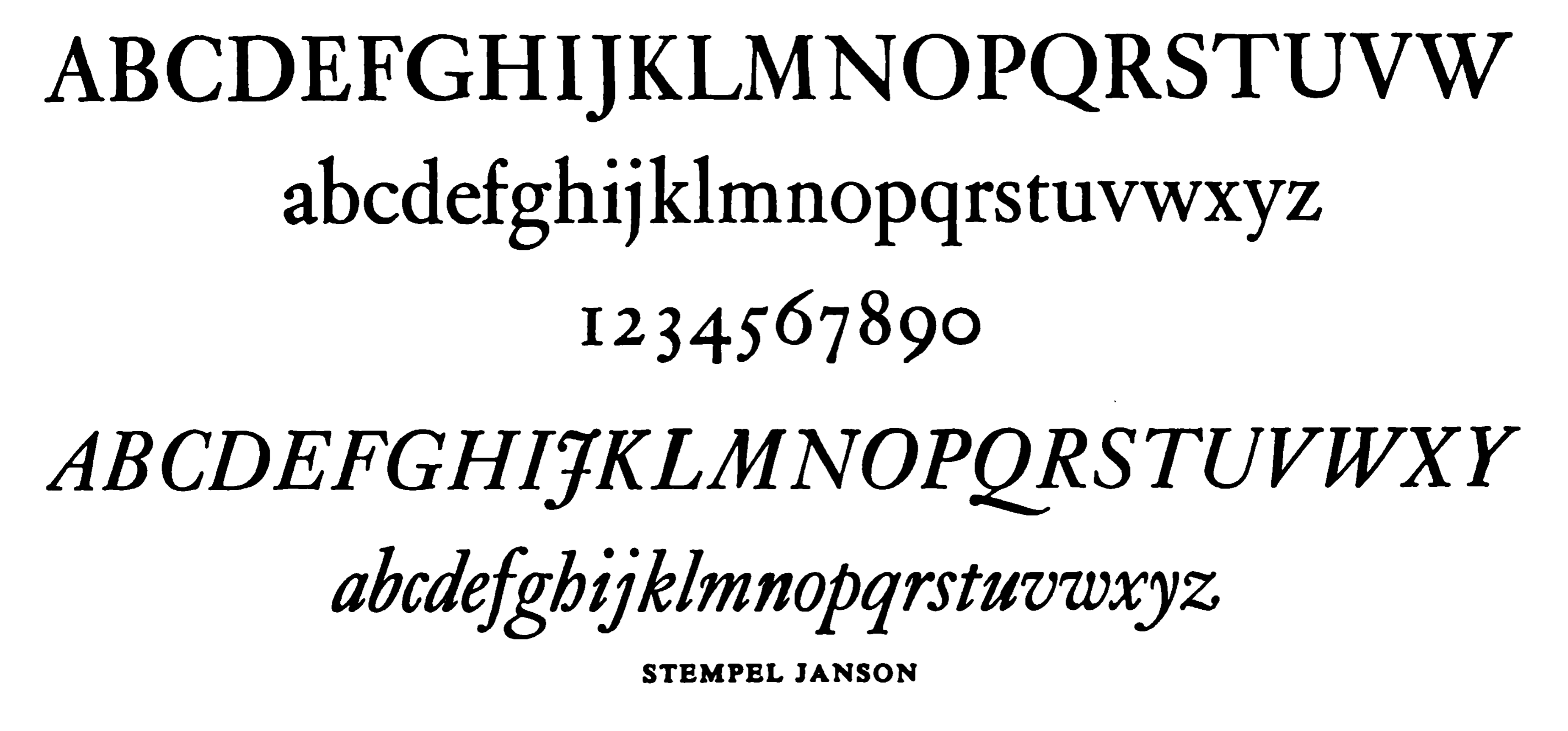
One Nicholas Kis's typefaces cut about 1690. Metal versions of this typefaces were cut by Stempel, Mergenthaler Linotype 1937, Linotype (London), Linotype (Frankfurt) and Lanston Monotype.' Berry, Johnson and Jaspert write: Another type which has been misnamed. The original dates from about 1690 and was cut by Nicholas Kis, a Hungarian in Amsterdam. The original matrices have survived in Germany and have since 1919 been held by the Stempel foundry. The type was not cut by Anton Janson, a Dutchman who worked at Leipzig. In the upper case the M is an easily remembered letter and in the lower case the g, which has a curved ear. In general the thin strokes are thinner than in earlier types. In the italic the m and n are more squared up. Note also the curves of the v and w. The Linotype version follows the original type was designed under the direction of C.H. Griffith. The Monotype Corporation's Ehrhardt (because the original types were in the Ehrhardt Foundry at Leipzig in the early eighteenth century) is a version of this type. |
EXTERNAL LINKS |
| | |

file name: Linotype Janson

file name: Stempel Janson
| | |
|
Luc Devroye ⦿ School of Computer Science ⦿ McGill University Montreal, Canada H3A 2K6 ⦿ lucdevroye@gmail.com ⦿ https://luc.devroye.org ⦿ https://luc.devroye.org/fonts.html |
