|
Cyrillic on Google Fonts: Humanist Sans

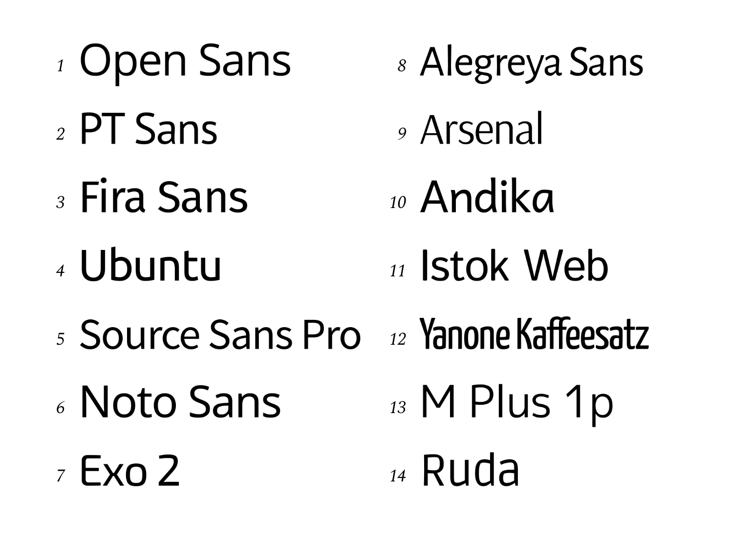
Mikhail Strukov, Yury Ostromentsky and Ilya Ruderman render their verdict on the Cyrillic parts of the main humanist fonts on Google Fonts. Their summary recommendations in 2021: - Open Sans (Steve Matteson): Open Sans can be used when there is no need to save space. But you better avoid using its Cyrillic, especially in the bolder weights.
- PT Sans (Alexandra Korolkova, Olga Umpeleva, Vladimir Yefimov): The typeface is well suited for long texts. Concise and compact, short ascenders and descenders are inducing tight leading. But keep in mind that PT Sans appears fairly light in typesetting and shall be balanced by enough white space, both around and between the lines.
- Fira Sans (Erik Spiekermann, Ralph du Carrois): When choosing a font, don't forget that Fira Sans is very similar to FF Meta. It is not good or bad in itself--it's just that Meta has been widely used for thirty years now. And stay away from Cyrillic, please. Sad to say, it is a true failure.
- Ubuntu (Dalton Maag): Be careful while choosing styles: each has its own set of problems when it comes to Cyrillic (even though such problems are slightly offset by the distinctive personality of Ubuntu).
- Source Sans Pro (Paul D. Hunt): Source Sans Pro would be the right choice if you have to save space, but it's super light. So you have to be careful with small line spacings. And it might be best to avoid using Cyrillic at all.
- Noto Sans (Google): The practical Noto Sans might be useful in multilingual situations, but you'd better consider alternatives for Cyrillic. Here, the very same mistakes reoccur in all styles.
- Exo 2 (Natanael Gama): Exo 2 is optimized for small sizes. However, this Cyrillic fails to reflect the character of the font; not to mention how badly it was designed---with mistakes so grave, that it is hardly worth any recommending for use.
- Alegreya Sans (Juan Pablo del Peral): Alegreya Sans works well in large, and medium sizes. Yet, its Cyrillic should be approached with great caution (because of technical errors, at the very least); and Cyrillic small caps shall not be used under any circumstances.
- Arsenal (Andrij Shevchenko): It would be more appropriate to deploy Arsenal for headlines and in display typesetting. And this Cyrillic is indeed very decent.
- Andika (SIL (former Summer Institute of Linguistics): Victor Gaultney, Annie Olsen): Decent Latin but you don't want to use this Cyrillic, especially for literacy training purposes. Eventually, those children will learn how to read---but they also risk spoiling their taste.
- Istok Web (Andrey V. Panov): Pick a different font! Istok Web is a font of downright poor quality, both in terms of design and from the technical point of view.
- Yanone Kaffeesatz (Yanone): Yanone Kaffeesatz is a vibrant, high-quality font, best used as intended, that is, for display typography.
- M Plus 1p (Coji Morishita): A smart font for flexible typesetting and for the joint use of Japanese and Latin---not Cyrillic script, though. In M Plus 1p, it is of poor quality.
- Ruda (Mariela Monsalve, Angelina Sanchez): Ruda is a typeface with an interesting approach to letterforms and a powerful Latin version. However, this Cyrillic is too messed up to be used.
|
EXTERNAL LINKS
Cyrillic on Google Fonts: Humanist Sans
MyFonts search
Monotype search
Fontspring search
Google search
INTERNAL LINKS
Cyrillic type design ⦿
Choice of fonts ⦿
|


