TYPE DESIGN INFORMATION PAGE last updated on Thu Apr 16 22:25:02 EDT 2026
FONT RECOGNITION VIA FONT MOOSE
|
|
|
|
Léo Guibert
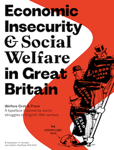
French type designer based in Paris. He graduated in 2020 from the postgraduate program in type design at ESAD Amiens (France) and in 2018 from the DSAA Design Typographique (MFA Type Design) at École Estienne, Paris with a project about experimental workhorse typefaces. He regularly works with PoliceStudio and Typofonderie. His graduation typeface at ESAD was Welfare (Grot and Press), about which he writes: Welfare is rooted in the English Industrial Revolution context and acts as witness to the opposition that existed between typefoundries' commercial typefaces and Private Press Movement's handcrafted revivals. The typeface is composed of two subsets: Grot, a grotesque design inspired by early English sans serifs; and Press, a serif design inspired by Jensonian revivals of the Private Press Movement's typefaces. Co-designer of Cloche d'Or (2016), a custom all caps alphabets done for Minale Design Strategy Brussels. Cloche d'Or was designed by Christophe Badani (lead), Maha Mouidine, and Léo Guibert. It includes Normal, Hatch, Inline Bright, Inline Dark, Stencil and Outline styles. Other earlier typefaces: Covenant (2019: a Scotch roman), Retex (2018: a study into readibility), Savon Italic (2018: with Loan Bottex), Galmi (2017: inspired by Praguese Clay Golem). |
EXTERNAL LINKS |
| | |

file name: Leo Guibert Gabriel Vaury Heritier 2017

file name: Leo Guibert Gabriel Vaury Heritier 2017

file name: Leo Guibert Gabriel Vaury Heritier 2017

file name: Leo Guibert Gabriel Vaury Heritier Stencil 2017

file name: Leo Guibert Gabriel Vaury Heritier Stencil 2017

file name: Leo Guibert Covenant 2019

file name: Leo Guibert Covenant 2019

file name: Leo Guibert Retex 2018

file name: Leo Guibert Retex 2018

file name: Leo Guibert Welfare 2020

file name: Leo Guibert Welfare 2020

file name: Leo Guibert Welfare 2020

file name: Leo Guibert Welfare 2020

file name: Leo Guibert Welfare 2020

file name: Leo Guibert Welfare 2020

file name: Leo Guibert Welfare 2020

file name: Leo Guibert Welfare 2020

file name: Leo Guiber Loan Bottex Savon Italic 2018

file name: Leo Guiber Loan Bottex Savon Italic 2018

file name: Leo Guibert Fanny Hamelin Loan Bottex Marion Sendral Savon 2018

file name: Leo Guiber Galmi 2017

file name: Christophe Badani Maha Mouidine Leo Guibert Cloche D Or 2016.

file name: Christophe Badani Maha Mouidine Leo Guibert Cloche D Or 2016b

file name: Christophe Badani Maha Mouidine Leo Guibert Cloche D Or 2016c

file name: Christophe Badani Maha Mouidine Leo Guibert Cloche D Or 2016d

file name: Christophe Badani Maha Mouidine Leo Guibert Cloche D Or 2016e

file name: Christophe Badani Maha Mouidine Leo Guibert Cloche D Or 2016f

file name: Christophe Badani Maha Mouidine Leo Guibert Cloche D Or 2016g

file name: Christophe Badani Maha Mouidine Leo Guibert Cloche D Or 2016h
| | |
|
Luc Devroye ⦿ School of Computer Science ⦿ McGill University Montreal, Canada H3A 2K6 ⦿ lucdevroye@gmail.com ⦿ https://luc.devroye.org ⦿ https://luc.devroye.org/fonts.html |

