TYPE DESIGN INFORMATION PAGE last updated on Wed May 6 16:35:39 EDT 2026
FONT RECOGNITION VIA FONT MOOSE
|
|
|
|
Agency Gothic
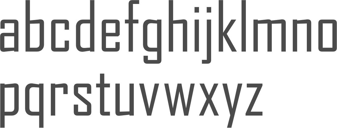
A typeface designed by Morris Fuller Benton in 1933 for American Typefounders. This is a typeface in which normally curved strokes are somewhat straightened. Mac McGrew writes: Agency Gothic is a squarish, narrow, monotone gothic without lowercase, designed by Morris F. Benton in 1932. It has an alternate A and M which further emphasize the vertical lines. Sizes under 36-point were added in 1935. Agency Gothic Open was drawn by Benton in 1932 and introduced in 1934; it follows the same style in outline with shadow, and probably has been more popular than its solid companion. Triangle Type Foundry, a Chicago concern that manufactured matrices, copied this typeface as Slim Open, adding some smaller sizes. ATF's working titles for these typefaces, before release, were Tempo, later Utility Gothic and Utility Open. Compare Raleigh Gothic Condensed, Poster Gothic, Bank Gothic. Digital versions include Warp Three NF (2008, Nick Curtis), which borrows its lowercase from Square Gothic (1888, James Conner's Sons), FB Agency (1995, David Berlow at FontBureau), OPTI Agency Gothic (by Castcraft), Agency Gothic (by Dan Solo), Agency Open (Jason Castle) and Agency Gothic Inline (Jason Castle). |
EXTERNAL LINKS |
| | |

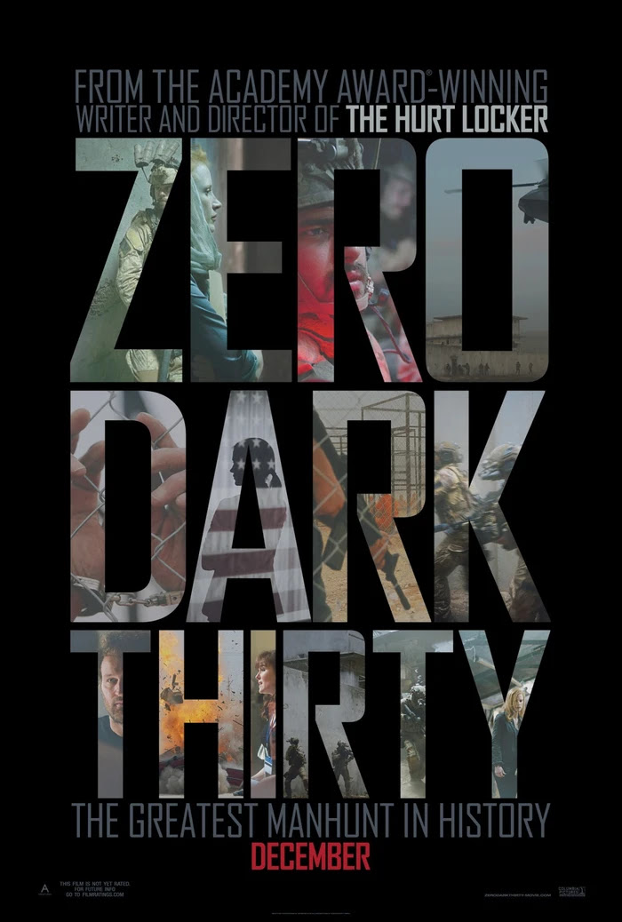
file name: Font Bureau Agency F B in use Zero Dark Thirty Movie Poster 2012

file name: Dan Solo Agency Gothic

file name: Jason Castle Agency Gothic C T Condensed

file name: Castcraft O P T I Agency Gothic

file name: David Berlow Agency F B 1995
| | |
|
Luc Devroye ⦿ School of Computer Science ⦿ McGill University Montreal, Canada H3A 2K6 ⦿ lucdevroye@gmail.com ⦿ https://luc.devroye.org ⦿ https://luc.devroye.org/fonts.html |
