TYPE DESIGN INFORMATION PAGE last updated on Wed May 6 16:08:54 EDT 2026
FONT RECOGNITION VIA FONT MOOSE

file name: Wim Crouwel Hiroshima Poster 1957

file name: Wim Crouwel Edgar Fernhout Poster 1963

file name: Wilson Thomas Edgar Fernhout 2012

file name: Wilson Thomas Edgar Fernhout 2012

file name: Wilson Thomas Edgar Fernhout 2012b

file name: Wim Crouwel Nike Case Crouwel 2014

file name: Wim Crouwel Nike Case Crouwel 2014b

file name: Wim Crouwel Nike Case Crouwel 2014d

file name: Wim Crouwel Hussem Bouthoven Poster 1961

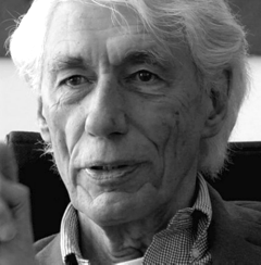
file name: Wim Crouwel Pic

file name: Wim Crouwel Pic1

file name: Wim Crouwel Pic

file name: Wim Crouwel New Alphabet1967

file name: Wim Crouwel New Alphabet

file name: Wim Crouwel Amsterdamse School 1975

file name: Michael Hernan New Alphabet 1996 after Wim Crouwel

file name: Pierre Bernard wim Crouwelby Michael Levy

file name: W I M C R O U W E L E R O B I A Lby Michael Levy

file name: W I M C R O U W E L L E C T U R E 3by Michael Levy

file name: W I M C R O U W E L P O R T R A I T by Michael Levy

file name: Wim Crouwel Postage Stamps 1976

file name: Wim Crouwel Stedelijk Museum Amsterdam Poster 1968

file name: Wim Crouwel Fodor 1969

file name: Wim Crouwel Gridnik 1974

file name: Wim Crouwel New Alphabet 1967

file name: Wim Crouwel Pic

file name: Wim Crouwel Pic

file name: Wim Crouwel Pic

file name: Wim Crouwel Pic

file name: Wim Crouwel Mr Gridnik White Suit

file name: Wim Crouwel Cyrus Highsmith March6 2015 Pic by Henk Gianotten

file name: Wim Crouwel Rabobank Poster 1973

file name: Wim Crouwel Bazaine Poster 1958

file name: Wim Crouwel Etienne Martin Poster 1963

file name: Wim Crouwel Leger Poster 1963

file name: Wim Crouwel S M Japan Poster 1966

file name: Wim Crouwel Stedelijk Museum Amsterdam Poster 1969

file name: Wim Crouwel Vintage Car Pic

file name: Wim Crouwel Stedelijk 1968

file name: Wilson Thomas Edgar Fernhout 2012

file name: Matt Mc Inerney New Alphabet 2008

file name: Mrman New Alphabet Substance Style 2012

file name: Oscar Cobo Wete U T Morph 2018

file name: Oscar Cobo Wete U T Morph 2018a

file name: Oscar Cobo Wete U T Morph 2018d

file name: Oscar Cobo Wete U T Morph 2018e

file name: Oscar Cobo Wete U T Morph 2018f

file name: Paul D Hunt New Azbuka 2012

file name: Duncan Robertson New Alphabet13 2013

file name: David Quay Foundry Gridnik 2016 200547

file name: David Quay Foundry Gridnik 2016 200548

file name: David Quay Foundry Gridnik 2016 200549

file name: David Quay Foundry Gridnik 2016

file name: Wim Crouwel Olivetti Typeface 1974

file name: Wim Crouwel Olivetti Typeface 1974

file name: Fabio Furlanis C Alphabet 2013

file name: Fabio Furlanis C Alphabet 2013b

file name: Fabio Furlanis C Alphabet 2013c

file name: Fabio Furlanis C Alphabet 2013d

file name: Tommy Seddon The Empty Space 2013

file name: Tommy Seddon The Empty Space 2013b

file name: Boris De Vries Wim Crouwel Face1 2011

file name: Boris De Vries Wim Crouwel Face1 2011b

file name: Boris De Vries Wim Crouwel Face2 2011
| | |
|
Luc Devroye ⦿ School of Computer Science ⦿ McGill University Montreal, Canada H3A 2K6 ⦿ lucdevroye@gmail.com ⦿ https://luc.devroye.org ⦿ https://luc.devroye.org/fonts.html |


