TYPE DESIGN INFORMATION PAGE last updated on Fri May 1 17:27:26 EDT 2026
FONT RECOGNITION VIA FONT MOOSE
|
|
|
|
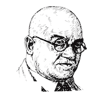
Born in Düsseldorf in 1878, died in Köln, 1935. A teacher at the Köner Werkschule, he designed these typefaces:
Linotype page. Typedia link. FontShop link. Klingspor link. Catalog of some of his digitized typefaces: they include Canyon (SoftMaker), Humanist Slabserif 671 (Bitstream) and a custom typeface by Reymund Schroeder and Andrej Loll. Various digital versions of Candida. Jakob Erbar typeface showcase. |
EXTERNAL LINKS |
| | |

file name: Jakob Erbar Erbar Grotesk Fett 1929

file name: Jakob Erbar Erbar Grotesk Schmal Halbfett 1929

file name: Jakob Erbar Erbar Grotesk Schmalmager 1930

file name: U R W Erbar Neo Mini

file name: U R W Erbar Neo Mini

file name: U R W Erbar 2009

file name: Jakob Erbar Erbar1922

file name: Jakob Erbar Erbar Grotesk 1922

file name: Uwe Borchert Neu5 Land 2018

file name: Uwe Borchert Neu5 Land Bold 2018

file name: Uwe Borchert Neu5 Land Normal 2018

file name: Jakob Erbar Erbar Initialen

file name: Dieter Steffmann Erbar Initialen

file name: Soft Maker Eller Initials 2019 290876 002

file name: Soft Maker Eller Initials 2019 290877 002

file name: Nick Curtis Kudos Kaps Five N F 2006

file name: Jakob Erbar Erbar Kanzlei 1913

file name: Jakob Erbar Erbar Mediaeval 1914

file name: Jakob Erbar Erbar Mediaeval 1914

file name: Jakob Erbar Erbar Mediaeval Halbfett 1913

file name: Jakob Erbar Erbar Mediaeval Kursiv 1914

file name: Jakob Erbar Erbar Mediaeval Lichtfett 1914

file name: Jakob Erbar Erbar Mediaeval Lichtfett 1922

file name: Nick Curtis Jacopo Mediaeval N F 2012 after Jakob Erbar Erbar Mediaeval 1914

file name: Jakob Erbar Feder Grotesk 1909

file name: Jakob Erbar Feder Grotesk Fett 1910

file name: Jakob Erbar Grotesk Lichtfett

file name: Scangraphic Koloss S B

file name: Elsner Flake Koloss E F

file name: Ludwig Mayer Koloss 1916 after J Erbar

file name: Jakob Erbar Lautsprecher 1931

file name: Jakob Erbar Erbar Grotesk Lucina

file name: Jakob Erbar Lucina 1926

file name: Jakob Erbar Lumina 1928

file name: R M U R M U Luchs 2021

file name: R M U R M U Luchs 2021 2

file name: R M U R M U Luchs 2021 3

file name: Jakob Erbar Lux 1929

file name: Jakob Erbar Lux 1929

file name: Steve Jackaman after Jakob Erbar19221930 Phosphate R R Inline

file name: Marcus Sterz Letterpress Phosphor 2009 after jakob Erbar Phosphor 1923

file name: Marcus Sterz Letterpress Phosphor 2009 after jakob Erbar Phosphor 1923b

file name: Marcus Sterz Letterpress Phosphor 2009 after jakob Erbar Phosphor 1923c

file name: Michelle Devlin Candida 2021

file name: Jakob Erbar Candida 1936 Bitstreamversion

file name: Walter Hoehnisch Candida Italic

file name: Ludwig Mayer Antiqua Candida 1960 after Jakob Erbar Candida 1936

file name: Ludwig Mayer Antiqua Candida 1960 after Jakob Erbar Candida 1936

file name: Ludwig Mayer Antiqua Candida 1960 after Jakob Erbar Candida 1936

file name: Ludwig Mayer Antiqua Candida 1960 after Jakob Erbar Candida 1936

file name: Ludwig Mayer Antiqua Candida 1960 after Jakob Erbar Candida 1936

file name: Ludwig Mayer Antiqua Candida 1960 after Jakob Erbar Candida 1936

file name: Ludwig Mayer Antiqua Candida 1960 after Jakob Erbar Candida 1936

file name: Ludwig Mayer Antiqua Candida 1960 after Jakob Erbar Candida 1936

file name: Ludwig Mayer Antiqua Candida 1960 after Jakob Erbar Candida 1936

file name: Ludwig Mayer Antiqua Candida 1960 after Jakob Erbar Candida 1936

file name: Ludwig Mayer Antiqua Candida 1960 after Jakob Erbar Candida 1936

file name: Ludwig Mayer Antiqua Candida 1960 after Jakob Erbar Candida 1936

file name: Ludwig Mayer Antiqua Candida 1960 after Jakob Erbar Candida 1936

file name: Ludwig Mayer Antiqua Candida 1960 after Jakob Erbar Candida 1936

file name: Ludwig Mayer Antiqua Candida 1960 after Jakob Erbar Candida 1936

file name: Ludwig Mayer Antiqua Candida 1960 after Jakob Erbar Candida 1936

file name: Ludwig Mayer Antiqua Candida 1960 after Jakob Erbar Candida 1936

file name: Ludwig Mayer Antiqua Candida 1960 after Jakob Erbar Candida 1936

file name: Jakob Erbar Portrait
| | |
|
Luc Devroye ⦿ School of Computer Science ⦿ McGill University Montreal, Canada H3A 2K6 ⦿ lucdevroye@gmail.com ⦿ https://luc.devroye.org ⦿ https://luc.devroye.org/fonts.html |


