TYPE DESIGN INFORMATION PAGE last updated on Mon Apr 13 05:20:06 EDT 2026
FONT RECOGNITION VIA FONT MOOSE
|
|
|
|
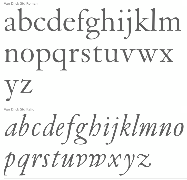
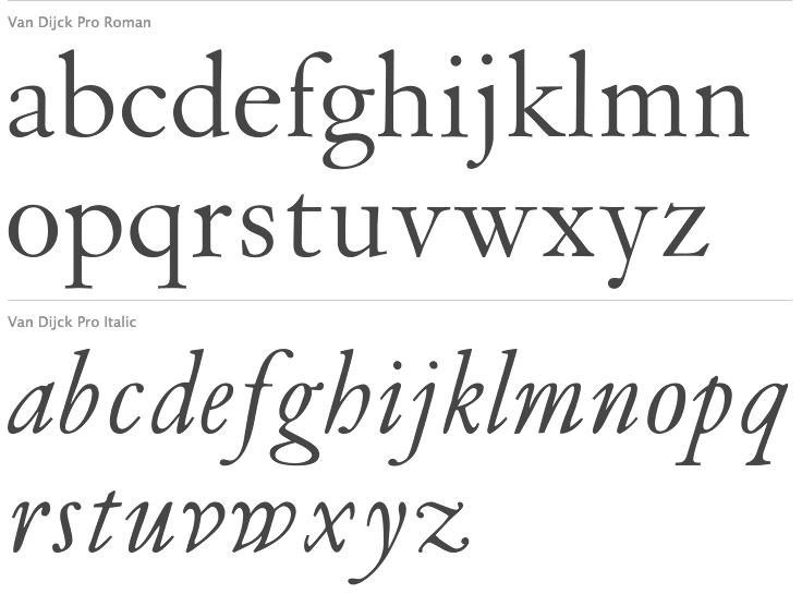
Born in Dexheim, Germany in 1606 or 1608 (some sources say 1601), he died in Amsterdam in 1669. Dutch printer, typefounder, type cutter, and type designer who worked for Elsevier. He had a type foundry in Amsterdam. In texts like Johan Enschedé's Proef vann Letteren (1768), his name is spelled Chistoffel van Dyk. Elsewhere we find the more modern Dutch spellings Dijk and Dijck for his last name. Rudi Geeraerts explains a bit about present day types based on Van Dijck's work. I cite him, interspersed with my own comments and additions:
FontShop link. Klingspor link. Christoffel Van Dijck's digital legacy. |
EXTERNAL LINKS |
| | |

file name: Christoffel Van Dijck Dutch Textura 1681

file name: Johan Enschede Proef Van Letteren 1768 Christoffel Van Dyk Augustyn Duits No2

file name: Johan Enschede Proef Van Letteren 1768 Christoffel Van Dyk Descendiaan Duits No2

file name: Johan Enschede Proef Van Letteren 1768 Christoffel Van Dyk Mediaan Duits No2

file name: Gerard Unger Hollander 1983

file name: Gerard Unger Hollander Bold 1983

file name: Van Dijck Book B Q Regular 1993

file name: Robin Nicholas Van Dijck

file name: Robin Nicholas Monotype Van Dijck Pro

file name: Robin Nicholas Monotype Van Dijck Pro

file name: Gerard Daniels D T L Elzevir 1993

file name: Gerard Daniels D T L Elzevir 1993b

file name: Gerard Daniels D T L Elzevir 1993c

file name: Gerard Daniels D T L Elzevir 1993d

file name: Gerard Daniels D T L Elzevir 1993e

file name: Gerard Daniels D T L Elzevir 1993f

file name: Gerard Daniels D T L Elzevir 1993g

file name: Gerard Daniels D T L Elzevir 1993h

file name: Gerard Daniels D T L Elzevir 1993i

file name: Gerard Daniels D T L Elzevir 1993j

file name: Gerard Daniels D T L Elzevir 1993k

file name: Gerard Daniels D T L Elzevir 1993l

file name: Gerard Daniels D T L Elzevir 1993m

file name: Gerard Daniels D T L Elzevir 1993n

file name: Gerard Daniels D T L Elzevir 1993o

file name: Gerard Daniels D T L Elzevir 1993p

file name: Gerard Daniels D T L Elzevir 1993q

file name: Gerard Daniels D T L Elzevir 1993r

file name: Gerard Daniels D T L Elzevir 1993s

file name: Gerard Daniels D T L Elzevir 1993t

file name: Gerard Daniels D T L Elzevir 1993u

file name: Gerard Daniels D T L Elzevir 1993v

file name: Gerard Daniels D T L Elzevir 1993w

file name: Gerard Daniels D T L Elzevir 1993x

file name: Gerard Daniels D T L Elzevir 1993y

file name: Gerard Daniels D T L Elzevir 1993z
| | |
|
Luc Devroye ⦿ School of Computer Science ⦿ McGill University Montreal, Canada H3A 2K6 ⦿ lucdevroye@gmail.com ⦿ https://luc.devroye.org ⦿ https://luc.devroye.org/fonts.html |


