TYPE DESIGN INFORMATION PAGE last updated on Thu Apr 16 21:58:53 EDT 2026
FONT RECOGNITION VIA FONT MOOSE
|
|
|
|
Vladimir Yefimov (b. Moscow, 1949, d. Moscow, 2012) was the art director and a co-founder of ParaType, Ltd., Moscow (since 1992; before that, starting in 1988, it was called ParaGraph, and he had been staff designer there since its inception). He lectured on type design at the Stroganov Higher School of Arts and Crafts, Moscow (1995-96) and the Higher Academical School of Graphic Design, Moscow (1997-98). He worked at the type department of NPO Polygraphmas (1973-1991). He is the designer of many Cyrillic typefaces, and several Indian, Greek, and Hebrew typefaces, and author on typography and type design. His typefaces include Bitstream Kis Cyrillic, AdverGothic (1989, after Advertisers Gothic by Robert Wiebking from 1917), Futuris, Futura PT (1991, 22 styles in all, after Renner's famous 1927 design), Compact (1991, ParaGraph, based on Anons by Gennady Baryshnikov), Decor (1989, after a typeface by Gennady Baryshnikov), Zhikharev (1989, after a 1953 original by Igor Zhikharev), Arthur (1994, TypeMarket, based on Agfa Marigold by Arthur Baker, 1989), Fraktura (1987, a Latin Fraktur typeface based on Justus E. Walbaum's Walbaum Fraktur), PT Didona (1992), PT ITC True Grit (1997, a Cyrillic version of Michael Stacey's ITC True Grit from 1995), PT Octava (2000, earlier (1996) called Scriptura Russica, a family commissioned by the Russian Bible Society and based on Lectura, 1969, by Dick Dooijes and Stone Print, 1991, by Sumner Stone. Octava won the Grand Prix of the Golden Biennale in 1996), Standard Poster (1992, based on a design from 1986 at Polygraphmash, inspired in turn by the fat didone style of the Ossip Lehmann type foundry (St.Petersburg)), Mason Sans Cyrillic (2002, Paratype, extending the Mason Sans family of Barnbrook at Emigre (1992)), Petersburg (1992), PT Compact (1991), PT ITC Fat Face (1993, with the help of Gennady Baryshnikov), PT ITC Zapf Chancery (1993, with the help of Gennady Baryshnikov), PT ITC Flora (1993, with help from Emma Zakharova, an extension of Unger's 1989 font ITC Flora), PT Pragmatica (1989, with Alexander Tarbeev and later Isabella Chaeva), the Cyrillic version of ITC Avant Garde Gothic (Paratype, 1993), the Cyrillic version of ITC Charter (1999, called PT ITC Charter) and the Cyrillic version of Barnbrook's Mason. He oversaw the development of the PT Sans (Open Font Library link) and PT Serif superfamilies in 2010-2011. PT Serif was co-designed with Olga Umpeleva and Alexandra Korolkova. In 2012, Isabella Chaeva and Vladimir Yefimov created a Cyrillic version of Roundhand BT (1966, Matthew Carter) for ParaType. The typeface was posthumously released. Yefimov Serif (2014) is a contemporary serif face, with low contrast, squarish shapes of round glyphs and emphasized business-like nature. It is one of the last original typefaces by Vladimir Yefimov. The typeface was completed by Maria Selezeneva and released by ParaType in 2014. The companion typeface is Yefimov Sans (2015, by Alexandra Korolkova and Maria Selezeneva). Adam Twardoch's announcement of his death: Today, the co-founder of ParaType, prolific type designer and teacher Vladimir Yefimov has died in Moscow. Both his original typefaces and his masterful Cyrillic extensions of existing Latin typefaces were truly impressive. He even attempted multi-script extensions such as that of ITC Avant Garde. Among my favorite text typefaces (or actually, serif screen typefaces) is Vladimir's Octava. Matthew Carter praised Vladimir's Cyrillic version of ITC Charter, which I think is one of the finest Cyrillic alphabets ever designed. I was also very fond of Vladimir's Cyrillic extension of Kis, which John Hudson described as "one of his favourite Cyrillic text types as well as a remarkable exercise in historic imagination." Vladimir often collaborated with other designers, many of them were his former students. One of the last projects that he participated in was the monumental PT Sans (Open Font Library link, Github link) and PT Serif project. But he was not only dedicated, skillful and artistically refined---but also kind, generous, modest, warm and funny. I first met him in 1998 at the ATypI Lyon conference, and greatly enjoyed all the subsequent occasions that I could spend some time with him. It's been a great pleasure and a true privilege knowing him (a bit). Brief CV. At ATypI 2004 in Prague, he spoke about the origin and history of Cyrillic letters. At ATypI 2008 in St. Petersburg, he spoke about designing Latin/Cyrillic fonts. FontShop link. Klingspor link. Paratype link. Google Plus link. |
EXTERNAL LINKS |
| | |

file name: Pic efimov

file name: Pic vladimir yefimov

file name: Vladimir Yefimov Pic

file name: Alexandra Korolkova Olga Umpeleva Vladimir Yefimov P T Serif Narrow Pro Black 2011

file name: Alexandra Korolkova Olga Umpeleva Vladimir Yefimov P T Serif Pro 2011

file name: Alexandra Korolkova Olga Umpeleva Vladimir Yefimov P T Serif Pro 2011b

file name: Alexandra Korolkova Olga Umpeleva Vladimir Yefimov P T Serif 2013

file name: Alexandra Korolkova Olga Umpeleva Vladimir Yefimov P T Serif 2013b

file name: Alexandra Korolkova Olga Umpeleva Vladimir Yefimov P T Serif 2013c

file name: Alexandra Korolkova Olga Umpeleva Vladimir Yefimov P T Serif 2013d

file name: Alexandra Korolkova Olga Umpeleva Vladimir Yefimov P T Serif 2013e

file name: Paratype P T Serif 2010

file name: Maria Selezeneva Vladimir Yefimov Yefimov Serif 2014b

file name: Maria Selezeneva Vladimir Yefimov Yefimov Serif 2014c

file name: Maria Selezeneva Vladimir Yefimov Yefimov Serif Black 2014

file name: Maria Selezeneva Alexandra Korolkova Vladimir Yefimov Yefimov Sans 2015

file name: Maria Selezeneva Alexandra Korolkova Vladimir Yefimov Yefimov Sans 2015b

file name: Maria Selezeneva Alexandra Korolkova Vladimir Yefimov Yefimov Sans 2015c

file name: Vladimir Yefimov Herold 1993 after Heinz Hoffmann Herold Reklameschrift 1901 255813

file name: Vladimir Yefimov Herold 1993 after Heinz Hoffmann Herold Reklameschrift 1901 255814

file name: Vladimir Yefimov Herold 1993 after Heinz Hoffmann Herold Reklameschrift 1901 255815

file name: Vladimir Yefimov Herold 1993 after Heinz Hoffmann Herold Reklameschrift 1901 255816

file name: Vladimir Yefimov Herold 1993 after Heinz Hoffmann Herold Reklameschrift 1901 255817

file name: Vladimir Yefimov Herold 1993 after Heinz Hoffmann Herold Reklameschrift 1901 255818

file name: Vladimir Yefimov Herold 1993 after Heinz Hoffmann Herold Reklameschrift 1901 43712

file name: Vladimir Yefimov Herold 1993 after Heinz Hoffmann Herold Reklameschrift 1901

file name: Gennady Baryshnikov Vladimir Yefimov Decor 1989
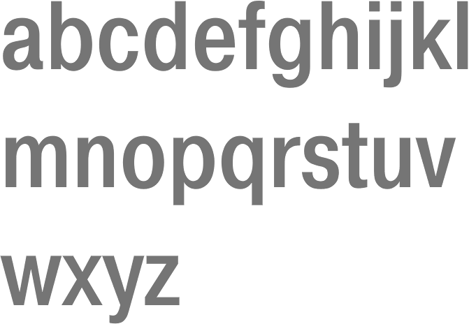
file name: Vladimir Yefimov Alexander Tarbeev Isabella Chaeva Pragmatica Cond Medium 1989
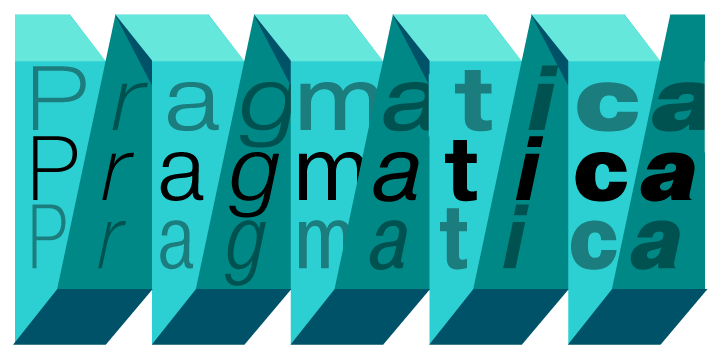
file name: Vladimir Yefimov Alexander Tarbeev Isabella Chaeva Pragmatica 1989
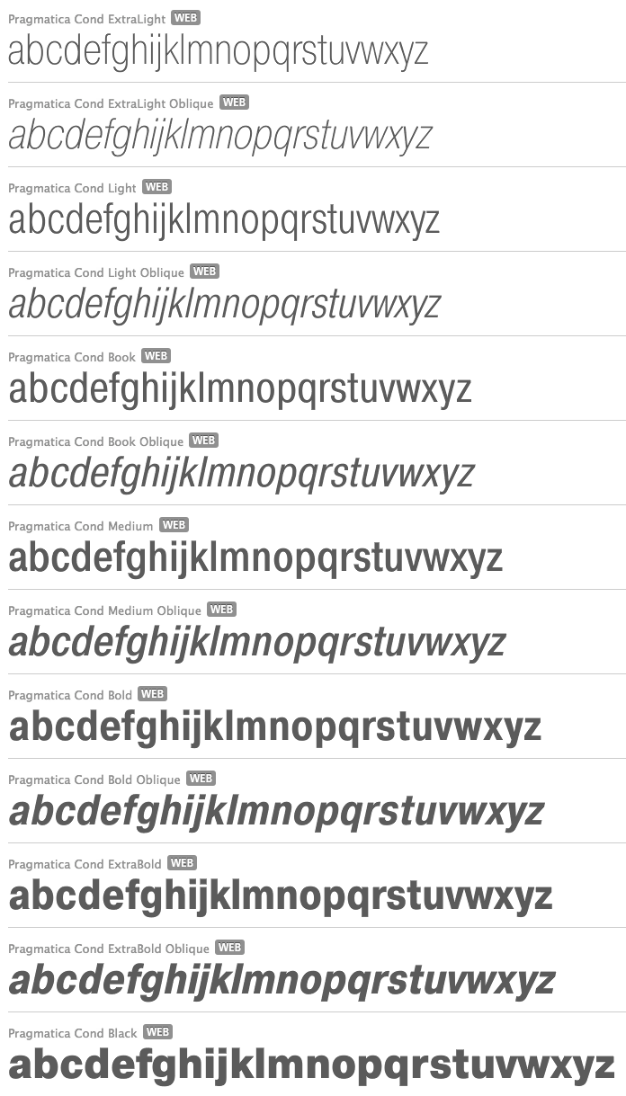
file name: Vladimir Yefimov Alexander Tarbeev Isabella Chaeva Pragmatica 1989b

file name: Vladimir Yefimov Olga Chaeva Pragmatica 1989 2004

file name: Igor Zhikharev Gennady Baryshnikov Vladimir Yefimov Zhikharev 1989 after original 1953
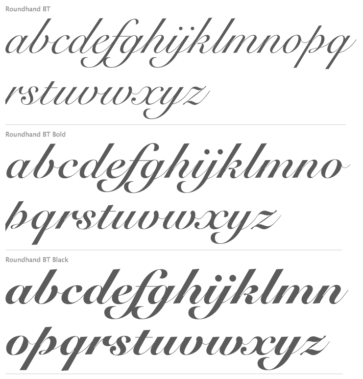
file name: Isabella Chaeva Vladimir Yefimov Roundhand B T Cyrillic 2013 after Matthew Carter Roundhand 1966

file name: Isabella Chaeva Vladimir Yefimov Roundhand B T Cyrillic 2013 after Matthew Carter Roundhand B T Black 1966

file name: Paratype P T Sans Bold 2009

file name: Paratype P T Sans 2010

file name: Paratype Didona

file name: Paul Renner Vladimir Yefimov Paratype Futura P T 2003 236296

file name: Vladimir Yefimov Futura P T 1991

file name: Vladimir Yefimov Futura P T Demi 1991

file name: Vladimir Yefimov Futura P T Extra Bold 1991
| | |
|
Luc Devroye ⦿ School of Computer Science ⦿ McGill University Montreal, Canada H3A 2K6 ⦿ lucdevroye@gmail.com ⦿ https://luc.devroye.org ⦿ https://luc.devroye.org/fonts.html |

