|
Gustave F. Schroeder

Punchcutter, b. 1861 (Berlin), who made many typefaces. He worked at the Central Type Foundry and then ATF in the late 1800s, and was living in St. Louis, MO, in 1891 and in Mill Valley, CA in 1892. The Inland Printer announced in 1895 that Schroeder had joined the Pacific States Type Foundry in San Francisco. His typefaces straddle the Victorian, arts and crafts and art nouveau eras. His typefaces include: - Victorian style typefaces at Central Type foundry, done early in his career: Apollo (1888), Atlanta (1885, based on a design of Andreas V. Haight), Harper (1882, curly), Hogarth (1883), Jeffderson (1890), Jupiter (1888), Lafayette (1885), Morning Glory (1884), Scribner (1883), Victoria (1886, with Nicholas J. Werner), Victoria Italic (1891), Washington (1886). Apollo was revived by Nick Curtis in 2014 as Gloriosus NF.
- At Marder, Luse and Co: French Old Style Extended.
- At Pacific States: Aldus Italic (before 1891), Sierra (before 1897).
- Arts and crafts typefaces at Central Type Foundry: Eccentric (1881, available in digital form at Monotype (Agfa), Solotype, Jeff Levine (2020: called Oddly Nouveau JNL), and Adobe. There is also a free version, Eccentrical, from an unknown designer.
- Art nouveau typefaces done at Central Type Foundry: Art Gothic (1885), Multiform No. 1 through No. 4 (1892).
- Othello (1886, Central Type Foundry). A black condensed rounded typeface that became very successful thanks to its revival (copy?) by Morris Fuller Benton. Digital versions include Bathysphere (2013, by Seymour Caprice) and Nick Curtis's Iago NF (2011).
- Geometric Condensed (1882, Central Type Foundry, with W.W. Jackson). Revived in 2014 under the same name by Robert Donona.
- For Barnhart Bros and Spindler: Era (1891) and Era Condensed No. 5 (1891). These typefaces were done with Nicholas J. Werner. Pastel was originally called Era.
- For ATF: Empire Initials (ca. 1898), McCullagh No. 2 (1897, a remarkable art deco typeface twenty years ahead of its time). Patent application for McCullagh.
- Geometric (+Italic, Condensed, Antique). Done in 1881 at Central Type Foundry. The Condensed and Antique are from 1883. For a digital version, see HWT Geometric (2013) by Hamilton Wood Type / James Grieshaber.
- DeVinne (1890-1896, Central Type Foundry). This design was sold to Stephenson Blake. Digital versions available at Bitstream and Wooden Type Fonts. Bitstream writes about its version: This revival of the Bruce Foundry's No. 11 is typical of the nineteenth century types derived from the work of Didot and Bodoni; the typeface remains popular with lawyers and government printers. In fact, Theodore Low De Vinne opposed this kind of design as hard to print and read; he had Century designed to replace it.
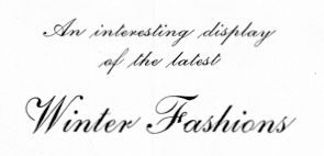
- Other typefaces at Central Type Foundry: Cushing Old Style (1890), Erebus (1889), Hades (1889), Johnston Gothic (1892, with Nicholas J. Werner), Laclede (1897), Novelty Script (ca. 1891), Old Style Bold (1886), Old Style Script (1887), Quaint Roman (1890 or 1895), Royal Script (1887), Typewriter (1884), University (1889). Mac McGrew on Royal Script: Royal Script originated with the Central Type Foundry branch of ATF in St. Louis in 1893. It is much like the later Typo Script, but wider. In spite of that similarity, it appeared in ATF specimen books as late as 1968. In the 24- and 30-point sizes there are normal and small versions of lowercase, caps being the same. Early specimens designated these large and small sizes as No.1 and No.2 respectively, later specimens as No. 551 and No. 552. Hansen's Newton Script is the same design.
- The angled serif font family Romana (1892). Digital versions by Linotype, Elsner & Flake (called EF Romana) and Bitstream. Bitstream puts this didone design in the proper context: The French interest in the revival of suitably edited Oldstyle romans as an alternative to a world of Modern typefaces started in 1846 when Louis Perrin cut the Lyons capitals. About 1860, as Phemister was cutting the Miller & Richard Old Style in Edinburgh, Theophile Beaudoire turned the idea of the Lyons capitals into a complete Oldstyle typeface, with similar overwhelming success; it was generally known as Elzevir in France and Roemisch, Romanisch, Romaans or Romana in Germany, Holland and Switzerland. In 1892, Gustav Schroeder, at the Central Division of ATF, expanded the series, adding a boldface under the name DeVinne. It was promptly copied, initially in Europe by Ludwig & Mayer, and spread rapidly throughout the US and Europe, becoming the best known member of the series. ATF made popular an ornamental form under the name De Vinne Ornamental.
- Patent applications: unnamed face for BBS (1891), another unnamed face (1893), an unnamed art nouveau face and another unnamed serif face (1893, for VJA Rey).
FontShop link. Google patent link. Typefaces by him at MyFonts.
|
EXTERNAL LINKS
Gustave F. Schroeder
 [Designer info] [Designer info]
Monotype link
Klingspor Museum page
MyFonts search
Monotype search
Fontspring search
Google search
INTERNAL LINKS
Type designers ⦿
Type designers ⦿
German type scene ⦿
Art Nouveau typefaces ⦿
Type scene in Missouri ⦿
Type scene in California ⦿
Arts and Crafts Movement ⦿
Victorian typefaces ⦿
Modern style [Bodoni, Didot, Walbaum, Thorowgood, Computer Modern, etc.] ⦿
Elzevir ⦿
Curly typefaces ⦿
|


