TYPE DESIGN INFORMATION PAGE last updated on Thu Apr 16 21:59:08 EDT 2026
FONT RECOGNITION VIA FONT MOOSE
|
|
|
|
Parkinson Type Design
[Jim Parkinson]
Jim Parkinson's Parkinson Type Design was based in Oakland, CA. This prolific type designer was born in 1941 in Richmond, CA, and lived in Oakland, CA. After a long struggle with Alzheimer's, he died on June 26, 2025 at his home in Oakland. Originally, a letterer, he went digital in 1990. His Keester and Azuza typefaces won awards at the TDC2 Type Directors Club's Type Design Competition 2002. MyFonts on Jim Parkinson and on his Parkinson Foundry. His impressive output:
MyFonts interview. FontShop link. More FontShop material on him. Klingspor link. |
EXTERNAL LINKS |
| | |

file name: Jim Parkinson Pic

file name: Font Shop Pic of Jim Parkinson Typo S F 2012

file name: Jim Parkinson Comrade Bold 1998 after Jozef Peeters

file name: Jim Parkinson 76 Birthday 2017

file name: Jim Parkinson Azuza 2002

file name: Jim Parkinson Azuza 2001c

file name: Jim Parkinson Azuza 2001d
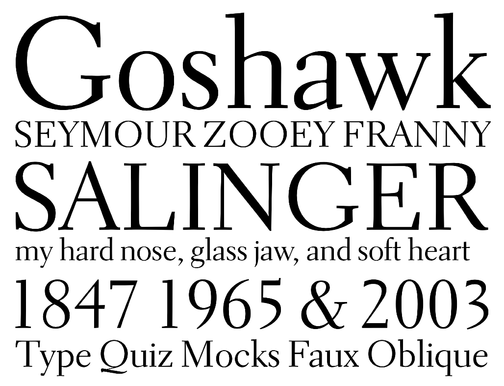
file name: Jim Parkinson Parkinson Electra 2010 based on W A Dwiggins Electra
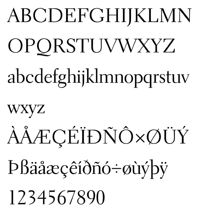
file name: Jim Parkinson Parkinson Electra 2010 based on W A Dwiggins Electra

file name: Jim Parkinson Parkinson Electra 2012 based on W A Dwiggins Electra
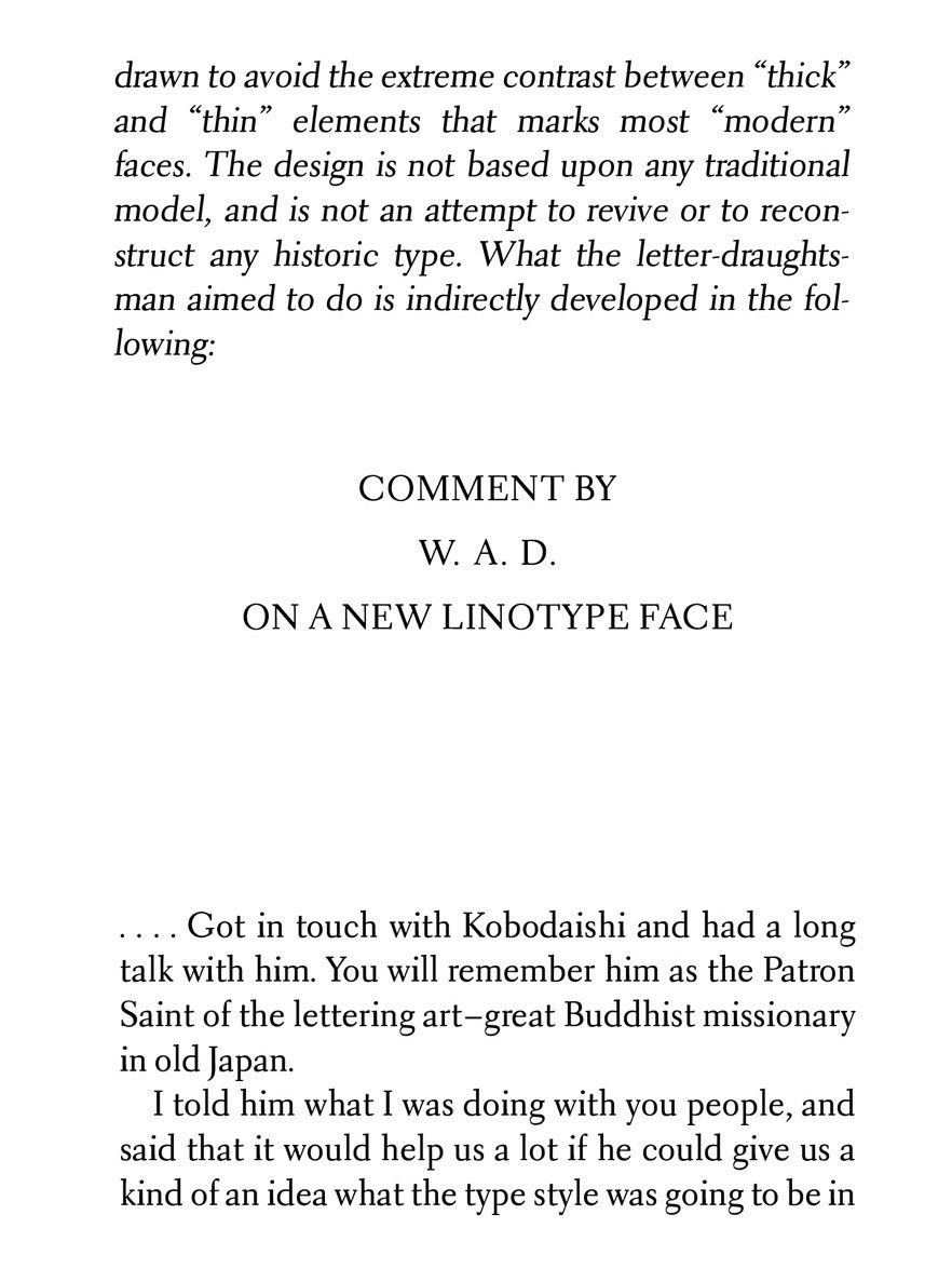
file name: Jim Parkinson Aluminia 2017 based on W A Dwiggins Electra
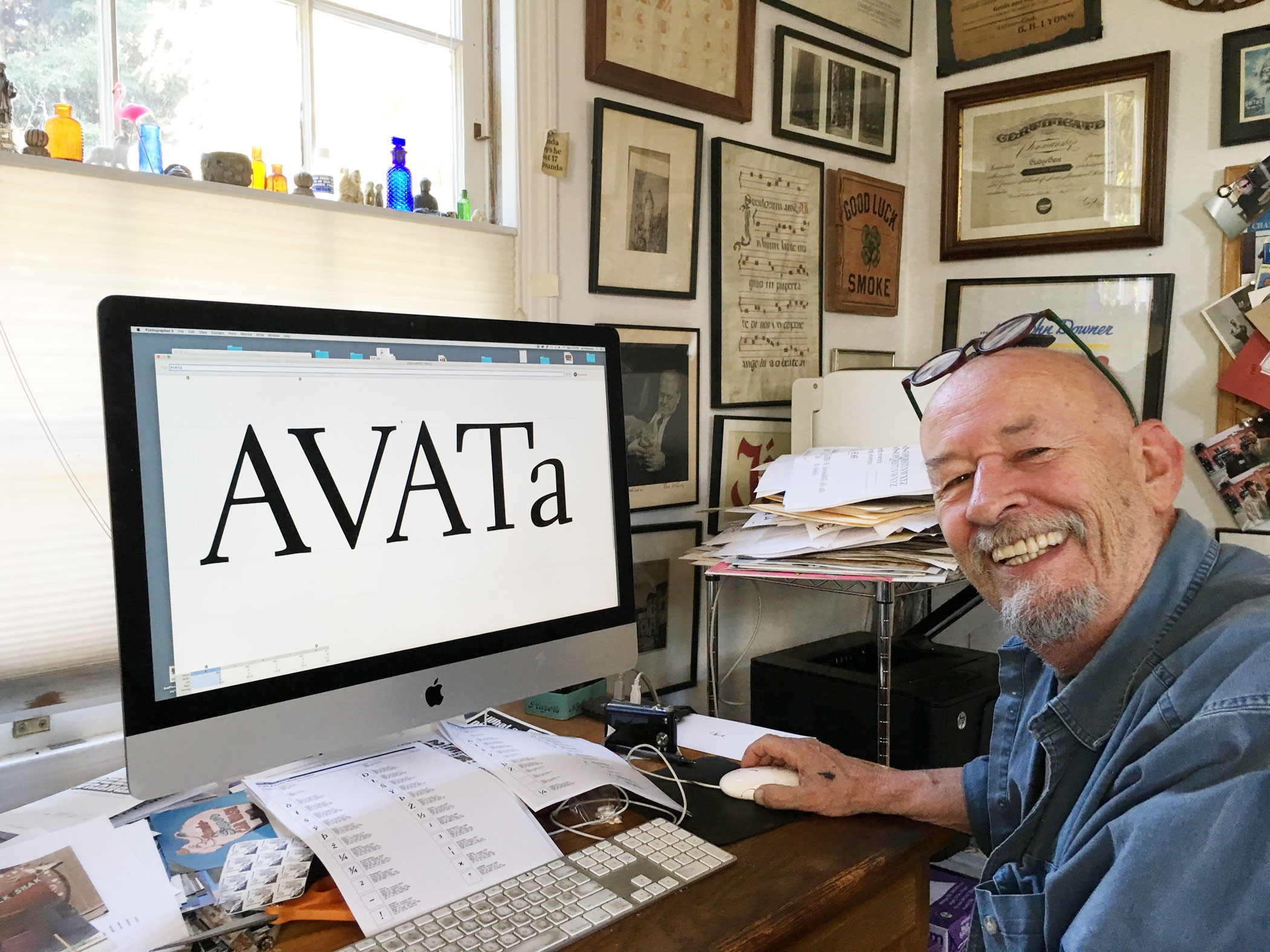
file name: Jim Parkinson working on Aluminia 2017

file name: Jim Parkinson F F Matinee Gothic 1996

file name: Jim Parkinson Sumner Stone Holly Goldsmith Janice Fishman I T C Bodoni Seventy Two Bold 1994

file name: Jim Parkinson Sumner Stone Holly Goldsmith Janice Fishman I T C Bodoni Seventy Two Book 1994

file name: Giambattista Bodoni Jim Parkinson Sumner Stone Holly Goldsmith Janice Fishman I T C Bodoni Twelve 1994

file name: Janice Fishman Holly Goldsmith Jim Parkinson Sumner Stone I T C Bodoni Seventytwo Book 1994 1995

file name: Jim Parkinson Sutro Initials 2016 226717

file name: Jim Parkinson Sutro Initials 2016 226719

file name: Jim Parkinson Sutro Initials 2016 226720

file name: Jim Parkinson Sutro Initials 2016 226721

file name: Jim Parkinson Sutro Initials 2016

file name: Jim Parkinson Sutro Deluxe 2014

file name: Jim Parkinson Sutro Deluxe 2014b

file name: Jim Parkinson Sutro Deluxe 2014c

file name: Jim Parkinson Sutro Deluxe 2014d

file name: Jim Parkinson Sutro Deluxe 2014e

file name: Jim Parkinson Sutro Deluxe 2014f

file name: Jim Parkinson Sutro Deluxe 2014g

file name: Jim Parkinson Sutro Deluxe 2014h

file name: Jim Parkinson Sutro Deluxe 2014i

file name: Jim Parkinson Sutro Deluxe 2014j

file name: Jim Parkinson Hoosier Daddy 2012

file name: Jim Parkinson Hoosier Daddy 2012b

file name: Jim Parkinson Antique Condensed Two

file name: Jim Parkinson Balboa 2001a

file name: Jim Parkinson Balboa 2001c

file name: Jim Parkinson Balboa Black 2001

file name: Jim Parkinson Balboa Extra Black 2001

file name: Jim Parkinson Balboa Extra Condensed 2001

file name: Jim Parkinson Balboa Medium 2001

file name: Jim Parkinson Balboa Plus 2015 186945

file name: Jim Parkinson Balboa Plus 2015 186948

file name: Jim Parkinson Balboa Plus 2015 186951

file name: Jim Parkinson Balboa Plus 2015 186952

file name: Jim Parkinson Balboa Plus 2015

file name: Jim Parkinson Balboa Plus 2015

file name: Jim Parkinson Balboa Plus 2015h

file name: Jim Parkinson Balboa Plus 2015i

file name: Jim Parkinson Balboa Plus 2015j

file name: Jim Parkinson Balboa Plus 2015k

file name: Jim Parkinson Balboa Plus 2015l

file name: Jim Parkinson Balboa Plus 2015m

file name: Jim Parkinson Balboa Plus 2015n

file name: Jim Parkinson Meatball 2012

file name: Jim Parkinson Meatball 2012b

file name: Jim Parkinson Cabazon 2005

file name: Jim Parkinson Commerce Gothic

file name: Jim Parkinson Dreamland 1999

file name: Jim Parkinson El Grande 1993

file name: Jim Parkinson Industrial Gothic Std Banner

file name: Jim Parkinson Jimbo 1995

file name: Jim Parkinson Modesto 2000

file name: Jim Parkinson Modesto Expanded 2000

file name: Jim Parkinson Mojo 1996

file name: Jim Parkinson Mojo 1996

file name: Jim Parkinson Mojo

file name: Jim Parkinson Montara 2001

file name: Jim Parkinson Parkinson Medium 1994

file name: Jim Parkinson Newsweek No9

file name: Jim Parkinson I T C Roswell

file name: Jim Parkinson I T C Roswell Two

file name: Jim Parkinson Poster Black 1993
| | |
|
Luc Devroye ⦿ School of Computer Science ⦿ McGill University Montreal, Canada H3A 2K6 ⦿ lucdevroye@gmail.com ⦿ https://luc.devroye.org ⦿ https://luc.devroye.org/fonts.html |


