|
Max Miedinger

Swiss designer, born and died in Zürich, 1910-1980. His typefaces, all produced for the Haas Foundry in Basel, Switzerland: - Pro Arte (1954), a very condensed Playbill-like slab serif that is similar to many of its genre.
- Helvetica (1956/57), Helvetica Rounded (1956/57). Helvetica was in fact first called Neue Haas Grotesk, and was only named Helvetica in 1960 by Stempel AG, because it wanted to appeal to an international market. Erik Spiekermann says that it was coined by a Stempel salesman, Heinz Eul, although credit for the invention of the name later went to Eul's boss, Schultz-Anker, the managing director of Stempel. Linotype published Neue Helvetica in 1983, with weights denoted by two digits, ab, where a goes from 2 to 9 (ultra light to black), and b from 3 to 7 (extended to condensed)---example: 75 is Bold Regular. A total of 51 weights were produced in 1983.
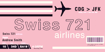
The Bitstream version of Helvetica is called Swiss 721. See also "Sans" and "Hegel" on the SoftMaker MegaFont XXL CD, 2002. URW's version of Helvetica, free with the Ghostscript font package, is Nimbus Sans (1987). Most famous for Meta, Spiekermann is quoted as saying: Neue Haas Grotesk was a redesign of (surprise!) Haas Grotesk, which in turn was partly based on Scheltersche Grotesk from Schelter&Giesecke in those days, type was also quickly assimilated, copied, emulated, ripped-off; the success of Akzidenz Grotesk had alerted Haas to the fact that they were missing sales because all the Swiss designers were specifying AG from Germany. People are always reminded that Miedinger was in fact a salesman, not a true type designer. Nick Shinn: Here is a document showing the working process of plagiarizing Akzidenz Grotesk that Miedinger oversaw. Mac McGrew: Helvetica originated as Neue Haas Grotesk at the Haas Type foundry in Switzerland, where Max Miedinger, in cooperation with Edward Hoffman, drew the first version in 1957; this was acquired by Stempel in Germany and developed into an extensive series, which has become what is probably the most widely used typeface of the 1980s and 1990s. The name is derived from an ancient name for Switzerland. Along with the foundry type, many fonts of German Linotype matrices were imported into the United States. In 1965 Mergenthaler Linotype copied several versions and later added more of its own. Since alignment standards are different, American typographers who had bought imported matrices had to replace them with domestic mats so the older versions would align with the added ones. Linotype's Helvetica Bold is the same weight as what is common- ly known as Helvetica Medium in foundry type; this has caused much confusion. A spokesman says, "At Mergenthaler we use Medium to designate a weight that is in the text category. We have no Mediums that are designed for bold typeface emphasis. We intend to stick with this system for all the future faces we produce." Lanston Monotype, after it was taken over by ATF in the late 1960s, produced several weights of Helvetica, but listed them only as Gothic with their identifying numbers. Reportedly they were copied directly from Linotype cuttings, without the delicate adjustments normally made to fit the Monotype unit system; thus these typefaces have a somewhat spotty appearance when assembled. Compare Record Gothic Medium-Extended. - Horizontal (1964). Digitally revived in 2007 by Patrick Griffin (Canada Type) as Miedinger. Canada Type writes: The original film typeface was a simple set of bold, panoramically wide caps and figures that give off a first impression of being an ultra wide Gothic incarnation of Microgramma. Upon a second look, they are clearly more than that. This typeface is a quirky, very non-Akzidental take on the vernacular, mostly an exercise in geometric modularity, but also includes some unconventional solutions to typical problems (like thinning the midline strokes across the board to minimize clogging in three-storey forms). This digital version introduces a new lighter weight alongside the bold original.
Biography by Nicholas Fabian. Linotype link. FontShop link. Klingspor link. Wikipedia link.
|
EXTERNAL LINKS
Max Miedinger
 [Designer info] [Designer info]
Monotype link
Klingspor Museum page
MyFonts search
Monotype search
Fontspring search
Google search
INTERNAL LINKS
Type designers ⦿
Type designers ⦿
Type design in Switzerland ⦿
German type scene ⦿
Akzidenz Grotesk ⦿
|


