TYPE DESIGN INFORMATION PAGE last updated on Thu Apr 16 21:59:08 EDT 2026
FONT RECOGNITION VIA FONT MOOSE
|
|
|
|
UK-born designer (1905-1968) who worked at The Times. Creator of Times New Roman (1932), under Stanley Morison's direction. Charles Bigelow explains the development and the choice of the name (Times New Roman versus Times Roman) in May 1994: "Times Roman" is the name used by Linotype, and the name they registered as a trademark for the design in the U.S. "Times New Roman" was and still is the name used by The Monotype Corporation. The typeface was developed by The Times newspaper for its own use, under the design direction of Stanley Morison. Originally cut by the Monotype Corp. in England, the design was also licensed to Linotype, because The Times used Linotype equipment for much of its actual production. The story of "The Times New Roman" can be found in Stanley Morison's A Tally of Types, published by Cambridge University Press, with additional, though not quite the same, versions in Nicolas Barker's biography of Stanley Morison, and in James Moran's biography of SM. (There should be an apostrophe in that name, "Times' Roman", I suppose, though no-one uses it.) During WWII, the American Linotype company, in a generous spirit of Allied camaraderie, applied for registration of the trademark name "Times Roman" as its own, not Monotype's or The Times', and received the registration in 1945. In the 1980's, all this was revisited when some entrepreneurs, desirous of gaining the rights to use the name, applied to Rupert Murdoch, who owned The Times; separately, a legal action was also initiated to clarify the right of Monotype to use the name in the U.S., despite Linotype's registration. The outcome of all of the legal maneuverings is that Linotype and its licensees like Adobe and Apple continue to use the name "Times Roman", while Monotype and its licensees like Microsoft use the name "Times New Roman". During the decades of transatlantic "sharing" of the Times designs, and the transfer of the typefaces from metal to photo to digital, various differences developed between the versions marketed by Linotype and Monotype. Especially these became evident when Adobe released the PostScript version, for various reasons having to do with how Adobe produced the original PostScript implementations of Times. The width metrics were different, as well as various proportions and details. In the late 1980's, Monotype redrew its Times New Roman to make it fit exactly the proportions and metrics of the Adobe-Linotype version of Times Roman. Monotype claimed that its new version was better than the Adobe-Linotype version, because of smoother curves, better detailing, and generally greater sensitivity to the original designs done for The Times and Monotype by Victor Lardent, who worked under the direction of Stanley Morison. During the same period, Adobe upgraded its version of Times, using digital masters from Linotype, which of course claimed that it had a superior version, so there was a kind of competition to see who had the most refined, sensitive, original, genuine, bona-fide, artistically and typographically correct version. Many, perhaps most, users didn't notice and didn't care about these subtle distinctions, many of which were invisible at 10 pt at 300 dpi (which is an em of 42 pixels, a stem of three pixels, a serif of 1 pixel, and so on). When Microsoft produced its version of Times New Roman, licensed from Monotype, in TrueType format, and when Apple produced its version of Times Roman, licensed from Linotype, in TrueType format, the subtle competition took on a new aspect, because both Microsoft and Apple expended a great deal of time and effort to make the TrueType versions as good as, or better than, the PostScript version. During the same period, Adobe released ATM along with upgraded versions of its core set of fonts, for improved rasterization on screen. Also, firms like Imagen, now part of QMS, and Sun developed rival font scaling technologies, and labored to make sure that their renderings of Times, licensed from Linotype in both cases, were equal to those of their competitors. Hence, the perceived quality of the Times design became a litmus for the quality of several font formats. Never before, and probably never again, would the precise placement of pixels in the serifs or 's' curves etc. of Times Roman occupy the attention of so many engineers and computer scientists. It was perhaps the supreme era of the Digital Fontologist. As for the actual visual differences in the designs, well, like any good academic author, I leave the detection and analysis of those "as an exercise for the reader". |
EXTERNAL LINKS |
| | |

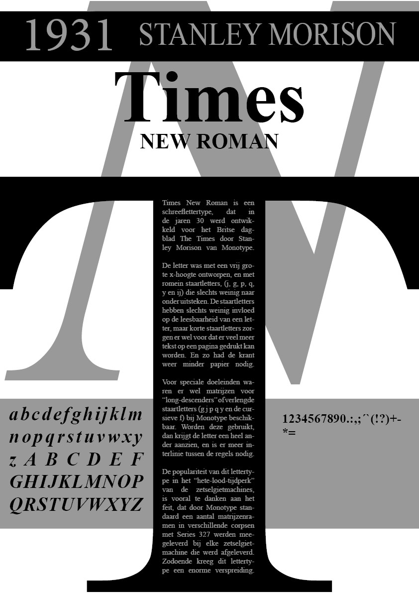
file name: Stanley Morison Victor Lardent Times New Roman 1932 poster by Thanut Rujiwanakul 2019

file name: Stanley Morison Times New Roman 1932 Poster by Dominika Grudysz 2019

file name: Stanley Morrison Times New Roman 1931 Poster by Abdelrahman Saeed 2018

file name: Stanley Morison Times New Roman 1931 Poster by Sebastian Miekus 2017

file name: Stanley Morison Times New Roman 1932 Poster by Alex Edwards 2016

file name: Stanley Morison Times New Roman 1932 Poster by Alex Edwards 2016b

file name: Stanley Morison Times New Roman 1932 Poster by Alex Edwards 2016c

file name: Stanley Morrison Times New Roman 1931 Poster by Tevfik Bozbay 2016

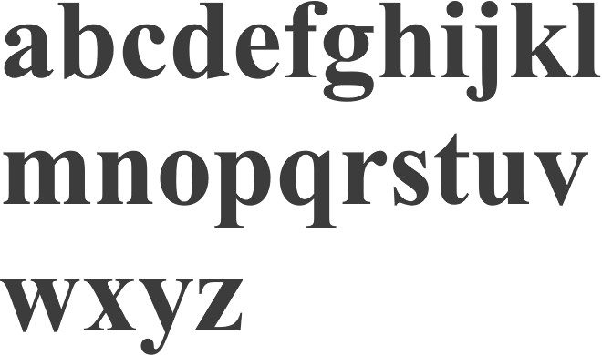
file name: Monotype Times New Roman World Bold

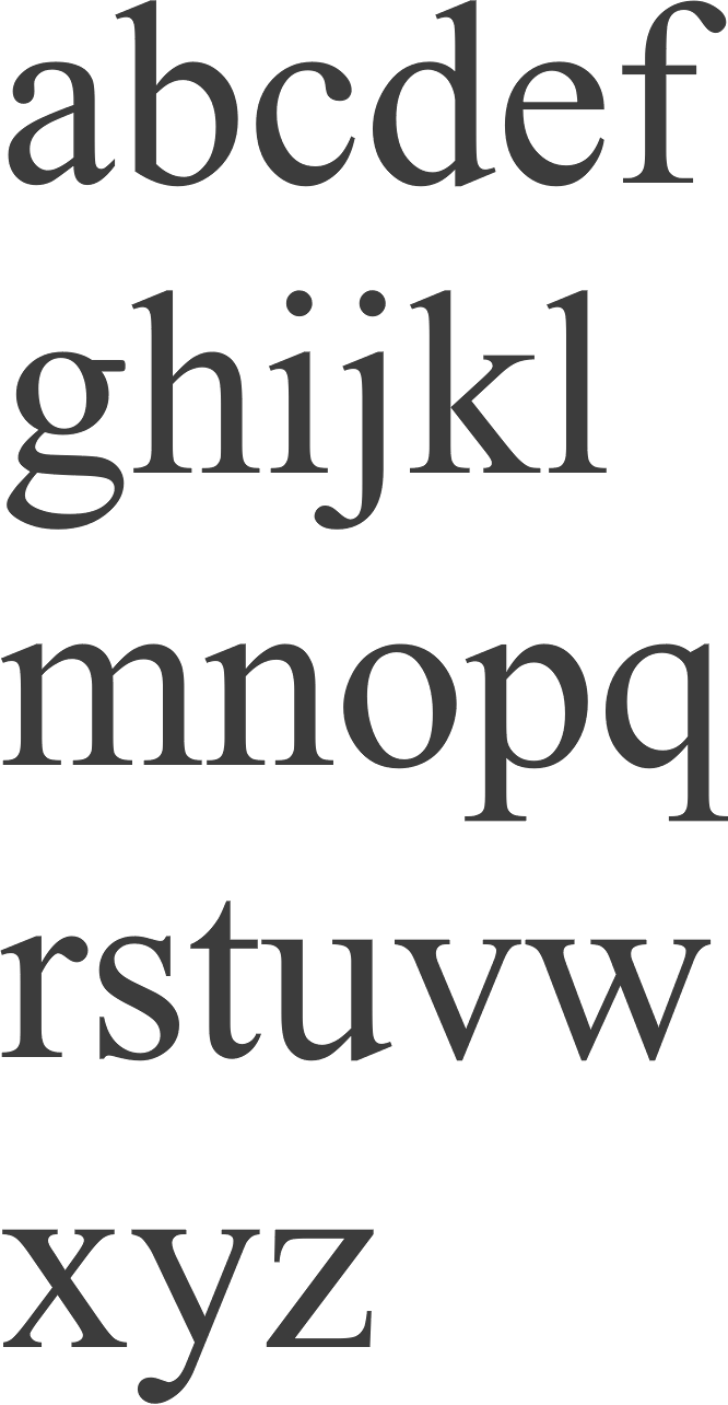
file name: Monotype Times New Roman World Regular

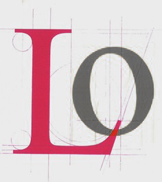
file name: Victor Lardent Times New Roman 1931 Poster by Anerly Foong 2014

file name: Stanley Morison Victor Lardent Times New Roman

file name: Stanley Morison Victor Lardent Times New Roman 1935

file name: Stanley Morison Victor Lardent Times New Roman P S Bold 2001
| | |
|
Luc Devroye ⦿ School of Computer Science ⦿ McGill University Montreal, Canada H3A 2K6 ⦿ lucdevroye@gmail.com ⦿ https://luc.devroye.org ⦿ https://luc.devroye.org/fonts.html |


