TYPE DESIGN INFORMATION PAGE last updated on Tue May 5 11:40:07 EDT 2026
FONT RECOGNITION VIA FONT MOOSE
|
|
|
|
Born in 1936 in Basel, Switzerland's André managed the design office at Deberny&Peignot in the late fifties and early sixties. He taught production letter design at the Künstgewerberschule in Basel from 1965 onwards. He started Team 77 with Christian Mengelt and Erich Gschwind in order to make a correct grotesk improving over past grotesks, including Helvetica. Gürtler's typefaces:
|
EXTERNAL LINKS |
| | |

file name: Andre Guertler Reinhard Haus Lino Letter 1978
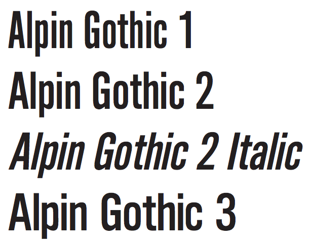
file name: Andre Guertler Alpin Gothic

file name: Bitstream Alternate Gothic No2 after Morris Fuller Benton 1903 198840

file name: Bitstream Alternate Gothic No2 after Morris Fuller Benton 1903 198841

file name: Bitstream Alternate Gothic No2 after Morris Fuller Benton 1903
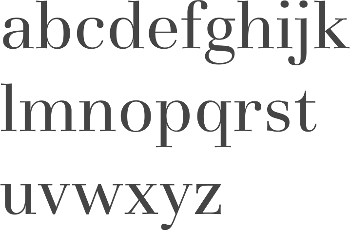
file name: Andre Guertler Basilia 1978
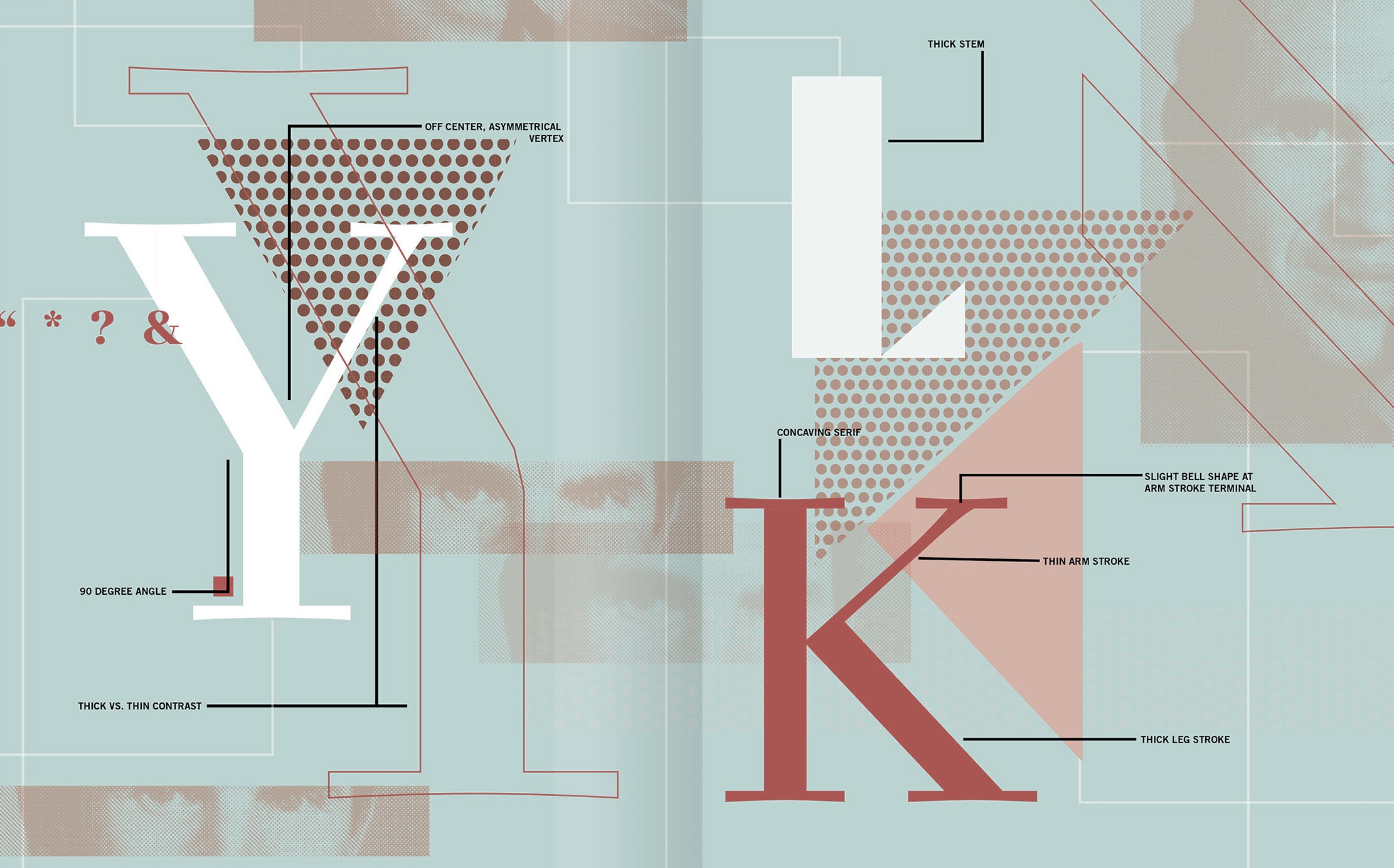
file name: Andre Guertler Basilia 1978 poster by Sara De Noyelles 2018b
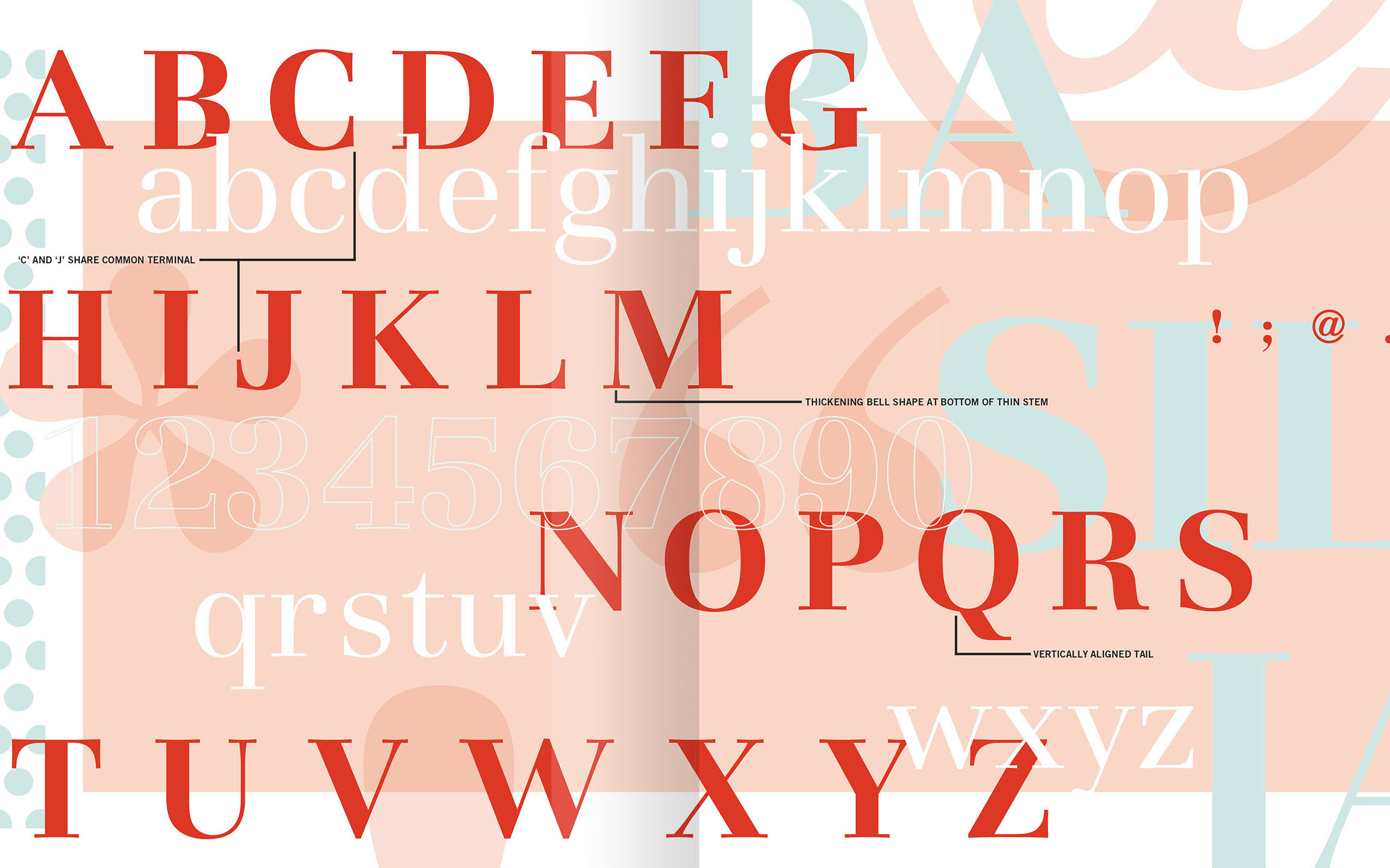
file name: Andre Guertler Basilia 1978 poster by Sara De Noyelles 2018c

file name: Andre Guertler Basilia 1978 poster by Sara De Noyelles 2018d
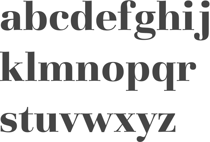
file name: Andre Guertler Basilia Bold 1978
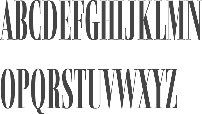
file name: Andre Guertler Basilia Medium Compressed 1978

file name: Andre Guertler Basilia Medium Compressed 1978b
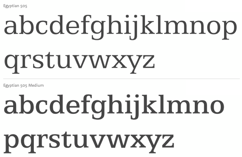
file name: Andre Guertler Egyptian505 Bitstream 1966

file name: Scangraphic Egyptian505 S H 2004

file name: Andre Gurtler Egyptian505 1966

file name: Andre Guertler Media Condensed 1976

file name: Andre Guertler Signa Medium 1078
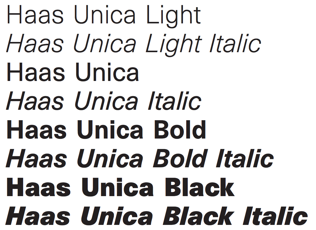
file name: Andre Gurtler Haas Unica 1980

file name: Michael Hernan Unica Deux 2006 after Andre Gurtler Unica Deux
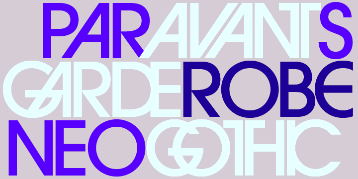
file name: Edward Benguiat Andre Gurtler Tom Carnase Christian Mengelt Erich Gschwind I T C Avant Garde Gothic 1971 1977a

file name: Edward Benguiat Andre Gurtler Tom Carnase Christian Mengelt Erich Gschwind I T C Avant Garde Gothic 1971 1977b

file name: Edward Benguiat Andre Gurtler Tom Carnase Christian Mengelt Erich Gschwind I T C Avant Garde Gothic 1971 1977c

file name: Edward Benguiat Andre Gurtler Tom Carnase Christian Mengelt Erich Gschwind I T C Avant Garde Gothic 1971 1977f

file name: Edward Benguiat Andre Gurtler Tom Carnase Christian Mengelt Erich Gschwind I T C Avant Garde Gothic 1971 1977g
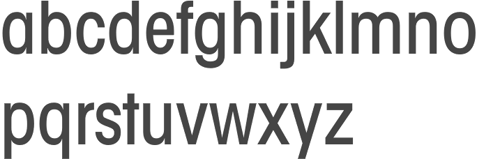
file name: Edward Benguiat Andre Gurtler Tom Carnase Christian Mengelt Erich Gschwind I T C Avant Garde Gothic Condensed Medium 1971 1977

file name: Edward Benguiat Andre Gurtler Tom Carnase Christian Mengelt Erich Gschwind I T C Avant Garde Gothic Demi Bold Oblique 1971 1977

file name: Edward Benguiat Andre Gurtler Tom Carnase Christian Mengelt Erich Gschwind I T C Avant Garde Gothic Extra Light 1971 1977

file name: Edward Benguiat Andre Gurtler Tom Carnase Christian Mengelt Erich Gschwind I T C Avant Garde Gothic Pro Bold 1971 1977

file name: Edward Benguiat Andre Gurtler Tom Carnase Christian Mengelt Erich Gschwind I T C Avant Garde Gothic 1971 1977

file name: Andre Gurtler, Christian Mengelt Erich Gschwind Media 1976

file name: Andre Gurtler, Christian Mengelt Erich Gschwind Media 1976b

file name: Andre Gurtler, Christian Mengelt Erich Gschwind Signa 1978

file name: Andre Gurtler, Christian Mengelt Erich Gschwind Signa 1978b

file name: Herb Lubalin Tom Carnase Edward Benguiat I T C Avant Garde 1970 1977 Poster by Kim Norbury 2015

file name: Herb Lubalin Tom Carnase Edward Benguiat I T C Avant Garde 1970 1977 Poster by Kim Norbury 2015b
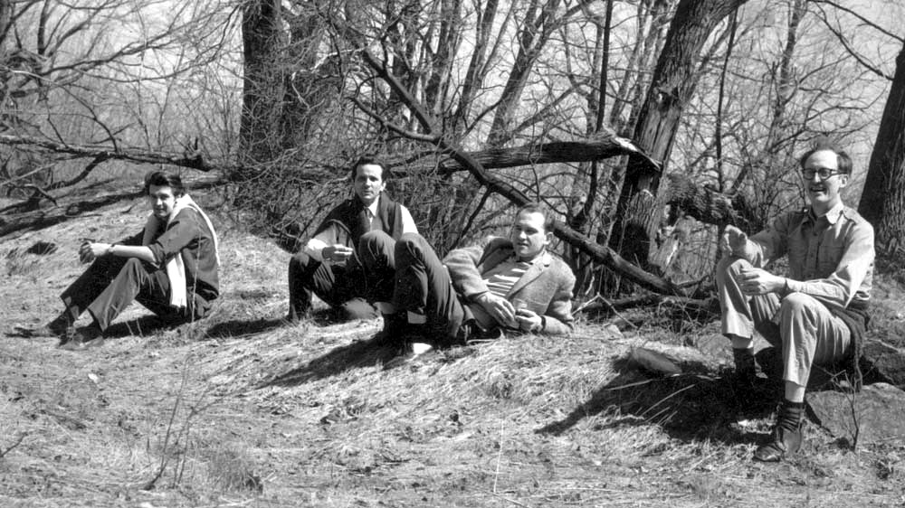
file name: Matthew Carter Aldo Novarese Andre Guertler Matthew Parker Pic in Colrain M A 1960s
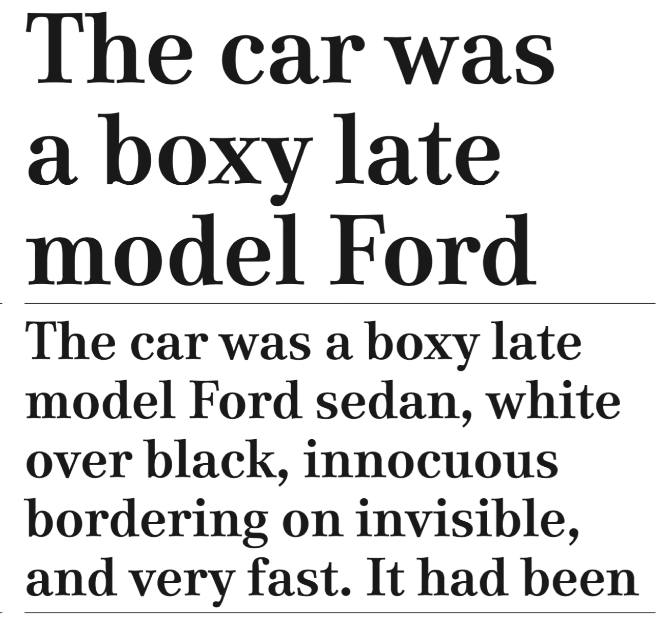
file name: Team77 Media77 2016

file name: Team77 Media77 2016a
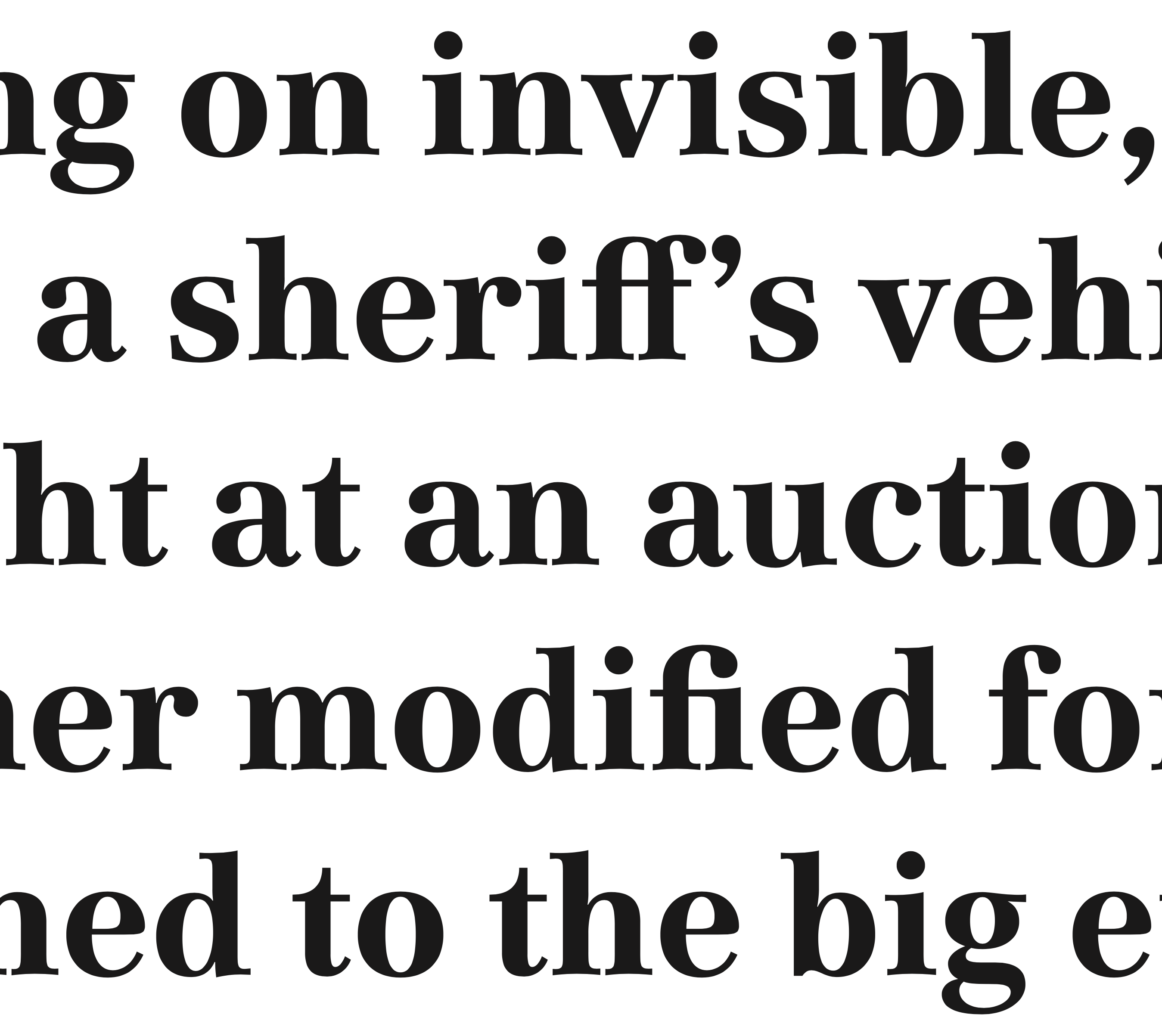
file name: Team77 Media77 2016b

file name: Team77 Media77 2016c
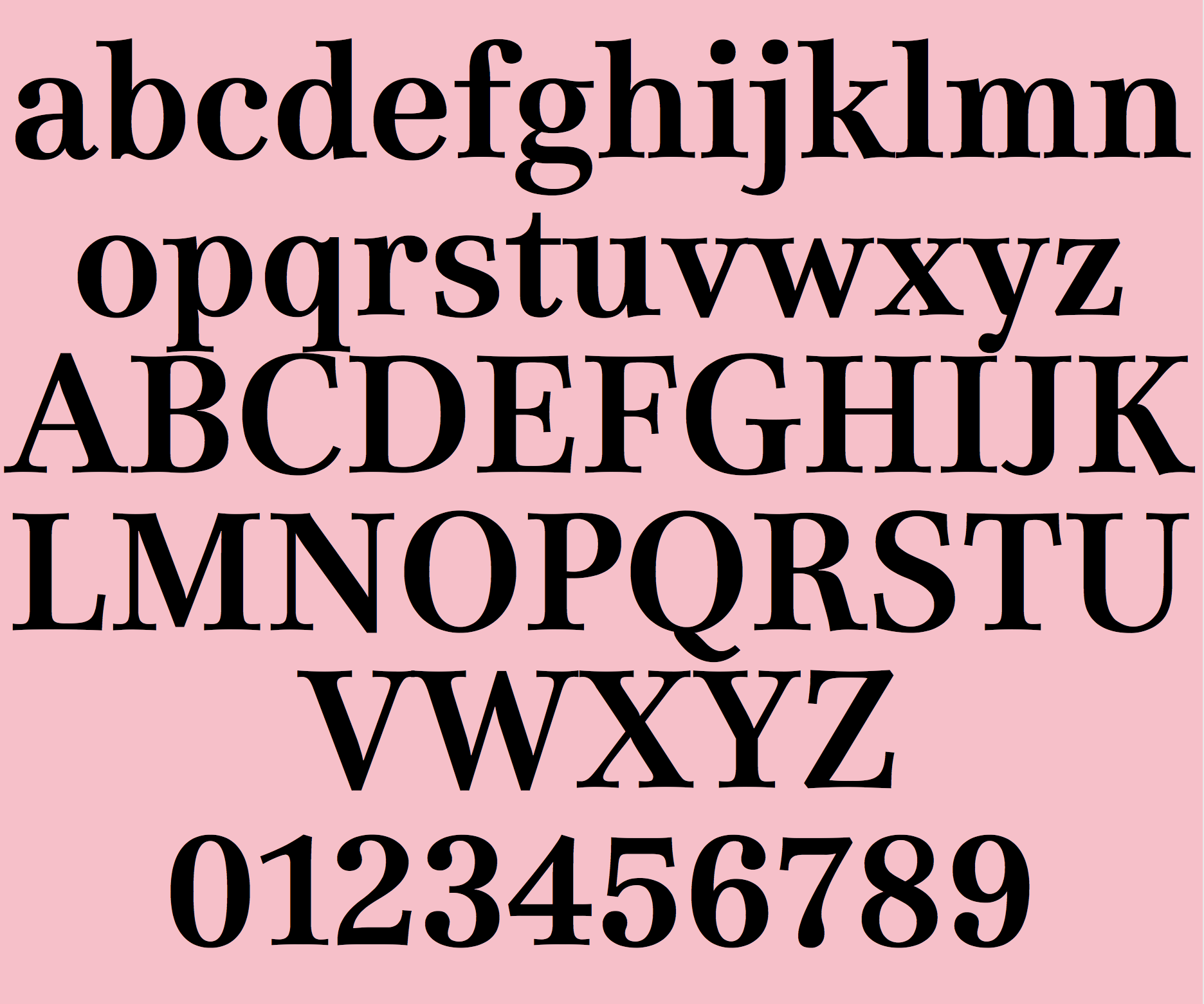
file name: Team77 Media77 Medium 2015
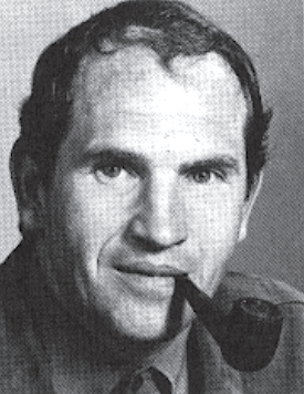
file name: Pic Andre Guertler
| | |
|
Luc Devroye ⦿ School of Computer Science ⦿ McGill University Montreal, Canada H3A 2K6 ⦿ lucdevroye@gmail.com ⦿ https://luc.devroye.org ⦿ https://luc.devroye.org/fonts.html |


