TYPE DESIGN INFORMATION PAGE last updated on Wed May 6 16:09:30 EDT 2026
FONT RECOGNITION VIA FONT MOOSE
|
|
|
|
Frank E. Blokland (b. 1959, Leiden) studied Graphic and Typographic design at the Royal Academy of Arts in The Hague. In 1985 Blokland won Chartpak's type design contest with his typeface Bernadette. In 1990 Blokland wrote a bestseller with his course book for Teleac's television course: Calligraphy, the art of hand writing, of which 16.000 copies were sold. In the same year Blokland founded the Dutch Type Library in 's Hertogenbosch, The Netherlands. Since the 1980s he has published over 150 articles in professional journals like Compres, Page, PrintBuyer, and the Hamburger Satzspiegel. When Gerrit Noordzij retired in 1987 from the Royal Academy of Arts in The Hague, Blokland was the first of the younger generation to succeed him. Blokland now lectures in letter drawing and type design/production to first- and post-graduate courses at this institute. In 1995 he was asked to become a lecturer at the Plantijn Gennootschap in Antwerp. A few years later he initiated and supervised the development of DTL FontMaster, a set of utilities for professional font production [in cooperation with URW++]. He is working towards a Ph.D. at the University of Leiden entitled Leiden University titled Harmonics, Patterns, and Dynamics in Formal Typographic Representations of the Latin Script. The regularization, standardization, systematization, and unitization of roman type since its Renaissance origin until the Romain du Roi. In 2016, Frank E. Blokland obtained a Ph.D. at the University of Leiden for On the Origin of Patterning in Movable Latin Type. His typefaces:
At ATypI 2008 in St. Petersburg, he gave a series of lectures: Type tools by DTL, Automating font production, Automating type design, Integration of FontMaster in Linux and Mac OSX, and History of Type. On that occasion, participants were presented with the booklet Comprehensive Notes on the Design of Cyrillic Letters by Finnish type designer Hanna Hakala and typeset in the preliminary version of DTL Valiance. Speaker at ATypI 2011 in Reykjavik on the topic of parametrized type design, and in particular on the development of the DTL LetterModeller (LeMo) application, which is an attempt to come to such parameterization of type design. Speaker at ATypI 2018 in Antwerp. |
EXTERNAL LINKS |
| | |

file name: Frank E Blokland D T L Documenta

file name: Frank E Blokland D T L Documenta Sans

file name: Frank E Blokland D T L Documenta 1986

file name: Frank E Blokland D T L Documenta 1986b

file name: Frank E Blokland D T L Documenta 1986c

file name: Frank E Blokland D T L Documenta 1986d

file name: Frank E Blokland D T L Documenta 1986e

file name: Frank E Blokland D T L Documenta 1986f

file name: Frank E Blokland D T L Documenta 1986g

file name: Frank E Blokland D T L Documenta 1986h

file name: Frank E Blokland D T L Documenta 1986i

file name: Frank E Blokland D T L Documenta 1986j

file name: Frank E Blokland D T L Documenta 1986k

file name: Frank E Blokland D T L Documenta 1986l

file name: Frank E Blokland D T L Haarlemmer 1994 after Jan Van Krimpen 1938

file name: Frank E Blokland D T L Haarlemmer 1994 after Jan Van Krimpen 1938b

file name: Frank E Blokland D T L Haarlemmer 1994 after Jan Van Krimpen 1938c

file name: Frank E Blokland D T L Haarlemmer 1994 after Jan Van Krimpen 1938d

file name: Frank E Blokland D T L Haarlemmer 1994 after Jan Van Krimpen 1938e

file name: Frank E Blokland D T L Haarlemmer 1994 after Jan Van Krimpen 1938f

file name: Frank E Blokland D T L Haarlemmer 1994 after Jan Van Krimpen 1938g

file name: Frank E Blokland D T L Haarlemmer 1994 after Jan Van Krimpen 1938h

file name: Frank E Blokland D T L Haarlemmer 1994 after Jan Van Krimpen 1938i

file name: Frank E Blokland D T L Haarlemmer 1994 after Jan Van Krimpen 1938j

file name: Frank E Blokland D T L Haarlemmer 1994 after Jan Van Krimpen 1938k

file name: Frank E Blokland D T L Haarlemmer 1994 after Jan Van Krimpen 1938l

file name: Frank E Blokland D T L Haarlemmer Sans Roman

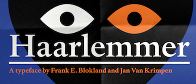
file name: Frank E Blokland Haarlemmer Std Medium Monotype 1998 after Jan Van Krimpen Poster by Michael Sallit 2017

file name: Frank E Blokland Haarlemmer Std Medium Monotype 1998 after Jan Van Krimpen

file name: Frank E Blokland Haarlemmer Std Medium Italic Monotype 1998 after Jan Van Krimpen

file name: Peter Verheul Frank Blokland as students

file name: Frank E Blokland Pic

file name: Frank E Blokland Pic From James Bond Trailer 2013

file name: Frank E Blokland Pic From James Bond Trailer 2013b
| | |
|
Luc Devroye ⦿ School of Computer Science ⦿ McGill University Montreal, Canada H3A 2K6 ⦿ lucdevroye@gmail.com ⦿ https://luc.devroye.org ⦿ https://luc.devroye.org/fonts.html |


