TYPE DESIGN INFORMATION PAGE last updated on Thu Apr 16 21:59:10 EDT 2026
FONT RECOGNITION VIA FONT MOOSE
|
|
|
|
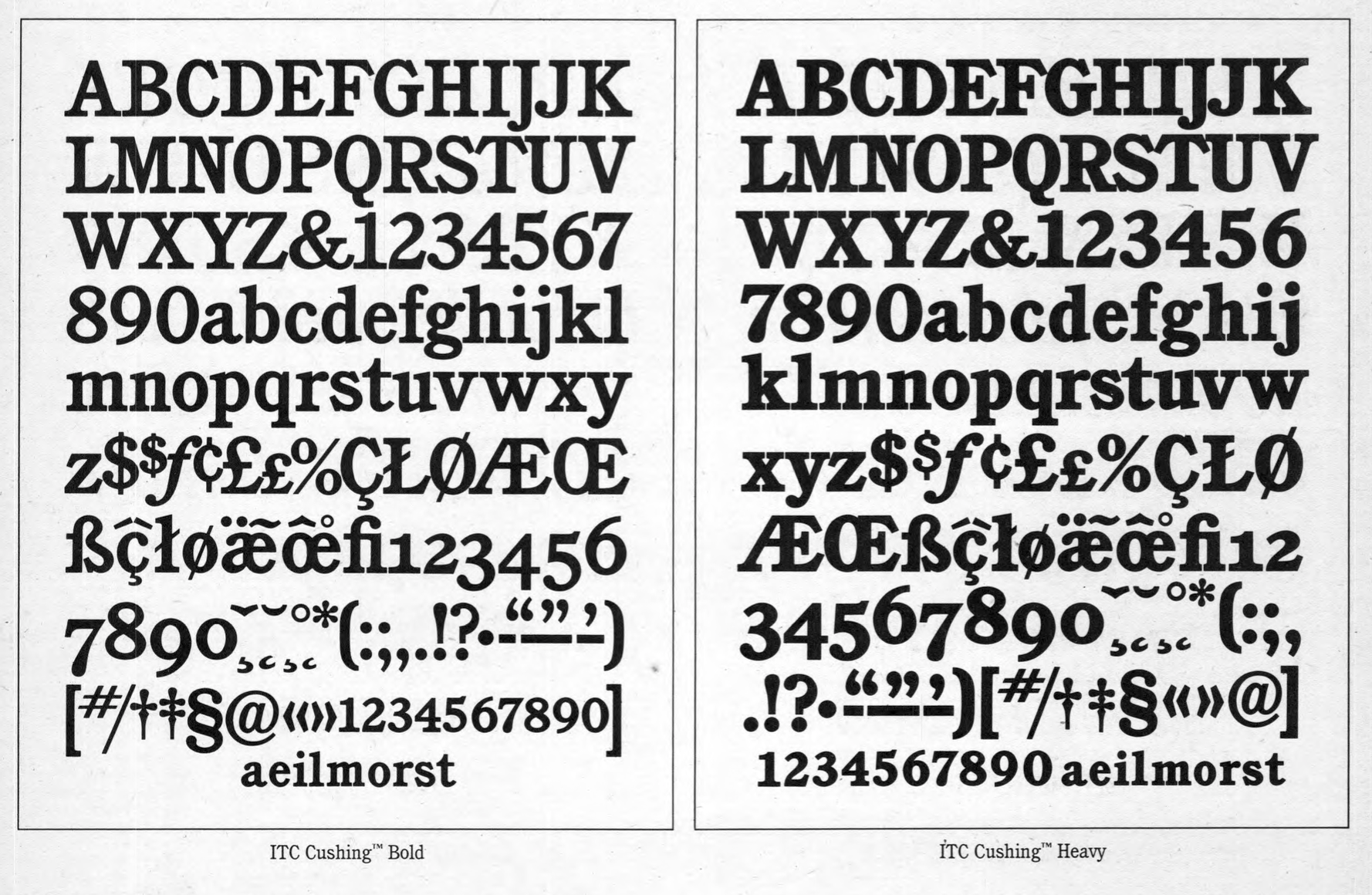
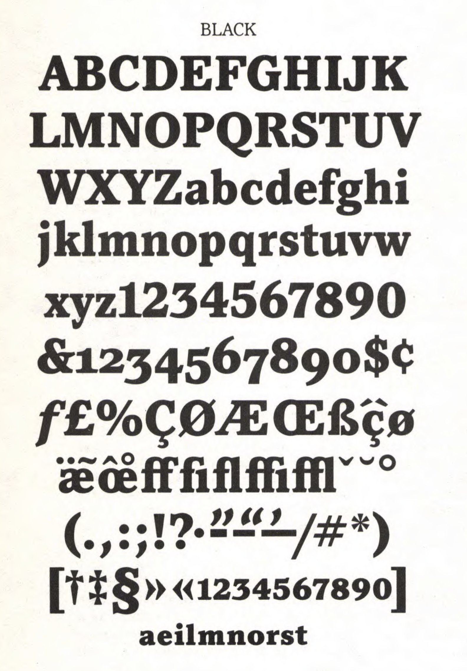
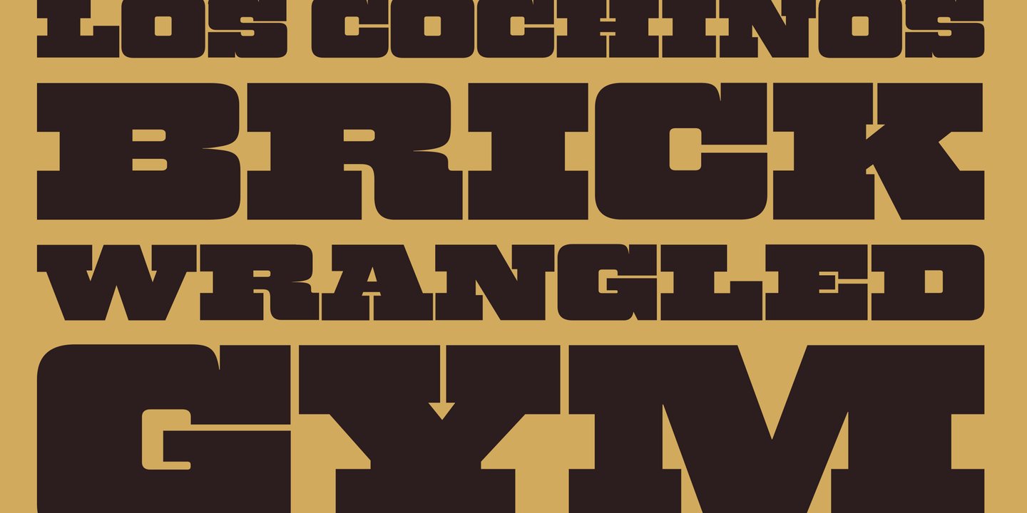
American lettering artist and type designer from New York. Creator of ITC Cushing (1982) and ITC Pacella (1987). MyFonts.com hints that he may have died. According to Linotype, ITC Cushing has a long history. The font was originally designed [for ATF] by J. Stearns Cushing [in 1897], a Boston-based book printer, and famous American type designer Frederic Goudy expanded it to include an italic weight [in 1904]. These early ATF typefaces became known as Lining Cushing Oldstyle No. 2 and Italic. ATF also brought out a Lining Cushing No. 2 and Italic, Cushing Antique, and Lining Cushing Monotone 553.] A Ludlow version featured narrow capitals and an oblique crossbar on the lowercase t. A Monotype version in one weight of roman and italic had small, inclined serifs, wide capitals, short ascenders and descenders. In 1901, Lanston Monotype introduced Cushing Oldstyle, a slightly condensed typeface with large bracketed serifs and fairly uniform weight. It has little relationship to the ATF and Monotype Cushing. Under a special license from the American Type Founders, Vincent Pacella modified the design for ITC and added some additional weights. ITC Cushing is slightly condensed with large, bracketed serifs. Pacella changed the capital letters to better complement the lower case and replaced the sloping serifs of the italics to linear type serifs to produce ITC Cushing. ITC Pacella was fashioned in the tradition of Century Schoolbook, Corona and Nimrod, accordung to Linotype. In the 1970s, he made a Photolettering Egyptian headline typeface called Blackjack, which was digitized in 2007 by Nick Curtis as Flap Jacks NF. His 1970s semi-psychedelic typeface Carousel became Nick Curtis's Vinnie Culture NF (2007). His Pacella Vega Extended 10 (Photolettering, 1960s) was digitized by Nick Curtis as Palo Pinto NF (2010). MyFonts also credits Pacella with AT Stratford Bold, a thick slab serif. His PhotoLettering fonts Pacella Barrel and Pacella Colossus inspired Nick Curtis to create the beautiful ultra fat western slab serif Earmark NF (2009). The Western poster font Pioneer was revived by Nick Curtis as Trailblazer NF (2010). Bingham (done for PLINC) led Nick Curtis to design the angular octagonal typeface Binghamton NF (2010). Designer of Plinc Goliath, a fat slab serif, based on Film No. 6206 in the PhotoLettering archive. Originally drawn in 1970 by Pacella, Goliath was digitized by Ben Kiel with Adam Cruz in 2011 for House Industries. |
EXTERNAL LINKS |
| | |

file name: Vincent Pacella I T C Cushing 1982

file name: Vincent Pacella I T C Cushing 1982b

file name: Vincent Pacella I T C Cushing 1982c

file name: Vincent Pacella I T C Pacella 1987

file name: Vincent Pacella I T C Pacella 1987

file name: Vincent Pacella I T C Pacella 1987

file name: Vincent Pacella I T C Pacella 1987

file name: Vincent Pacella I T C Pacella 1987

file name: Vincent Pacella I T C Pacella 1987

file name: Vincent Pacella Ben Kiel Adam Cruz Goliath 2011

file name: House Industries Plinc Goliath 2021 1

file name: House Industries Plinc Goliath 2021 3

file name: House Industries Plinc Goliath 2021

file name: Nick Curtis Vinnie Culture N F 2007 after Vincent Pacella Carousel 1970s

file name: Nick Curtis Binghamton N F 2010

file name: Nick Curtis Earmark N F 2009

file name: Nick Curtis Trailblazer N F 2010

file name: Vincent Pacella Pic U L C 1987

file name: Vincent Pacella Pic
| | |
|
Luc Devroye ⦿ School of Computer Science ⦿ McGill University Montreal, Canada H3A 2K6 ⦿ lucdevroye@gmail.com ⦿ https://luc.devroye.org ⦿ https://luc.devroye.org/fonts.html |


