TYPE DESIGN INFORMATION PAGE last updated on Thu Apr 16 21:59:21 EDT 2026
FONT RECOGNITION VIA FONT MOOSE
|
|
|
|
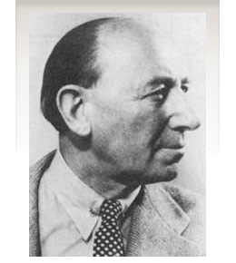
Vienna-born type designer who lived from 1883-1972, and whose real name was Emil Kahn. He died in New York, where he lived most of his life. He studied at the Munich Academy, which became a center of poster design. In 1910 he co-founded the magazine Das Plakat. During WWI he designed posters for the German War effort. In 1920 he was appointed as the first professor of poster design at The Akedemie der Kunst, Berlin. He moved to New York in 1923 and continued his poster work. He also continued his teaching at the Art Students League and at New York University. Short biography of Lucian Bernhard. Biography. MyFonts link. His typefaces:
Posters by Bernhard: An advertising exhibition in 1929 (with Fritz Rosen), Manoli Cigarettes (1912). Linotype link. FontShop link. Klingspor link. View Lucian Bernhard's typefaces. Showcasing the digital legacy of Lucian Bernhard. |
EXTERNAL LINKS |
| | |

file name: Lucian Bernardand Fritz Rosen Posterforanadvertisingexhibition 1929

file name: Lucian Bernhard Poster for Manoli Cigarettes1912

file name: Lucian Bernhard Manoli Poster

file name: Lucian Bernhard Bernhard Negro 1930b

file name: Lucian Bernhard Bernhard Negro 1930g

file name: Lucian Bernhard Bernhard Negro 1930h

file name: Lucian Bernhard Bernhard Tango

file name: Bernhard Tango

file name: Bitstream Bernhard Fashion B T 1990

file name: Infinitype Bernhard Fashion Regular

file name: Infinitype Bernhard Fashion

file name: Lucian Bernhard Bernhard Fashion

file name: Lucian Bernhard Bernhard Fashion 1929 poster by Merle Perle 2013

file name: Peter Wiegel Bernardo Moda 2014

file name: Peter Wiegel Bernardo Moda Contrast 2014 Poster by Nout Alhamwi 2017

file name: Sean Cavanaugh Bernhard Modern F S 2011

file name: Sean Cavanaugh Bernhard Modern F S 2011b

file name: Lucian Bernhard Bernhard Modern 1937

file name: Lucian Bernhard Bernhard Modern

file name: Lucian Bernhard Bernhard Modern 1937 Poster by Ashley Adamcryk 2017

file name: Lucian Bernhard Bernhard Modern 1937 Poster by Rachel Stern 2016b

file name: Lucian Bernhard Bernhard Modern 1937 Poster by Rachel Stern 2016c

file name: Lucian Bernhard Bernhard Modern 1937 Poster by Rachel Stern 2016d

file name: Lucian Bernhard Bernhard Modern 1937 Poster by Rachelle Cepeda 2017

file name: Bernhard Cursive Bold

file name: Bernhard Cursive Bauer Bodoni 1930

file name: Nick Curtis Didgeree Doodle N F 2006 after Lucian Bernhard Bernhard Heavy Antique Cursive

file name: Lucian Bernhard Flinsch Bernhard Antiqua

file name: Lucian Bernhard Bernhard Antiqua Fett 1912 poster by Kenji Enos 2018

file name: Lucian Bernhard Bernhard Antique

file name: Lucian Bernhard Bernhard Antiqua Fett 1912

file name: Pintassilgo Prints Botanique 2016 based on Lucian Bernhard Schmalfette Bernhard Antiqua 1912 201642

file name: Pintassilgo Prints Botanique 2016 based on Lucian Bernhard Schmalfette Bernhard Antiqua 1912 201643

file name: Pintassilgo Prints Botanique 2016 based on Lucian Bernhard Schmalfette Bernhard Antiqua 1912 201647

file name: Pintassilgo Prints Botanique 2016 based on Lucian Bernhard Schmalfette Bernhard Antiqua 1912 201649

file name: Pintassilgo Prints Botanique 2016 based on Lucian Bernhard Schmalfette Bernhard Antiqua 1912 201652

file name: Pintassilgo Prints Botanique 2016 based on Lucian Bernhard Schmalfette Bernhard Antiqua 1912 201653

file name: Pintassilgo Prints Botanique 2016 based on Lucian Bernhard Schmalfette Bernhard Antiqua 1912 201781

file name: Pintassilgo Prints Botanique 2016 based on Lucian Bernhard Schmalfette Bernhard Antiqua 1912

file name: John Nahmias Bernhard Signature 2019 312669

file name: John Nahmias Bernhard Signature 2019 312670

file name: John Nahmias Bernhard Signature 2019 312673 002

file name: John Nahmias Bernhard Signature 2019

file name: Lucian Bernhard Bernhard Block

file name: Lucian Bernhard Bernhard Kursiv Extrafett 1927

file name: Lucian Bernhard Lucian 1925

file name: Lucian Bernhard Lucian Open 1925

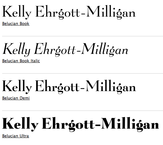
file name: Kelly Ehrgott Milligan David Berlow Belucian 1990 after Lucian Bernhard 1928

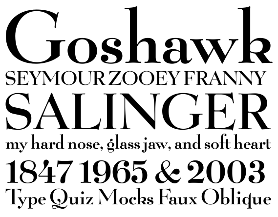
file name: Kelly Ehrgott Milligan David Berlow Belucian Demi 1990 after Lucian Bernhard 1928

file name: Kelly Ehrgott Milligan David Berlow Belucian Demi 1990 after Lucian Bernhard 1928b

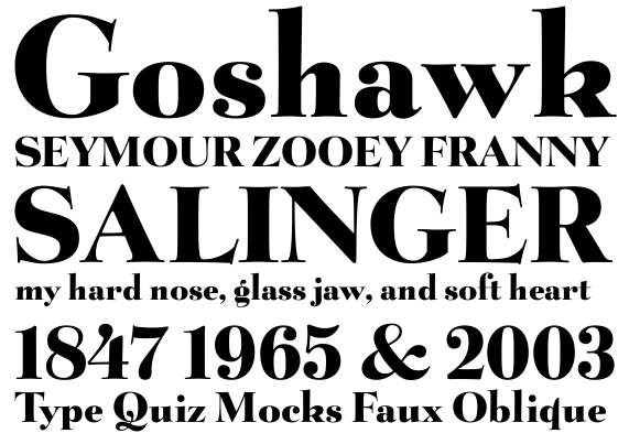
file name: Kelly Ehrgott Milligan David Berlow Belucian Ultra 1990 after Lucian Bernhard 1928

file name: Kelly Ehrgott Milligan David Berlow Belucian Ultra 1990 after Lucian Bernhard 1928b

file name: Font Bureau Belucian based on Lucian Bernhard

file name: Lucian Bernhard Bernhard Fraktur Initialen

file name: Lucian Bernhard Bernhard Fraktur

file name: Lucian Bernhard Bernhard Fraktur Fett 1921

file name: Christoph Schwedhelm Extrafette Bernhard Fraktur 2013 after Lucian Bernhard 1921

file name: Christoph Schwedhelm Extrafette Bernhard Fraktur 2013 after Lucian Bernhard 1921b

file name: Christoph Schwedhelm Extrafette Bernhard Fraktur 2013 after Lucian Bernhard 1921c

file name: Christoph Schwedhelm Extrafette Bernhard Fraktur 2013 after Lucian Bernhard 1921d

file name: Christoph Schwedhelm Extrafette Bernhard Fraktur 2013 after Lucian Bernhard 1921e

file name: Lucian Bernhard Bernhard Fraktur Extrafett 1921 poster by Stefan Chirila 2014

file name: Ralph M Unger Bernhard Blackletter 2016 220615

file name: Ralph M Unger Bernhard Blackletter 2016 220616

file name: Ralph M Unger Bernhard Blackletter 2016 220617

file name: Ralph M Unger Bernhard Blackletter 2016 220619

file name: Ralph M Unger Bernhard Blackletter 2016 220620

file name: Ralph M Unger Bernhard Blackletter 2016

file name: Infinitype Bernhard Condensed Bold

file name: Infinitype Bernhard Condensed

file name: Ivan Moreno Presta 2018

file name: Ivan Moreno Presta 2018b

file name: Ivan Moreno Presta 2018c

file name: Ivan Moreno Presta 2018d

file name: Ivan Moreno Presta 2018e

file name: Lucian Bernhard Priester 1906 Jonahfonts L B Priester 2009

file name: Jonahfonts Harpsichord 2010 after Lucian Bernhard Community Low 1940s

file name: Wooden Type Fonts Bernhard Gothic Medium 2017 236545

file name: Wooden Type Fonts Bernhard Gothic Medium 2017

file name: Lucian Bernhard Bernhard Gothic

file name: Lucian Bernhard Bernhard Schoenschrift

file name: Lucian Bernhard Bernhard Plakate

file name: Lucian Bernhard Bosch Licht Poster
| | |
|
Luc Devroye ⦿ School of Computer Science ⦿ McGill University Montreal, Canada H3A 2K6 ⦿ lucdevroye@gmail.com ⦿ https://luc.devroye.org ⦿ https://luc.devroye.org/fonts.html |


