TYPE DESIGN INFORMATION PAGE last updated on Thu Apr 16 21:59:27 EDT 2026
FONT RECOGNITION VIA FONT MOOSE
|
|
|
|
LettError is a foundry in Den Haag, founded by the interesting duo, Just Van Rossum (b. 1966) and Erik van Blokland (b. Gouda, 1967). Many of their fonts can be found in the FontFont library. Erik van Blokland is a graduate of the Royal Academy of Art in The Hague (KABK), class of 1989. He develops niche tools for type design and font production and has been involved with Tal Leming in the development of the UFO (for font sources) and WOFF (for font binaries) formats. Since 1999, he is a senior lecturer at the TypeMedia master at the Royal Academy of Arts in Den Haag. Erik developed many type software tools such as the acclaimed type interpolation tools MutatorMath and Superpolator, and the teaching tool TypeCooker. Their typefaces:
Erik speaks often about his work. At ATypI 2004 in Prague, LettEror spoke about education in type design, and the RoboFab toolkit. Speaker at ATypI 2013 in Amsterdam and at ATypI 2014 in Barcelona [on interpolations with Superpolator3]. Klingspor link. FontShop link. Wired interview. Shop. FontFont link. |
EXTERNAL LINKS |
| | |

file name: Letterror Title

file name: Letterror Catalog

file name: Erik Van Blokland Action Text 2020

file name: Erik Van Blokland Action Text 2020

file name: Erik Van Blokland Action Text 2020

file name: Erik Van Blokland Action Text 2020

file name: Erik Van Blokland Action Condensed 2016

file name: Erik Van Blokland Action Condensed 2016b

file name: Erik Van Blokland Action Condensed 2016c

file name: Erik Van Blokland Action Condensed 2016d

file name: Erik Van Blokland Action Condensed 2016e

file name: Erik Van Blokland Action Condensed 2016f

file name: Erik Van Blokland Action Condensed 2016g

file name: Erik Van Blokland Action Condensed 2016h

file name: Erik Van Blokland Action Condensed 2016i

file name: Erik Van Blokland Eames Century Modern 2010

file name: Erik Van Blokland Eames Century Modern 2011

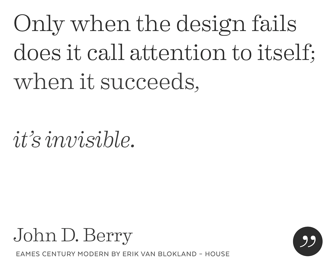
file name: Erik Van Blokland House Eames Century Modern 2010

file name: Erik Van Blokland House Eames Century Modern 2010 poster by Zeinab Mohsen 2019

file name: Erik Van Blokland House Eames Century Modern 2010 Poster by Bill Dawson 2015

file name: Erik Van Blokland Eames Poster Numerals 2010

file name: House Eames Century Modern Stencil Stencil 2010b

file name: Erik Van Blokland F F Trixie

file name: Erik Van Blokland Trixie 1991 Poster By Sol Kazin 2014

file name: Erik Van Blokland Trixie 1991 Poster By Chengyu Liu 2016

file name: Erik Van Blokland Trixie 1991 Poster By Chengyu Liu 2016b

file name: Erik Van Blokland Trixie 1991 Poster By Chengyu Liu 2016c

file name: Erik Van Blokland F F Trixie 1991

file name: Erik Van Blokland F F Trixie 1991b

file name: Erik Van Blokland F F Trixie 1991c

file name: Erik Van Blokland F F Trixie 1991d

file name: Lett Error L T R Salmiak 2001

file name: Lett Error L T R Salmiak 2001a

file name: Lett Error L T R Salmiak 2001b

file name: Lett Error L T R Salmiak 2001c

file name: Lett Error L T R Salmiak 2001d

file name: Just Van Rossum Erik Van Blokland F F Beowolf 1990

file name: Just Van Rossum Erik Van Blokland F F Beowolf 1990b

file name: Pic atypi2002 Erik Van Blokland

file name: Erik Van Blokland Pic
| | |
|
Luc Devroye ⦿ School of Computer Science ⦿ McGill University Montreal, Canada H3A 2K6 ⦿ lucdevroye@gmail.com ⦿ https://luc.devroye.org ⦿ https://luc.devroye.org/fonts.html |


