TYPE DESIGN INFORMATION PAGE last updated on Sat Jan 10 12:00:13 EST 2026
FONT RECOGNITION VIA FONT MOOSE
|
|
|
|
Akzidenz-Grotesk
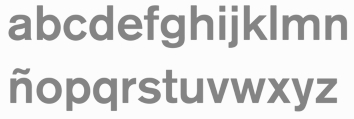
The original sans typeface Akzidenz-Grotesk, the most influential grotesque, was first released by the Berthold type foundry in 1896 (as Accidenz-Grotesk). Quoting a Berthold press release: The design originates from Royal Grotesk light by Ferdinand Theinhardt who also supplied the regular, medium and bold weights. In Berthold's specimen booklet (Schriftprobe) number 444 released in December of 1957, Akzidenz-Grotesk mager (light) was referenced as Royal-Grotesk in parenthesis. Karl Gerstner said of Akzidenz-Grotesk, It is the work of anonymous typecutters: craftsmen, specialists, whose professional background and experience meant they were familiar with the finest subtleties and principles, and not just those of Grotesque. They gave Akzidenz-Grotesk the ultimate accolade a typeface can have: a functional, formal rightness, transcending the whims of fashion. Erik Spiekermann on the origins: Accidenz (sic) Grotesk was acquired by Berthold in Berlin when they bought another foundry, Pöpplbaum in Vienna. That was 1896 or 1898, depending whether one takes the date of the sale or the release of AG. The original weight was quite light, and Berthold kept adding weights, some of them from other typefaces, acquired from other foundries. Every foundry had a version of that type of face, more often than not available in a few sizes only. The original series remained quite diverse, individual weights showing not much resemblance but name. It was mainly a marketing and naming success. That only changed when they cut (I'm talking foundry type, with some sizes and weights also available on Intertype slug casters) Series 57, and then Series 58, named for the years of release. These had some sizes (but not all) recut under the direction of Günter Gerhard Lange, who was their (freelance) artistic director at the time. Throughout the years, Berthold has expanded this extremely popular and versatile family. AG ExtraBold (1966) and AG Super (1968) were developed by Guenter Gerhard Lange and are excellent choices for headlines. Guenter Gerhard Lange added more weights for Berthold including Super Italic (2001) and ExtraBold Italic (2001). In 2006, Berthold first released Akzidenz-Grotesk in OpenType. In 2007, Berthold announces the release of Akzidenz-Grotesk Pro+ with Cyrillic and Greek support for all 30 fonts in the collection as well as language support for Central European, Baltic and Turkish. Akzidenz-Grotesk Pro+ is available in CFF PostScript flavored OpenType. Also added in 2007 was Akzidenz-Grotesk Next in 14 styles. Akzidenz-Grotesk Probe Nr. 473 (1966, H. Berthold AG) is a specimen book. Ulrich Stiehl dociuments the Linotype clones from 1958. In 1992, H. Berthold made 22 PostScript fonts of Akzidenz Grotesk, shown here. Images of Akzidenz Grotesk, courtesy of Gabriel Perdomo Motta: i, ii, iii. Credit for some images below: Danielle West. |
EXTERNAL LINKS |
| | |

file name: H Berthold Akzidenz Grotesk 1896 Poster by Danielle West 2014

file name: H Berthold Akzidenz Grotesk 1896 Poster by Danielle West 2014b

file name: H Berthold Akzidenz Grotesk 1896 Poster by Tony Pham 2017

file name: H Berthold Akzidenz Grotesk 1896 Poster by Tony Pham 2017b

file name: Akzidenz Grotesk

file name: H Berthold Akzidenz Grotesk 1898 Poster by Lochlainn Kane 2018

file name: Berthold Akzidenz Grotesk Cond 2007

file name: Berthold Akzidenz Grotesk Next Black 2007

file name: Berthold Akzidenz Grotesk Next Cond 2007b

file name: Berthold Akzidenz Grotesk 1896 Poster by Kay Li 2015

file name: Berthold Akzidenz Grotesk Next Cond Extra Bold 2007

file name: Berthold Akzidenz Grotesk Next Med 2007

file name: Gabriel Perdomo Motta Akzidenz Grotesk Poster 2011

file name: Gabriel Perdomo Motta Akzidenz Grotesk Poster 2011b

file name: Gabriel Perdomo Motta Akzidenz Grotesk Poster 2011c
| | |
|
Luc Devroye ⦿ School of Computer Science ⦿ McGill University Montreal, Canada H3A 2K6 ⦿ lucdevroye@gmail.com ⦿ https://luc.devroye.org ⦿ https://luc.devroye.org/fonts.html |
