|
Nick Curtis: Victorian typefaces
[Nick Curtis]

It is difficult to precisely define a Victorian typeface. They range from the ridiculously ornate typefaces from 1850-1870 to awkwardly balanced display typefaces and the pre-art nouveau trends. Nick Curtis's revivals in this genre are listed below. - Alto Rey NF (2014). A revival of a Victorian typeface issued by the Palmer and Rey Type Foundry of San Francisco in 1884.
- AnagramShadowNF. A free font. Commercial version in 2008. Anagram Shadow NF is based on handlettering from a 1928 poster for a steamship line by renowned British artist Austin Cooper.
- Angler NF (2014). After Anglo, which appears in the Barnhart Brothers and Spindler catalog of 1895.
- Beantown Bounce NF (2007) revives Century, an ornamental display typeface from the 1898 catalog of the Boston Type Foundry.
- Brownwood NF (2011). The inspiration for this semi-Victorian semi-art nouveau typeface came from a 1906 travel poster, promoting the Hotel Braunwald, located in the Swiss Alps.
- Cinnci Card Ornaments NF (2014) is a collection of design elements used in logotypes and calling cards from the Victorian era.
- Cleveland Litho NF (2007), a curly Victorian face, appeared in the 1898 specimen book of the Cleveland Type Foundry, under the name of Litho, while Yum Yum NF (1898) appeared in Cleveland's 1893 specimen book as Mikado.
- DoctorJekyllNF. A free font.
- Durham Abbey NF (2005). Based on a Victorian era font called Romanesque, which can be found in the Dan X. Solo collection.
- Dury Lane (2007) is based on a Victorian era release by Blake Type Foundry called Blackfriars.
- FancyPantsNF. A free font.
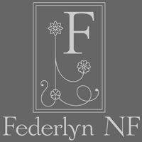
- Federlyn NF (2010) and Federlyn Initials NF (2011). Based on the Edwardian-era Artcraft by Robert Wiebking.
- Filibuster NF (2007). This curly über-Victorian typeface is based on Congress, an ornamental typeface found in H. C. Hansen Type Foundry's catalog of 1909.
- GingerPeachyNF. A free font.
- Great Sage NF (2010). That ugly duckling Victorian typeface Karnac (1888, ATF) [not to be confused with the Egyptian typeface Karnak by R.H. Middleton] led Nick Curtis to Great Sage NF.
- Habana Sweets NF (2012). Based on Cuban (1873, Richard & Miller).
- HardlyWorthit. A free font.
- HornswoggledNF. A free font.
- HutSutRalstonNF (2001). Based on a 1915 example in a Speedball Pen book.
- LabyrinthCapital, Labyrinth (1999, 2007). A free font family based on this poster.
- Londonderry Air NF (2002-2004) is based on Canterbury Old Style, a typeface designed by Morris Fuller Benton in 1920-1926 at ATF.
- MarchMadnessNF (2003). A free font. Inspired by lettering from a 1920s Italian poster by legendary postermeister Marcello Dudovich.
- MetropolisNF. A free font. Based on this movie poster from 1927 by Hungarian Josef Bottlik.
- Millrich Reading NF (2010). A Victorian typeface that revives a 1918 Miller&Richard face. Millrich Olivian NF (2014) revives Olivian.
- Nickelodeon NF (1999). A free font. This is sometimes compared with silent movie fonts.
- Nickley Normal (1997). A free font based on arts and crafts lettering by William Joseph Dard Hunter.
- Oaken Bucket NF (2009).
- Oh You Klid NF (2009). Based on a Victorian typeface by Central Type Foundry called Euclid (1880s).
- Palmer Oxonian NF (2011). Based on Oxford (Palmer&Rey, 1884).
- PasticheCapital, Pastiche. A free font.
- PayzantPenNF (2001). A free font, with a commercial version in 2010. Payzant Pen NF is based on Frank H. Atkinson's A Show at Sho-Cards: Comprehensive, Complete, Concise, published in 1918, executed with the then-state-of-the-art Payzant Reservoir Pen.
- Plus de Vagues NF (2006). Based on a curly semi-Victorian alphabet by Stephenson Blake called Recherché.
- Putney Junction NF (2007). Based on a BBS typeface called Design, ca. 1900.
- RhumbaScriptNF. A free font. Based on Tango Kursiv (1913, Ernst Deutsch), it is often compared with silent movie fonts.
- Shady Lady NF (2005). An ornamental shaded caps typeface called Umbra in the 1907 Barnhart Brothers&Spindler type specimen catalog.
- ShangriLaNF, ShangriLaNFSmallCaps (2002). A free font family. The commercial version was done in 2008. Based on a Victorian alphabet from the 1922 chapbook Modern Show Card Writing, by Joseph Bertram Jowitt.
- Sil Vous Plait NF (2009). A Victorian text typeface based on a 1917 font by Morris Fuller Benton called Invitation.
- SouciSans (1999). A free font. Based on a type design by Sam Welo shown in Lettering Modern and Foreign (1930).
- Speedball No1, Speedball No2 SW (2001), Speedball No3 (2001). SpeedballNo1NF-Bold, SpeedballNo1NF, SpeedballNo2NF-Bold, SpeedballNo2NF, SpeedballNo2SW, SpeedballNo3, SpeedballNo3NF-Bold, SpeedballNo3NF. This series is based in part on alphabets by Samuel Welo.
- Storybook Initials NF (2014).
- Streamers NF (2005). A Victorian-era typeface called Fillet revived.
- Tanglewood Tales (2000). A free font.
- Vidalia Sunshine NF (2007). An extension of the 1888 all caps typeface Ornamented No. 5 from MacKellar, Smiths&Jordan.
- Vintage Panels NF (2011): Victorian panels.
- VlaanderenChiseledNF, VlaanderenRoundNF, VlaanderenSquareNF. A free font family. These are based on an untitled work by Dutch designer André Vlaanderen from 1928. These are ugly ducklings because they mix various inconsistent styles without much thought.
|
EXTERNAL LINKS
Nick Curtis: Victorian typefaces
 [Buy fonts] [Buy fonts]
Fontspring link [Buy fonts]
Monotype link
MyFonts search
Monotype search
Fontspring search
Google search
INTERNAL LINKS
Nick Curtis ⦿
Victorian typefaces ⦿
Arts and Crafts Movement ⦿
Labyrinthine fonts ⦿
Silent movie fonts ⦿
Dingbats (original) ⦿
Morris Fuller Benton ⦿
Curly typefaces ⦿
|


