TYPE DESIGN INFORMATION PAGE last updated on Mon Jul 13 21:18:47 EDT 2026
FONT RECOGNITION VIA FONT MOOSE

|
|
|
|
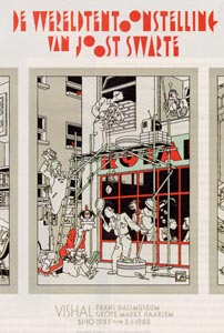
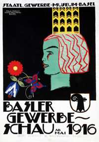
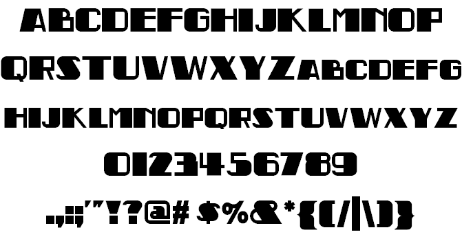
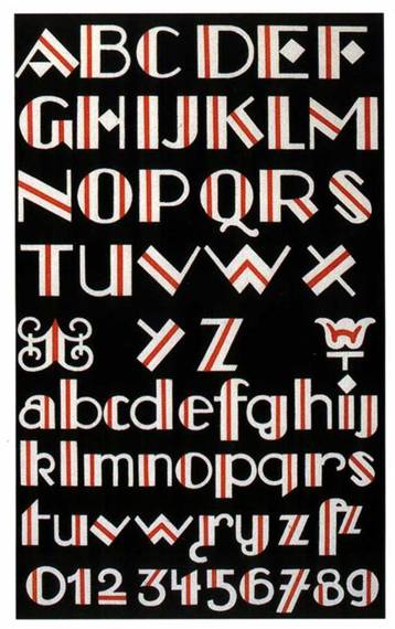
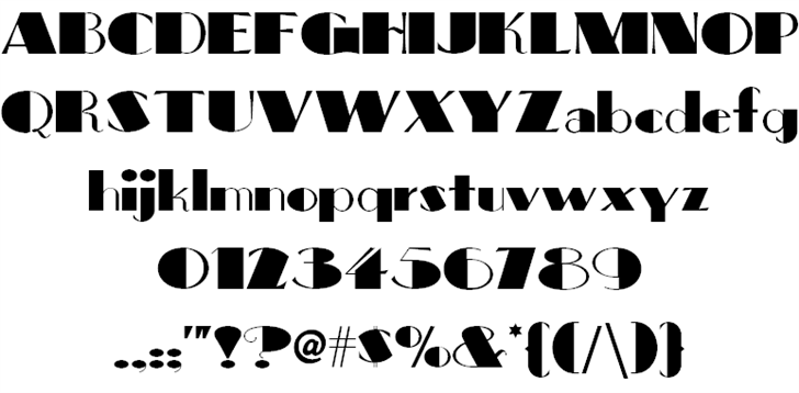
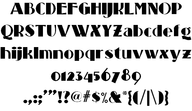
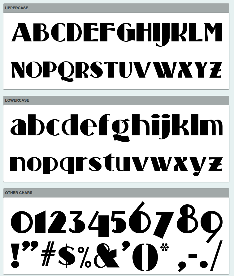
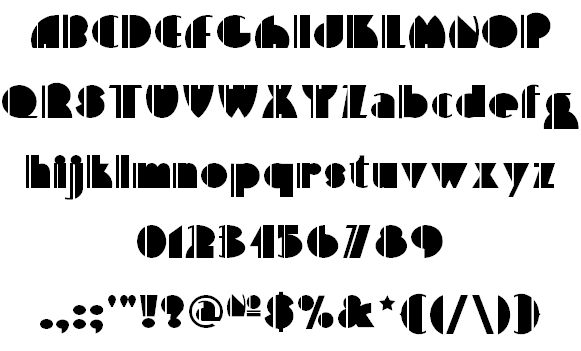
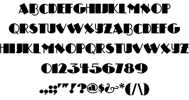
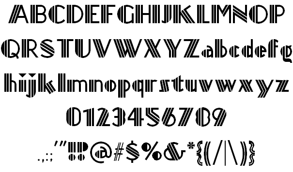
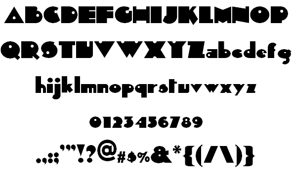
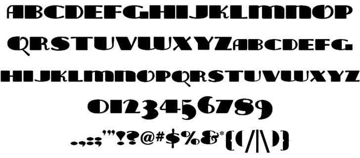
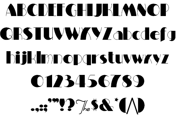
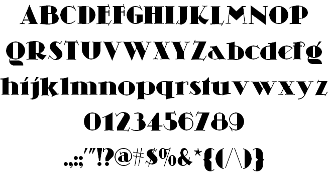
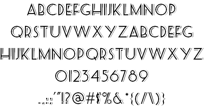
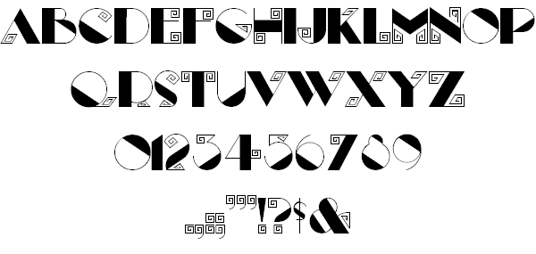
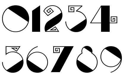
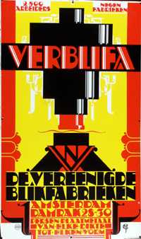
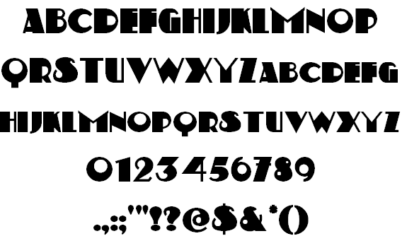
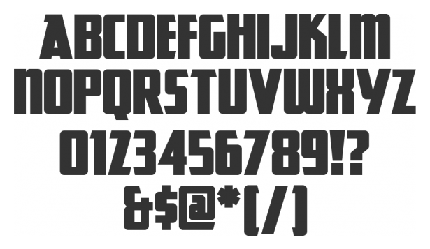
Art deco typefaces by Nick Curtis: I
[Nick Curtis]
Free art deco typefaces by Nick Curtis, made between 1997 and 2003. Nick Curtis also made commercial art deco typefaces, but these will be listed elsewhere.
|
EXTERNAL LINKS |
| | |


file name: Nick Curtis Day Tripper N F

file name: Nick Curtis Backstage Pass N F 2008 after Saul Bass
file name: Nick Curtis Rialto N F 2000c
file name: Nick Curtis Big Apple 2006
file name: Nick Curtis Standing Room Only N F

file name: Nick Curtis Standing Room Only N F 2006
file name: Nick Curtis Standing Room Only N F

file name: Nick Curtis Standing Room Only N F 2010

file name: Nick Curtis Standing Room Only N F 2010b
file name: Nick Curtis High Five 2006
file name: Nick Curtis Drumag Studio N F 2003

file name: Nick Curtis Great Lakes N F 2007d
file name: Nick Curtis Titanick Display after Dextor
file name: Nick Curtis Sid The Kid N F
file name: Nick Curtis Tara Bulbous N F 1997
file name: Nick Curtis Milton Burlesque 2000
file name: Nick Curtis Fontsource Skittlesn Beer N F

file name: Nick Curtis Skittles Beer N F 2013
file name: Nick Curtis Skittles N Beer N F
file name: Nick Curtis Seaside Resort N F 2003

file name: Nick Curtis Seaside Resort N F 2003b
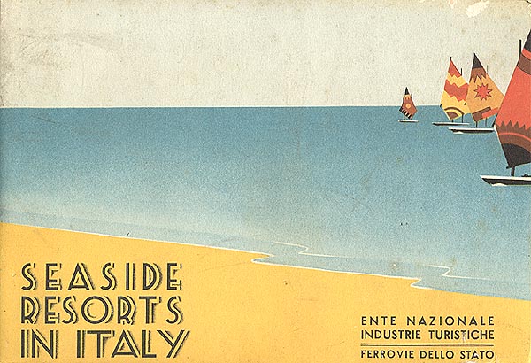
file name: Nick Curtis Seaside Resort N F poster
file name: Nick Curtis Sesquipedalian 2000b

file name: Nick Curtis Sequipedalian 2000

file name: Nick Curtis Sesquipedalian
file name: Nick Curtis Selznick Normal 2006

file name: Nick Curtis Fontsource Seaside Resort N F

file name: Nick Curtis Kismet Normal N F poster

file name: Nick Curtis Monkey Fingers 1999 after Otto Heim

file name: Otto Heim 1925 Monkey Fingers N F
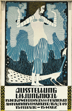
file name: Nick Curtis Munchausen N F 2000 after Poster by Ludwig Jungnickel Austria 1911

file name: Ludwig Heinrich Jungnickel 1911 Munchausen N F
file name: A Bardi 1931 Disque Nightcap N F

file name: Nick Curtis Nightcap 1999

file name: Nick Curtis Nightcap 2013

file name: Nick Curtis Odalisque Stencil N F 2010

file name: Nick Curtis Rialto N F 2000

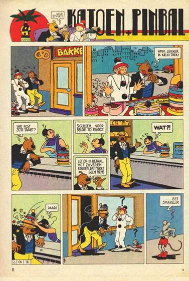
file name: Nick Curtis Pinball Whiz N F poster

file name: Nick Curtis Fontsource Raskalnikov N F
file name: Nick Curtis Riot Squad N F 2000 after Otto Heim
file name: Nick Curtis Ritzy 1999

file name: Nick Curtis Nickelodeon 1999 First
file name: Nick Curtis Nickelodeon 1999
file name: Nick Curtis Nickley 1997
file name: William Joseph Dard Hunter Nickley N F

file name: Nick Curtis Hut Sut Ralston 2001
file name: Nick Curtis Tanglewood Tales 2000
file name: Nick Curtis Souci Sans 1999
file name: Nick Curtis Sesquipedalian 2000
file name: Nick Curtis Fontsource Studebaker N F
file name: Nick Curtis Studebaker 2010

file name: Paul Carlyle Guy Oring 1938 Tara Bulbous N F
file name: Nick Curtis Labyrinth 1999
file name: Nick Curtis Labyrinth 1999
file name: Nick Curtis Labyrinth numerals 1999

file name: Nick Curtis Labyrinth 1999
file name: Chris Van Der Hoef 1920 Kerfuffle N F
file name: Nick Curtis Kerfuffle 2000 after Poster By C Jan Der Hoef 1920

file name: Nick Curtis Indochine N F 2005
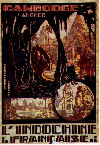
file name: Joseph Henri Ponchin 1931 Indochine N F
file name: Nick Curtis Great Lakes N F

file name: Peter Ewart 1935 Great Lakes N F

file name: Nick Curtis Grado Gradoo G N F poster
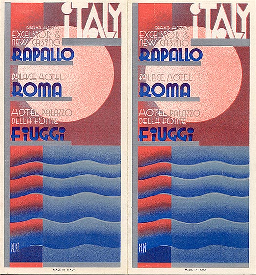
file name: B E P I 1932 Grado Gradoo N F
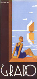
file name: Urbano Corva 1933 Grado Gradoo G

file name: Anton Kurvers 1940 Dusty Rose N F

file name: Nick Curtis East Market

file name: Nick Curtis East Market 1999

file name: Nick Curtis Dusty Rose N F poster

file name: Nick Curtis Debonair Inline N F 2008 after Herbert Bayer Universal Modern Face 1931

file name: Nick Curtis Debonair Inline N F 2008 after Herbert Bayer Universal Modern Face 1931 La Chica Poster by Stephanie Overmars 2016

file name: C De Haas 1926 Amstel Heavy N F

file name: Nick Curtis Amsterdam Tangram N F poster
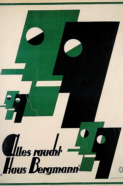
file name: Wilhelm Poetter 1923 Anchor Steam N F

file name: Paul Hosch Hans Melching 1916 Boogie Nights N F

file name: Nick Curtis Brica Braque N 2010 after Cubist Bold by John W Zimmerman1929
file name: Draim 1928 Chainsaw Geometric N F
file name: Nick Curtis Coaster Poster 1999
file name: A Bardi 1931 Disque Nightcap N F
file name: Nick Curtis Nightcap 2013
file name: Nick Curtis Nightcap 1999
| | |
|
Luc Devroye ⦿ School of Computer Science ⦿ McGill University Montreal, Canada H3A 2K6 ⦿ lucdevroye@gmail.com ⦿ https://luc.devroye.org ⦿ https://luc.devroye.org/fonts.html |