TYPE DESIGN INFORMATION PAGE last updated on Thu Apr 16 21:59:53 EDT 2026
FONT RECOGNITION VIA FONT MOOSE
|
|
|
|
Art deco typefaces by Nick Curtis: II
[Nick Curtis]
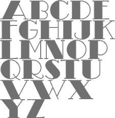
Commercial art deco typefaces by Nick Curtis.
|
EXTERNAL LINKS |
| | |

file name: Nerino Nannetti 1928 Duck Soup N F

file name: Nick Curtis Madison Squared N F 2012

file name: Nick Curtis Coochie Nando N F 2011 after Milton Glaser Kitchen

file name: Nick Curtis Turista Gorda N F 2009 after Baltimore Type Foundry Airport Tourist after Renner Futura

file name: Nick Curtis Day Tripper N F

file name: Nick Curtis Heavy Tripp N F Day Tripper N F 2002 after Alphonse E Tripp Dignity Roman 1930s

file name: Nick Curtis Heavy Tripp N F

file name: Nick Curtis Ernst Stabenschrift N F 2008 after Ernst Engel 1927

file name: Nick Curtis Suave Sam N F 2009 after Samuel Welo1930

file name: Nick Curtis Nip And Tuck 2006

file name: Nicks Fonts Legnano 2014

file name: Nick Curtis Odalisque N F 2000

file name: Nick Curtis Odalisque Stencil N F 2010

file name: Nick Curtis Orchard Street Inline N F 2011

file name: Nick Curtis Orchard Street N F 2011

file name: Nick Curtis Retrorocket N F 2015

file name: Nick Curtis Dooijes Deco N F 2010

file name: Nick Curtis Dooijes Deco Engraved N F 2011

file name: Nick Curtis Dooijes Deco N F 2011

file name: Nick Curtis Picture Postcard N F 2004

file name: Nick Curtis Picture Postcard N F 2004b

file name: Nick Curtis Picture Postcard N F 2004c

file name: Nick Curtis Legnano 2014

file name: Nick Curtis Legnano 2014b

file name: Nicks Fonts Lodewijk Gothic N F 2014

file name: Nick Curtis Lodewijk Gothic N F 2014 after A T F Elzevir Gothic 1897

file name: Nick Curtis Lodewijk Gothic N F 2014 after A T F Elzevir Gothic 1897b

file name: Nick Curtis Lodewijk Gothic N F 2014 after A T F Elzevir Gothic 1897c

file name: Nick Curtis Kinkajou Stew N F poster

file name: Nick Curtis Kinkajou Stew N F 2003

file name: Nick Curtis Kinkajou Stew N F 2003b

file name: Nick Curtis Faerie Queen N F poster

file name: Nick Curtis Fontsource Faerie Queen N F

file name: Nick Curtis Mogzilla N F 2007

file name: Nick Curtis Faerie Queen N F 2006 after Richard Gans Titania 1933

file name: Nick Curtis Faerie Queen N F 2006 after Richard Gans Titania 1933b

file name: Nick Curtis Blue Jay Way N F 2011

file name: Nick Curtis Top Kick N F 2011

file name: Nick Curtis Pentaprism N F 2011

file name: Nick Curtis Pentaprism N F 2011b

file name: Nick Curtis Pentaprism N F 2011c

file name: Nick Curtis Kymmera Deco N F 2011

file name: Nick Curtis Ege Schrift N F 2011 after Eduard Ege Ege Schrift 1921

file name: Nick Curtis Ege Schrift N F 2011 after Eduard Ege Ege Schrift 1921b

file name: Nick Curtis Stony Island N F 2011 after Alf R Becker Chicago Modern Thick And Thin 1935

file name: Nick Curtis Stony Island N F

file name: Nick Curtis Salzmann Deco Deco N F 2011 after Max Salzmann Zier Dolmen 1923

file name: Nick Curtis Salzmann Deco N F 2011 after Max Salzmann Dolmen 1922

file name: Gustav Jensen Nick Curtis Tasneem N F 2007

file name: Nick Curtis Blitzkrieg N F 2011

file name: Nick Curtis Fontsource Blitzkrieg N F

file name: Nick Curtis Elektromoto N F 2011 after K Sommer Dynamo 1930

file name: Nick Curtis Elektromoto Narrow N F 2011 after E Grundeis Stadion 1929

file name: Nick Curtis Smart Frocks N F

file name: Nick Curtis Smart Frocks N F 2006

file name: Nick Curtis Quoi Chou N F Bold 2006

file name: Nick Curtis Tasneem N F 2007 after Gustav Jensen

file name: Nick Curtis Turista Gorda N F 2009

file name: Nick Curtis Rassetta N F 2005 after Willard T Sniffin Rosetti 1931

file name: Nick Curtis Chalk And Cheese N F 2004 after Charles Loupot

file name: Nick Curtis Chalk And Cheese N F 2004 after Ludwig Hohlwein

file name: Charles Loupot 1930 Chalk And Cheese U N F

file name: Nick Curtis Boho A Gogo N F 2007

file name: Nick Curtis Resolute 2009 after M F Benton Eagle 1934

file name: Nick Curtis Mighty Ditey N F 2007 after Richard Nebiolo Aphrodite 1970s

file name: Nick Curtis Mighty Ditey N F 2007

file name: Nick Curtis Mighty Ditey N F 2007b

file name: Nick Curtis Monte Carlo Script N F 2002

file name: Enric Crous Vidal Aragon Reyna Catalina N F

file name: Nick Curtis Humpty Dumpling N F 2010

file name: Nick Curtis Kharon Ultra2009 Ludlow Stygian

file name: Nick Curtis Smart Frocks N F 2008

file name: Nick Curtis Smart Frocks N F 2008c

file name: Nick Curtis Dooijes Deco Deluxe N F 2010

file name: Nick Curtis Dooijes Deco Engraved N F 2010

file name: Nick Curtis Dooijes Deco N F 2010

file name: Nick Curtis Raconteur N F 2006

file name: Nick Curtis Raconteur N F 2006c

file name: Charles Loupot 1919 Secret Agent N F
| | |
|
Luc Devroye ⦿ School of Computer Science ⦿ McGill University Montreal, Canada H3A 2K6 ⦿ lucdevroye@gmail.com ⦿ https://luc.devroye.org ⦿ https://luc.devroye.org/fonts.html |


