TYPE DESIGN INFORMATION PAGE last updated on Thu Apr 16 22:00:54 EDT 2026
FONT RECOGNITION VIA FONT MOOSE
|
|
|
|
Frere Jones Type
[Tobias Frere-Jones]
Celebrated type designer, born in 1970 in New York City. Frere-Jones received a BFA in Graphic Design from the Rhode Island School of Design in 1992. He moved to Boston, where he worked at the Font Bureau until 1999. He joined the faculty of the Yale University School of Art in 1996 and has lectured throughout the United States, Europe and Australia. From 1999 until 2014, he worked for and with Jonathan Hoefler in New York. In 2015, he set up his own type foundry, Frere Jones Type. His old Font Bureau typefaces can be bought since 2020 at Frere Jones / Type Network. His work is in the permanent collections of the Victoria & Albert Museum in London and the Museum of Modern Art in New York. In 2006, The Royal Academy of Visual Arts in The Hague (KABK) awarded him the Gerrit Noordzij Prijs, for his contributions to typographic design, writing and education. In 2013 he received the AIGA Medal, in recognition of exceptional achievements in the field of design.
At FontFont, he designed the children's fonts FF Dolores (1991) and FF Dolores Cyrillic. At FUSE 15, he designed Microphone (1996). At FUSE 10, he published Fibonacci, a font consisting just of lines. His custom work includes WorthGothic (1996), WorthLogo1996 (1995), WorthText (1995), GQGothic (1995), Halifax, Commonwealth (1995), Belizio-TwentySix (Font Bureau), HermanMillerLogo (1999, Font Bureau). Cassandra, Vitriol (1993), Quandry (1992-1994) and Chainletter (1993). Retina Agate (2001, specially made for small-print stock listings at the Wall Street Journal) netted him a Bukvaraz 2001 award and an AIGA 2003 Design Award. From 1999 until 2014, he designed for the Hoefler Type Foundry, which he joined as an equal partner (and the new company became Hoefler & Frere-Jones (in 2004), or H&FJ). He claims that he brought with him to H&FJ a lot of typefaces including Whitney, Whitney Titling, Elzevir, Welo Script, Archipelago (Shell Sans), Type 0, Saugerties, Greasemonkey, Vive, Apiana, and Esprit Clockface. It is not expicitly stated at the H&FJ site which typefaces he had a hand in, but one can safely assume that it must have been nearly every typeface made since he entered into the partnership. In 2014, Tobias sued Jonathan for half of the company in a 20-to-80 million dollar lawsuit since he claims that Hoefler reneged on his promise to give him his half. The typefaces at H&FJ he had a hand in include:
Interview. Interviewed by Dmitri Siegel. He created Estupido Espezial for fun, but it actually made it into an issue of Rollingstone. Catalog of his typefaces at Font Bureau. Keynote speaker at Typecon 2014. View typefaces designed by Tobias frere-Jones. Another page with typefaces created by Tobias Frere-Jones. |
EXTERNAL LINKS |
| | |

file name: Tobias Frere Jones Interstate Ultra Black Compressed 1993

file name: Tobias Frere Jones Interstate 1993

file name: Tobias Frere Jones Interstate 1993 Poster nby Zoe Larson 2017

file name: Tobias Frere Jones Interstate 1993 Poster nby Zoe Larson 2017b

file name: Tobias Frere Jones Interstate Cond Bold 1993

file name: Tobias Frere Jones Interstate Ultra Black Compressed 1993b

file name: Tobias Frere Jones Interstate 1993 2004

file name: Tobias Frere Jones Interstate Hairline 1993

file name: Tobias Frere Jones Christian Schwartz Interstate Mono 2000

file name: Tobias Frere Jones Interstate 1993 Poster nby Lynnasha Galbreath 2014

file name: Tobias Frere Jones Interstate 1993 poster by Halil Ibrahim Keskinbalta 2019

file name: Tobias Frere Jones Interstate 1993 poster by Halil Ibrahim Keskinbalta 2019 3

file name: Tobias Frere Jones Interstate 1993 poster by Halil Ibrahim Keskinbalta 2019 4

file name: Tobias Frere Jones Interstate 1993 poster by Halil Ibrahim Keskinbalta 2019 5

file name: Tobias Frere Jones Interstate 1993 poster by Halil Ibrahim Keskinbalta 2019 6

file name: Tobias Frere Jones Interstate 1993 poster by Halil Ibrahim Keskinbalta 2019 8

file name: Typecon2014 Tobias Frere Jones Keynote Address Pic by Pete Bella

file name: Typecon2014 Tobias Frere Jones Keynote Address Pic by Pete Bella

file name: Tobias Frere Jones Reiner Script 1993 after Imre Reiner 1951

file name: Tobias Frere Jones Reiner Script 1993

file name: Tobias Frere Jones Jonathan Hoefler Verlag 2006 Poster by Randall De Von 2014

file name: Tobias Frere Jones Jonathan Hoefler Verlag 2006

file name: Tobias Frere Jones Hightower 1994

file name: Tobias Frere Jones Hightower 1994 1996
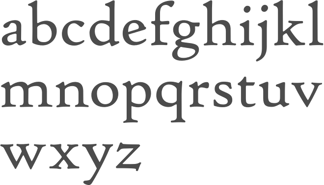
file name: Tobias Frere Jones Hightower 1994 1996b
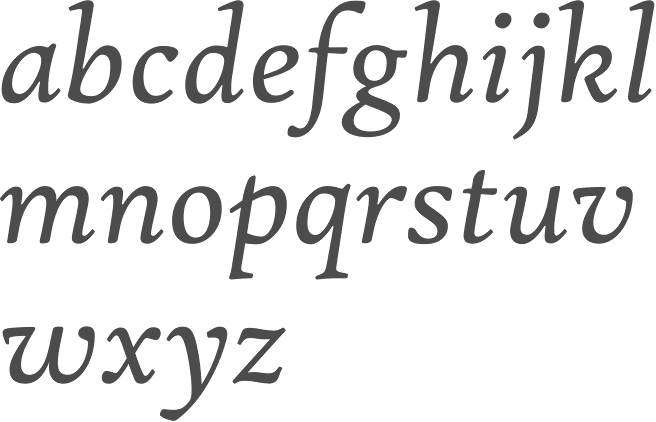
file name: Tobias Frere Jones Hightower 1994 1996c

file name: Tobias Frere Jones Hightower 1994 1996d

file name: Tobias Frere Jones Hightower 1994

file name: Tobias Frere Jones Asphalt Black 1995

file name: Tobias Frere Jones Asphalt Black Condensed 1995c

file name: Tobias Frere Jones Asphalt Black Condensed 1995

file name: Tobias Frere Jones Asphalt Black 1995b

file name: Tobias Frere Jones Cafeteria 1993

file name: Tobias Frere Jones Cafeteria 1993

file name: Tobias Frere Jones Cafetaria 1993

file name: Tobias Frere Jones Citadel 1995

file name: Tobias Frere Jones Citadel 1995

file name: Tobias Frere Jones Epitaph 1993

file name: Tobias Frere Jones Epitaph 1993

file name: Tobias Frere Jones Epitaph 1993

file name: Tobias Frere Jones Illustration by David Berlow

file name: Tobias Frere Jones Poynter Gothic Text 1997 1999

file name: Tobias Frere Jones Poynter Oldstyle Display 1997 2000

file name: Tobias Frere Jones Poynter Oldstyle Text 1997

file name: Tobias Frere Jones Stereo 1993

file name: Tobias Frere Jones Stereo 1993 after Karlgeorg Hoefer 1963

file name: Tobias Frere Jones Niagara 1994d

file name: Tobias Frere Jones Niagara Condensed 1994

file name: Tobias Frere Jones Niagara Engraved 1994

file name: Tobias Frere Jones Niagara Solid 1994

file name: Tobias Frere Jones Niagara Light Engraved 1994c

file name: Tobias Frere Jones Niagara 1994

file name: Tobias Frere Jones Niagara Light Engraved 1994

file name: Tobias Frere Jones Griffith Gothic 1997 2000
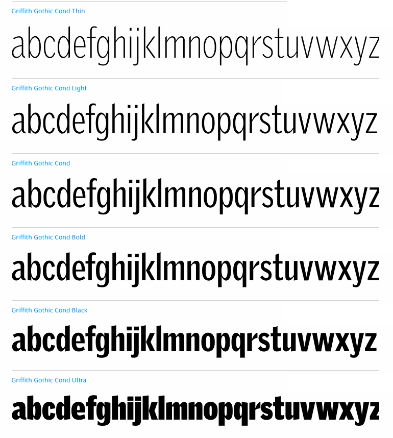
file name: Tobias Frere Jones Griffith Gothic 1997 after Chauncey H Griffith 1937

file name: Tobias Frere Jones Griffith Gothic 1997
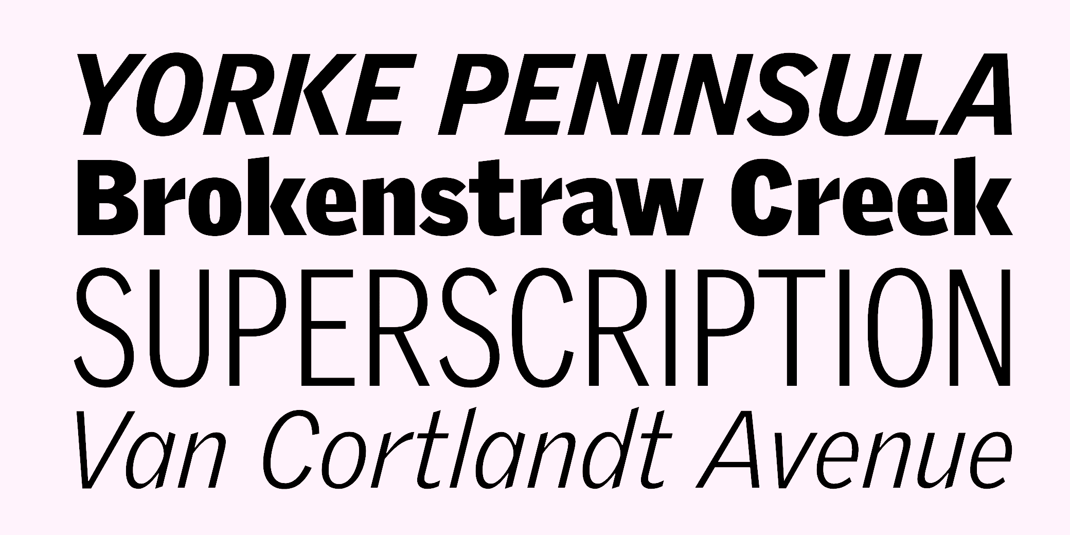
file name: Tobias Frere Jones Griffith Gothic 1997
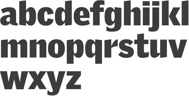
file name: Tobias Frere Jones Griffith Gothic Ultra 1997

file name: Tobias Frere Jones Pilsner 1995

file name: Tobias Frere Jones Pilsner 1995

file name: Tobias Frere Jones Pilsner Black 1995
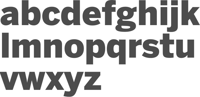
file name: Tobias Frere Jones Cyrus Highsmith Benton Sans Black 2000
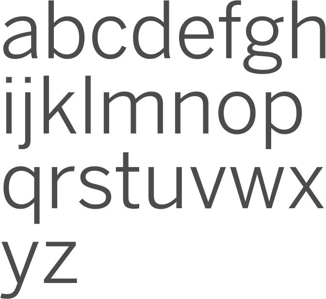
file name: Tobias Frere Jones Cyrus Highsmith Benton Sans Book 2000

file name: Tobias Frere Jones Cyrus Highsmith Benton Sans Cond Black S C 2000
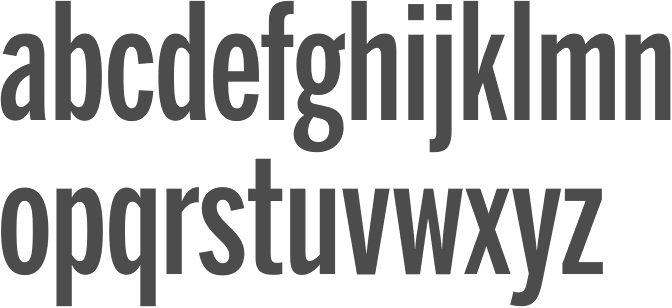
file name: Tobias Frere Jones Cyrus Highsmith Benton Sans Extra Comp Medium 2000
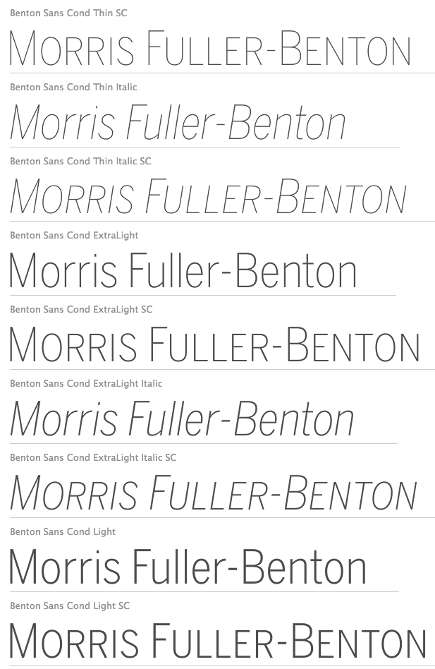
file name: Tobias Frere Jones Cyrus Highsmith Benton Sans T Cond Thin Light 2000
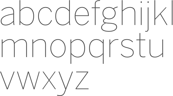
file name: Tobias Frere Jones Cyrus Highsmith Benton Sans Thin 2000

file name: Tobias Frere Jones Armada 1994

file name: Tobias Frere Jones Armada 1987 1994

file name: Tobias Frere Jones Armada 1987 1994b

file name: Tobias Frere Jones Armada Black Compressed 1987 1994

file name: Tobias Frere Jones Armada Compressed Light 1987 1994

file name: Tobias Frere Jones Armada Condensed Black 1987 1994

file name: Font Bureau Eldorado1993
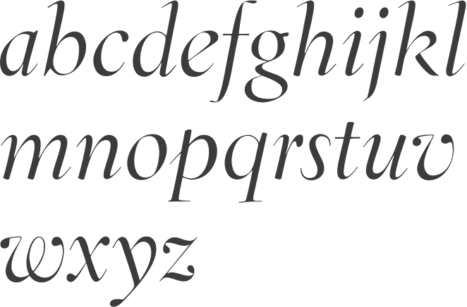
file name: David Berlow Jane Patterson Tobias Frere Jones Tom Rickner Eldorado Display Italic 1993 1994

file name: David Berlow Jane Patterson Tobias Frere Jones Tom Rickner Eldorado Display Roman 1993 1994
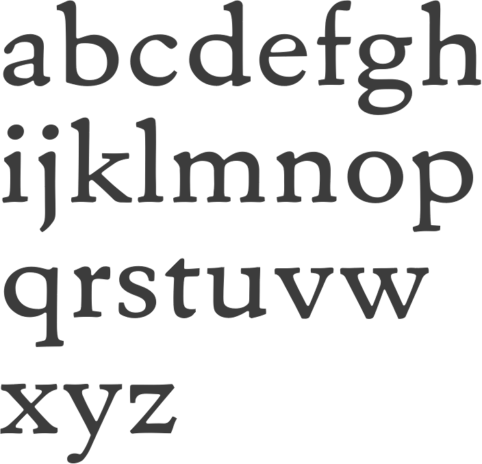
file name: David Berlow Jane Patterson Tobias Frere Jones Tom Rickner Eldorado Micro Roman 1993 1994

file name: David Berlow Jane Patterson Tobias Frere Jones Tom Rickner Eldorado Text Light S C 1993 1994

file name: Tobias Frere Jones Grand Central 2000

file name: Tobias Frere Jones Grandcentral 1998 after Louis Perrin 1846b

file name: Tobias Frere Jones Grandcentral 1998 after Louis Perrin 1846b

file name: Hoefler Gotham Black 2003

file name: H F J Gotham Poster by Ashlee Burlie 2013

file name: Tobias Frere Jones Jesse M Ragan Gotham 2000 Poster by Tobias Thiel 2017

file name: Tobias Frere Jones Jesse M Ragan Gotham 2000 Poster by Tobias Thiel 2017b

file name: Tobias Frere Jones Jesse M Ragan Gotham 2000 Poster by Tobias Thiel 2017c

file name: Tobias Frere Jones Jesse M Ragan Gotham 2000 Poster by Tobias Thiel 2017d

file name: Tobias Frere Jones Jesse M Ragan Gotham 2003 Poster by Oshana Kewal 2016

file name: Tobias Frere Jones Jesse M Ragan Gotham 2003 Poster by Camila Cardoso 2018

file name: Tobias Frere Jones Jesse M Ragan Gotham 2000 poster by Catalina Mora Norembuena 2019

file name: Tobias Frere Jones Jesse M Ragan Gotham 2000 poster by Catalina Mora Norembuena 2019

file name: Tobias Frere Jones Jesse M Ragan Gotham 2000 poster by Catalina Mora Norembuena 2019

file name: Tobias Frere Jones Jesse M Ragan Gotham 2000 poster by Catalina Mora Norembuena 2019

file name: Tobias Frere Jones Jesse M Ragan Gotham 2000 poster by Catalina Mora Norembuena 2019

file name: Tobias Frere Jones Jesse M Ragan Gotham 2000 poster by Catalina Mora Norembuena 2019copy

file name: Tobias Frere Jones Jesse M Ragan Gotham 2003 01

file name: Tobias Frere Jones Jesse M Ragan Gotham 2003 02

file name: Tobias Frere Jones Jesse M Ragan Gotham 2003 03

file name: Tobias Frere Jones Jesse M Ragan Gotham 2003 04

file name: Tobias Frere Jones Jesse M Ragan Gotham 2003 05

file name: Tobias Frere Jones Jesse M Ragan Gotham 2003 06 B

file name: Tobias Frere Jones Jesse M Ragan Gotham 2003 07

file name: Tobias Frere Jones Jesse M Ragan Gotham 2003 08

file name: Tobias Frere Jones Jesse M Ragan Gotham 2003 09

file name: Tobias Frere Jones Jesse M Ragan Gotham 2003 12

file name: Tobias Frere Jones Jesse M Ragan Gotham 2003 Poster by Stephen Kim 2015

file name: Tobias Frere Jones Jesse M Ragan Gotham 2003 14

file name: Tobias Frere Jones Jesse M Ragan Gotham 2003 15

file name: Tobias Frere Jones Jesse M Ragan Gotham 2003 16

file name: Tobias Frere Jones Jesse M Ragan Gotham 2003 17

file name: Hoefler Gotham Narrow Office Bold 2001 2016

file name: Hoefler Gotham Office 2016

file name: Tobias Frere Jones Jesse M Ragan Gotham 2003 Poster by Bill Dawson 2015

file name: Tobias Frere Jones Jesse M Ragan Gotham 2003 Poster by Jen Beck 2013b

file name: Tobias Frere Jones Jesse M Ragan Gotham 2003 Poster by Jen Beck 2013c

file name: Tobias Frere Jones Jesse M Ragan Gotham 2003 Poster by Jen Beck 2013e

file name: Tobias Frere Jones Jesse M Ragan Gotham 2003 Poster by Jen Beck 2013f

file name: Tobias Frere Jones Jesse M Ragan Gotham 2003 Poster by Jen Beck 2013g

file name: Tobias Frere Jones Jesse M Ragan Gotham 2000 Poster by William Vega 2016

file name: Tobias Frere Jones Jesse M Ragan Gotham 2000 poster by Alexey Razuvaev 2019

file name: Tobias Frere Jones Gotham 2000 poster by Grayson Kent 2018

file name: Tobias Frere Jones Gotham 2000 poster by Sam Tribolet 2018

file name: Tobias Frere Jones Jesse M Ragan Gotham 2000 Poster by Autumn Beane 2017

file name: Tobias Frere Jones Jesse M Ragan Gotham 2000 Poster by John Ehn 2016

file name: Tobias Frere Jones Noel Condensed Black

file name: Tobias Frere Jones Jesse M Ragan Gotham 2000 Poster by Tinh Thien 2016

file name: Tobias Frere Jones Jesse M Ragan Gotham 2003 Poster by Jen Beck 2013i

file name: Tobias Frere Jones Jesse M Ragan Gotham 2003 Poster by Jen Beck 2013j

file name: Tobias Frere Jones Jesse M Ragan Gotham 2003 Poster by Jen Beck 2013k

file name: Tobias Frere Jones Jesse M Ragan Gotham 2003 Poster by Katie Rodden 2014

file name: Tobias Frere Jones Joakim Meihack Gotham Poster by Joakim Meihack 2013

file name: Tobias Frere Jones Jesse M Ragan Gotham 2003 Poster by Haylee Hedge

file name: Tobias Frere Jones Jesse M Ragan Gotham 2003 Poster by Haylee Hedge

file name: Tobias Frere Jones Jesse M Ragan Gotham 2003 Poster by Haylee Hedge

file name: Tobias Frere Jones Jesse M Ragan Gotham 2003 Poster by Haylee Hedge

file name: Tobias Frere Jones Gotham Poster

file name: Jonathan Hoefler Gotham Rounded Screen Smart

file name: Tobias Frere Jones Jesse M Ragan Gotham Rounded Bold 2003 Poster by Clement Gillard Antonin Breton Edouard Spriet 2015

file name: Tobias Frere Jones Jesse M Ragan Gotham Rounded Bold 2003 Poster by Clement Gillard Antonin Breton Edouard Spriet 2015b

file name: Tobias Frere Jones Jesse M Ragan Gotham Rounded Bold 2003
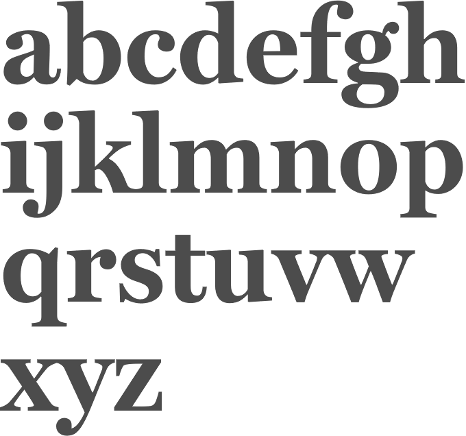
file name: Matthew Carter Cyrus Highsmith Tobias Frere Jones Font Bureau Miller 1997
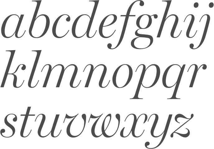
file name: Matthew Carter Cyrus Highsmith Tobias Frere Jones Font Bureau Miller 1997b

file name: Tobias Frere Jones Whitney 2004 01

file name: Tobias Frere Jones Whitney 2004 02

file name: Tobias Frere Jones Whitney 2004 03

file name: Tobias Frere Jones Whitney 2004 04

file name: Tobias Frere Jones Whitney 2004 05

file name: Tobias Frere Jones Whitney 2004 06 B

file name: Tobias Frere Jones Whitney 2004 07

file name: Tobias Frere Jones Whitney 2004 08

file name: Tobias Frere Jones Whitney Condensed 2004 01

file name: Tobias Frere Jones Whitney Condensed 2004 02

file name: Tobias Frere Jones Whitney Condensed 2004 03

file name: Tobias Frere Jones Whitney Condensed 2004 04

file name: Tobias Frere Jones Whitney Condensed 2004 05

file name: Hoefler Frere Jones Whitney Greek 1

file name: Hoefler Frere Jones Whitney Greek 2

file name: Hoefler Frere Jones Whitney Greek cyrillic 1

file name: Hoefler Frere Jones Whitney Greek cyrillic 2

file name: Hoefler Frere Jones Whitney Greek cyrillic 4

file name: Hoefler Frere Jones Whitney Book 2004

file name: Hoefler Type Foundry Whitney Index Black Round Md 20034

file name: Hoefler Type Foundry Whitney Index Black Round Md 20034b

file name: Jonathan Hoefler Tobias Frere Jones Whitney Medium 2004

file name: Hoefler Forza

file name: H F J Forza 2010 01

file name: H F J Forza 2010 02

file name: H F J Forza 2010 04

file name: H F J Forza 2010 07

file name: Font Bureau Nobel 1993 after Sjoerd Hendrik De Roos

file name: Font Bureau Nobel 1993 after Sjoerd Hendrik De Roos

file name: Tobias Frere Jones F B Nobel 1991

file name: Tobias Frere Jones Nobel Black 1993 after Sjoerd Hendrik De Roos

file name: Tobias Frere Jones Nobel Book 1993 after Sjoerd Hendrik De Roos

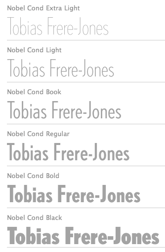
file name: Tobias Frere Jones Nobel Cond Bold 1993 after Sjoerd Hendrik De Roos

file name: Tobias Frere Jones Nobel Cond Book 1993 after Sjoerd Hendrik De Roos

file name: Tobias Frere Jones Nobel Extra Light 1993 after Sjoerd Hendrik De Roos

file name: Tobias Frere Jones F F Dolores 1991

file name: Tobias Frere Jones F B Reactor 1996

file name: Tobias Frere Jones Reactor F B 1996

file name: Tobias Frere Jones Garage Gothic 1992

file name: Tobias Frere Jones Garage Gothic Black 1992d

file name: Tobias Frere Jones Garage Gothic Black 1992c

file name: Tobias Frere Jones Garage Gothic Black 1992

file name: Tobias Frere Jones Garage Gothic Bold 1992
| | |
|
Luc Devroye ⦿ School of Computer Science ⦿ McGill University Montreal, Canada H3A 2K6 ⦿ lucdevroye@gmail.com ⦿ https://luc.devroye.org ⦿ https://luc.devroye.org/fonts.html |

