TYPE DESIGN INFORMATION PAGE last updated on Thu Apr 16 22:01:07 EDT 2026
FONT RECOGNITION VIA FONT MOOSE
|
|
|
|
29 Letters
[Pascal Naji Zoghbi]
Madrid (and before that, Lebanon)-based Arabic type designer who runs the Arab type news and blog site called Arabic Typography. KHTT link. An ex-student of the KABK in 2006, he currently is a part time instructor of design and typography at Notre Dame University, Louaize, Lebanon, as well as a part time instructor of typography at the American University of Beirut (AUB), both since 2007. His Arabic type foundry is called 29letters. At ATypI 2008 in St. Petersburg, he ran a workshop on the Arabic Kufi script. Speaker at ATypI 2010 in Dublin on the topic of political resistance and expression through graffiti in Lebanon and Palestine. His contributions to type design:
|
EXTERNAL LINKS |
| | |

file name: Pascal Zoghbi 29 L T Zarid Display 2020

file name: Pascal Zoghbi Jan Fromm 29 L T Zarid Slab Variable 2020

file name: Pascal Zoghbi Ramiro Espinoza Jan Fromm Khajag Apelian 29 L T Zarid Serif 2020

file name: Pascal Zoghbi Ramiro Espinoza Jan Fromm Khajag Apelian 29 L T Zarid Serif Text Variable 2020

file name: Pascal Zoghbi Ramiro Espinoza Jan Fromm Khajag Apelian 29 L T Zarid Serif Variable 2020

file name: Pascal Zoghbi 29 L T Zarid Sans 2020

file name: Pascal Zoghbi 29 L T Zarid Sans 2020

file name: Pascal Zoghbi Zarid

file name: Pascal Zoghbi Zarid

file name: Pascal Zoghbi Ian Party Wael Morcos Azer 2013

file name: Pascal Zoghbi Ian Party Wael Morcos Azer 2013b

file name: Pascal Zoghbi Ian Party Wael Morcos Azer 2013c

file name: Pascal Zoghbi Ian Party Wael Morcos Azer 2013d

file name: Wael Morcos Ian Party Pascal Zoghbi Azer T D C Award 2014

file name: Pascal Zoghbi Droid Arabic Naskh 2012

file name: Pascal Zoghbi Droid Arabic Kufi 2010

file name: Pascal Zoghbi U A Neo B 2007 2013

file name: Pascal Zoghbi U A Neo B 2007 2013b

file name: Pascal Zoghbi U A Neo B 2007 2013c

file name: Pascal Zoghbi U A Neo B 2007 2013d

file name: Pascal Zoghbi U A Neo N 2007 2013

file name: Pascal Zoghbi U A Neo N 2007 2013b

file name: Pascal Zoghbi U A Neo N 2007 2013c

file name: Pascal Zoghbi U A Neo N 2007 2013d

file name: Pascal Zoghbi Droid Persian Unicode

file name: Pascal Zoghbi Huda Abi Fares Alef Caps B 2008

file name: Pascal Zoghbi Al rouiya 2008

file name: Pascal Zoghbi Baseet 2009

file name: Pascal Zoghbi Ben Wittner 29 L T Baseet Variable 2020

file name: Pascal Zoghbi Ben Wittner 29 L T Baseet Variable 2020

file name: Pascal Zoghbi Ben Wittner 29 L T Zawi Variable 2020

file name: 29 L T Bukra Variable 2020

file name: 29 L T Bukra 2016

file name: 29 L T Bukra 2016b

file name: 29 L T Bukra 2016c

file name: 29 L T Bukra 2016d

file name: Pascal Zoghbi Bukra Extra Bold 2008

file name: Pascal Zoghbi Expo2020 Dubai

file name: 29 L T Swatch

file name: Pascal Zoghbi Swatch Type

file name: Pascal Zoghbi Swatch Type

file name: Pascal Zoghbi Swatch Type

file name: Pascal Zoghbi L T Kaff

file name: Pascal Zoghbi L T Makina

file name: Pascal Zoghbi L T Makinab

file name: Pascal Zoghbi Zeyn

file name: Pascal Zoghbi Zeyn

file name: Pascal Zoghbi Zeyn

file name: Pascal Zoghbi Zeyn

file name: Pascal Zoghbi Zeyn

file name: Pascal Zoghbi Mathaf 2011

file name: Pascal Zoghbi Nada Debs 2010

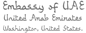
file name: Pascal Zoghbi U A E Embassy Corporate Type 2010

file name: Pascal Zoghbi U A E Embassy Corporate Type 2010b

file name: Pascal Zoghbi U A E Embassy Corporate Type 2010c
| | |
|
Luc Devroye ⦿ School of Computer Science ⦿ McGill University Montreal, Canada H3A 2K6 ⦿ lucdevroye@gmail.com ⦿ https://luc.devroye.org ⦿ https://luc.devroye.org/fonts.html |

