|
Haas'sche Schriftgiesserei

German/Swiss foundry established in 1790 (however, see timeline below) and based in Basel/Münchenstein. Many of its shares were acquired by D. Stempel in 1927. Linotype takes over Haas in 1989. Their collection includes: - Kompakte Grotesk (1893)
- Steinschrift (1834). See also here.
- Enge Grotesk (ca. 1870)
- Commercial-Grotesk Halbfett (1940)
- Altgrotesk halbfett (1880)
- Haas gotisch schmal. This typeface was digitally revived by Gerhard Helzel.
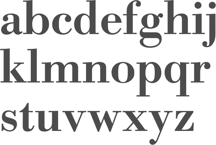
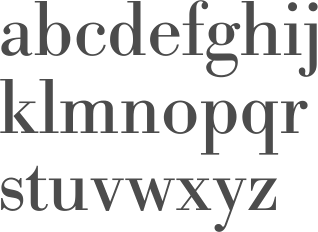
- Bodoni-Kursiv, Bodoni-Antiqua (Bodoni, 1780). The 1924 cuts of Bodoni formed the basis of Berthold Bodoni, which can now be had under that name in digital form.
- Ideal-Antiqua (ca. 1880)
- Caslon Antiqua and Caslon Kursiv (William Caslon, London, 1720)
- Alt-Fraktur and Fette Alt-Fraktur (ca. 1840)
- Fette Gotisch (ca. 1860)
- Halbfette Normande (1850) and Normande fett (by Thorne, London, 1810)
- Nürnberger Schwabacher (originally, ca. 1600, published in 1930)
- E.A. Neukomm: Bravo (1945), Chevalier (1946). Digital forms of Chevalier can be found at Agfa and LetterPerfect. Elsner&Flake's Escorial is another digital form of it. And so is PrimaFont's Chauvinist.
- A. Auspurg: Castor (1924), Pollux (1925).
- Hermann Eidenbenz: Graphique (1941), Clarendon (1953). Clarendon became a Linotype face.
- Adrian Frutiger: Ondine (1954), a calligraphic font done at Deberny et Peignot before it was taken over by Haas.
- Walter J. Diethelm: Diethelm Antiqua (1945-1950).
- M. Miedinger: Helvetica (1957), Horizontal (1964), Pro Arte (1954). Helvetica became Linotype's big prize face.
- Eugen+M. Lenz: Profil (1943-1947). In the digital era, Profil became Decorated 035 at Bitstream.
- P. Wezel: Constellation (1970).
- H. Baumgart: Quirinale (1970).
- Richard Gerbig: Riccardo (1941, a script face).
- Edmund Thiele: Superba (1934), Normale Grotesk (1942), Troubadour Lichte (1931, script). Troubadour survives digitally as Rechtman Script (Intecsas). Superba was digitally revived by Red Rooster as Superba Pro (1992 and 2017).
- Anzeigen Grotesk (1943, Haas / Linotype) is a heavy condensed sans in the style of Impact. Modern digital versions include Anzeigen Grotesk (2009) by URW and Anzeigen Grotesk (2006) by Linotype.
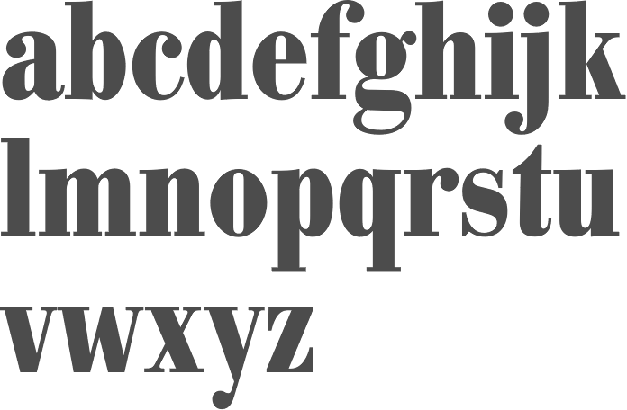
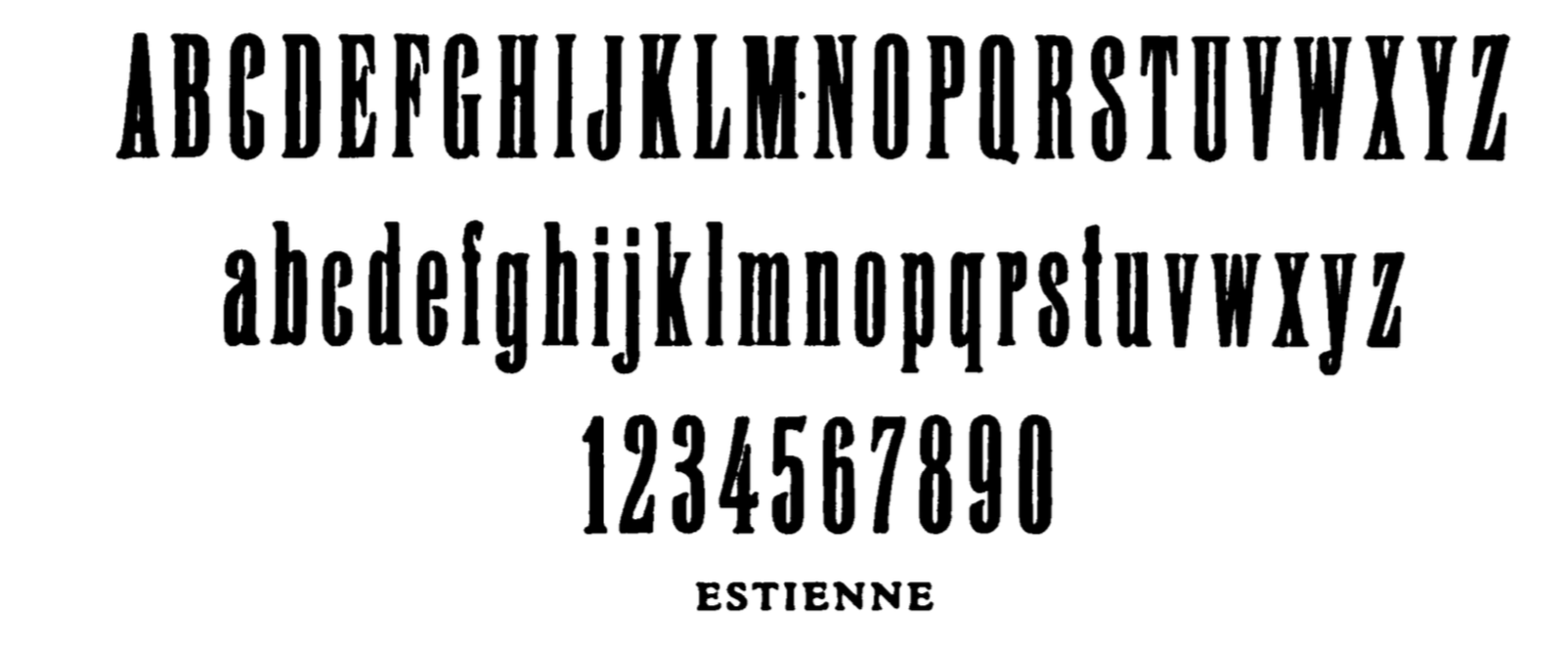
- Estienne is a condensed roman with small pointed serifs that revives a nineteenth century design. Not to be confused with the old face Linotype estienne.
In Chronik der Haas'schen Schriftgiesserei (2002), Hans Reichardt describes this timeline: - 1654: Johann Jakob Genath (1582-1654) runs a print shop and foundry in Basel.
- 1708: His son Johann Rudolf Genath (1638-1708) leaves the foundry to his second son Johann Rudolf Genath II.
- 1737: Johann Rudolf Genath II has no children and makes Johann Wilhelm Haas (1698-1764) his official heir. Haas had come from Nürnberg to Basel in 1718 to work with Genath.
- 1745: Haas takes over, and dies in 1764. His son Wilhelm Haas Münch (1741-1800) then takes over.
- 1772: Wilhelm invents a hand press, and in 1776 develops a system for printing maps.
- 1790: Publication of Epreuves des caracteres d'usage ordinaire dans l'imprimerie. Local download.
- 1800: Wilhelm is succeeded by his son, Wilhelm Haas Decker (1766-1838).
- 1830: Wilhelm Haas Decker leaves the business to his son Georg Wilhelm Haas (1792-1853) and to Karl Eduard Haas (1801-1853).
- 1852: Two employees, Jakob Haas and G. Münch take over. But in 1857, they sell the company to Otto Stuckert (1824-1874) who lived in Lörrach.
- 1866-1895: The Basler Handelsbank was the main investor in the business, and sells it in 1895 to Fernand Vicarino.
- 1904: Max Krayer becomes owner.
- 1921: A new plant is built in Münchenstein.
- 1924: Work on a new cut of Bodoni has started. Later, Stempel and Berthold would use this type, and it became well-known as Berthold Bodoni.
- 1927: The company becomes an AG (Aktiengesellschaft) and strikes business cooperation deals with D. Stempel AG and H. Berthold AG.
- 1940-1941: Caslon Antiqua and Kursiv (1940) and Riccardo (1941) are created.
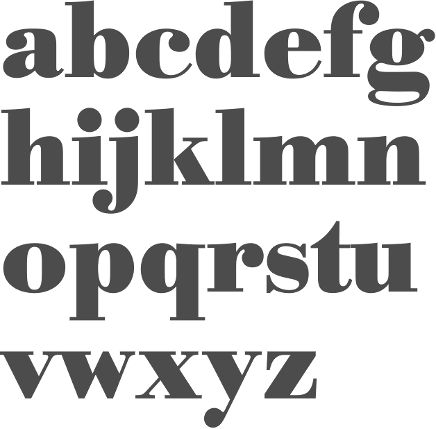
- 1941: Ideal Roman is cast. Berry, Johnson and Jaspert write: This Haas revival is a condensed semi-bold nineteenth-century design, which is almost a Fat Face. There is the usual long spur to the G, curled tail to the R, and long serifs in the E, F and T. Ascenders and descenders in the lower case are very short. Cf. Contact. The present design is cast from 1941 matrices, and the identical type is cast by Stempel, who call it Jeannette. The type is quite different from Amsterdam and Intertype Ideal.
- 1944: Eduard Hoffmann becomes Director when Max Krayer dies.
- 1945-1958: In the Post World War II boom, these typefaces were created: Bravo (1945), Graphique (1945), Chevalier (1946), Profil (1947), Clarendon kräftig and fett (1953), Pro Arte (1954), Neue Haas-Grotesk halbfett (1957), Neue Haas-Grotesk mager (1958).
- 1968: Alfred Hoffmann succeeds Eduard Hoffmann.
- 1972-1982: An expansion period follows. The company takes over Deberny&Peignot (Paris) in 1972, Fonderie Olive (Marseille) in 1978, and Grafisk Compagni (Copenhagen) in 1982.
- 1989: Linotype takes over Haas and dissolves the company. Linotype itself keeps the name and the rights to the typefaces, and gives the foundry to Walter Fruttiger, who continues that part of the business as Fruttiger AG.
- 1990: Società Nebiolo (Turin) is taken over.
View the Haas typeface library. See also here.
|
EXTERNAL LINKS
Haas'sche Schriftgiesserei
 [Buy fonts] [Buy fonts]
 [Designer info] [Designer info]
MyFonts search
Monotype search
Fontspring search
Google search
INTERNAL LINKS
Foundries of the 19th century ⦿
Extinct 20th century foundries ⦿
Foundries of the 18th century ⦿
Blackletter fonts ⦿
Type design in Switzerland ⦿
German type scene ⦿
Modern style [Bodoni, Didot, Walbaum, Thorowgood, Computer Modern, etc.] ⦿
Bastarda / Bâtarde / Schwabacher ⦿
Caslon ⦿
Clarendon ⦿
|
