TYPE DESIGN INFORMATION PAGE last updated on Tue May 5 11:42:42 EDT 2026
FONT RECOGNITION VIA FONT MOOSE
|
|
|
|
Eyal Holtzman (Den Haag, The Netherlands) is a graphic and type designer who was born in Haifa, Israel in 1969. He studied at the Royal Academy of Art in The Hague, and teaches typography and graphical arts in various places. He set up Studio Eyal and Myrthe together with Myrthe Stel. Eyal Holtzman has designed many corporate and some retail typefaces. typefaces for clients such as The Enschedé Font Foundry and Nationale Nederlanden. His work has been exhibited in many places, including in Museum of the Book---Meermanno in Den Haag. MyFonts writes: In the book Ha, daar gaat er een van mij! (Hey, there goes one of mine!, a chronicle of graphic design in The Hague from 1945 to 2000, 010 Publishers, Rotterdam 2002) he is called "one of the most idiosyncratic letter talents from The Hague" and in Dutch Type (010 Publishers, Rotterdam 2004) expert Jan Middendorp describes his letters as being "among the most original alphabets produced in the Netherlands", (...) "tapping into an idiom that no other type designer working in the Netherlands has ever used". His typefaces:
|
EXTERNAL LINKS |
| | |

file name: Eyal Holtzman Kristal 2021

file name: Eyal Holtzman Kristal 2021

file name: Eyal Holtzman Kristal 2015

file name: Eyal Holtzman Kristal 2015b

file name: Eyal Holtzman Kristal 2015c

file name: Eyal Holtzman Kristal 2021

file name: Eyal Holtzman Kristal 2021

file name: Eyal Holtzman Kristal 2021

file name: Eyal Holtzman Studio Kristal 2022

file name: Eyal Holtzman Studio Kristal 2022

file name: Eyal Holtzman Studio Kristal 2022

file name: Eyal Holtzman Studio Kristal 2022

file name: Eyal Holtzman Studio Kristal 2022

file name: Eyal Holtzman Kristal 2021

file name: Eyal Holtzman Kristal 2021

file name: Eyal Holtzman Kristal 2021

file name: Eyal Holtzman Kristal 2021

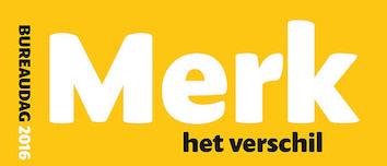
file name: Eyal Holtzman Jumbo 2016

file name: Eyal Holtzman Jumbo 2016

file name: Eyal Holtzman Jumbo 2016

file name: Eyal Holtzman Jumbo 2016b

file name: Eyal Holtzman Jumbo 2016b

file name: Eyal Holtzman Jumbo 2016b 2

file name: Eyal Holtzman Jumbo 2016b

file name: Eyal Holtzman Jumbo 2016c

file name: Eyal Holtzman Dille Kamille

file name: Eyal Holtzman Dille Kamille

file name: Eyal Holtzman Dille Kamille

file name: Eyal Holtzman Dille Kamille

file name: Eyal Holtzman Douche 2006

file name: Eyal Holtzman Douche 2006

file name: Eyal Holtzman Douche 2006

file name: Eyal Holtzman Jerusalem 1996

file name: Eyal Holtzman Jerusalem 1996

file name: Eyal Holtzman Jerusalem 1996

file name: Eyal Holtzman Jerusalem 1996

file name: Eyal Holtzman O D123

file name: Eyal Holtzman O D123

file name: Eyal Holtzman Rosart

file name: Eyal Holtzman Rosart

file name: Eyal Holtzman Soya

file name: Eyal Holtzman Soya

file name: Eyal Holtzman Staring

file name: Eyal Holtzman Staring

file name: Eyal Holtzman Joel Book Joel Italic 1996

file name: Eyal Holtzman Joel Display Joel Outline 1996

file name: Eyal Holtzman Rain Birds 1996

file name: Eyal Holtzman Normandia 1996
| | |
|
Luc Devroye ⦿ School of Computer Science ⦿ McGill University Montreal, Canada H3A 2K6 ⦿ lucdevroye@gmail.com ⦿ https://luc.devroye.org ⦿ https://luc.devroye.org/fonts.html |


