TYPE DESIGN INFORMATION PAGE last updated on Thu Apr 16 22:02:05 EDT 2026
FONT RECOGNITION VIA FONT MOOSE
|
|
|
|
Neubau Berlin (or: NB Typography, or: Neubau Laden)
[Stefan Gandl]
Stefan Gandl was the designer at Designer Shock in Berlin of the pixel fonts DS1D, DS2D, DS3D, DSClone, DSClone3D, DSCutout, DSImitate, DSMufdi, DSMufdi3DL, DSMufdi3DR, DSNSW45, DSNSW55, DSNSW65, DSNSW75, DSNSW85, DSNSW95, DSP9RMX (with Markus Angermeier), DSP9RMX3D, DSSQR35, DSSQR45, DSSQR55, DSSQR553DL, DSSQR553DR, DSSQR65, DSSQR75, DSSQR85, DSTicket35, DSTicket45, DSTicket55, DSTicket65, DSTicket75, DSTicket85, DSTicket95, DSVDOTXT1, DSVDOTXT2, DSVDOTXTError. At the end of 2001, he established Neubau Berlin or NB Typography. He created DS Yakuti (experimental) and DS Lane (2001, trilined) at Die Gestalten. Fonts at Neubau include NB55RMS, NB55RBX, NB55RLS, NB55MS, NB55BX, NB55SET, NBFETT, NBFORM, NBRUND, NBTRANSFER, NBUNIVERS, and NBBLOCK, which are all mostly futuristic-looking designs. In 2008, they added the beautiful 6-weight (35, 45, 55, 65, 75, 85) NBGrotesk family (+Mono, +Mono Stencil), also by Stefan Gandl. In the Neubau series, we also find the gorgeous didone display typeface NB Antiqua Nero (+Italic), NB Antiqua Roman, Antiqua Libro, and NB Typewriter. NB Architekt and NB Architekt Neue (2015) pay tribute to blueprint typefaces used during the Letraset era. The typeface is a classic modern monoline monospace that was originally designed by Gandl in 2002 and named NB55RMS. Neubau made a concerted effort in the Akzidenz Grotesk genre. The classical AG became the starting point for the development of Neubau's distilled grotesque NBGrotesk (2008)---a strongly restricted, grid-based, brutally honest and optically non-corrected mono line type system comprising 28 styles. An optically balanced version of NB Grotesk's skeleton resulted in Neubau's popular NB International (2014) type system paying homage to the "international style" era. Coming full circle with NB International's conceptual successor---NB Akademie---(2016-2020) is a more distinctive and refined follower inspired by the studio homegrown Berlin influences. The in house, non-retail and beta versions of NB Akademie are called NB National. Gandl writes: The typeface's infuences and naming go way back to legendary German type designer Ferdinand Theinhardt and his revolutionary typeset Royal Grotesk (1880) designed for the publications of the Königlich-Preußischen Akademie der Wissenschaften zu Berlin. After selling his own type foundry Ferd. Theinhardt Schriftgiesserei Berlin Theinhardt's Royal Grotesk became internationally successful as Berthold's Akzidenz Grotesk (1896)---the godmother of all modern grotesque typefaces. Other typefaces: NB Plan Pro, Postmates (2017). |
EXTERNAL LINKS |
| | |

file name: Stefan Gandl Postmates 2017

file name: Stefan Gandl N B Akademie 2020
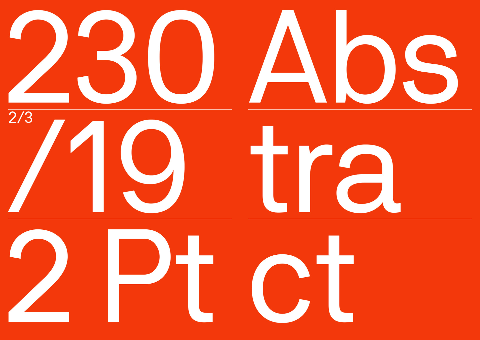
file name: Stefan Gandl N B Akademie 2020

file name: Stefan Gandl N B Akademie 2016
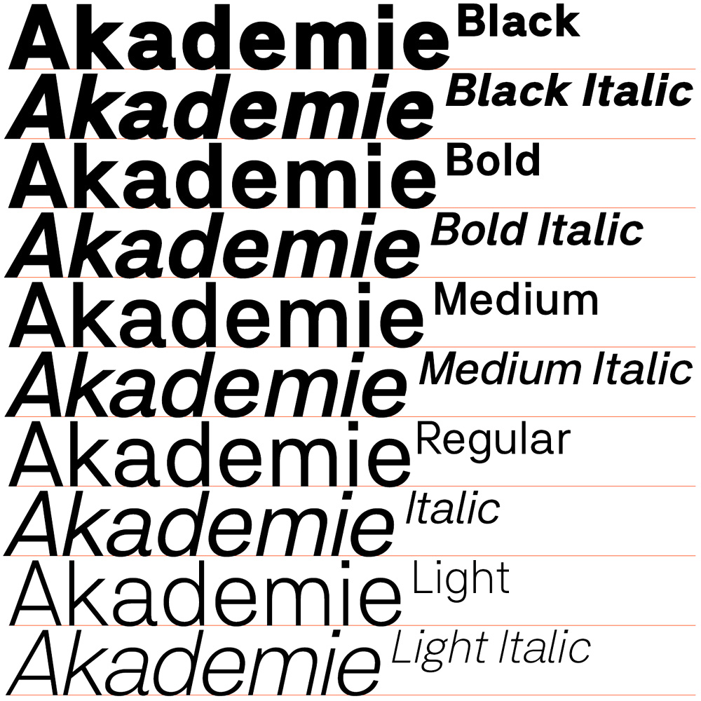
file name: Stefan Gandl N B Akademie 2016c
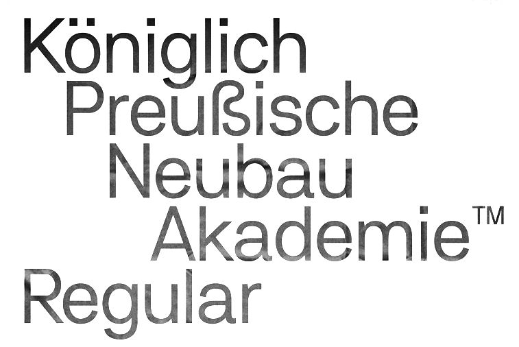
file name: Stefan Gandl N B Akademie 2016d
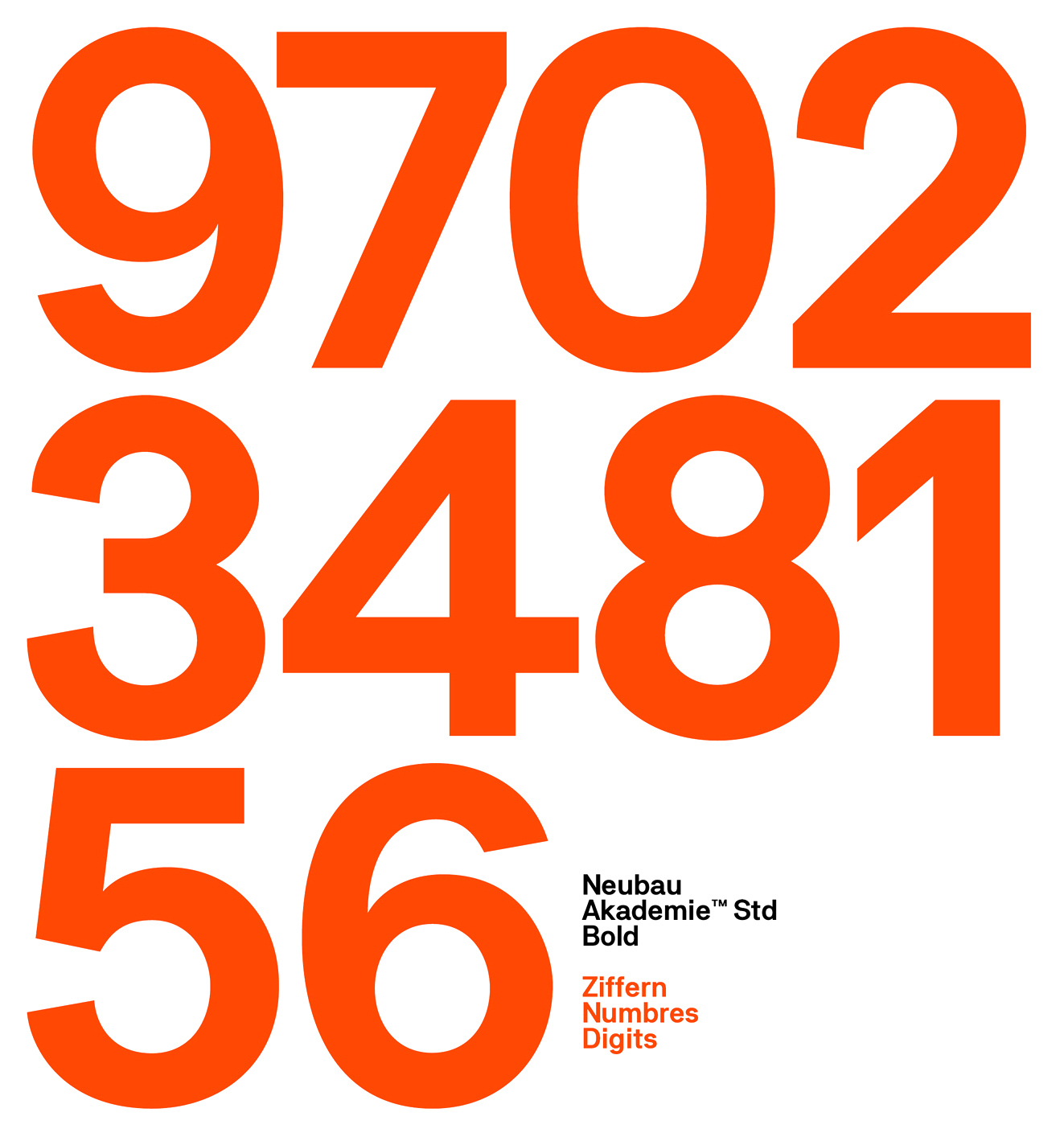
file name: Stefan Gandl N B Akademie 2016e

file name: Stefan Gandl N B Akademie 2016h

file name: Stefan Gandl D S Lane 2001

file name: Stefan Gandl N B Grotesk 2014

file name: Stefan Gandl N B Grotesk Mono 2014
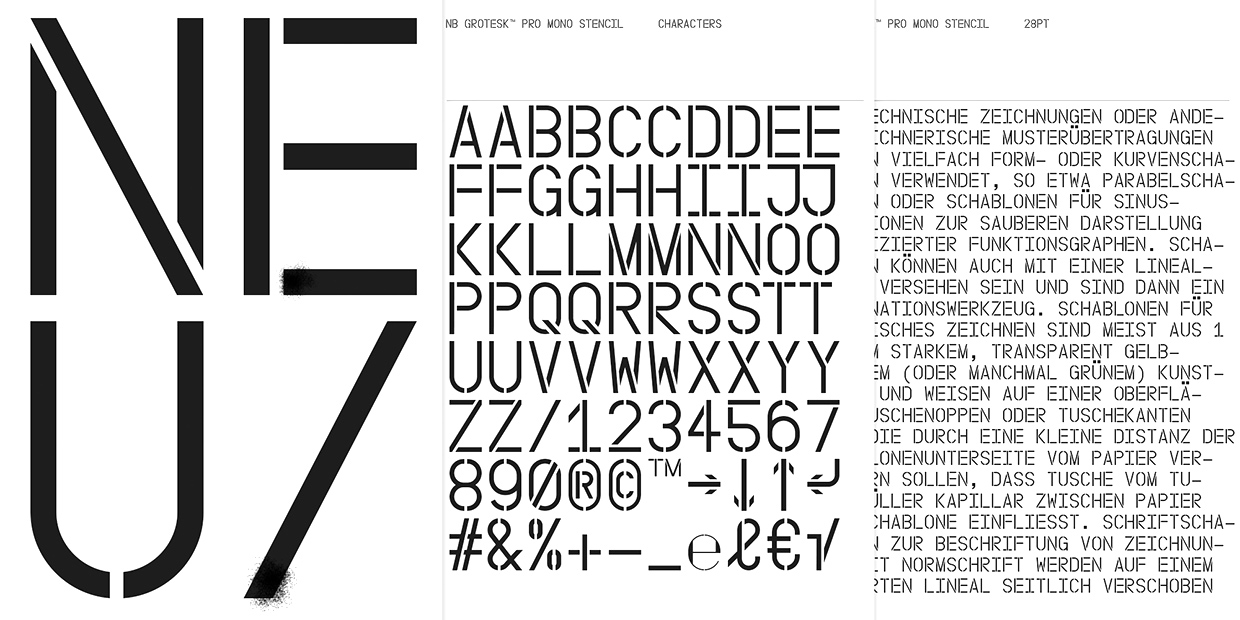
file name: Stefan Gandl N B Grotesk Pro Mono Stencil 2016

file name: Stefan Gandl N B Grotesk35 85 2009

file name: Stefan Gandl Neubau Grotesk Rund 2010

file name: Stefan Gandl N B International Pro 2014
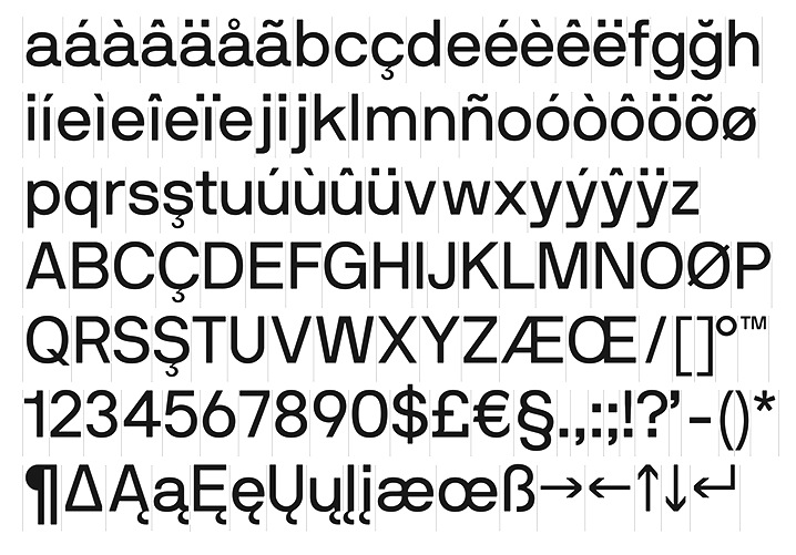
file name: Stefan Gandl N B International Pro 2014a
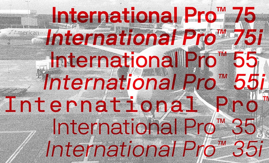
file name: Stefan Gandl N B International Pro 2014b

file name: Stefan Gandl N B International Pro 2014c

file name: Stefan Gandl N B International Pro 2014d

file name: Stefan Gandl N B International 2014

file name: Stefan Gandl N B International Mono 2014

file name: Stefan Gandl N B Antiqua Libro 2014

file name: Stefan Gandl N B Antiqua Libro Italic 2014

file name: Stefan Gandl N B Antiqua Nero 2014

file name: Stefan Gandl N B Antiqua Nero Italic 2014

file name: Stefan Gandl N B Antiqua Roman 2014
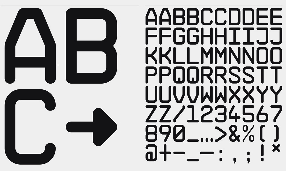
file name: Stefan Gandl N B Architekt 2015a
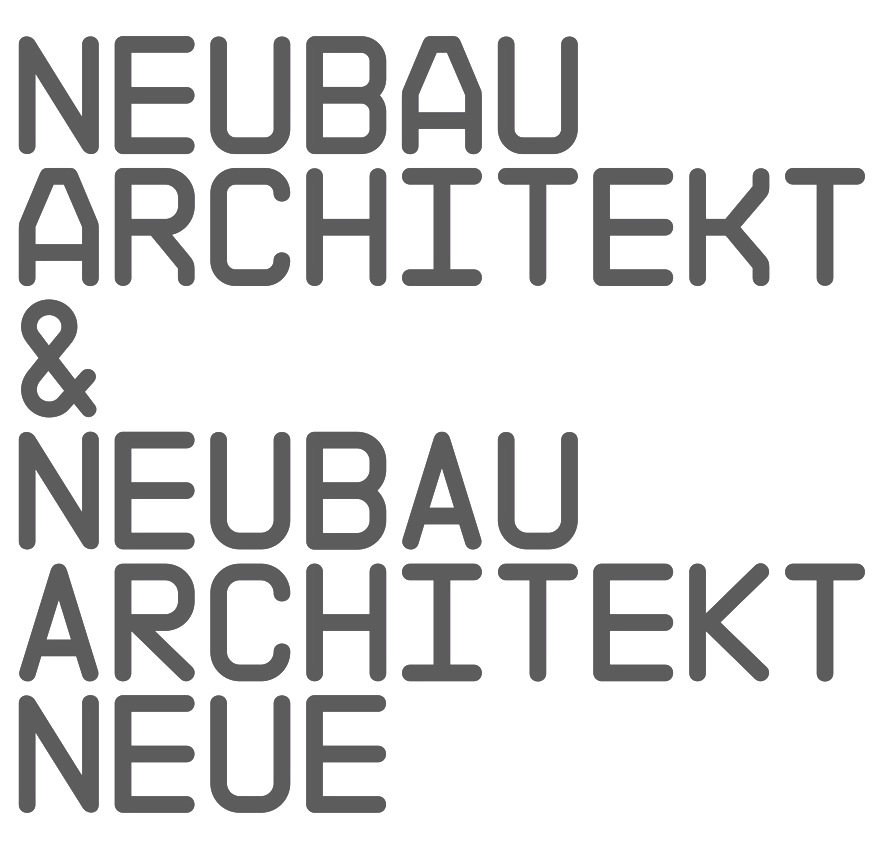
file name: Stefan Gandl N B Architekt 2015b
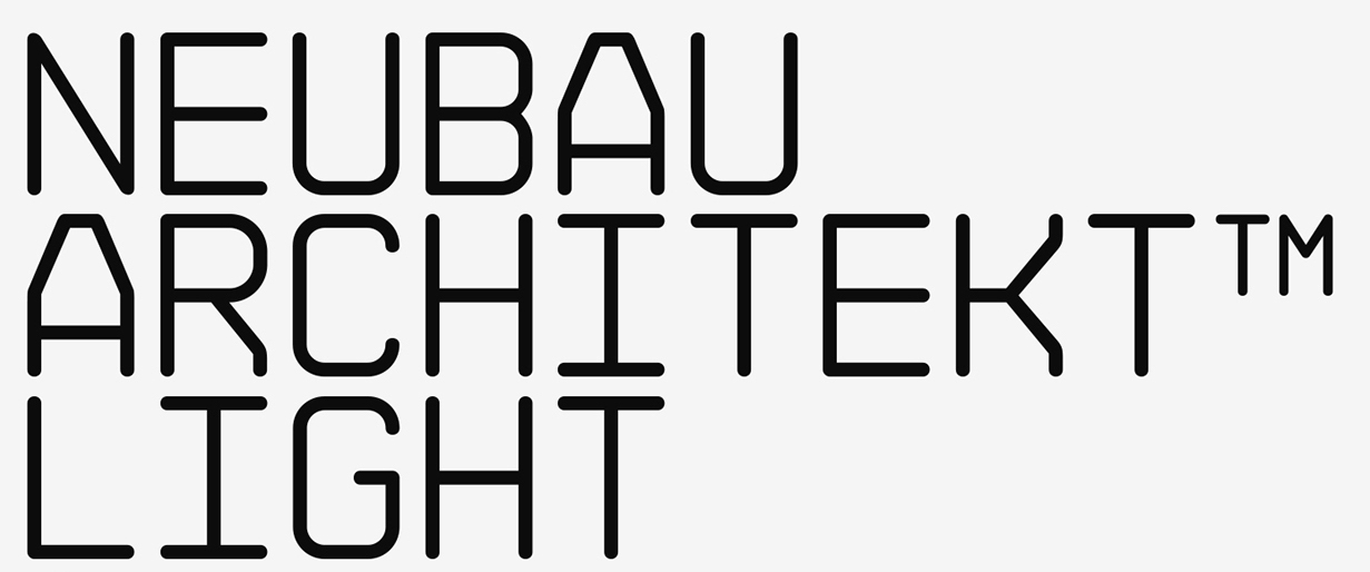
file name: Stefan Gandl N B Architekt Light 2016

file name: Stefan Gandl N B Architekt Light 2016b

file name: Stefan Gandl N B Architekt Neue 2015

file name: Stefan Gandl N B Architekt Neue Light 2016

file name: Stefan Gandl N B Architekt Neue 2015

file name: Stefan Gandl N B Typewriter 2014
| | |
|
Luc Devroye ⦿ School of Computer Science ⦿ McGill University Montreal, Canada H3A 2K6 ⦿ lucdevroye@gmail.com ⦿ https://luc.devroye.org ⦿ https://luc.devroye.org/fonts.html |

