|
TDC2 Type Directors Club's Type Design Competition 2011

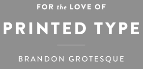
The TDC2 2011 competition's jury was headed by James Montalbano. The other members are Jos Buivenga, Jessica Hische, Steve Matteson and Charles Nix. The 20 winners out of 179 participants: - Hannes von Döhren. He is a double winner. I had his Brandon Grotesque pegged for a win for a long time, because it is just about everywhere. It comes in 12 styles, and is, in my view, the trendiest typeface of 2010. He also won for 36-style Supria Sans and Supria Sans Condensed family.
- Ludwig Übele is another double winner. Several stylistic components can be found in the art deco fat display typeface Daisy. He also got awarded for his low-contrast text family Tundra (FontFont).
- Erik van Blokland, the third double winner. It is no surprise that Eames Century Modern (House Industries) found its way to the top of the pile---it is a balanced and very useful family. Eames Poster Numerals was also given a prize. The blurb at TDC: The Eames Poster Numerals are numerological necessities punctuated with a pulchritudinous parade of pachydermic power whose circusized woodcut-inspired shapes were drawn in three stackable weights and boast a broad range of color choices limited only by the imagination, RGB or CMYK spectra, and the availability of custom pigmented emulsions. I was about to say just that.
- Jeremy Mickel is the fourth double winner. His Shift is inspired by American slab-serifs from the late 19th century. His second award was for Eventide (House Industries), an expansion of a 1940 octagonal typeface by Paul Carlyle that had seeped into a PhotoLettering collection in 1971. In fact, he is a two-and-half-time winner, because his poster style family Aero, co-designed with Chester Jenkins at Village Type, also made it to the final list. Aero takes inspiration from Roger Excoffon's Antique Olive, particularly the heavy Nord weight.
- Chester Jenkins. Look under Jeremy Mickel's carcass.
- Nadine Chahine (Linotype) won with Palatino Sans Arabic, which was designed in consultation with Hermann Zapf.
- Lara Assouad Khoury (Dar Onboz Publishing) won with the experimental Arabic typeface Tabati.
- Kristyan Sarkis made Thuraya, the third Arabic typeface awarded this year. TDC explains: Thuraya is an Arabic display typeface that explores a contemporary context for the complex Diwani style with maximized calligraphic features.
- Neil Summerour (Positype) was awarded for his rough-edged calligraphic typeface Nori.
- Jim Wasco (Monotype) admits that Elegy was the most difficult design job I have ever done in my life. This connected formal Spencerian calligraphic typeface is based on the original ITC logo designed by Ed Benguiat in 1970.
- Alejandro Paul (Sudtipos) receives his annual TDC award for the third calligraphic typeface in the list of 20, Poem Script. It too was influenced by American pen scripts.
- Jason Mannix and Lindsay Mannix share an award for Enzian: Enzian is the product of a German research fellowship sponsored by the Alexander von Humboldt Foundation. We set out with two goals: to better understand the technical nuance and complicated history of German Blackletter and produce an original typeface inspired by our findings.
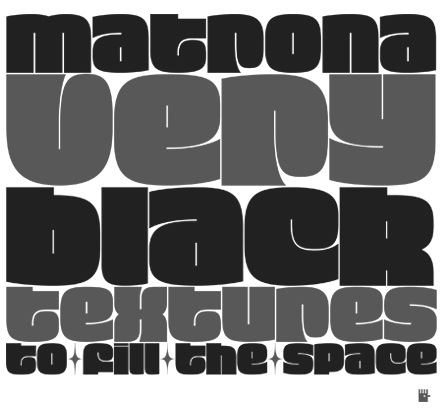
- Hubert Jocham created the fat poster typeface Matrona. Think Otero paintings and Sunday mass in Palermo.
- Alex Rütten (FontShop) received an award for his Egyptian family FF Suhmo.
- Aki Toyoshima sneaked in with the minimalist Japanese type family News (FontFont).
- Vera Evstafieva's Amalta (Infonta) is a Latin / Cyrillic typeface with calligraphic roots.
|
EXTERNAL LINKS
TDC2 Type Directors Club's Type Design Competition 2011
MyFonts search
Monotype search
Fontspring search
Google search
INTERNAL LINKS
Past type competitions ⦿
|


