TYPE DESIGN INFORMATION PAGE last updated on Mon Jul 13 21:21:15 EDT 2026
FONT RECOGNITION VIA FONT MOOSE

|
|
|
|
Erik Bertell
[Erik Jarl Bertell]
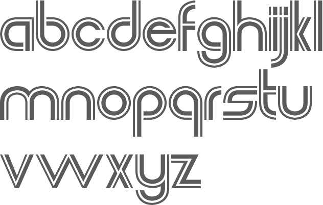
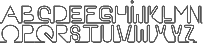
Helsinki, Finland-based Erik Bertell graduated from Lahti Institute of Design. His fonts include Neon, Mama and Mama Round. Born in Helsinki in 1980, Erik was at first a type designer for Fenotype, which was founded by his brother Emil Bertell. He holds an MA in graphic design from aalto University in Helsinki. Around 2012, he set up his own foundry, simply called Erik Bertell. Erik's fonts EB Base Mono (2009, monospaced), EB Futuretro (2002, bilined art deco techno face), EB Neon (2002), EB Boogie Monster (2002, multiline prismatic op art family), EB Vintage Future and EB Humboldt (2002, ultra fat). EB Martin (2010) is, in his own words, a post modern take on several traditional blackletter types. EB Bellissimo Display (2010) is a rounded monoline geometric sans typeface family. EB Jessica (2011) is part typewriter, part cemetery. Typefaces from 2013: Steamer (which he calls a grimy grotesque), EB Vintage Future, EB Martin (blackletter), EB Jessica Condensed Book. Moomin (2015) is a custom typeface designed for the Moomin brand. It is based the type used in the early comic strips by Tove Jansson, the author and creator of the Moomins. Cavalier (2016) is an avant-garde sans in the style of the 1970s. Typefaces from 2018: Capital (a sans and serif family by Teo Tuominen, Erik Jarl Bertell and Emil Karl Bertell). Typeface from 2019: Portland (a reverse contrast typeface by Emil Bertell, Erik Bertell and Teo Tuominen), Taurus (an all caps logotype family by Emil Bertell, Erik Bertell and Teo Tuominen), Zeit (a transitional text typeface by Emil Bertell, Erik Bertell and Teo Tuominen), Avion (a sans family by Emil Bertell, Erik Bertell and Teo Tuominen), Fabrica (a decorative frilly didone by Emil Bertell, Erik Bertell and Teo Tuominen), Tapas (by Emil Bertell, Erik Bertell and Teo Tuominen: a Serif, Sans, Deco and Script collection), Galatea (a 48-style sans family by Erik and Emil Bertell), Well (Erik Bertell and Toni Hurme: a wavy custom display typeface for Well Coffee), Morison (a great 32-style wedge serif typeface by Erik and Emil Bertell and Teo Tuominen), Frank Sans (grungy). Typefaces from 2020: Laurel (by Teo Tuominen, Emil Bertell and Erik Bertell: a 4 style sans with amnay wedge elements), Resolve Sans (by Teo Tuominen, Emil Bertell and Erik Bertell: an extensive grotesk super family of 124 fonts: from compressed to extended, thin to black), Rockford Sans (2020: an 8-style geometric sans with large x-height and slightly rounded corners; Emil Bertell, Erik Bertell and Teo Tuominen), Walden (a heavy rustic serif typeface by Emil Bertell, Erik Bertell and Teo Tuominen), Klik (a geometric sans family with Bauhaus influences, by the dynamic trio of Emil Bertell, Erik Bertell and Teo Tuominen). Typefaces from 2021: Imagist (a 12-style sharp-edged serif by Emil Bertell, Erik Bertell and Teo Tuominen), Alonzo (a 24-style Peignotian sans by Emil Bertell, Erik Bertell and Teo Tuominen), Maine (a 12-style modernized book antiqua by Emil Bertell, Erik Bertell and Teo Tuominen), Lagom (a 16-style slab serif with some Clarendon charm; by Emil Bertell, Erik Bertell and Teo Tuominen), Wonder (a 12-style rounded serif in the style of Windsor; by Emil Bertell, Erik Bertell and Teo Tuominen), Grand Cru (a refined serif family with 36 styles; by Emil Bertell, Erik Bertell and Teo Tuominen). |
EXTERNAL LINKS |
| | |


file name: Emil Bertell Erik Bertell Teo Tuominen Imagist 2021

file name: Emil Bertell Erik Bertell Teo Tuominen Imagist 2021

file name: Emil Bertell Erik Bertell Teo Tuominen Imagist 2021

file name: Fenotype Imagist 2021 1

file name: Fenotype Imagist 2021 2

file name: Fenotype Imagist 2021 3

file name: Fenotype Alonzo 2021 1

file name: Emil Bertell Erik Bertell Teo Tuominen Alonzo 2021

file name: Emil Bertell Erik Bertell Teo Tuominen Alonzo 2021

file name: Emil Bertell Erik Bertell Teo Tuominen Alonzo 2021

file name: Emil Bertell Erik Bertell Teo Tuominen Alonzo 2021

file name: Emil Bertell Erik Bertell Teo Tuominen Alonzo 2021

file name: Fenotype Alonzo 2021 2

file name: Fenotype Alonzo 2021 3

file name: Fenotype Alonzo 2021 4

file name: Fenotype Alonzo 2021

file name: Fenotype Maine 2021 1

file name: Fenotype Maine 2021 2

file name: Fenotype Maine 2021 3

file name: Fenotype Maine 2021 4

file name: Fenotype Maine 2021 5

file name: Fenotype Maine 2021

file name: Emil Bertell Erik Bertell Teo Tuominen Maine 2021

file name: Emil Bertell Erik Bertell Teo Tuominen Maine 2021

file name: Emil Bertell Erik Bertell Teo Tuominen Maine 2021

file name: Emil Bertell Erik Bertell Teo Tuominen Maine 2021

file name: Emil Bertell Erik Bertell Teo Tuominen Lagom 2021

file name: Emil Bertell Erik Bertell Teo Tuominen Lagom 2021

file name: Fenotype Lagom 2021

file name: Fenotype Lagom 2021

file name: Fenotype Lagom 2021

file name: Fenotype Lagom 2021 1

file name: Fenotype Lagom 2021 3

file name: Fenotype Wonder 2021

file name: Fenotype Wonder 2021

file name: Fenotype Wonder 2021 3

file name: Fenotype Wonder 2021 4

file name: Fenotype Wonder 2021 5

file name: Fenotype Wonder 2021

file name: Fenotype Grand Cru 2021 1

file name: Fenotype Grand Cru 2021 10

file name: Fenotype Grand Cru 2021 11

file name: Fenotype Grand Cru 2021 6

file name: Fenotype Grand Cru 2021 7

file name: Fenotype Grand Cru 2021 8

file name: Fenotype Grand Cru 2021 9

file name: Fenotype Grand Cru 2021 2

file name: Fenotype Grand Cru 2021 3

file name: Fenotype Grand Cru 2021 4

file name: Fenotype Grand Cru 2021 5

file name: Fenotype Grand Cru 2021

file name: Fenotype Laurel 2020 1

file name: Fenotype Laurel 2020 2

file name: Fenotype Laurel 2020 3

file name: Fenotype Laurel 2020 4

file name: Fenotype Laurel 2020

file name: Emil Bertell Erik Bertell Teo Tuominen Resolve Sans 2020

file name: Emil Bertell Erik Bertell Teo Tuominen Resolve Sans 2020

file name: Emil Bertell Erik Bertell Teo Tuominen Resolve Sans 2020

file name: Emil Bertell Erik Bertell Teo Tuominen Resolve Sans 2020

file name: Emil Bertell Erik Bertell Teo Tuominen Resolve Sans 2020

file name: Emil Bertell Erik Bertell Teo Tuominen Resolve Sans 2020

file name: Emil Bertell Erik Bertell Teo Tuominen Resolve Sans 2020

file name: Emil Bertell Erik Bertell Teo Tuominen Resolve Sans 2020

file name: Emil Bertell Erik Bertell Teo Tuominen Resolve Sans 2020

file name: Emil Bertell Erik Bertell Teo Tuominen Resolve Sans 2020

file name: Emil Bertell Erik Bertell Teo Tuominen Resolve Sans 2020

file name: Emil Bertell Erik Bertell Teo Tuominen Resolve Sans 2020

file name: Emil Bertell Erik Bertell Teo Tuominen Resolve Sans 2020

file name: Emil Bertell Erik Bertell Teo Tuominen Resolve Sans 2020

file name: Emil Bertell Erik Bertell Teo Tuominen Resolve Sans 2020

file name: Emil Bertell Erik Bertell Teo Tuominen Resolve Sans 2020

file name: Emil Bertell Erik Bertell Teo Tuominen Resolve Sans 2020

file name: Fenotype Resolve Sans 2020 1

file name: Fenotype Resolve Sans 2020 2

file name: Fenotype Resolve Sans 2020 3

file name: Fenotype Resolve Sans 2020 5

file name: Fenotype Resolve Sans 2020

file name: Emil Bertell Erik Bertell Teo Tuominen Rockford Sans 2020

file name: Emil Bertell Erik Bertell Teo Tuominen Rockford Sans 2020 353891

file name: Emil Bertell Erik Bertell Teo Tuominen Rockford Sans 2020 353892

file name: Emil Bertell Erik Bertell Teo Tuominen Rockford Sans 2020 353894

file name: Fenotype Rockford Sans 2020 353897

file name: Fenotype Rockford Sans 2020 353898

file name: Fenotype Rockford Sans 2020 353899

file name: Fenotype Rockford Sans 2020

file name: Emil Bertell Erik Bertell Teo Tuominen Walden 2020

file name: Fenotype Walden 2020 343864 002

file name: Fenotype Walden 2020

file name: Emil Bertell Erik Bertell Teo Tuominen Klik 2020 343448

file name: Emil Bertell Erik Bertell Teo Tuominen Klik 2020 343448

file name: Emil Bertell Erik Bertell Teo Tuominen Klik 2020 343449

file name: Emil Bertell Erik Bertell Teo Tuominen Klik 2020 343450

file name: Emil Bertell Erik Bertell Teo Tuominen Klik 2020 343452

file name: Emil Bertell Erik Bertell Teo Tuominen Klik Condensed 2020 343448

file name: Fenotype Klik 2020 343453

file name: Fenotype Klik 2020 343454

file name: Fenotype Klik 2020 343456

file name: Fenotype Klik 2020 343457

file name: Fenotype Klik 2020

file name: Fenotype Portland 2020 340877

file name: Fenotype Portland 2020

file name: Emil Bertell Portland 2019

file name: Emil Bertell Portland 2019

file name: Emil Bertell Portland 2019

file name: Fenotype Taurus 2019

file name: Fenotype Taurus 2019 332572

file name: Fenotype Taurus 2019 332573

file name: Fenotype Taurus 2019 332575

file name: Fenotype Taurus 2019

file name: Teo Tuominen Erik Jarl Bertell Emil Karl Bertell Taurus 2019

file name: Emil Bertell Erik Bertell Teo Tuominen Zeit 2019

file name: Emil Bertell Erik Bertell Teo Tuominen Zeit 2019

file name: Emil Bertell Erik Bertell Teo Tuominen Zeit 2019 326760

file name: Emil Bertell Erik Bertell Teo Tuominen Zeit 2019 326761

file name: Emil Bertell Erik Bertell Teo Tuominen Zeit 2019 326762

file name: Emil Bertell Erik Bertell Teo Tuominen Zeit 2019 326764

file name: Fenotype Zeit 2019 326765

file name: Fenotype Zeit 2019 326768

file name: Fenotype Zeit 2019

file name: Emil Bertell Erik Bertell Teo Tuominen Avion 2019 322891

file name: Emil Bertell Erik Bertell Teo Tuominen Avion 2019 322892

file name: Emil Bertell Erik Bertell Teo Tuominen Avion 2019 322894

file name: Emil Bertell Erik Bertell Teo Tuominen Avion 2019 322896

file name: Fenotype Avion 2019 322897

file name: Fenotype Avion 2019 322898

file name: Fenotype Avion 2019 322899

file name: Fenotype Avion 2019 322900

file name: Fenotype Avion 2019 322901

file name: Fenotype Avion 2019

file name: Fenotype Fabrica 2019 316909

file name: Fenotype Fabrica 2019 316910

file name: Fenotype Fabrica 2019 316911

file name: Fenotype Fabrica 2019 316914

file name: Fenotype Fabrica 2019 316915

file name: Fenotype Fabrica 2019 316916 002

file name: Fenotype Fabrica 2019 316917

file name: Fenotype Fabrica 2019 316918

file name: Fenotype Fabrica 2019

file name: Emil Bertell Erik Bertell Teo Tuominen Tapas 2019 314216

file name: Emil Bertell Erik Bertell Teo Tuominen Tapas 2019 314217

file name: Emil Bertell Erik Bertell Teo Tuominen Tapas 2019 314218

file name: Emil Bertell Erik Bertell Teo Tuominen Tapas Sans 2019

file name: Emil Bertell Erik Bertell Teo Tuominen Tapas Script 2019

file name: Emil Bertell Erik Bertell Teo Tuominen Tapas Serif 2019

file name: Fenotype Tapas 2019 314219

file name: Fenotype Tapas 2019 314220 002

file name: Fenotype Tapas 2019 314221

file name: Fenotype Tapas 2019 314222 002

file name: Fenotype Tapas 2019

file name: Erik Bertell Emil Bertell Galatea 2019

file name: Erik Bertell Emil Bertell Galatea 2019

file name: Erik Bertell Emil Bertell Galatea 2019

file name: Erik Bertell Emil Bertell Galatea 2019

file name: Erik Bertell Emil Bertell Galatea 2019

file name: Erik Bertell Emil Bertell Galatea 2019

file name: Erik Bertell Emil Bertell Galatea 2019

file name: Erik Bertell Emil Bertell Galatea 2019

file name: Erik Bertell Emil Bertell Galatea 2019

file name: Erik Bertell Emil Bertell Galatea 2019

file name: Erik Bertell Emil Bertell Galatea 2019

file name: Erik Bertell Emil Bertell Galatea 2019

file name: Erik Bertell Emil Bertell Galatea 2019

file name: Erik Bertell Emil Bertell Galatea 2019

file name: Erik Bertell Emil Bertell Galatea 2019

file name: Erik Bertell Emil Bertell Galatea 2019

file name: Erik Bertell Emil Bertell Galatea 2019

file name: Erik Bertell Emil Bertell Galatea 2019

file name: Emil Bertell Erik Bertell Teo Tuominen Morison 2019 30

file name: Emil Bertell Erik Bertell Teo Tuominen Morison 2019 31

file name: Emil Bertell Erik Bertell Teo Tuominen Morison 2019 312472

file name: Emil Bertell Erik Bertell Teo Tuominen Morison 2019 312473

file name: Emil Bertell Erik Bertell Teo Tuominen Morison 2019 312474

file name: Emil Bertell Erik Bertell Teo Tuominen Morison 2019 312475

file name: Emil Bertell Erik Bertell Teo Tuominen Morison 2019 312476

file name: Emil Bertell Erik Bertell Teo Tuominen Morison Display Extrabold 2019

file name: Fenotype Morison 2019 312478

file name: Fenotype Morison 2019 312479 002

file name: Fenotype Morison 2019 312480 002

file name: Fenotype Morison 2019 312481 002

file name: Fenotype Morison 2019

file name: Emil Bertell Frank Sans 2019

file name: Emil Bertell Frank Sans 2019

file name: Teo Tuominen Erik Jarl Bertell Emil Karl Bertell Capital 2018 262745

file name: Teo Tuominen Erik Jarl Bertell Emil Karl Bertell Capital 2018 262746

file name: Teo Tuominen Erik Jarl Bertell Emil Karl Bertell Capital 2018 262747

file name: Teo Tuominen Erik Jarl Bertell Emil Karl Bertell Capital 2018 262748

file name: Teo Tuominen Erik Jarl Bertell Emil Karl Bertell Capital 2018 262749

file name: Teo Tuominen Erik Jarl Bertell Emil Karl Bertell Capital 2018

file name: Erik Bertell Cavalier 2016 198646

file name: Erik Bertell Cavalier 2016 198648

file name: Erik Bertell Cavalier 2016 198649

file name: Erik Bertell Cavalier 2016 198650

file name: Erik Bertell Cavalier 2016 198651

file name: Erik Bertell Cavalier 2016 198652

file name: Erik Bertell Cavalier 2016 198654

file name: Erik Bertell Cavalier 2016
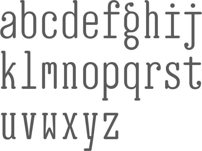
file name: Erik Bertell E B Jessica 2011
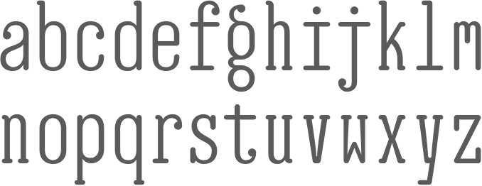
file name: Erik Jarl Bertell E B Jessica Condensed Book 2013

file name: Erik Jarl Bertell E B Jessica Condensed Book 2013b

file name: Erik Bertell Moomin 2015

file name: Erik Bertell Moomin 2015a
file name: Erik Jarl Bertell E B Futuretro 2002

file name: Erik Jarl Bertell E B Futuretro 2002b

file name: Erik Jarl Bertell Humboldt 2002
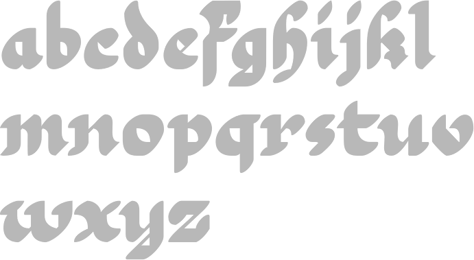
file name: Erik Jarl Bertell E B Martin Black 2010
file name: Erik Jarl Bertell E B Martin Black 2010b

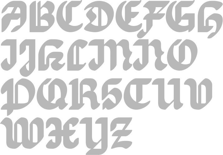
file name: Erik Jarl Bertell E B Martin 2013

file name: Erik Jarl Bertell E B Martin 2013b
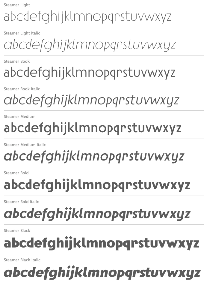
file name: Erik Jarl Bertell Steamer 2013

file name: Erik Jarl Bertell Steamer 2013b

file name: Erik Jarl Bertell Steamer Black 2013

file name: Erik Jarl Bertell Steamer Light 2013
file name: Erik Jarl Bertell E B Bellissimo Display Bold 2010

file name: Erik Jarl Bertell E B Bellissimo Display Bold 2010b

file name: Erik Jarl Bertell E B Bellissimo Display Bold 2010d

file name: Erik Jarl Bertell E B Bellissimo Display Bold 2010e
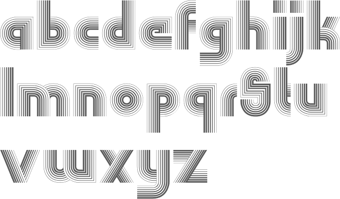
file name: Erik Jarl Bertell E B Boogie Monster 2013

file name: Erik Jarl Bertell E B Boogie Monster 2013b
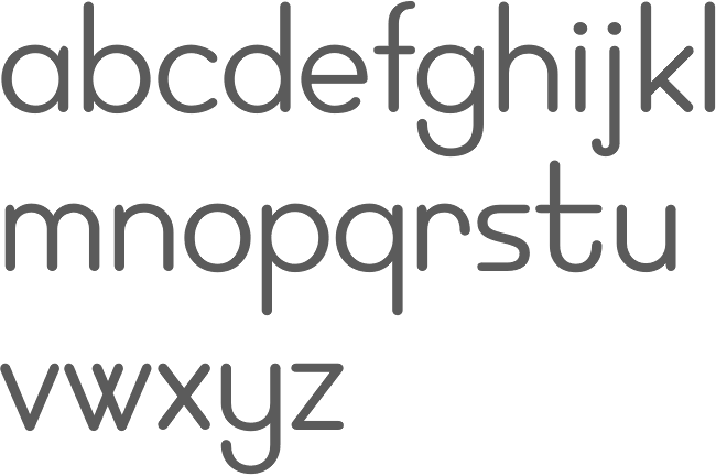
file name: Erik Jarl Bertell E B Neon 2002

file name: Erik Jarl Bertell E B Neon 2002b

file name: Erik Jarl Bertell Pic
| | |
|
Luc Devroye ⦿ School of Computer Science ⦿ McGill University Montreal, Canada H3A 2K6 ⦿ lucdevroye@gmail.com ⦿ https://luc.devroye.org ⦿ https://luc.devroye.org/fonts.html |