TYPE DESIGN INFORMATION PAGE last updated on Wed May 6 16:12:47 EDT 2026
FONT RECOGNITION VIA FONT MOOSE
|
|
|
|
Barnhart Brothers&Spindler (or: BB&S)
Chicago-based foundry, which grew out of The Great Western Type Foundry in 1868 when the Barnhart brothers (newspaper publishers in Iowa who came to Chicago as advertising agents) bought out the Toepfer family in 1868. They retained Herman Spindler as the foreman, since he was the only typefounder in the group. Aggressive in business, BB&S became the largest foundry in Chicago. Book of type specimens. Comprising a large variety of superior copper-mixed types, rules, borders, galleys, printing presses, electric-welded chases, paper and card cutters, wood goods, book binding machinery etc., together with valuable information to the craft. Specimen book no.9 (1907) is a 1048-page monster catalog (see also here and here and here). Some pictures from Type Barnhart Type Foundry Co. New York City: Superior Copper-Mixed Type (1908). In 1913, they published Preferred Type Faces. BB&S was purchased by ATF about 1911 and it operated independently until about 1930. Typophile page on them. Text file with a list of the typefaces in their Catalog 25 (1925). Discussion of some of their typefaces and digitizations:
|
EXTERNAL LINKS |
| | |

file name: Nick Curtis Shady Lady N F 2005 after B B S Umbra 1907

file name: Dan X Solo Pekin after Ernst Lauschke 1888

file name: Monotype Umbra after Ludlow

file name: U R W Umbra after R H Middleton

file name: Nick Curtis Smackeroo N F 2005 after B B S Steelplate 1900

file name: Nick Curtis Cerulean N F 2011 after Lining Gothic No.71 B B S 1907

file name: Nicks Fonts Miss Dottie N F 2014

file name: Nick Curtis Mazurka N F 2004 after Barnhart Brothers Spindler Gothic Novelty Title 1923

file name: Nick Curtis Mazurka N F 2004 ater Carl S Junge 1923

file name: Nick Curtis Junge Holiday Cuts 2004 after Barnhart Brothers Spindler 1920s

file name: Nick Curtis Junge Holiday Cuts 2004 after Barnhart Brothers Spindler 1920s

file name: Paul Hunt P22 Allyson 2006 after B B S Hazel Script

file name: Paul Hunt P22 Allyson 2006 after B B S Hazel Script

file name: Paul Hunt P22 Allyson 2006 after B B S Hazel Script

file name: Barnhart Brothers Castor

file name: Jeff Levine Millinery J N L 2022

file name: Steelplate Text

file name: Nick Curtis Vulkan N F 2014 after Barnhart Brothers Spindler Vulcan 1884

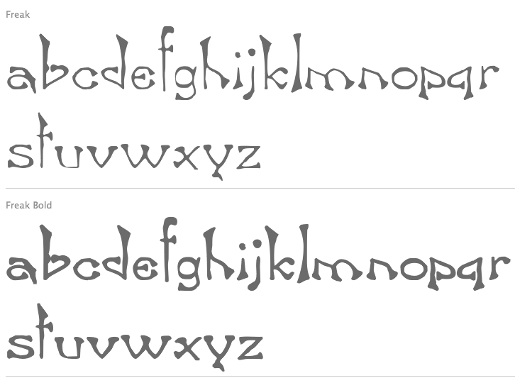
file name: Tom Wallace Freak 2005 after Great Western Foundry Bamboo 1889
| | |
|
Luc Devroye ⦿ School of Computer Science ⦿ McGill University Montreal, Canada H3A 2K6 ⦿ lucdevroye@gmail.com ⦿ https://luc.devroye.org ⦿ https://luc.devroye.org/fonts.html |


