TYPE DESIGN INFORMATION PAGE last updated on Wed May 6 16:13:28 EDT 2026
FONT RECOGNITION VIA FONT MOOSE
|
|
|
|
Geometric sans serifs
Jon Coltz on the choice of geometric sans serifs in 2003: "A nice, ol' geometric sans-serif can make me rather giddy and not even a little insane." Coltz's table of drool:
|
EXTERNAL LINKS |
| | |

file name: Nicolai Gogoll Drescher Grotesk B T 2001 144662

file name: Nicolai Gogoll Drescher Grotesk B T 2001a

file name: Svend Smital Super Grotesk 1999 110171
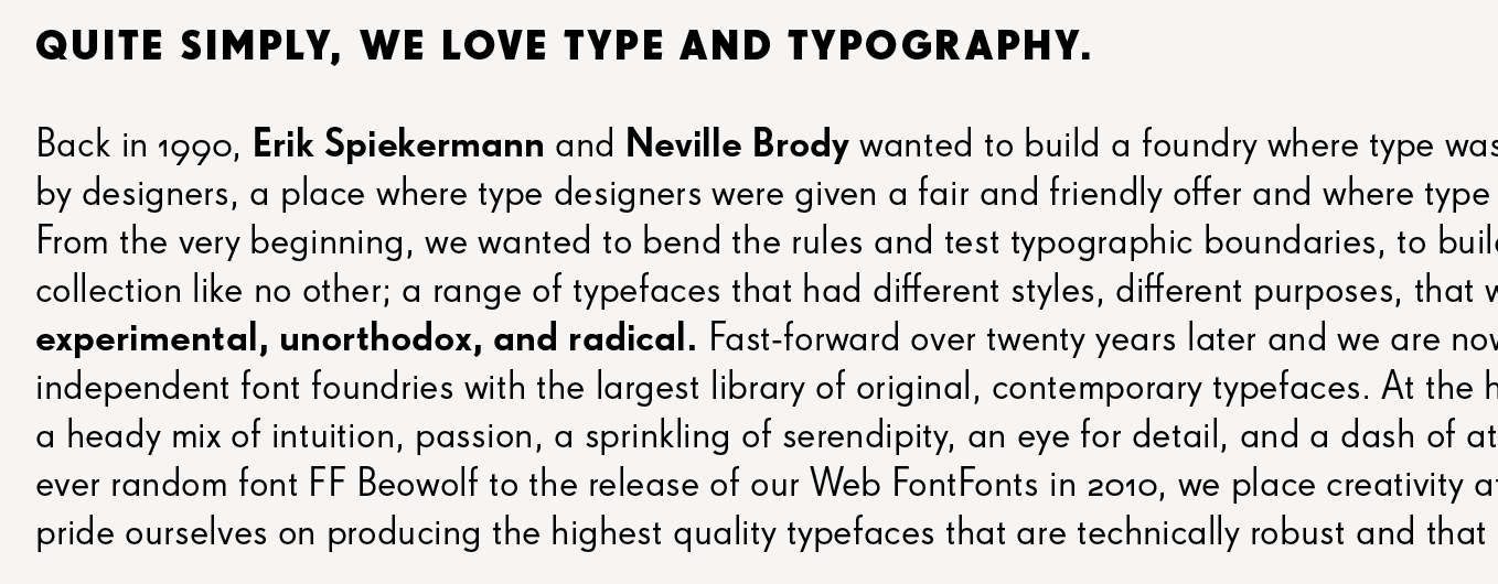
file name: Svend Smital Super Grotesk 1999 110173

file name: Svend Smital Super Grotesk 1999 110174

file name: Svend Smital Super Grotesk 1999 110175

file name: Svend Smital Super Grotesk 1999a

file name: House Industries Neutraface Display 2021

file name: House Industries Neutraface Display 2021 1
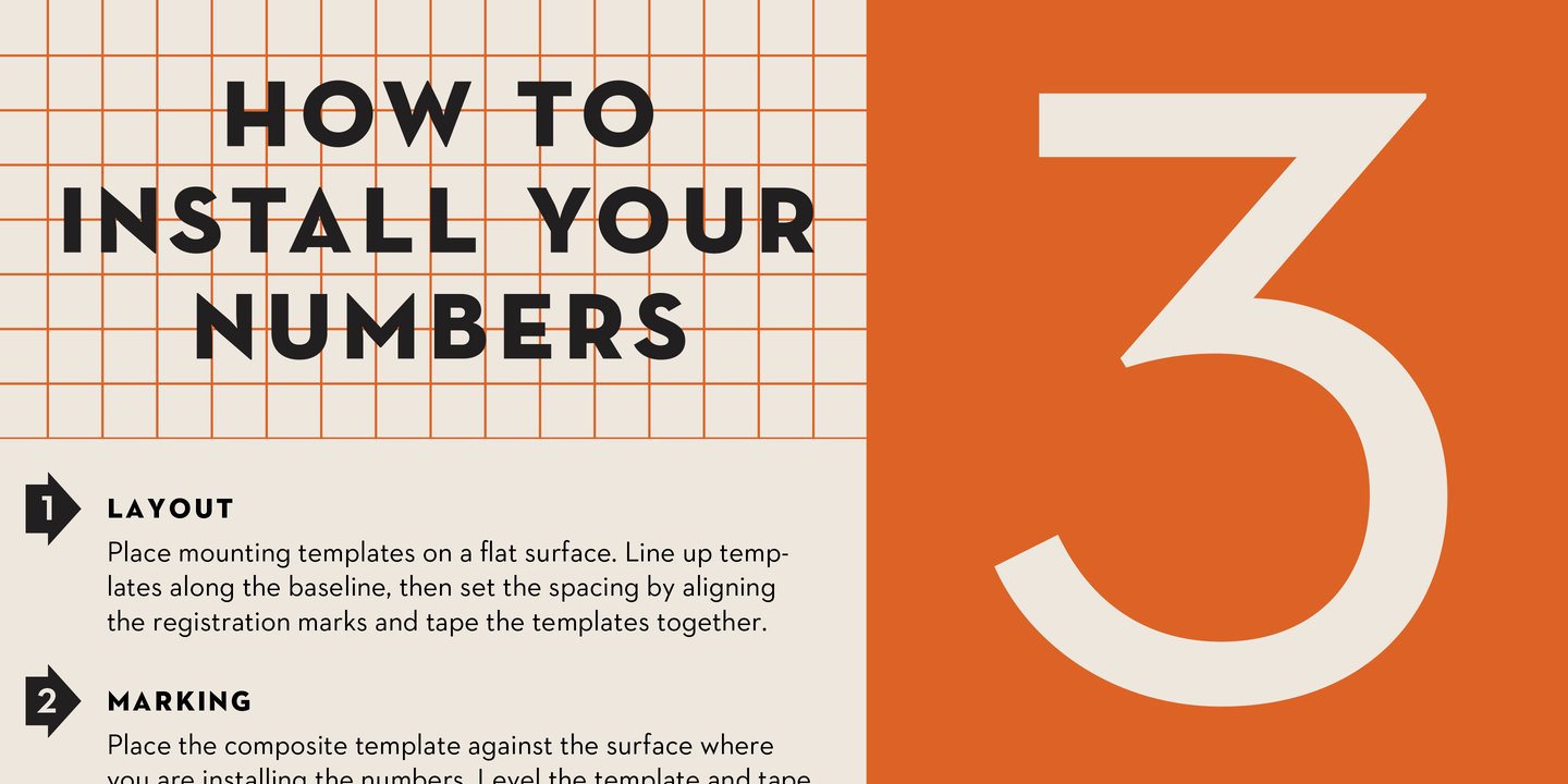
file name: House Industries Neutraface Display 2021 4
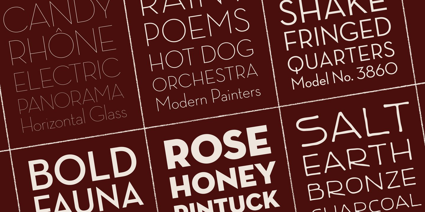
file name: House Industries Neutraface Display 2021 5

file name: House Industries Neutraface Text 2021

file name: House Industries Neutraface Text 2021 1
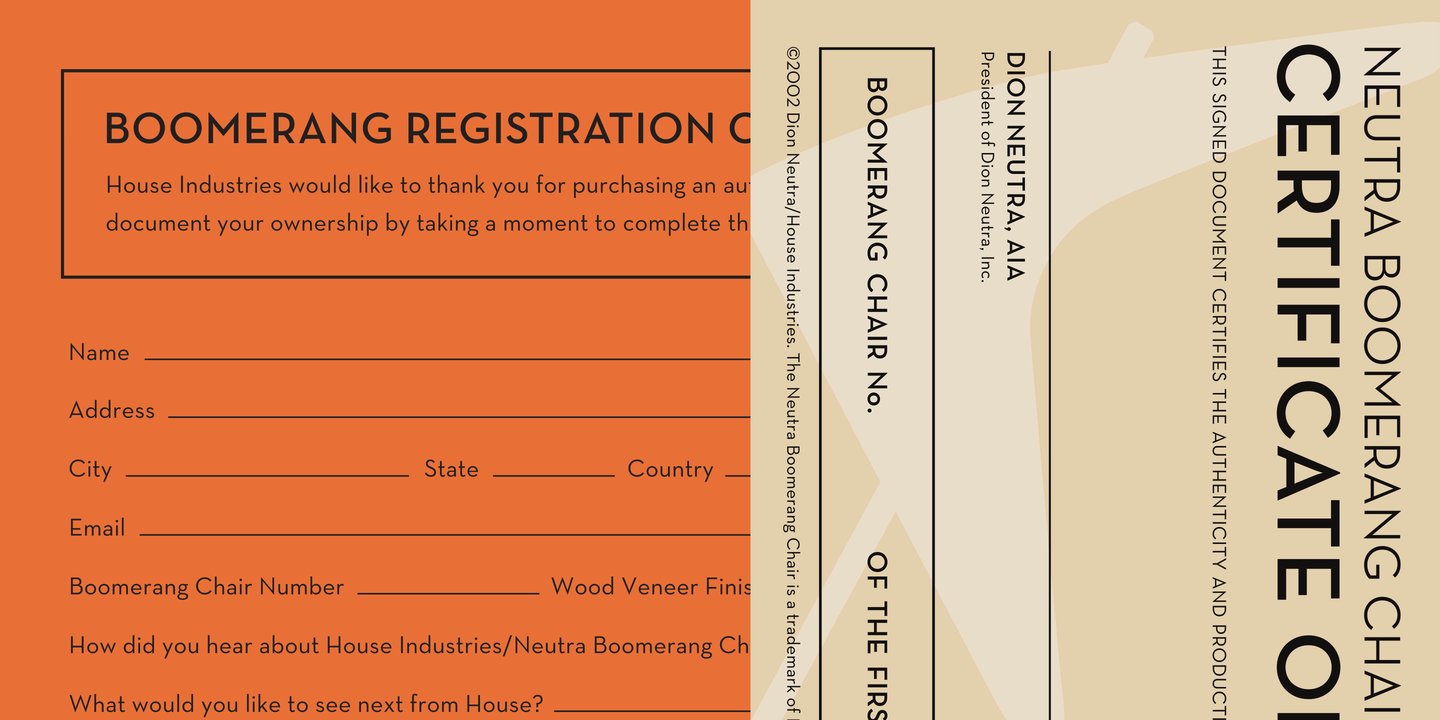
file name: House Industries Neutraface Text 2021 4

file name: Tobias Frere Jones Nobel Black 1993 after Sjoerd Hendrik De Roos

file name: Tobias Frere Jones Nobel Book 1993 after Sjoerd Hendrik De Roos

file name: Tobias Frere Jones Nobel Cond Bold 1993 after Sjoerd Hendrik De Roos

file name: Tobias Frere Jones Nobel Cond Book 1993 after Sjoerd Hendrik De Roos

file name: Tobias Frere Jones Nobel Extra Light 1993 after Sjoerd Hendrik De Roos
| | |
|
Luc Devroye ⦿ School of Computer Science ⦿ McGill University Montreal, Canada H3A 2K6 ⦿ lucdevroye@gmail.com ⦿ https://luc.devroye.org ⦿ https://luc.devroye.org/fonts.html |

