TYPE DESIGN INFORMATION PAGE last updated on Thu Apr 16 22:03:20 EDT 2026
FONT RECOGNITION VIA FONT MOOSE
|
|
|
|
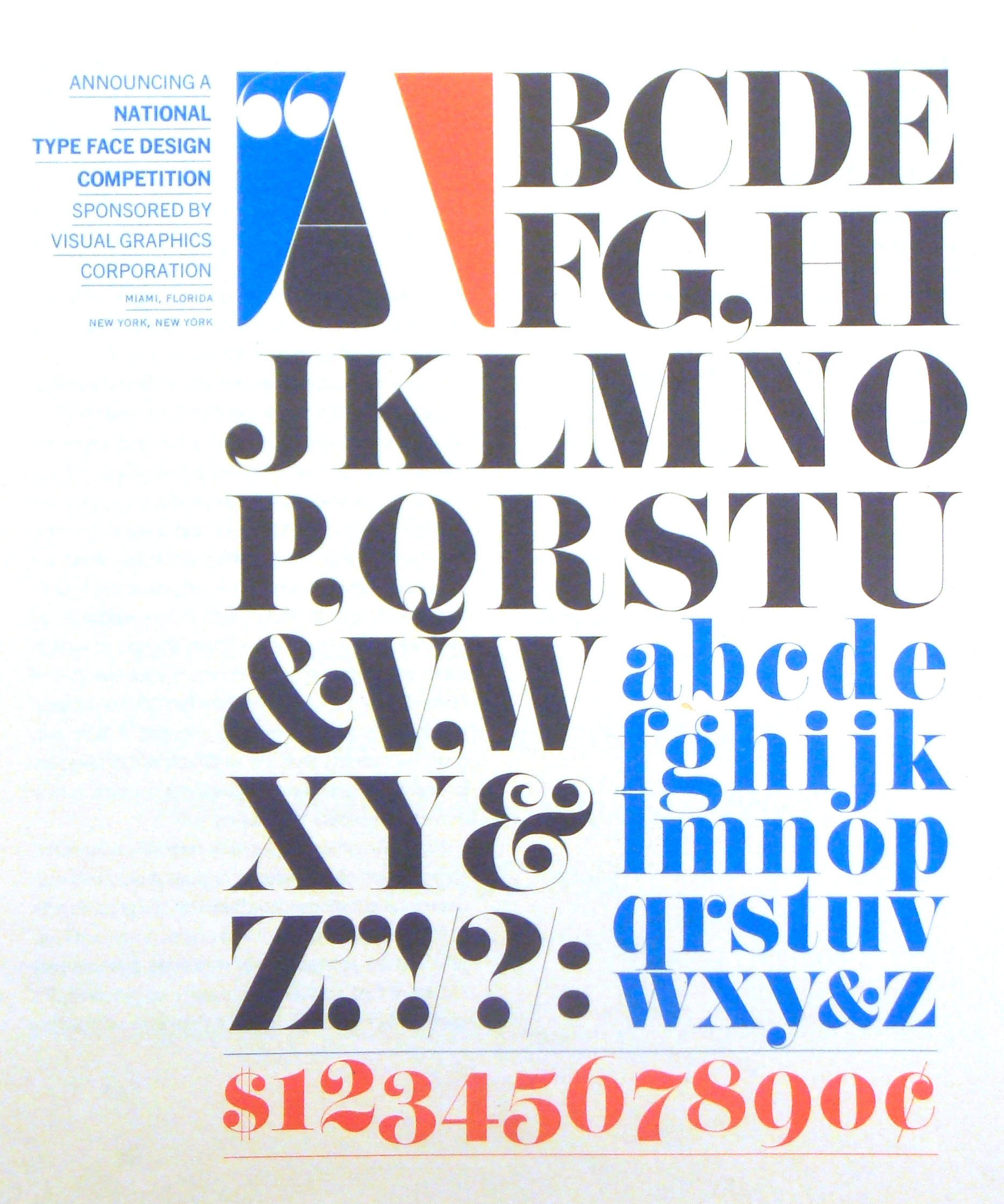
Born in 1925, died in 2003. He worked for the advertising agency Sudler & Hennessey, where he was head of lettering design. Frances Elfenbein met him first in 1957 at Sudler&Hennessey. She writes: John was the most skilled and creative letterer I had the privilege of knowing. He did the finished lettering for most of the designs Herb Lubalin created [at S&H], always adding refinements to the very rough sketches he received from Herb. In addition he created his own very beautiful roman serif typeface. He was "the Man" for lettering, and each and every art director in the agency sought to have him work on their project...of course Herb came first. When I broke my ankle skiing in 1963, John lettered the word "Love" in script on my cast...he was a sweet guy, and professionally very modest in spite of his formidable talent. Herb started his own design firm in 1964. John did not go with him, preferring to remain at S&H until his retirement. Tony Carnese who had been trained by John inherited his mantle and worked in the same greystone as Herb Lubalin Inc. I worked in the office alongside John in the mid '80's at S&H. He frequently sang as he lettered, always a surprise to people who realized that he stuttered when he spoke. [...] He had an enormous amount of patience. In the late 1950's we still had to use metal (Monotype) for large point sizes. Herb hated the letterspacing and line spacing that resulted from the shoulders and leading on individual characters. He achieved the results he wanted (very tightly kerned letters and tightly leaded lines) by having John cut apart each individual letter from clay-coated proofs only to reassemble the letters and lines. This was a monstrous task when the type was 24pt Century Expanded. John did it and never complained, and to tell the truth he agreed that the text did look much better. Thank you Frances for sending me this touching description. In 1964, Herb Lubalin made a typeface with him called Pistilli Roman (photocomposition format only, VGC). There are also Bold and Black weights. It is one of the most gorgeous extreme-contrast didone headline typefaces ever made. A picture of the VGC typeface competition poster. Revivals of Pistilli Roman:
|
EXTERNAL LINKS |
| | |

file name: Jukebox Eloquent

file name: Jason Walcott Eloquent Pro 2010

file name: Jason Walcott Eloquent

file name: Claude Pelletier Pistilli Roman 2011

file name: John Pistilli Pistilli Roman 1969 poster by Eric Bonillo 2017

file name: Nick Curtis Spiffily N F 2012 after John Pistilli Pistilli Roman 1970s

file name: Phil Martin Didoni U R W D Normal 1969

file name: Pistilli Roman Open No1 2

file name: Didoni Graphic

file name: John Pistilli Pistilli Roman Poster by Herb Lubalin

file name: John Pistilli Pistilli Roman Poster by Michaela Kriener 2014

file name: Pistilli
| | |
|
Luc Devroye ⦿ School of Computer Science ⦿ McGill University Montreal, Canada H3A 2K6 ⦿ lucdevroye@gmail.com ⦿ https://luc.devroye.org ⦿ https://luc.devroye.org/fonts.html |


