TYPE DESIGN INFORMATION PAGE last updated on Wed May 6 16:13:53 EDT 2026
FONT RECOGNITION VIA FONT MOOSE
|
|
|
|
William Stremic
[Bill Blakefield]
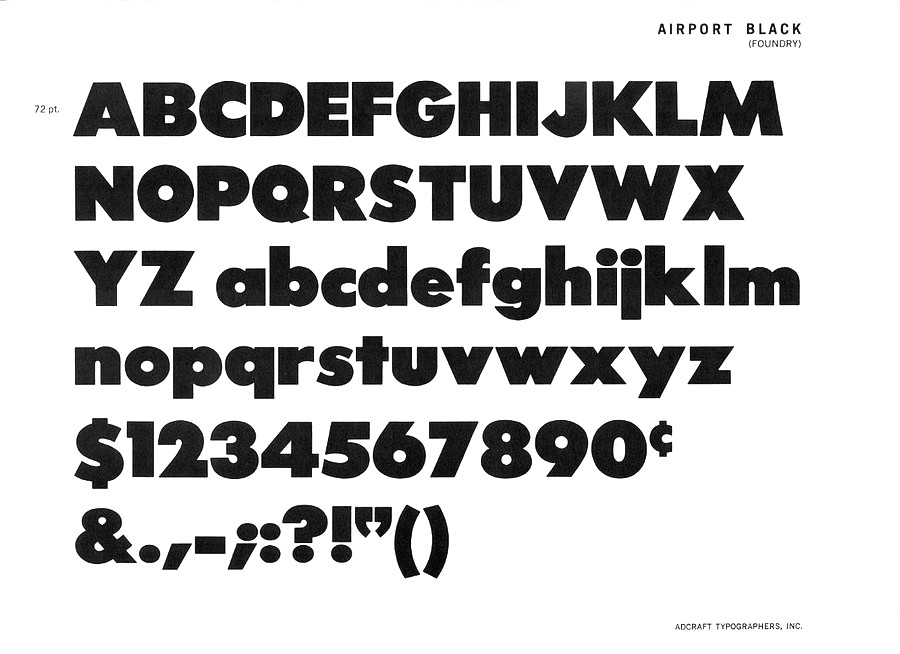
William Stremic may also be known as Bill Blakefield. Designer of Airport Black. The reason for that uncertainty about the name is this paragraph written by mac McGrew: Most of this series [Airport Gothic] is the first American copy of Futura, which originated in Germany in 1927, designed by Paul Renner for Bauer. One source says it was cut from original Futura drawings, smuggled out of that country, but it seems more likely that matrices were made by electrotyping the imported type. An extrabold weight, Airport Black, was cut by Baltimore about 1943; information on this cutting is scarce and contradictory- one account says it was designed by Bill Stremic or Bill Blakefield, another that it was designed by Carl Hupie (or Hooper), and cut by Herman Schnoor. There is also Airport Black Condensed Title and Airport Broad. The latter is a modification of Airport Black, cut 50 percent wider on the pantagraph by Herman Schnoor. Baltimore later cast some of its Airport series from Monotype Twentieth Century matrices, and in a few cases listed both series. Airport Relief, Baltimore 299, is English Monotype Gill Sans Cameo Ruled, while Airport Tourist, Baltimore 602, is Futura Display, cast from electrotype mats of the German foundry type. |
EXTERNAL LINKS |
| | |

file name: Baltimore Type Foundry Airport Black 1943
| | |
|
Luc Devroye ⦿ School of Computer Science ⦿ McGill University Montreal, Canada H3A 2K6 ⦿ lucdevroye@gmail.com ⦿ https://luc.devroye.org ⦿ https://luc.devroye.org/fonts.html |
