TYPE DESIGN INFORMATION PAGE last updated on Thu Apr 16 22:03:38 EDT 2026
FONT RECOGNITION VIA FONT MOOSE
|
|
|
|
Type and graphic designer from Joseph City, AZ. His first degree was from Brigham Young University. He was a type designer at P22/Lanston from 2004-2007. In 2008, he obtained an MA in typeface design from the University of Reading where he designed the typefaces Grandia and Grandhara (Indic). In January 2009, he joined Adobe just after Thomas Phinney left. He lives in San Jose, CA. His talk at ATypI 2014 in Barcelona was entitled The history of non-Latin typeface development at Adobe. He created Howard (2006, a digitization of Benton's Sterling), P22 Allyson (2006, based on Hazel Script by BB&S; a winner at Paratype K2009), the P22 FLWW Midway font family (2006-2018: Midway One, Two and Ornaments; based on the lettering found on the Midway Gardens working drawings of Frank Lloyd Wright from 1913---tall-legged and casual), Kilkenny (2005, P22), a Victorian-style font based on the metal types named Nymphic and Nymphic Caps which were designed by Hermann Ihlenburg in 1889. This typeface has almost 1000 glyphs and comes in OpenType format. It includes Cyrillic characters. Check the studies here and here. For another revival of Nymphic Caps, see Secesja by Barmee. Designer of the display typefaces Seventies Schoolbook (2004) and Interlocq (2004). Hunt also digitized Goudy's Village (2005). Village was originally designed by Fredric Goudy in 1903 for Kuppenheimer & Company for advertising use, but it was decided it would be too expensive to cast. It was later adopted as the house face for Goudy's and Will Ransom's Village Press. The matrices were cut and the type cast by Wiebking. The design was influenced by William Morris's Golden Type. This Venetian typeface was digitized by David Berlow (1994, FontBureau) and by Paul D. Hunt (2005). Hunt's version was eventually released in 2016 by P22/Lanston as LTC Village. He revived Hazel Script (BB&S), which he renamed Allyson (2005). Still in 2005, he created a digital version of Sol Hess' Hess Monoblack called LTC Hess Monoblack. In 2006, he published a nice set of connected calligraphic script fonts, P22 Zaner. Bodoni 175 (2006, P22/Lanston) is a revival of Sol Hess' rendition of Bodoni. He was working on Junius (2006), a revival/adaptation of Menhart Antiqua. Frnklin's Caslon, or P22 Franklin Caslon, was designed in 2006 by Richard Kegler and Paul Hunt in collaboration with the Philadelphia Museum of Art. This slightly eroded font set includes faithfully reproduced letterforms digitized directly from images of impressions made by Benjamin Franklin and his printing office circa 1750. It comes with a set of ornaments. In 2007, he used Goudy's 1924 typeface Italian Old Style in the development at P22/Lanston of LTC Italian Old Style. That typeface was remastered and extended to cover several languages by James Grieshaber in 2011. In 2014, Paul Hunt finished work on the wood type revival font HWT Bulletin Script Two (P22 & Hamilton Wood Type). This backslanted psychedelic typeface can be traced back to the wood type manufacturers Heber-Wells (Bulletin Condensed, No. 5167), Morgans and Wilcox (Bulletin Script No. 2, No. 3184), Empire Wood Type (1870: Bulletin Script), Keystone Type Foundry (1899: Bulletin Script), Hamilton (117), and Wm. H. Page & Co (No. 111 through No. 113). Free fonts at Google Web Fonts: Source Sans Pro (2012; Source Sans Pro for the TeX crowd), Source Code Pro (2012, a companion monospaced sans set by Paul D. Hunt and Teo Tuominen). Source Serif Pro, its Fournier-style relative, was developed at Adobe by Frank Grießhammer. They can also be downloaded from CTAN and Open Font Library. Fun creations at FontStruct in 2008-2009: Possibly (a stencil loosely based on the Mission Impossible series logo), Probably (same as Possibly but not stenciled), Med Splode, Arcade Fever, negativistic_small, New Alpha_1line, New Alpha_4line, New Alpha_bit, New Alpha_dot [dot matrix font], New Azbuka [after Wim Crouwel's New Alphabet from 1967], positivistic, slabstruct_1, slabstruct_too, structurosa_1, structurosa_bold, structurosa_bold_too, structurosa_caps, structurosa_faux_bold, structurosa_leaf, structurosa_script, structurosa_soft, structurosa_tape, structurosa_too, structurosa_two, Slabstruct Too Soft, Structurosa Clean Soft, Structurosa Script Clean, Structurosa Clean, Structurosa Clean Too, Structurosa Clean Leaf, Structurosa Boxy, Stucturosa Script Heavy. In 2010, he designed he programming font Sauce Code Powerline. Well, this is probably a renaming of Source Code by some hackers. Just mentioning that sauce Code is on some Github pages. |
EXTERNAL LINKS |
| | |

file name: Paul D Hunt Pic

file name: Paul D Hunt Pic

file name: Paul D Hunt Sauce Code 2010

file name: Paul D Hunt Source Sans Pro 2012

file name: Paul D Hunt Source Sans Pro 2012b

file name: Paul D Hunt Source Sans Pro 2012f

file name: Paul D Hunt Source Code Pro 2012

file name: Paul D Hunt Source Code Pro 2012b

file name: Teo Tuominen Paul Hunt Source Code Pro Bold 2010

file name: Teo Tuominen Paul Hunt Source Code Pro Medium Italic 2010

file name: Frank Griesshammer Source Serif Pro Black 2014

file name: Frank Griesshammer Source Serif Pro Black 2014b

file name: Frank Griesshammer Source Serif Pro Black 2014c

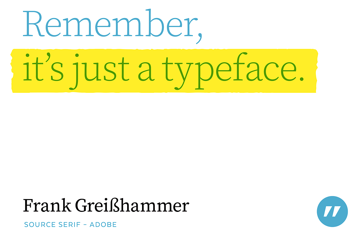
file name: Frank Griesshammer Source Serif 2014 Poster by Bill Dawson 2015

file name: P22 Bulletin Script 2014 William Page No111 113 Morgans Wilcox Bulletin Script Heber Wells Bulletin Condensed No1

file name: Paul Hunt H W T Bulletin Script Two 2014 William Page No111 113 Morgans Wilcox Bulletin Script Heber Wells Bulletin Condensed No1

file name: Paul Hunt H W T Bulletin Script Two 2014 William Page No111 113 Morgans Wilcox Bulletin Script Heber Wells Bulletin Condensed No1

file name: Paul Hunt H W T Bulletin Script Two 2014 William Page No111 113 Morgans Wilcox Bulletin Script Heber Wells Bulletin Condensed No1

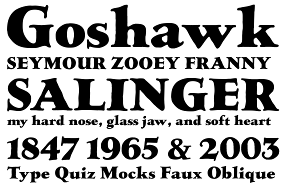
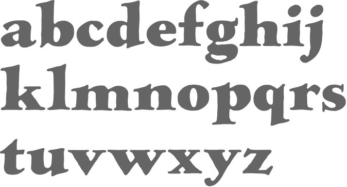
file name: Paul D Hunt Richard Kegler P22 Franklin Caslon 2006

file name: Paul D Hunt Richard Kegler P22 Franklin Caslon 2006b

file name: Paul Hunt James Grieshaber L T C Italian Old Style Pro 2007 2011 after Frederic Goudy Italian Old Style 1924

file name: Paul Hunt James Grieshaber L T C Italian Old Style Pro 2007 2011 after Frederic Goudy Italian Old Style 1924b

file name: Paul Hunt James Grieshaber L T C Italian Old Style Pro 2007 2011 after Frederic Goudy Italian Old Style 1924c

file name: Paul Hunt James Grieshaber L T C Italian Old Style Pro 2007 2011 after Frederic Goudy Italian Old Style 1924d

file name: Lanston Type Company L T C Village 2020 353382

file name: Lanston Type Company L T C Village 2020 353384

file name: Lanston Type Company L T C Village 2020

file name: Paul D Hunt L T C Village 2007

file name: Paul D Hunt L T C Village 2016 after Frederic Goudy Village Type 1902

file name: Paul D Hunt L T C Village 2016 after Frederic Goudy Village Type 1902b

file name: Paul D Hunt L T C Village 2016 after Frederic Goudy Village Type 1902c

file name: Paul Hunt P22 Allyson 2006 after B B S Hazel Script

file name: Paul Hunt P22 Allyson 2006 after B B S Hazel Script

file name: Paul Hunt P22 Allyson 2006 after B B S Hazel Script

file name: Sol Hess Paul Hunt L T C Hess Monoblack Regular 2005

file name: Sol Hess Lanston L T C Hess Monoblack 2013

file name: Paul Hunt P22 Kilkenny2005

file name: Paul D Hunt New Azbuka 2012
| | |
|
Luc Devroye ⦿ School of Computer Science ⦿ McGill University Montreal, Canada H3A 2K6 ⦿ lucdevroye@gmail.com ⦿ https://luc.devroye.org ⦿ https://luc.devroye.org/fonts.html |


