TYPE DESIGN INFORMATION PAGE last updated on Fri May 1 17:32:32 EDT 2026
FONT RECOGNITION VIA FONT MOOSE
|
|
|
|
Spiekermann's favorite typefaces
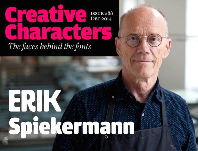
[Erik Spiekermann]
Erik Spiekermann reveals his choices for type: "I use my own typefaces (mainly Meta, Officina and Unit - I don't have to pay for them) and corporate type like Frutiger, FF Transit, News Gothic, Minion (very versatile), Univers, Myriad et al and even Helvetica (for Deutsche Bahn, the German railways, but that's going to change)." He goes on to list those typefaces he admires most:
|
EXTERNAL LINKS |
| | |

file name: Akira Kobayashi F F Clifford18 Italic

file name: Akira Kobayashai F F Clifford 1999

file name: Akira Kobayashai F F Clifford 1999b

file name: Akira Kobayashai F F Clifford 1999c

file name: Akira Kobayashai F F Clifford 1999d

file name: Erik Spiekermann F F Transit 1990

file name: Erik Spiekermann Pic
| | |
|
Luc Devroye ⦿ School of Computer Science ⦿ McGill University Montreal, Canada H3A 2K6 ⦿ lucdevroye@gmail.com ⦿ https://luc.devroye.org ⦿ https://luc.devroye.org/fonts.html |
