TYPE DESIGN INFORMATION PAGE last updated on Wed May 6 16:14:20 EDT 2026
FONT RECOGNITION VIA FONT MOOSE
|
|
|
|
ClearType
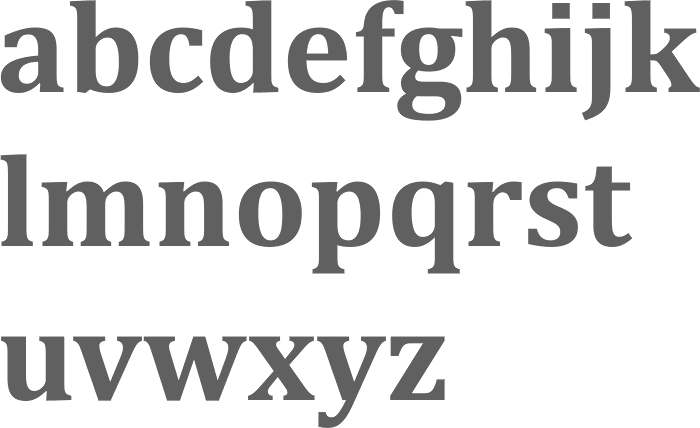
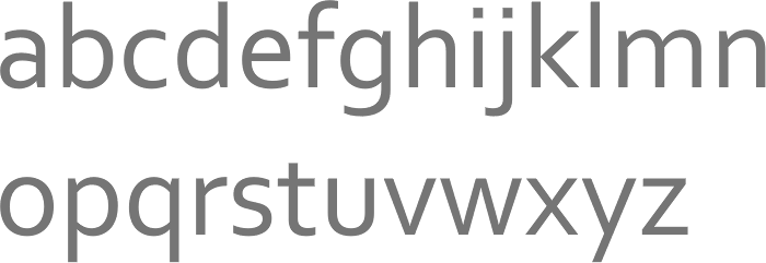
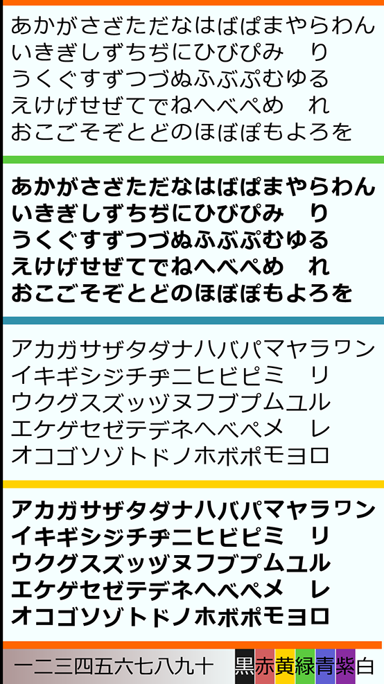
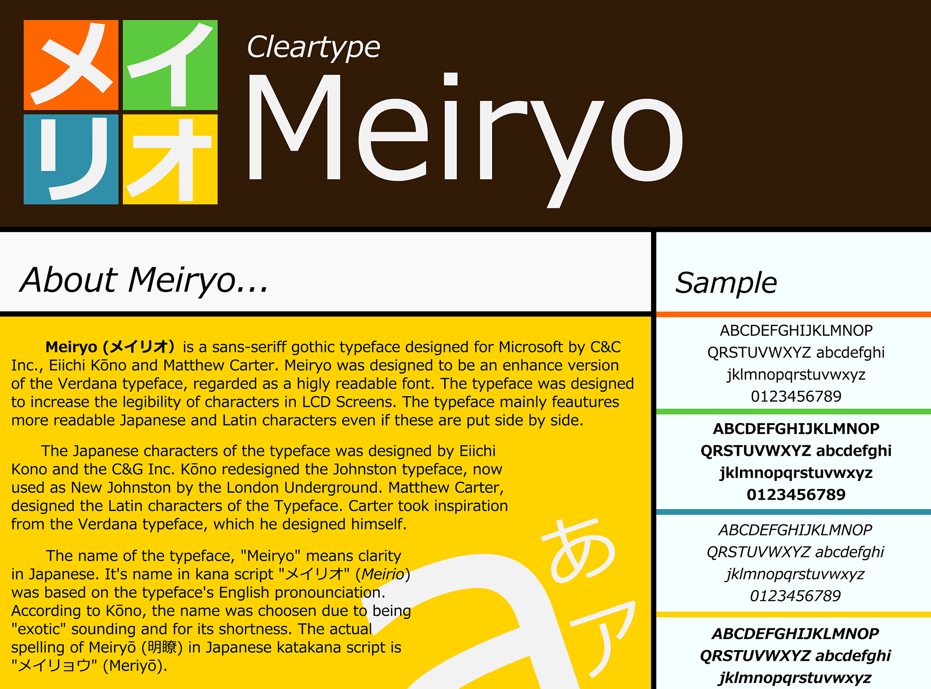
On November 15, 1998, Microsoft claimed a major breakthrough in font technology with what they are calling "ClearType". They state: "The effective tripling of horizontal resolution in ClearType subpixel rendering allows much greater fidelity to the true angle of italic type, and ClearType's patented color-filtering techniques maintain high contrast and so enable comfortable [on screen] reading". The book Now read this (John Berry and John Hudson, 2004, Microsoft Reading and Advanced Reading Technologies Group) explains the technology in more detail. In the ClearType project (2004), Microsoft releases six Western families (Calibri and Consolas by Luc(as) de Groot, Candara by Gary Munch, Corbel by Jeremy Tankard, Cambria by Jelle Bosma, and the extraordinary Constantia by John Hudson) and one full Japo-Western family, Meiryo, developed by Eiichi Kono and Matthew Carter. Review by Anne van Wagener: Calibri is a pleasure to read, Cambria is a formal and solid workhorse serif, the informal sans Candara is her least favorite, Consolas is a monospaced typeface, Constantia is her favorite--it is a clean and readable serif, and Corbel, a sans, is crisp and refreshing. On a trademark note: Constantia is the name of a pre-2000 typeface designed by Bill Horton (Foster & Horton)---if Bill plays his card right, he could make some good money off this. Typohile discussion. Microsoft we page on the ClearType font collection. |
EXTERNAL LINKS |
| | |
file name: Jelle Bosma Steve Matteson Robin Nicholas Cambria Bold 2006
file name: Jeremy Tankard Corbel 2005
file name: Eiichi Kono Matthew Carter Meiryo 2005 poster by Yohance Hernando 2017
file name: Eiichi Kono Matthew Carter Meiryo 2005 poster by Yohance Hernando 2017b
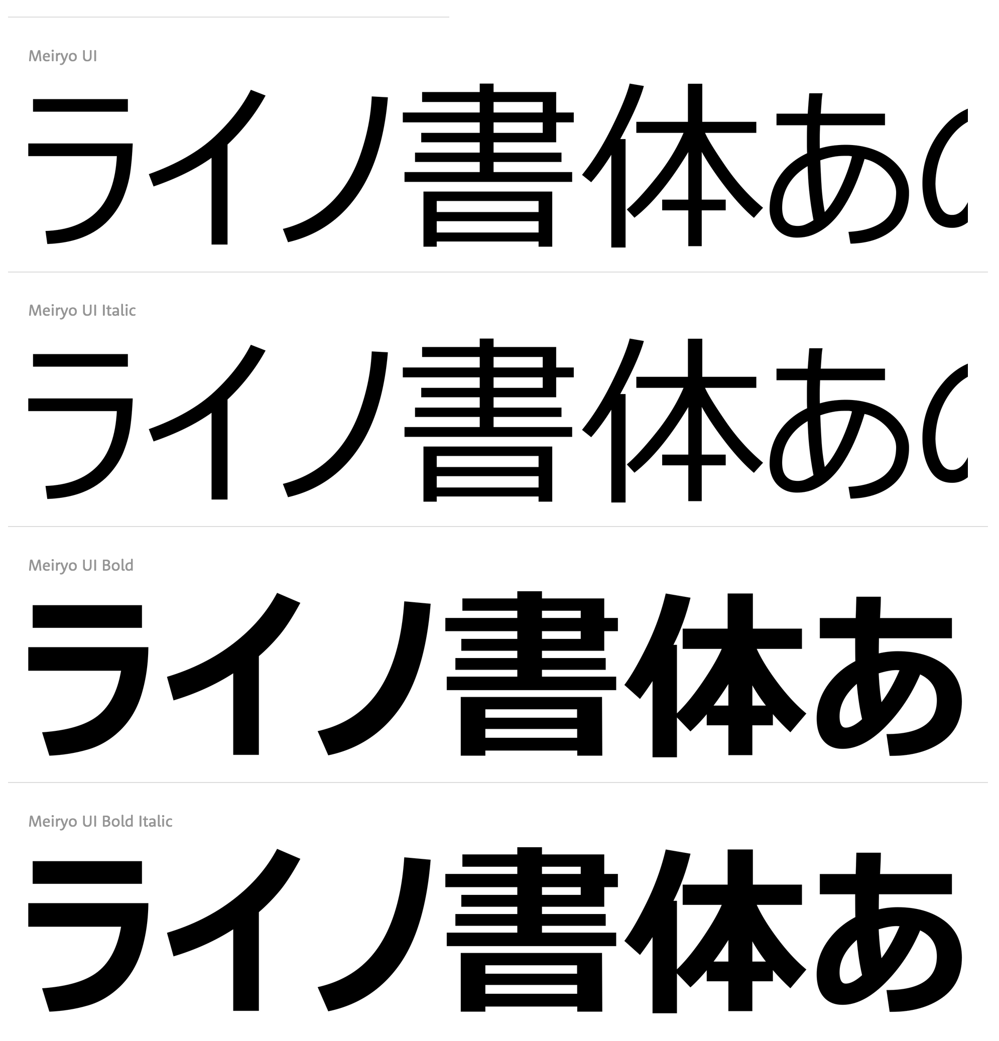
file name: Microsoft Meiryo U I 2020

file name: Microsoft Meiryo U I 2020

file name: Clear Type Group Greg Hitchock Bert Keely Bill Hill Mike Duggan Dick Brass Pic by Brian Smale
| | |
|
Luc Devroye ⦿ School of Computer Science ⦿ McGill University Montreal, Canada H3A 2K6 ⦿ lucdevroye@gmail.com ⦿ https://luc.devroye.org ⦿ https://luc.devroye.org/fonts.html |
