TYPE DESIGN INFORMATION PAGE last updated on Mon Mar 9 16:34:07 EDT 2026
FONT RECOGNITION VIA FONT MOOSE
|
|
|
|
Clarendon
A discussion on Typophile regarding the best Clarendon turned also into a discussion on Egyptians. The highlights:
|
EXTERNAL LINKS |
| | |

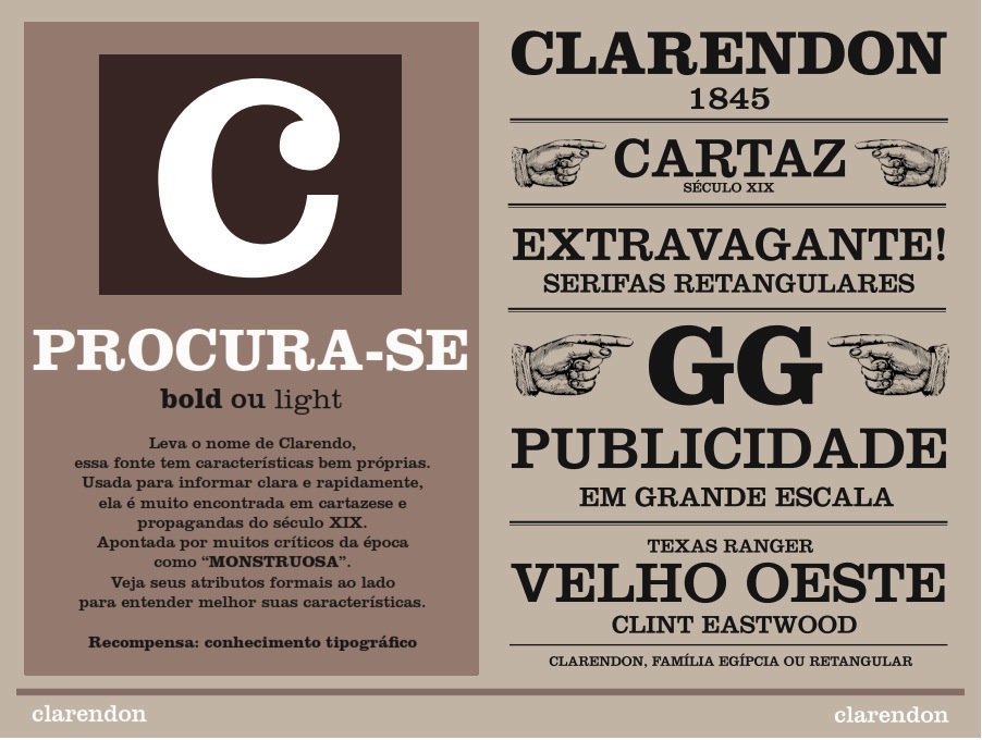
file name: Elizabeth West Clarendon Poster 2012

file name: Peter Matthias Noordzij Caecilia Etext Bold 2013

file name: Peter Matthias Noordzij Caecilia 2

file name: Peter Matthias Noordzij Caecilia

file name: Peter Matthias Noordzij P M N Caecilia 1991

file name: Peter Matthias Noordzij P M N Caecilia 1990b

file name: Scangraphic Egyptian505 S H 2004

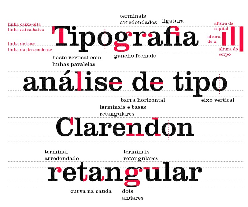
file name: Robert Besley Clarendon L T Poster by Igor Goncalves 2014

file name: Robert Besley Clarendon L T Poster by Igor Goncalves 2014

file name: Robert Besley Clarendon L T Poster by Igor Goncalves 2014c
| | |
|
Luc Devroye ⦿ School of Computer Science ⦿ McGill University Montreal, Canada H3A 2K6 ⦿ lucdevroye@gmail.com ⦿ https://luc.devroye.org ⦿ https://luc.devroye.org/fonts.html |

