|
Clarendon

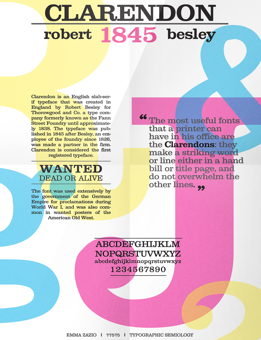
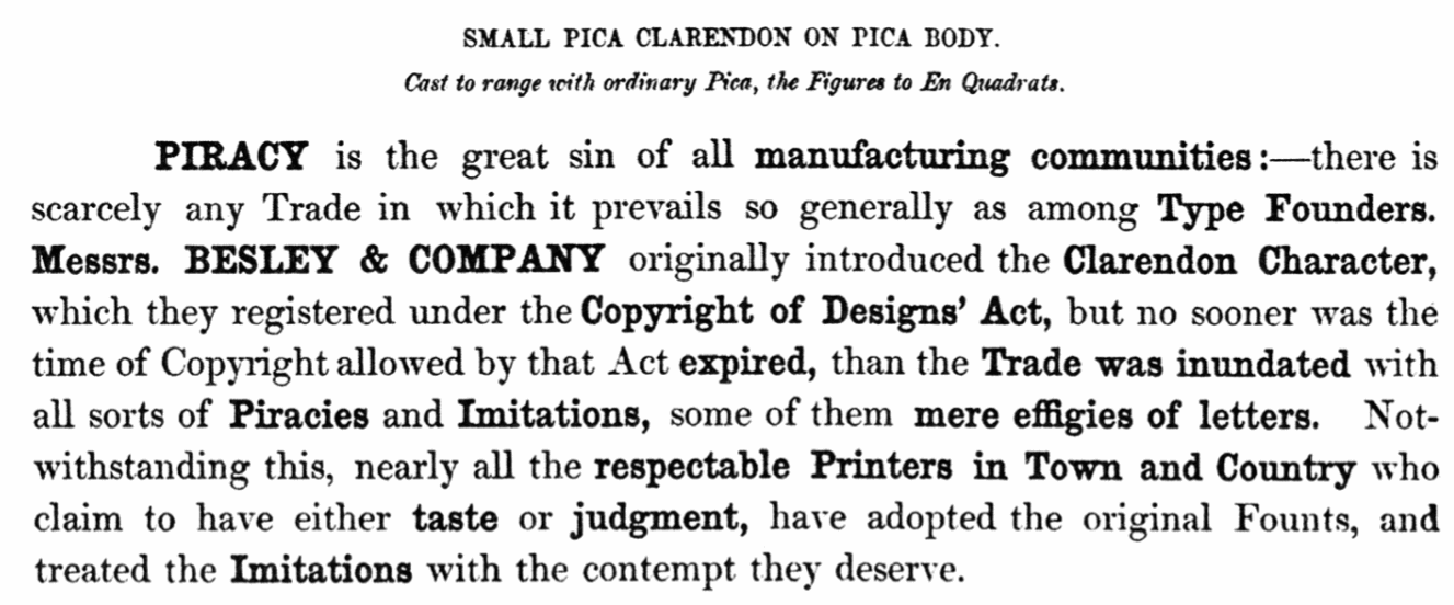
A discussion on Typophile regarding the history of Clarendon and good versions. This site provides additional information. A summary: - The original Clarendon is due to Robert Besley (1845). Robert Bringhurst writes: Clarendon is the name of a whole genus of Victorian typefaces, spawned by a font cut by Benjamin Fox for Robert Besley at the Fann Street Foundry, London, in 1845. These typefaces reflect the hearty, stolid, bland, unstoppable aspects of the British Empire. They lack cultivation, but they also lack menace and guile. They squint and stand their ground, but they do not glare. In other words, they consist of thick strokes melding into thick slab serifs, fat ball terminals, vertical axis, large eye, low contrast and tiny aperture. The original had no italic, as the typeface had nothing of the fluent hand or sculpted nib left in its pedigree.
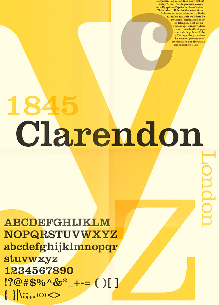
- Robert Bringhurst: Herman Eidenbenz drew a revival Clarendon for Haas Foundry in Münchenstein, Switzerland, in 1951, and in 1962 the foundry finally added the light weight that transformed the series, paring it down from premodern ponderousness to postmodern insubstantiality. Clarendon LT (Linotype) is the digital version of this typeface (Linotype says that the typeface was created in 1953, contradicting Bringhurst).
- Freeman "Jerry" Craw designed the Craw Clarendon (Book and Condensed) at ATF in 1955-1960. It is available, e.g., as Craw Clarendon EF, OPTI Craw Clarendon, and Craw Clarendon (2013, Jordan Davies).
- Contemporary Clarendons include Font Bureau's Giza, Storm's Farao and Hoefler's Proteus.
Poster by Elizabeth West.
|
EXTERNAL LINKS
Clarendon
MyFonts search
Monotype search
Fontspring search
Google search
INTERNAL LINKS
Choice of fonts ⦿
History of type ⦿
Type design in the United Kingdom ⦿
Victorian typefaces ⦿
Clarendon ⦿
|

