|
Andy Budd

Managing Director of Clearleft in Brighton, UK. He has a blog, where people were prompted for the names of type families, if they could only buy six of them. Continued here and here. The totals are tallied for you: - Akzidenz Grotesk (2 votes): Akzidenz Grotesk is the classic alternative to its dowdy and overused relation, Helvetica. If you ever feel the need to use Helvetica, resist the urge and try Akzidenz instead.
- Avenir or Avenir Next (2 votes): Futura is a wonderful typeface, although is can feel slightly sterile at times. Adrian Frutiger set about humanizing Futura and created Avenir in 1988. Avenir is a beautiful typeface but is restricted to just 12 weights. In 2004 the typeface was completely revised and Avenir Next was released with a stunning 96 weights. If you are looking for a modern sans, you need look no further.
- Neutraface (2 votes): Designed by Christian Schwartz for House Industries, Neutraface captures the 1950s stylings of architect Richard Neutra in a beautiful typeface meant for application on the screen, in print, and in metalwork. If you are ever in need of a classy retro face, they don't get any more polished than this. [...] Tired of Futura and Gill Sans? Neutraface is a beautiful art-deco alternative. Modern yet retro, this typeface comes with loads of ligatures and 7 beautiful figure styles. If this typeface was a drink it would be a Vodka Martini, shaken, not stirred.
- Engravers Gothic: For a period of about two years, I attempted to inject this font into every single project I worked on. Even if I couldn't fit it into the main scene, I screened it back somewhere in the distance just to feel better about myself. For a brief time, I was actually creating design projects for the sole purpose of using Engravers Gothic in them. It was at this point that I sought professional help.
- Myriad: Its quite simply the most readable sans-serif typeface ever invented for print at least. On the web, that'd be Lucida Grande, but thanks to Apple, I don't really have to buy that now, do I?
- Meta: Like a good mullet, this typeface has something for everyone. Its clean lines make it ideal for logotype, headings, and other professional applications, but its curvy flourishes keep it from looking sterile or uptight.
- Agency: Originally designed in 1932, and then expanded to multiple weights and widths in the 1990s by David Berlow, this typeface can be made to look futuristic or retro. Im partial to flexible typefaces, and Agency is second-to-none in this regard. Use it for old movie posters. Use it for your pathetic Star Trek Convention flyers. Agency feels at home in any environment.
- Palatino: Also abused in both web and print work, Palatino is undeniably versatile and (imho) a much better option overall than Times.
- Proxima Nova: I am counting down the minutes until this typeface is available. No joke.
- Dynasty Light: Someone please give me an excuse to use this in my next project. I take that back: no excuse needed.
- Trajan Pro: I am a sucker for classic Roman letterforms, and it doesn't get much better than Trajan.
- Warnock Pro Light Italic: I stumbled across this gorgeous typeface just recently, and its one of the hottest italics I have had the pleasure of using in recent months.
- Frutiger: Originally designed for the signage at Charles De Gaulle Airport in Paris, Frutiger is a beautifully fluid and legible typeface. Without doubt the most influential typeface in the past 30 tears, Frutiger has been the inspiration for many amazing fonts including the excellent Myriad Pro.
- DIN Schriften: DIN stands for Deutsche Industrie-Norm, the German industrial standard. Originally used for German road signage, this typeface was the darling of 90s graphic designers, and like FF Meta, is starting to make a comeback. With its wide open letter forms DIN is am extremely clear and legible typeface, great at any size.
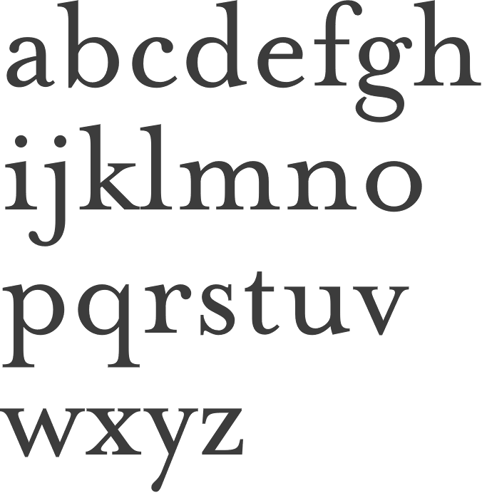
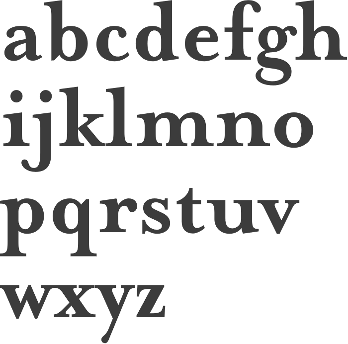
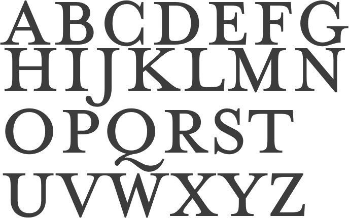
- Mrs Eaves: If I had to choose one serif typeface it would be Mrs Eaves. Named after John Baskervilles wife, this stylised version of Baskerville is loved by graphic designers around the world. Mrs Eaves is a modern serif that retains an air of antiquated dignity. Playful without being too scripty, its a fully featured typeface with a beautiful collection of ligatures.
|
EXTERNAL LINKS
Andy Budd
MyFonts search
Monotype search
Fontspring search
Google search
INTERNAL LINKS
Choice of fonts ⦿
Type design in the United Kingdom ⦿
DIN ⦿
Typefaces inspired by the Trajan column in Rome ⦿
Akzidenz Grotesk ⦿
Baskerville ⦿
|


